80 types of charts & graphs for data visualization (with examples)
In this article we'll talk about different types of charts and graphs. They are sorted into six categories according to the function of the chart . Each chart type section consist of a chart example, a general description of a chart and recommendations on where to use or not to use this particular chart type. Every category contains clickable icons that allows you navigate the article fast. It doesn't matter if you're a dataviz beginner or professional, this article can be a huge help. Keep on reading!
( 👇 Select a chart icon to navigate to its section)
COMPARISON |
|||||||
|
|||||||
|
|||||||
|
|||||||
|
|||||||
|
|||||||
Ask yourself what is it you actually want to show and who is your audience? Sounds simple, I know. But remember, you can’t please everyone. And sometimes, a pie chart is fine. We don’t hate pie charts and actually, there are cases when they’re quite appropriate charts to use to communicate data.
You can try to explore variations and alternatives to different chart types. But before you gather all your data and start creating beautiful graphs and visualizations, take a step back for a second and think. Who do you want to show your data to? Are the viewers knowledgeable about dataviz best practices? It’s very likely that you just want to present your information to someone who needs to easily understand it. Similar to how using reliable antivirus software protects your online privacy by shielding the right information, your goal is to use the correct data visualization to ensure clarity and purpose in your message.
For this reason, it’s important to consider the right type of data visualization for you.
Now, if you want to include different charts and graphs in your final product, it’s a great next step to explore your options. There are many, many chart types and we won’t be able to cover all of them. In this article, we will show you some of the most important charts that can effectively convey a message and communicate your data. And also create engaging data storytelling for your readers. Below, you might find charts you are familiar with and some that are less common. We hope you explore all chart types and find the most suitable ones for your data visualization project. The list consists of eighty types of charts and graphs, many of which you can create online for free with Datylon Report Studio, or with our chart maker plug-in Datylon for Illustrator.
1. Comparison
Comparison charts are usually the first choice for data visualization. This is because in most cases we visualize data to compare. Comparison charts are designed to show how values compare to each other. In most of the cases a bar chart is the first and most logical choice.
Bar chart
Alternative name: Bar graph
What is a bar chart?
One of the most common chart types out there. A bar chart is a set of rectangles with a length proportional to the values it represents. Each rectangle – the bar, is a representation of one category.
When to use bar charts?
Use bar charts when you need to compare values that correspond to categories or discrete values. Bar charts work best when visualized values are in the same order of magnitude.
Bar charts are universal. It can be used everywhere, from a school project to a scientific paper. It is widely recognisable. Bar charts are commonly used due to their simplicity. Viewers need just to decode their bars' length and position, making bar charts very easy to understand. The general public is fairly capable of reading bar charts, so no extra dataviz expertise is necessary. The differences in bar length are easier to perceive, than, for example, differences in size and color. For this reason, bar charts are doing their job well. You should consider using bar charts in your data visualization if the data structure and the actual message allow for it.
When you shouldn't use a bar chart
The bar chart has a few limitations. First, the axis along bar charts should always start from zero. It makes it impossible to use it for some specific data range that does not include zero. Also, if your values vary greatly in size, it's better to use charts that use area for representing a value. Alternative options here are an icon chart or treemap. If there are a lot of bars (above 30), it becomes really hard to read the chart.
If you want to improve your dataviz skills and design the best bar chart you can check our bar chart resource page and discover even more pro design tips.
Back to table of contents ⬆️
Column chart
Alternative names: Column graph, Vertical bar chart

What is a column chart?
Long story short, you can say that a column chart is the same thing as a bar chart, turned by 90 degrees. Indeed, a column chart is a type of chart that resembles a bar graph with bars positioned vertically.
When should you use a column chart?
The main difference between a column chart and a bar chart is in the usage of categorical labels. Long labels don't suit column charts because of easy overlapping. But it might be useful if the labels are short and don’t take up a lot of horizontal space.
Column charts can sometimes be useful when showing date-over-time data. But there is a limitation. It only works if there are only a few timestamps. For an extended number of timestamps, it's better to use line charts.
Column charts are as universal as bar charts and can be used in every domain where charts can be placed. Column charts are better than bar charts for cases when categories have a natural order, like income levels or education levels. Column charts are very easy to read and they are easily recognised by the general public.
When you shouldn't use a column chart
If the names of the categories are too long, column chart becomes really cluttered and hard to read. Changing the angle of the labels won't solve the problem, it makes labels unreadable. So if the labels are too long, use bar chart.
You can use our bar chart resource page to learn how to improve the readability of your column chart as well.
Back to table of contents ⬆️
Grouped bar/column chart
Alternative names: Paired bar/column chart, Clustered bar/column chart
What is a grouped bar chart?
A grouped bar chart is a multi-series variation of a bar chart where every category is represented by several columns. Each bar is communicating different aspects of the main category. Columns of each category are separated from the other categories using spacing.
When should you use a grouped bar chart?
This type of chart is used to compare multiple bars based on two variables, either categorical or discrete. For example, product sales grouped by product categories. Usually these types of charts are used in reports or presentations. If you need to make a comparison of values that are related to multiple categories and they should be on the same line, use a grouped bar chart.
When you shouldn't use grouped bar chart
Despite this chart being a variation of a very useful and popular bar chart, it comes with a few guidelines to keep in mind. Placing too many categories makes the chart cluttered and hard to read. Also, there are a lot of cases when poor color choice makes grouped bar charts unreadable.
Back to table of contents ⬆️
Lollipop chart
Alternative name: Lollipop plot

What is a lollipop chart?
This type of chart consists of a line and ends with a dot, or a circle. The length of the line represents the value. The dot or a circle used as an extra highlight of the value.
When should I use a lollipop chart?
You can use a lollipop chart when you need to show the relationship between a numeric and a categorical variable.
A lollipop chart can be a sweet alternative to a regular bar chart if you are dealing with a lot of categories and want to make optimal use of space. All the rules that are applied for bar and column charts can also be applied here.
When you shouldn't use a lollipop chart
When you have enough space for a bar chart, it is better to use a bar chart. Also, when you have values that are very close to each other, bar charts are better. They are easier and more accurate to read than a lollipop because of the data mark that can be hard to compare, especially when the data mark is big.
Bullet chart
Alternative name: Bullet graph
What is a bullet chart?
A bullet chart is a type of chart designed to benchmark against a target value and ranges. Bullet charts resemble a combination of bar/column charts and progress bars. The results are shown in a single bar or column. The ranges bar is constructed based on values from a category that comparison will be based on (for example competitor sales figures). All these values are then divided into a certain number of sub-ranges (in most cases it’s quartiles). Target shows the value which is aimed for. And the bar shows the actual figures.
When should you use a bullet chart?
Bullet chart is a space-efficient chart used primarily for displaying performance data. Bullet chart is a primary choice for cases where multiple specific values should be shown in a compact way. Actual value, target values, reference ranges – all this can be placed in a space of a single bar.
When you shouldn't use a bullet chart
Bullet charts have limited use. Being a very specific performance or benchmarking chart, is not useful for any other cases.
Dot plot
Alternative name: Dot chart
What is a dot plot?
Dot plot consists of one or more dots related to each category.
When should you use a dot plot?
Dot plots are a good choice for comparison. Especially if you need to place multiple values under one category. It allows you to have a lot of information on the chart and be clean and clear at the same time. Also, it's important that it can be used for ranges of values. Unlike bar charts, you don't need the X axis to start from zero. It gives additional freedom for changing the chart range. It allows you to zoom into a certain part of the dataset.
Dot plot packs a lot of information in a small space. A dot plot with only one value per category makes a comparison between those categories very easy. When the dot plot has multiple values per category, you can also compare within the categories.
When you shouldn't use a dot plot
This chart may need gridlines that turn a dot plot into a chart with a proper context. Visually it might lack some "base", compared to bar charts.
More about dot plot
We wrote a very interesting article about dot plots.
Make sure to also check our dot plot resource page and discover pro design tips.
Back to table of contents ⬆️
Dumbbell
Alternative names: Dumbbell plot, Dumbbell chart, Connected dot plot, Dumbbell dot plot, DNA chart, Barbell chart
What is a dumbbell chart?
A dumbbell is a variation of dot plot with two connected values per category. A dumbbell consists of dots (or circles) and connectors (or lines). Not adding marks and only leaving the connector makes it a range chart.
When should you use a dumbbell chart?
Use it when you want to emphasize the delta (change) between the two values (data points, i.e. two points in time). Also it can work for comparing values in the same category and throughout all the categories of the chart.
A dumbbell chart is a good choice for visualizing paired values. For example, gender pay gap.
When you shouldn't use a dumbbell chart
Dumbbell charts work for very specific cases of paired values per category. If it's not the case, this chart makes little sense.
Pictogram
Alternative names: Pictorial chart, Proportional unit chart, Picture graph
What is a pictogram chart?
A pictogram chart is a type of chart that uses icons or symbols, or even small images, to represent data. Each of these icons can correspond to a certain category. Another option is that the icon represents a certain value or a visual representation of an item. Pictogram charts to some extent resemble bar charts, but instead of using a bar, they show icons.
When should you use a pictogram chart?
Some data visualization experts might argue this type of chart is very basic, to the point that it’s widely used in schools and kindergarten. But it's important to keep in mind that using a pictogram chart helps overcome language barriers and it’s easy to interpret.
The simplicity of the pictogram chart allows it to use it in cases when the audience is not prepared for charts. IKEA is using only images in their assembly diagrams which makes them universal for all languages. It's not a dataviz example, but it shows how icons can be a powerful tool for multi-language communication.
When you shouldn't use a pictogram chart
If the audience of the chart are professionals that constantly work with data, using pictogram charts might be an oversimplification.
Icon chart
Alternative name: Proportional area chart![]()
What is an icon chart?
The icon chart consists of icons of a different area. Each icon corresponds to one category. For most cases the placement of icons can be customized.
When should you use an icon chart?
Icon charts are an effective alternative to bar charts when there's a significant difference between the values. The icon chart uses area rather than length to visualize values, which allows it to display a larger range of values in a compact way.
When you shouldn't use an icon chart
Icon charts can be tricky to read. Usually readers are not used to perceiving area in correspondence with the value. It can be hard to see the difference if the values have minor differences. Keep that in mind, if you’re planning to use an icon chart in your visualization.
Range plot
Alternative name: Range chart

What is a range plot?
The range plot looks similar to a bar chart. It also consists of rectangular bars. The difference is that a range plot shows two values of a category, instead of just one. These two points are connected with a line or a bar between them. This line indicates the difference, or a gap, between these points and suggests a direction of such change.
When should you use a range plot?
Use a range plot if you want to highlight the difference between two values, rather than showing these values as something separate. A use case example is any sort of demographic gap, i.e. gender pay gap. Compared to the dumbbell chart, the range chart is more focused on the range itself rather than the individual data points.
When you shouldn't use a range plot
When you want to focus on a certain value related to a category, better to choose another chart, like bar chart or icon chart.
Back to table of contents ⬆️
Radial bar chart
Alternative name: Circular bar chart
What is a radial bar chart?
A radial bar chart is a variation of a regular bar chart with the main difference being the circular shape of the chart. The chart itself is plotted on what is called a polar coordinate system. It means that each bar appears in a circle. The larger the value, the longer the bar.
When should you use a radial bar chart?
Try radial chart if you really want to grasp the attention and you want to try something fancy. Also, if the accuracy of data presentation is not your first priority, it is fine to use it.
When you shouldn't use a radial bar chart
I was always puzzled by this chart and inability to show the values in a logical way. So let me know if you find a legitimate use case for this chart. It is really hard to read and interpret. Inner and outer bars can seem totally different in size and visualise the same value. Inner bars tend to be shorter than the outer ones.
Back to table of contents ⬆️
Parallel coordinates
Alternative names: Parallel plot, Parallel coordinates plot
What is a parallel coordinates plot?
The parallel coordinates chart resembles a line chart. Instead of time values, categories are plotted on the horizontal axis.
When should you use a parallel coordinates plot?
In case you need to plot a multitude of categories/dimensions without compromising the readability in a simple 2d space. Every dimension can be presented with a separate axis and each of them can have its own range.
When you shouldn't use a parallel coordinates plot
The relative simplicity of the chart, yet, adds some limitations. If each dimension has its own scale, just two neighboring dimensions relationships can be followed at a time. You might look at it as a chain of slope charts. Ordering plays a crucial role in this chart. This chart is not an easy one to read, so you need to consider if the data can be presented in some other way.
Back to table of contents ⬆️
Radar chart
Alternative names: Spider chart, Spider graph, Web chart, Spider web chart, Star chart, Star plot, Cobweb chart, Irregular polygon, Kiviat diagram
What is a radar chart?
A Radar chart consists of several axes, all coming from the same point in the center (which resembles a spider web). Every axis is connected to a specific attribute of the compared items (the minimum number of attributes is three).
When should you use a radar chart?
Radar charts are used for making a visual “profile”. Each axis corresponds to an attribute. Usually radar charts are used for side-by-side comparison on the same chart or using separate charts for each profile. They useful for getting an approximate picture.
When you shouldn't use a radar chart
Although it’s a very interesting chart to use, it’s important to keep in mind that it is hard to read. As it is designed in a circular fashion, it requires extra visual perception, in contrast to the more common linear types of charts and graphs. It is often easier to replace it with another type of chart. If all axes in your chart have the same scale, then a bar chart or sometimes a lollipop will suffice. If the axes have a different scale, it’s better to use parallel coordinates.
Back to table of contents ⬆️
Nightingale chart
Alternative names: Nightingale's graph, Nightingale rose chart, Rose diagram, Coxcomb chart, Polar area chart
What is a Nightingale chart?
A Nightingale chart is a variation of a pie chart. It also consists of sectors, but with different radiuses. In this chart, the value corresponds to the area of the sector, not the radius.
When should you use a Nightingale chart?
A Nightingale chart is visually similar to the pie chart, but it has a different function. It’s used mostly for comparison.
When you shouldn't use a Nightingale chart
In most cases, a Nightingale chart is not the best primary chart choice. It’s really hard to compare the sector areas of a Nightingale chart precisely. It also inherits all the issues of the pie chart. The most obvious is that it’s hard to distinguish sectors with similar values. For these types of cases, it’s better to use bar charts.
Waterfall chart
Alternative names: Flying bricks chart, Mario chart, Bridge chart, Cascade chart
What is a waterfall chart?
In the waterfall chart, the first value (column) typically starts from the baseline of zero, as does the ending value. They are connected by a number of seemingly floating shorter bars that show the intermediate changes. The overall shape of the chart resembles a waterfall.
When should you use a waterfall chart?
A waterfall chart is a type of graph that usually shows positive and negative values of change between two points, which helps in understanding the cumulative effect of these changes (so the net change).
This chart does not only look at the starting value and the ending value of your data set but also shows each individual positive or negative change that happened. As you can imagine, this type of chart is quite useful in financial sectors or human resources, but also in other industries (think of inventories, revenue tracking, etc.).
When you shouldn’t use a waterfall chart
A waterfall chart is not useful if you want to visualize and communicate the absolute values of each parameter, not the influence of this parameter on the whole.
Back to table of contents ⬆️
Matrix chart
Alternative name: Matrix diagram
What is a matrix chart?
A matrix chart is a grid of two or more categorical variables. On the intersection of the categories one or more icons are placed, showing the type of the relationship between categories.
When should you use a matrix chart?
A matrix chart is a chart that helps in visualizing the relationship between two or more categorical items. Specifically, it shows the presence and strengths of such relationships. It can have different forms depending on how many groups must be compared.
When you shouldn’t use a matrix chart
You should be careful if you need to display more than two categorical dimensions, as adding more can quickly reduce readability.
Small multiples
Alternative name: Trellis chart, Lattice chart, Panel chart

What is a small multiples chart?
Unlike all the other graphs in this article, small multiples are more of a visualization concept than a graph itself. This is because small multiples repeat the same type of chart in a grid to show different slices of the dataset.
When should you use small multiples?
The main advantage of using small multiples is the possibility of showing three or (usually) more variables presenting different values in the same graph without confusing your audience. The main way of using small multiples is to split charts that are too complicated or cluttered into many simple charts. For example making a small multiple chart out of a spaghetti chart (line chart with too many lines. Another example is making small multiples out of stacked or grouped bar charts.
When you shouldn’t use small multiples
Small multiples work best when there is enough space to show each chart clearly. If space is too limited, lose clarity. Also, if a single chart can show the same story, they are not needed.
Word cloud
Alternative name: Tag cloud, word collage, wordle
What is a word cloud?
A word cloud is a visual cluster of words that vary in size based on how often they appear in the dataset. In other words, the more frequently a word or keyword appears in the text, the larger and often bolder it will look in the cloud.
When should you use a word cloud?
Word clouds can be helpful for analyzing data related to language and narrative studies. It allows you to get a fast approximate overview of the word patterns in a text.
When you shouldn’t use a word cloud
Word clouds only give a rough idea on the frequency of the words within the dataset. The exact area of the word is not always corresponding to the value because it’s really hard to calculate the area precisely. Words have a complex form and it also depends on the font that is used.
Back to table of contents ⬆️
Slope chart
Alternative name: Slopegraph
What is a slope chart?
A slope chart consists of two vertical lines representing start and end points. Data points are placed on each of these lines representing values for one category. Two data points are connected with a line, showing the change using the slope of the line.
When should you use a slope chart?
A slope chart can be used as a replacement for a line chart, grouped or stacked bar chart. If there are only two values to compare, it works perfectly.
When you shouldn’t use a slope chart
If there are more than two time or measuring points, the slope chart won’t work. In this case more conventional chart types like variations of bar chart or line chart should be used.
Table chart

What is a table chart?
Table chart is a usual table. It includes the usual attributes, like rows and columns of data. The difference is that the table chart has some additional visual elements that allow it to highlight certain cells. The most popular version of table charts is a table with some condition formatting. It can look almost like a heatmap, but the difference is that every column(s) or row(s) can have a different rule of coloring.
When should you use a table chart?
Table charts are a good starting point for exploiting the data. Similar to scatter plots and heatmaps, it gives an overview of the data. Sometimes it can also work as a final presentation visualization.
When you shouldn’t use a table chart
The possibilities of using different rules for different columns and rows gives not only the freedom of exploration but also might cause confusion for the reader. Table charts are usually not self-explanatory and need some additional notes and guides on where to look at and pay attention to.
Categorical scatter plot
What is a categorical scatter plot?
A categorical scatter plot differs from a regular scatter plot by the presence of a categorical axis. It can be just one categorical axis or both of them.
When should you use a categorical scatter plot?
Categorical scatter plots can be useful for visualizing a set of 2 categorical variables and one numerical variable. An example is visualizing the results of polls. A bubble positioned at the intersection of two categories shows the numerical value that is related to that specific category pair.
When you shouldn’t use a categorical scatter plot
Categorical scatter plots can have limited utility if the number of categories along each axis exceeds 20-30. In this case the representation of the values can be perceived only approximately. At that point, the scatter plot doesn’t add much value compared to just using a regular table.
Quadrant chart
Alternative names: matrix diagram, matrix chart, 4-quadrant matrix chart
What is a quadrant chart?
A quadrant chart is very similar to a scatter plot but it’s divided into equal parts (quadrants) in a matrix view. It can be 2x2, 3x3, 4x4 or other ratios, depending on the aim of the visualization.
When should you use a quadrant chart?
It is useful if you want to group distinct data marks for some specific type of analysis. One of the best and most well-known examples of using the quadrant chart is for a SWOT analysis. The quadrant chart is useful for benchmarking if there are two dimensions that should be taken into account.
When you shouldn’t use a quadrant chart
In case the splitting into quadrants doesn’t make sense or looks forceful.
2. Correlation (relational)
Correlation graphs are used to explore relationships between two sets of data. They allow to see if changes in one variable are linked to changes in another variable. Correlation graphs are great to identify potential connections in the data. It's also important to remember that correlation graphs show trends but not causation. The go to option for visualizing correlation are scatter plot and bubble chart.
Heatmap
Alternative names: Heat map, Heat table, Density table
What is a heatmap?
A heatmap shows values as colors in a grid or as a colored layer on a map. The palette makes patterns, trends, correlations, and density differences instantly visible. Adding a date or time scale to the x-axis lets you track how values change over time, helping you spot anomalies. In a matrix layout, it reveals correlations. On a geographic base, it highlights where a value is more or less concentrated.
When should you use a heatmap?
Heatmaps are most helpful when you need an initial view of the data and want to let the colors guide you. Using color is a very natural way of spotting patterns, trends, and correlations. So a heatmap quickly tells you where to look next: for outliers, other viewpoints, or specific angles. Typical situations include:
Exploring wide‑ranging data to see overall structure before deeper analysis
Monitoring changes over time by adding a temporal x‑axis
Showing spatial density on a geographic base layer
Revealing correlations in a matrix of two categorical variables
Focusing on the evolution of a single variable with a one‑dimensional heatmap (e.g., temperature variations)
When you shouldn't use a heatmap
A heatmap is primarily an exploratory technique and less suited for precise comparison. If your audience needs to measure exactly how much one value differs from another, color alone can be ambiguous. Subtle differences may fade, and extreme values can dominate the palette. In such cases, choose a chart that expresses magnitude more explicitly with position or length. For example, with parallel coordinates, a multi‑series line or bump chart, or a bubble chart.
Check our heatmap resource page and discover pro tips on how to design the best heatmap chart yourself.
Back to table of contents ⬆️
Bubble chart
Alternative name: Bubble plot
What is a bubble chart?
Deriving from a scatter plot, a bubble chart is a chart that looks at the relationship between three or more (numeric) variables. Two of those variables are represented by the y-axis and x-axis. The third value is represented by the size of a bubble.
With some expansions, a bubble chart can represent up to seven variables at once. You can add variables to color, stroke, icon, or label, for example. However, keeping the total to three or four variables keeps the chart readable. Analysts value bubble charts for spotting correlations, clusters, and outliers, and for their strong data‑to‑space ratio.
When should you use a bubble chart?
Use a bubble chart to explore relationships among several numeric variables, highlight clusters or extreme points, and keep the visual compact. Its ability to show multiple dimensions makes it popular for research dashboards and infographics. It also works in any setting where space is limited, but a richer view than a simple scatter plot is required.
When you shouldn't use a bubble chart
Bubble charts lose effectiveness if you overload them with too many bound variables, or if the range of the size variable is so narrow that bubbles look alike. Dense overlaps can also hide information unless you tweak the opacity. In these cases, consider a simpler alternative such as a scatter plot, heatmap, or dot plot that focuses on fewer dimensions.
Refer to our bubble chart resource page and discover pro tips on how to design the best bubble chart yourself.
Scatter plot
Alternative names: Scatterplot, Scatter chart, Scattergram, Scatter diagram, Scatter graph
What is a scatter plot?
A scatter plot shows two numerical variables by placing dots at their X and Y coordinates. With every mark the same size, you get a clear view of how each observation sits on the two‑variable plane.
When should you use a scatter plot?
Choose a scatter plot when you need a quick look at possible correlations, patterns, clusters, or outliers. Its strong data‑to‑space ratio and simple structure make it the usual first step in data exploration. Because the layout is so flexible, a scatter plot can evolve into bubble charts, categorical scatter plots, quadrant charts, hexagon binning, or other hybrids.
When you shouldn't use a scatter plot
Skip a scatter plot if dense overlaps make either the dots or their data labels hard to read. The same applies when readers need precise value‑by‑value comparisons rather than overall trends. They are also not ideal when variables are categorical or already grouped into ranges. In those cases, a categorical scatter plot, heatmap, or dot plot will convey the information more clearly.
For more design tips, visit our scatter plot resource page.
Back to table of contents ⬆️
Connected scatter plot
What is a connected scatter plot?
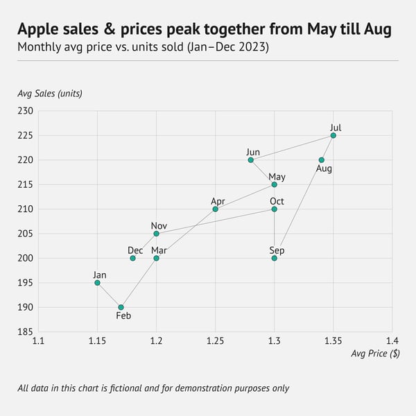
A connected scatter plot begins exactly like a regular scatter plot: two numerical variables go on the x‑axis and y‑axis, and each dot represents one observation. After plotting the dots, you draw a line that links them in sequence. The line links the points in order. However, each point stays visible, so you can read both the individual observations and the overall trend.
When should you use a connected scatter plot?
Choose a connected scatter plot only when you have two numerical variables that change in a clear sequence, such as year‑by‑year data. The line shows how one variable moves as the other shifts, letting you highlight dramatic moments. Keep the point count low and the order unmistakable. If a standard line chart or a pair of separate lines can show the story just as well, use those simpler options instead.
When you shouldn't use a connected scatter plot
Most readers find connected scatter plots hard to interpret unless you add plenty of explanatory annotations. If the same story can be told with a regular line chart, multiple lines, or a plain scatter plot, choose those simpler options instead. Also, avoid the connected version when the data has no clear order or when a large number of points would make the path cluttered and misleading.
Hexagonal binning
Alternative names: hexagonal plot, hexagonal bin plot
What is hexagonal binning?
Hexagonal binning is a heatmap of point density made with hexagons instead of squares. Lay a honeycomb over the x–y plane. Each cell counts how many observations fall inside, and the cell’s color shows that count (or a normalized density). Darker means more, lighter means fewer. Hexagons have six equal neighbors, which helps reduce grid artifacts and produces a smoother pattern. This makes clusters and gaps easier to see in very dense data.
When should you use hexagonal binning?
Use a hexagonal binning chart as a replacement for a crowded scatter plot. When thousands of points overlap, hexbinning reveals where data concentrate and where gaps exist without the noise of over‑plotting.
When you shouldn't use hexagonal binning
Think twice if your audience is not used to reading hex‑bin charts. Without a clear legend that links color to counts, many readers will be unsure how to interpret the picture. Because binning replaces points with aggregated counts, it hides exact values and can mask rare outliers. So this makes it a poor choice for small samples or analyses that depend on precise numbers. Also, the result is very sensitive to bin size. If you set the hexagons too small, the display looks noisy. If you set them too large, meaningful detail disappears.
Creating a good hex‑bin plot also takes more skill and software support than drawing a standard scatter plot. You need a tool that supports hexagonal tessellation, and you need experience to choose an appropriate bin width and color scale. If a simpler chart, such as a plain scatter plot, can tell the story clearly, it is usually the better option.
Contour plot
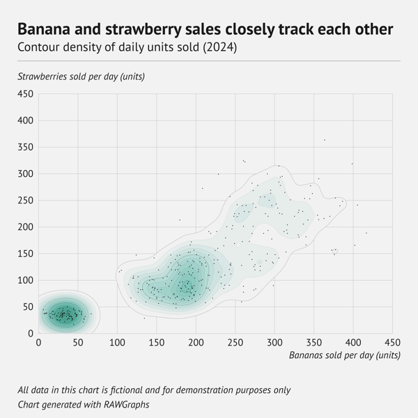
What is a contour plot?
A contour plot shows three numerical variables on a flat page. Two variables form the x‑axis and y‑axis, just like a scatter plot. The third variable appears as curved lines that link every point with the same value. Picture a topographic map: one line marks 200 m above sea level, the next marks 300 m, and so on. Wherever the lines crowd together, the value changes quickly, and where they spread apart the surface is flatter. If you fill the spaces between the lines with colour, the plot reads like a smooth relief map of the data.
When should you use a contour plot?
Contour plots shine when you need to show a continuous surface. For example, elevation on a landscape or temperature across a weather map. Their flowing lines help readers see gradients quickly. This is why they are common in cartography, meteorology, oceanography, and other scientific fields that map smooth phenomena such as density, pressure, or magnetic strength. However, they can also suit business or retail data if you want to highlight dense clusters without clutter.
When you shouldn't use a contour plot
Avoid a contour plot if the audience is not used to reading contour lines. It takes practice to translate the spacing of the lines into a sense of magnitude. The method also assumes that the data vary smoothly. If the surface is patchy or if there are sharp jumps, the interpolated lines can be misleading. Contour plots require enough data to create reliable interpolation, so they are not suitable for small or widely spaced samples.
Finally, if a simpler chart such as a heatmap can communicate the story clearly, prefer the simpler option for ease of interpretation.
3. Part-to-whole & hierarchical
Part-to-whole graphs is used to represent how individual pieces contribute to a complete picture. They focus on composition and proportions. Stacked bar chart in majority of the cases tend to be the best option amount part-to-whole graphs.
Stacked bar chart & stacked column chart

What is a stacked bar chart?
A stacked bar chart builds on a regular bar (or column) chart by slicing each bar into coloured segments. The full bar represents the total for a category, and each segment shows how much a sub‑category contributes to that total. If you scale every bar to the same length, you create a 100 percent stacked version. In this case, the segments display relative shares rather than absolute values.
When should you use a stacked bar chart?
Use a stacked bar chart to show the overall size of each category and how its sub‑categories contribute to that total. It works best when the number of segments is small and their order is consistent. This way, the reader can quickly see which category is largest, what makes it up, and how those parts compare across categories. A 100 percent stacked version is handy when you care more about proportional shares than absolute values.
When you shouldn't use a stacked bar chart
Avoid stacked bars if there are many segments. Thin stacks are hard to label and even harder to compare. They are also a poor choice when the goal is to compare individual segment sizes across categories. This is because only the bottom segments share a common baseline. If precise segment‑to‑segment comparison matters, a grouped bar chart or small multiples will be clearer.
Stacked bars also struggle with negative values or datasets where segments appear in some categories but not others. Both make the visual harder to read.
Diverging (stacked) bar/column chart

What is a diverging bar chart?
A diverging bar chart is a variation of a regular bar chart. Unlike a standard bar chart, it has a baseline in the center, usually set at zero. Bars extend in both directions from this midpoint. This makes it easy to compare values that move in opposite directions. For example, bars on the left often show negative values or sentiment, while bars on the right show positive values or sentiment.
The design typically relies on a diverging color palette. It consists of one hue for the bars that extend left and a contrasting hue for those that extend right. This way, readers can instantly see which side of zero each value falls on.
A common variation is the diverging stacked bar chart. In this chart, each side of the baseline is split into colored segments to show how different subgroups contribute to the negative or positive totals.
When should you use a diverging bar chart?
Choose a diverging bar chart when your measure can move in two directions and you want to compare those directions side by side. It is ideal for data that mixes positive and negative values. Examples are profit versus loss, approval versus disapproval, or temperature above and below average. Survey results on Likert scales are a common example, but any dataset with a natural midpoint (zero or neutral) can benefit from this format.
When you shouldn't use a diverging bar chart
Do not pick a diverging bar chart unless your data truly has a meaningful midpoint. The centred baseline implies a clear split into two opposite directions, often negative on the left and positive on the right. If your values are all positive, all negative, or lack a natural “zero,” this chart will mislead.
Also, limit the number of stacks. When there are many thin segments, it becomes hard to see or label them, and even harder to compare matching stacks across categories. Finally, if readers need to measure exact differences between individual segments, a grouped bar chart or small multiples will be easier to read.
Back to table of contents ⬆️
Population pyramid
Alternative names: Age-sex pyramid, Age structure diagram
What is a population pyramid?
A population pyramid looks like a diverging bar chart. However, it is used only to show how a population is distributed by age and sex. Bars for one sex extend to the left of a central baseline, and bars for the other sex extend to the right. Each horizontal layer represents an age group. So the overall shape reveals whether a population is young, ageing, or balanced.
When should you use a population pyramid?
Choose a population pyramid when your data list age together with exactly two gender categories. It gives a quick snapshot of how each age band splits between the two and is standard in demographic and population studies to spot youth bulges, ageing trends, or gender imbalances.
When you shouldn't use a population pyramid
Skip a population pyramid if your data is not limited to two sex categories. The classic left‑versus‑right layout forces everything into a male‑female split and hides people who identify outside that binary. In this case, use a chart that can show three or more groups. Examples are side‑by‑side bars or small multiples.
A population pyramid is also the wrong chart type when age bands are uneven or for comparing many regions in one frame. A grouped bar chart or small multiples will be clearer in those cases.
Icon array
Alternative name: Pictograph![]()
What is an icon array?
An icon array is a grid of small icons arranged in rows and columns. The entire grid represents the total number of units in the dataset. Each icon stands for one unit, such as a person, a vote, or an item. Icons that belong to the same subgroup share a colour or shape, letting you see quickly how the whole divides into its parts. A ten‑by‑ten grid is common because it neatly shows one hundred units, but other grid sizes can be used just as well.
When should you use an icon array?
Use an icon array when you need a quick part‑to‑whole picture that anyone can understand instantly. Each icon equals one unit, so readers can count symbols instead of decoding percentages or tables. The format suits survey results, market shares, or demographic splits. It also works for simple yes‑or‑no data where filled icons show “yes” and the remainder show “no.” Originating with the Isotype movement, icon arrays remain a clear way to turn numbers into pictures.
When you shouldn't use an icon array
Avoid icon arrays when counts are very large or uneven, for example 13 487. A grid that big is cluttered, and rounding can mislead. This type of chart also struggles with small differences. The smallest change you can make, adding or removing a single icon, often represents a sizable chunk of the data. Moreover, with more than a few categories, the chart becomes cluttered. If there are more than 5 categories, we recommend adding a “rest” category.
Visit our icon array resource page for pro tips on designing clear and effective icon arrays.
Back to table of contents ⬆️
Waffle chart
Alternative names: Square pie chart, Square area chart, Gridplot
What is a waffle chart?
A waffle chart looks like an icon array but replaces icons with a grid of 100 squares cells. Each cell equals one percent of the total. By colouring groups of cells, you can show how much of the whole is complete, how far you are from a goal, or how several categories contribute to one hundred percent.
When should you use a waffle chart?
Choose a waffle chart when you need a quick, part‑to‑whole picture that even non‑technical readers can understand. It works well for progress indicators and survey results, and any other data where you want to turn percentages into a neat, countable grid. Because its layout is square, some audiences find it easier to read than a pie chart.
When you shouldn't use a waffle chart
Skip a waffle chart if your numbers are not close to whole percentages, since you must round to the nearest cell, and that can distort small values. It also becomes cluttered when you have more than three or four categories. In this case, the coloured blocks start to blend, and labels get hard to place. For precise comparison between multiple groups, a bar or stacked bar chart will be clearer.
Pie chart
Alternative names: Pie graph, Pizza chart, Circle chart
What is a pie chart?
A pie chart is a circular graphic for showing how a total breaks into parts. The full circle represents the whole, while each slice represents a category’s share of that whole. The slices must add up to a meaningful total, which is often 100 percent. If your data are absolute numbers such as dollars or units, all categories together should equal a sensible total.
When should you use a pie chart?
Use a pie chart when you have only a few categories and you want readers to see their relative sizes instantly. It is especially effective when one slice is much larger or smaller than the others, because the difference stands out immediately.
When you shouldn't use a pie chart
Avoid a pie chart when you need precise comparisons. Human vision judges angles and curved areas poorly, so small differences between slices are hard to read. The chart is also limited if you have many categories, because narrow wedges become crowded and labels overlap. For detailed or multi‑category comparisons, a bar chart, stacked bar, or another linear chart will communicate the data more clearly.
Read the deep dive pie chart article to see our arguments for using pie charts. And if you want to create a really good pie chart yourself, don’t miss out on the pie chart resource page full of pro design tips.
Donut chart
Alternative names: Doughnut chart
What is a donut chart?
A donut chart is a pie chart with a circular hole in the centre. The ring still shows how a total splits into slices, but the empty middle frees up space for extra information.
When should you use a donut chart?
Choose a donut chart when you want the simple part‑to‑whole message of a pie chart plus room in the centre for a title, key metric, or icon. The ring shape also shifts the read from comparing wedge areas to comparing arc lengths, which many viewers find a little easier. Use it for small sets of categories where one or two slices dominate and a quick visual impression is enough.
When you shouldn't use a donut chart
Skip a donut chart if you need precise comparisons or have many categories. Thin wedges are hard to judge and to label, so a stacked bar chart or grouped bar chart will show detailed differences more clearly.
For your convenience, we also created a donut chart resource page with valuable design tips for your next donut chart.
Back to table of contents ⬆️
Semicircle donut chart
Alternative name: Half moon chart, Half donut chart, Semi-circle doughnut chart
What is a semicircle donut chart?
A semicircle donut chart is a donut chart sliced in half. All the pieces still add up to 100 percent, but they are arranged over only half of the circle. This forms a half‑moon shape with a straight edge at the bottom.
When should you use a semicircle donut chart?
Use a semicircle donut when you want the part‑to‑whole story of a donut chart, yet need extra blank space for labels, numbers, or a pointer. The flat edge also makes it a handy base for simple gauge visuals that show progress toward a target.
When you shouldn't use a semicircle donut chart
Avoid this chart for precise comparisons or when you have many categories. Narrow wedges become hard to read, and judging arc lengths in a half‑circle is even tougher than in a full circle. In those cases, a stacked or grouped bar chart will communicate the data more clearly.
Explore more pie and donut chart ideas on our inspiration page.
Back to table of contents ⬆️
Marimekko chart
Alternative names: Mekko chart, Mosaic chart, Mosaic plot
What is a Marimekko chart?
Think of a Marimekko chart as stacked bars that can vary in width. The width of each bar shows one measure. Each bar is then divided into coloured stacks whose heights show a second measure. All the bars fit together without gaps, so you can see both how big each bar is compared with the total and how each bar’s pieces break down inside it.
When should you use a Marimekko chart?
Use a Marimekko chart to compare part‑to‑whole relationships across two dimensions at once. It is popular in marketing and sales analysis. It can show, for example, how revenue is split by region (column width) and by product mix inside each region (segment height). Any dataset that needs to display two nested proportions in a single view can benefit from this format.
When you shouldn't use a Marimekko chart
Skip a Marimekko chart if there are many columns or many small segments. Narrow columns and thin slices are hard to label and even harder to compare. The chart is not ideal for precise reading. So if you need exact comparisons, a grouped bar chart, a stacked bar chart, or a pair of simpler bar charts will be clearer.
Treemap

What is a treemap?
A treemap is a rectangular diagram that shows how a total breaks down into parts. Each top‑level category gets its own rectangle, and you can split these into smaller rectangles for sub‑categories. The area of every rectangle is sized in proportion to the value it represents. This lets you instantly see which parts are large and which are small.
When should you use a treemap?
Choose a treemap when you have many categories arranged in a hierarchy and need to display all of them in one compact view. The chart makes good use of space, so it can show a large dataset on a single screen while still revealing relationships within and between groups. This makes treemaps popular for file‑system usage, market share by brand and product line, budget breakdowns, and similar tasks.
When you shouldn't use a treemap
Avoid a treemap if it will contain too many tiny rectangles. An overfilled grid becomes hard to read and overwhelms the viewer. Treemaps also struggle with precise comparison because people judge rectangular areas less accurately than bar lengths. When exact values or fine differences matter, a bar chart, stacked bar chart, or separate small multiples will communicate the data more clearly.
For more background, a deep‑dive article and a detailed treemap resource page are available if you would like extra tips before building your own.
Back to table of contents ⬆️
Circular treemap
Alternative name: Circular packing, Circle packing
What is a circular treemap?
A circular treemap uses circles instead of rectangles to show a hierarchy. Each top‑level category is drawn as a large circle, and these can be divided into smaller circles for sub‑categories. The area of every circle matches the value it represents, so larger values appear as larger circles within the overall packing.
When should you use a circular treemap?
Choose a circular treemap when you want to display a hierarchy in a way that feels organic and visually engaging. Although it is less space‑efficient than a rectangular treemap, a well‑designed circle packing can be eye‑catching and easy for viewers to explore. It works best for overviews where the exact proportions are less critical and visual appeal is a priority.
When you shouldn't use a circular treemap
Avoid a circular treemap when precise comparison matters more than showing the hierarchy. People judge circle areas less accurately than rectangle sizes or bar lengths, so fine differences between values can be hard to spot. If space is tight or you need exact comparisons, a rectangular treemap or a bar chart will serve better.
Convex treemap
Alternative names: Voronoi treemap, Polygonal partition
What is a convex treemap?
A convex treemap visualises hierarchical data in the same way a regular treemap does. However, it replaces rectangles with convex polygons. These are shapes with no inward dents, such as hexagons or irregular blobs whose edges always bulge outward. A simple way to tell if a polygon is convex is the following. Draw a straight line between any two points inside the shape, and that line will stay entirely inside the shape.
Because these polygons can be warped and packed into almost any outline, the entire chart can fit inside shapes such as circles, triangles, or custom silhouettes. Each polygon’s area still represents the value of a category, and polygons can be further subdivided to show sub‑categories. So the hierarchy remains intact while the overall layout looks more organic and space‑efficient than a strict rectangular grid.
When should you use a convex treemap?
Use a convex treemap when the chart must fit a non‑rectangular shape or avoid skinny tiles in deep hierarchies. Its flexible polygons suit infographics with custom outlines, dashboards with tight spaces, and visuals that benefit from an organic look.
When you shouldn't use a convex treemap
Avoid a convex treemap when exact area comparison matters. Irregular polygons are harder to judge than rectangles, and the view turns cluttered when many small categories appear. This layout also takes more computation to generate. If a rectangular grid will do, a standard treemap or bar chart is clearer.
For an example of a well‑designed convex treemap, see our treemap deep‑dive article.
Back to table of contents ⬆️
Dendrogram
Alternative name: Phylogenetic tree
What is a dendrogram?
A dendrogram is a tree‑shaped diagram that shows how items cluster into a hierarchy. It begins with each item as an individual leaf; branches then merge step by step until all items join a single trunk. The height where two branches join represents the distance between those items. Clusters near the bottom reflect the raw data most directly and are the most reliable. As you move up the tree the merges rely on earlier averages, so the relationships become progressively less precise.
When should you use a dendrogram?
Use a dendrogram when you need to present the results of hierarchical clustering. Biologists rely on it to map evolutionary links among species, while other fields use the same tree layout for gene clustering, customer segmentation, or grouping similar documents. The branching structure lets readers see which clusters lie close together and where the major splits occur.
When you shouldn't use a dendrogram
Avoid a dendrogram if the hierarchy is shallow or the dataset is huge. Too few levels give a tree that could be shown more clearly as simple groups. On the contrary, hundreds of leaves produce a tangle of lines that is hard to read. If your main goal is to compare cluster sizes or values, use a bar chart or heatmap instead.
Venn diagram
Alternative name: Set diagram, Logic diagram
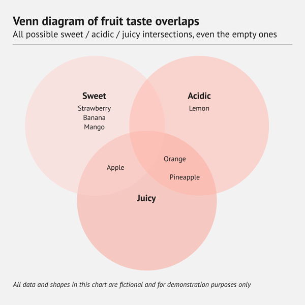
What is a Venn diagram?
A Venn diagram uses overlapping circles to show every possible intersection among two or more sets, even when some intersections contain no items. Shared regions reveal the elements that the sets have in common. Non‑overlapping regions hold elements unique to each set. Because the layout includes empty overlaps as well as real ones, it presents the full logical picture of how the sets could relate.
When should you use a Venn diagram?
Choose a Venn diagram when you want a familiar, easy‑to‑read picture of how two or three sets relate, including places where they could overlap but do not. This makes it useful in lessons, presentations, and simple reports where highlighting both real and potential intersections helps explain the concept.
When you shouldn't use a Venn diagram
Skip a Venn diagram if you have more than three sets or if you care only about the overlaps that actually exist. Extra circles or empty intersections quickly make the graphic cluttered. In those situations, an Euler diagram, which shows only real overlap, will be clearer.
Euler diagram
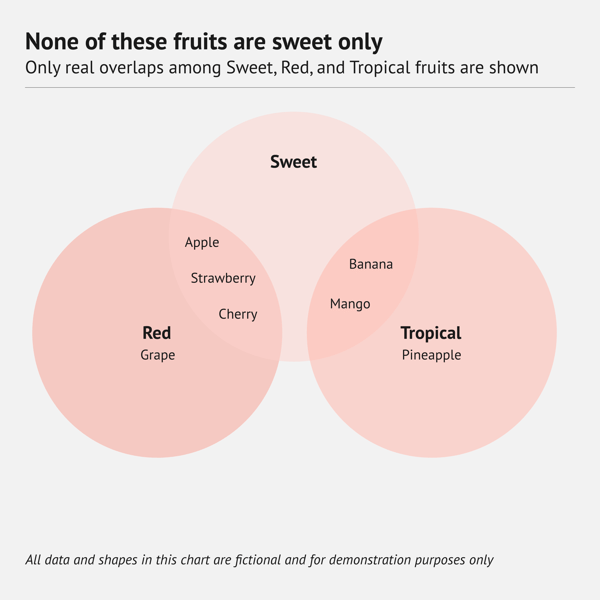
What is an Euler diagram?
An Euler diagram (pronounced “OY‑ler”) looks a lot like a Venn diagram, but it shows only the overlaps that actually exist in the data. In a Venn diagra, every possible intersection appears, even if no items fall in those intersections. An Euler diagram omits any empty intersections. So each region of the drawing corresponds to a real‑world set or overlap and nothing more.
When should you use an Euler diagram?
Use an Euler diagram to show only the overlaps that truly exist. It works well for two or three sets that share some items yet stay distinct elsewhere. This lets readers focus on real connections without empty intersections.
When you shouldn't use an Euler diagram
Do not use an Euler diagram when you must display every possible intersection, even ones that are empty. It is also limited when you have many sets or very complex overlaps, as the visual gets messy. In those situations, choose a matrix chart instead.
If you’re curious to understand it better, we recommend this article that explains the difference between the Venn and Euler diagram.
Back to table of contents ⬆️
Circular gauge
Alternative names: Angular gauge, Radial gauge chart
What is a circular gauge?
A circular gauge shows a single value on a round or half‑round scale. A needle (or pointer) sweeps across the scale to mark the current reading, much like the dial on a speedometer or an analogue clock. Coloured bands on the arc can signal safe, warning, or critical zones.
When should you use a circular gauge?
Use a circular gauge when you need a quick, instant check of one key metric in a dashboard. It works well for KPIs such as system load, sales progress, or temperature. Here, the viewer only needs to judge whether the value sits in a good, caution, or danger range.
When you shouldn't use a circular gauge
Skip a circular gauge when you need to display several metrics side by side or when readers must read exact values. Multiple gauges quickly fill a dashboard and make comparisons awkward. Moreover, curved scales are harder to read precisely. In these situations, a bullet chart is a better choice. This chart shows exact numbers and lets you compare several values against reference ranges in a compact space.
Sunburst chart
Alternative names: Multi-level pie chart, Multilayer pie chart, Sunburst graph, Ring chart, Radial treemap
What is a sunburst chart?
A sunburst chart has many names, but whatever you call it, it’s a spectacular type of graph. It shows a hierarchical dataset through a series of concentric outward rings. Each of those rings corresponds to a different hierarchy level. The inner circle looks like a donut chart, but each outer ring can be sliced up depending on its relationship to the inner (parent) circle.
When should you use a sunburst chart?
Sunburst charts are often a good alternative to treemaps, but if you do opt for this type of chart, keep in mind that its radial layout takes more space than a rectangular shape of a treemap.
When you shouldn't use a sunburst chart
Avoid a sunburst chart for very deep hierarchies or when there are many branches. Outer slices become thin, labels are hard to place, and comparisons across branches are difficult. If space is limited or you need easier comparisons, a treemap will work better.
Pyramid chart & Funnel chart
Alternative name: Triangle chart
What is a funnel chart?
A funnel chart stacks several horizontal bars on top of one another, widest at the base and narrowing toward the tip. Each band represents a level in a hierarchy, such as awareness, interest, and purchase in a marketing funnel.
When should you use a funnel chart?
Use these charts when you need a quick visual of how numbers shrink or grow as they move through ordered stages. They are common in sales and marketing dashboards to show how many prospects reach each step and what revenue is tied to those steps. They also work anywhere a clear top‑to‑bottom (or entry‑to‑exit) flow helps tell the story. They are widely used in infographics and business presentations and dashboards.
When you shouldn't use a funnel chart
Avoid these charts when you need precise comparisons between stages. Because the bars taper, they do not share a common baseline, and people find it hard to judge their exact sizes. A standard bar or column chart shows differences more clearly. Pyramid and funnel charts also become unreadable if you include too many stages because narrow slices are hard to read and label.
4. Data over time (temporal)
Date-over-time graphs are used to visualize trends and changes in data over a specific period. The X axis usually represents time, the Y axis the value shows the tracked data. Most common and useful time series chart type is line chart.
Area chart
What is an area chart?
An area chart builds on a line chart. You plot data points, connect them with a line, and then shade the space between the line and the x‑axis. The filled area shows how a total grows or shrinks over time, so the reader sees volume as well as trend.
When should you use an area chart?
Choose an area chart when you want to show the magnitude of a measure, not just its trend. The filled space draws the eye to how much has accumulated or changed over time. This is helpful for totals that start at zero, such as monthly revenue, website visits, or rainfall. Pick an area chart when the story is about “how much” in addition to “going up or down.
When you shouldn't use an area chart
Avoid an area chart when you need to compare precise values or show small fluctuations. In this case, a simple bar chart is better to use. Moreover, the filled shape can hide fine detail, and if the data does not start at zero, the shaded area can mislead. In this case, a line chart is clearer.
Back to table of contents ⬆️
Stacked area chart
Alternative name: Stacked area graph
What is a stacked area chart?
A stacked area chart shows how several groups change over time. Each group’s area is placed on top of the previous one, so the chart displays both the total and the contribution of each group at every point.
When should you use a stacked area chart?
Use a stacked area chart to show the overall trend of a total and how several groups contribute to that total over time. It works well for data that starts at zero and where the order of the series does not distract from the main message. This works, for example, for monthly revenue broken down by product line or daily energy use split by source. The filled layers let readers see growth or decline in the whole while still spotting which groups drive those changes.
When you shouldn't use a stacked area chart
Skip a stacked area chart if the main goal is to compare the subgroups with each other rather than the combined total. Upper layers sit on shifting baselines, which makes their exact sizes hard to judge. The chart also becomes messy with many small categories, as colours blend and labels overlap. In those situations, a grouped bar chart or multiple line charts will communicate the data more clearly. Another alternative is a percent‑stacked area chart. This chart rescales each time step to 100 percent so the layers show how each group’s share of the whole changes over time.
Stream graph
Alternative names: Streamgraph, ThemeRiver
What is a stream graph?
A stream graph is undoubtedly one of the most beautiful chart types available. This stunning type of chart is a variation of a stacked area chart. Instead of piling layers on a fixed x‑axis, it balances them around a central baseline. The layers rise and fall like a flowing river, so the chart looks smooth and organic. Peaks and dips show how each series grows or shrinks over time, and the overall shape can hint at seasonal patterns.
When should you use a stream graph?
Choose a stream graph when you want to highlight broad trends in multivariate time‑series data and add visual appeal. It works well for social‑media analysis over months, web‑traffic sources through a year, stock‑market sectors, or climate indicators. The floating baseline reduces the eye’s focus on exact numbers and lets viewers see how the mix of categories shifts over time.
When you shouldn't use a stream graph
Avoid a stream graph if precise comparisons matter. Because layers rest on a moving baseline, it is hard to read exact values or small differences. The chart also becomes confusing when you have many thin layers or highly volatile data. In those cases, a standard stacked area chart, a grouped line chart, or small multiples will be clearer.
Back to table of contents ⬆️
Bump chart
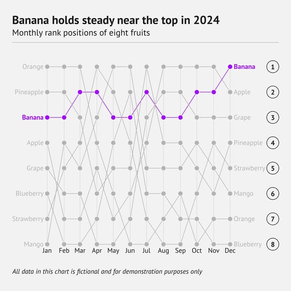
What is a bump chart?
A bump chart is a line chart that shows rankings over time. The x‑axis lists time points, the y‑axis lists rank positions (1 at the top, larger ranks below). Each category is drawn as a line that rises or falls as its rank changes. Small data marks can be placed at each time point to emphasise the “bumps” where positions shift.
When should you use a bump chart?
Use a bump chart when you care about who is ahead, who slips, and how often places change. It fits sports standings, sales leaderboards, election polls, or any series where order matters more than exact numbers. Limit the chart to a handful of lines so viewers can follow the crossings.
When you shouldn't use a bump chart
Avoid a bump chart if you need the actual values behind the ranks, because every step on the y‑axis is equal, even when the underlying differences are not. The chart also gets cluttered with many categories or frequent ties. For precise comparisons or large datasets, a regular line chart or a table is clearer.
Bump area chart
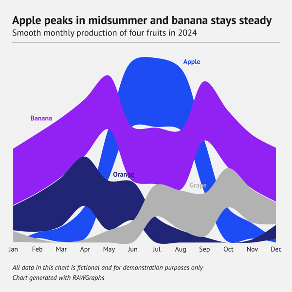
What is a bump area chart?
A bump area chart combines ideas from a bump chart and a stream graph. Each band shows the value of a category over time (area height) while its vertical position shows the rank among all categories at each moment. The bands are sorted by rank, so you see who is on top, who moves up or down, and how big each category is at the same time.
When should you use a bump area chart?
Choose a bump area chart when you need to show both how large each category is and how their rankings change. It works well for data like market share by company, streaming minutes by platform, or vote counts by party, where magnitude and position both matter.
When you shouldn't use a bump area chart
Skip this chart if the audience cares only about rank; a plain bump chart is simpler. It can also overwhelm readers who are not used to this type of chart, or when many categories crowd the view. In those cases, use a line chart, bump chart, or small multiples instead.
Line chart
Alternative names: Line graph, Line plot
What is a line chart?
A line chart plots data points on an x–y grid and connects them with straight lines to show how a value changes over a continuous variable, most often time. The x‑axis holds the time scale (or any ordered measure), while the y‑axis shows the numerical metric you want to track. One chart can display a single series or several lines for comparison.
When should you use a line chart?
Use a line chart when your x‑axis is a continuous scale such as time and you need to show overall trends, growth, or decline. Because the scale does not have to start at zero, you can zoom in on small movements and spot patterns that a bar chart might hide. Line charts are versatile and quick to read, making them essential in finance, science, and business dashboards. They also combine easily with other visuals. Examples are overlaying bars for totals or shading under the line to form an area chart.
When you shouldn't use a line chart
Reserve line charts for closely spaced, continuous data where trends matter more than exact values. When dates are far apart, the connecting line can imply change that never happened, so use bars or dots instead. If precision is key, switch to a bar chart or dot plot where each value is easy to read.
Moreover, a tangle of many lines soon overwhelms. Best practice is to highlight the main series and fade the rest. Finally, skip dual‑axis line charts. Two different scales on one graph mislead. It is therefore better to use two simple line charts side by side instead.
If you’d like to design really stunning line charts, make sure to see our line chart resource page full of great tips and more line chart examples.
Back to table of contents ⬆️
Spline chart
Alternative names: Spline graph, Curve chart
What is a spline chart?
A spline chart works like a line chart but replaces straight line segments with a smooth curve. This curving line gives the trend a softer, more continuous look. Combine the curve with a filled area and you get a spline area chart.
When should you use a spline chart?
Choose a spline chart when your data change smoothly over time, and you want to reflect that gentle flow in the visual. Examples are average temperatures or rolling sales figures. The curved line is also more visually appealing than sharp angles. So it works well in presentations or dashboards where design matters as much as the message.
When you shouldn't use a spline chart
Avoid a spline chart when precise inflection points matter, because the curve can hide sharp jumps. If data moves in abrupt steps or you need readers to see each exact point, use a standard line chart instead. Also, skip the spline if you only have a few data points. The smoothing can create misleading dips or peaks between them.
Back to table of contents ⬆️
Step line chart
Alternative names: Step chart, Stepped line graph
What is a step line chart?
The step line chart only uses horizontal and vertical lines to connect the data points. It is convenient to use when you want to highlight the exact moment in time when the data changes.
When should you use a step line chart?
Use it when your data shifts at irregular moments and you want to show exactly when each change happens. Typical cases are price updates or inventory restocks.
When you shouldn't use a step line chart
Skip a step line chart if the data changes at regular intervals or almost every time point. In that case, a standard line chart will show the pattern with less visual clutter.
Back to table of contents ⬆️
Candlestick chart
Alternative name: Japanese candlestick chart
What is a candlestick chart?
A candlestick chart plots price action over time. Each “candle” has a thick body that marks the opening and closing prices and thin wicks that show the highest and lowest prices for that period. Bodies can be colour‑coded to see instantly which periods fell and which rose. Typically, they are colored red when the price closes lower than it opened and green when it closes higher.
When should you use a candlestick chart?
Use a candlestick chart for financial data when you need to see intraday or period‑by‑period price moves and spot patterns that hint at future trends. Traders and analysts rely on it for stocks, forex, and cryptocurrency because it shows volatility and market sentiment at a glance.
When you shouldn't use a candlestick chart
Avoid a candlestick chart if you only need a single closing price per period or if your audience is not familiar with trading visuals. The extra detail can distract beginners. For basic end‑of‑day prices, a simple line or bar chart is clearer.
If you’re interested in designing a candlestick chart and adding it to your financial report, it’s possible to create it with Datylon for Illustrator.
You can read more about creating a candlestick chart in our article.
Gantt chart

What is a Gantt chart?
A Gantt chart is a bar chart that maps tasks against time. The y‑axis lists activities or tasks, and each task is drawn as a horizontal bar whose left end marks the start date and whose right end marks the finish date. The x‑axis shows the calendar, so you can see instantly when each task begins, how long it lasts, and where tasks overlap.
When should you use a Gannt chart?
Use a Gantt chart to plan or track work that unfolds over time. It is a staple in project management for monitoring schedules, deadlines, and progress, but the format suits any data that describes time blocks. You can plot crop seasons, service availability, or animal migration periods with the same layout. Any situation where “what happens when” is the key question is a good fit.
When you shouldn't use a Gannt chart
Skip a Gantt chart if the horizontal axis is not time. When the bars represent values instead of dates, use a range bar chart instead. Also, avoid a Gantt if you need to compare the exact duration of tasks; a simple bar chart that shows length alone will make those comparisons clearer.
Back to table of contents ⬆️
Barcode chart

What is a barcode chart?
A barcode chart lays very thin bars along a single axis to show the distribution of many observations. Each bar marks one data point. You can keep all bars the same thickness or vary the thickness and colour to encode extra information. The result looks like the stripes of a product barcode.
When should you use a barcode chart?
Use a barcode chart when you have many observations on one long scale but little space to show them. It works well as a compact alternative to a strip plot when the data marks would otherwise overlap. You can thicken some bars or colour them differently to highlight special states, such as events of interest or different categories.
When you shouldn't use a barcode chart
Avoid a barcode chart if readers must see exact values or compare precise differences. The thin bars give only position, not magnitude. It is also not suitable when you need many colour classes, because thin stripes make the colours hard to distinguish.
Back to table of contents ⬆️
OHLC chart
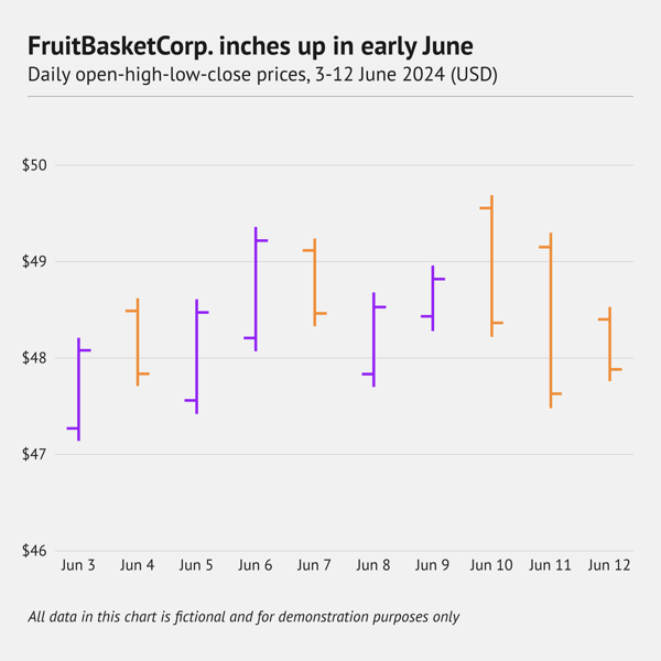
What is an OHLC chart?
An Open-High-Low-Close (OHLC) chart plots price action along a time axis. For each period, it draws a vertical line from the low to the high price, then adds two short horizontal ticks. The tick on the left marks the opening price, and the tick on the right marks the closing price. Often, the symbol is coloured green when the close is above the open and red when it is below. This way, you can see rising and falling periods instantly.
When should you use an OHLC chart?
Use an OHLC (Open‑High‑Low‑Close) chart when you need a compact view of all four key prices in each trading interval. It is a staple in finance for analysing stocks, forex, and other markets because it shows volatility and direction without the filled bodies of candlesticks, making dense timelines easier to read.
When you shouldn't use an OHLC chart
Skip an OHLC chart if your audience only needs closing prices or if they are unfamiliar with trading visuals. In those cases, a simple line chart or bar chart of closing prices will be clearer. If the focus is on pattern recognition and you want the visual weight of filled candles, a candlestick chart may be a better choice.
Back to table of contents ⬆️
5. Distribution
Distribution graphs are used to show how the data is spread. It is also can be used to show probability distribution. The essence of distribution graphs is to show how often each value appears in the dataset. The shape of distribution helps to gasp patterns which makes them a powerful tool for analysis in many fields. Histogram is the first option among distribution graphs.
Density plot
Alternative names: Kernel density plot, Density trace graph
What is a density plot?
A density plot is a type of chart that helps us visualize how the numeric data is being distributed over a period of time. Density plots somewhat resemble smooth peaks and valleys plotted between two axes. These correspond to a higher or lower concentration of values. A density plot is a variation of a histogram. However, it is visually more appealing, as it loses the sharp edges typical for histograms and adds a smooth continuous curve. The area below the line is usually transparent, which allows to show multiple distributions in one chart.
When should you use a density plot?
A density plot is a good choice for visualizing the distribution of continuous data. The specific case it is most useful is when you have multiple distribution curves and you want to compare them. The transparent nature of density plots allows one to see all the shapes of distribution curves as well as overlapping areas,
When you shouldn't use a density plot
Avoid a density plot when you need every detail of the distribution. Density plots tend to smooth the details. Also, watch carefully for the readability. Too many distribution lines can make the chart cluttered.
Back to table of contents ⬆️
Ridgeline plot
Alternative names: Joy plot, Joyplot
What is a ridgeline plot?
A ridgeline plot is a somewhat special type of chart. A ridgeline plot shows the distribution of a numeric value for several groups of a category. It is done by illustrating partially overlapping line plots (that can be made of density plots or histograms), which then can resemble a mountain range.
When should you use a ridgeline plot?
A ridgeline plot is used to visualize distribution over time (and space). It can be useful in case there are too many distribution lines for a density plot. The structure of the chart allows for the placement of a lot of distribution lines without losing readability. The limit is only the size of the chart.
When you shouldn't use a ridgeline plot
The form of the ridgeline has some special features. Separate lines should have more or less the same form or have minor step-by-step changes. If the form of the lines is drastically different, some of the details might not be visible as they will be hidden by other charts. So it’s a trial-and-error process for this chart. You should try your data beforehand and see if everything important can be seen on the chart.
Back to table of contents ⬆️
Horizon chart
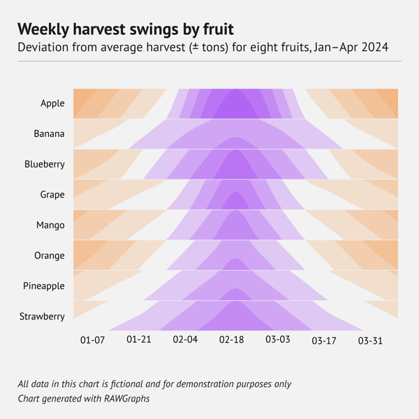
What is a horizon chart?
A horizon chart is what you get when you compress a line or area chart into narrow stripes. To understand how it’s made, imagine you have an area chart with a range from -10 to +10 made of paper. You cut the chart say every 5 notches. After that, you place them above each other in ascending order. The result will be a horizon chart.
The difference with other charts is that both the positive and negative values are shown above the baseline, instead of showing negative values under the baseline. This allows you to show a lot of data in a very condensed manner.
Usually, to create a horizon chart, a diverging color scheme is used. This allows you to show both positive and negative values.
When should you use a horizon chart?
When you are dealing with a lot of categories and you want to make efficient use of space, this chart is the way to go. It is perfect to show time series data on the horizontal axis. Also, values on the vertical axis can be represented by colored bands. This makes it possible to show great precision of the values.
When you shouldn't use a horizon chart
If you have enough space for a regular area or line chart and your audience is not familiar with the horizon chart, you definitely shouldn’t use the horizon chart. This chart is really hard to read intuitively; you really need to know the structure of how it’s made to use it effectively.
Histogram
Alternative names: Frequency distribution graph, Frequency distribution chart
What is a histogram?
A histogram is a type of chart that visually resembles a column chart. It’s a graph that consists of vertical rectangles (columns), whose length is proportional to the frequency of a variable (data items). The main visual difference between a histogram and a column chart is that there is no gap between the columns. That’s because, in a histogram, the values are grouped into ranges (bins). Each column’s height shows how many items fall within that range.
When should you use a histogram?
A histogram is a first option for visualizing a distribution. They are pretty versatile and can be used both to show an overall view when large bins are used and a detailed view if small bins are used. There’s also a specific formula to calculate the size of a bin for general use.
When you shouldn't use a histogram
Most of the issues are connected to the visual similarities of the histogram and the bar chart. To recap it once again. Bar charts are used for comparing categories. Histograms are for showing distribution, which shows how many items fall into a certain data range.
Back to table of contents ⬆️
Radial histogram
Alternative names: Angular histogram, Circular histogram, Polar histogram
What is a radial histogram?
A radial histogram is simply a variation of a histogram (see above), but with columns wrapped around a circle. It functions the same way as a regular histogram.
When should you use a radial histogram?
If a regular histogram might seem boring for your audience, you can try a radial histogram. It is not as accurate and easy to perceive as the regular histogram, but it’s very likely going to grab your readers’ attention.
When you shouldn't use a radial histogram
When you need to deliver accurate data to a scientist or analyst, a radial histogram is not a good choice. The more important and serious the data is, the less likely a radial histogram is a good option.
Back to table of contents ⬆️
Strip plot
Alternative names: Individual value plot, Single-axis scatter plot
What is a strip plot?
A strip plot is a variation of a scatter plot, but it only has one categorical and one numerical axis. It is a chart used to illustrate the distribution of many individual one-dimensional values. These values look like transparent dots located along a single (category) axis. If some of the dots have the same value, they can overlap, creating something that looks like a strip. Unlike a histogram and a density plot, the values are not placed in bins. Distribution is shown here via the density of overlapping dots.
When should you use a strip plot?
A strip plot works well for showing the distribution of several categories. It works best when the number of values is under 20-30 and there’s no intense overlapping of dots. A strip plot is also useful when you want to show the exact values. Another advantage of this plot is its space efficiency.
When you shouldn't use a strip plot
When the number of values exceeds 30, the overlapping of dots might look overwhelming and not informative, even if they are transparent.
Back to table of contents ⬆️
Jitter plot
Alternative names: Jittered strip plot, Jittered individual value plot
What is a jitter plot?
A jitter plot is an alternative to a strip plot (see above). It is used to visualize the distribution of several categorical variables. The main difference from a strip plot is that the dots used in the charts are shifted on the horizontal y-axis. This avoids overlapping (overplotting), which in turn avoids a lack of clarity.
When should you use a jitter plot?
Jitter plots have basically the same advantages as strip plots, but the number of values that can be shown under one category is more than for strip plots. This is due to additional space that is available via random shifts of dots.
When you shouldn't use a jitter plot
In some cases, the randomness of the dots shift can confuse the reader. The downside of the jitter plot is that you need to manually control the level of the jitter so that all the dots are more or less visible. Another thing you need to control is the overlap of the dots that belong to neighbor categories; they should be distinguishable from each other.
Back to table of contents ⬆️
One dimensional heatmap

What is a one-dimensional heatmap?
A one-dimensional heatmap is a chart that shows the distribution of a variable or category using colored stripes. Basically, you can get a one-dimensional heatmap if you take only one category from a heatmap. The visual difference is that in most cases, narrow and tall stripes are used instead of rectangles.
When should you use a one-dimensional heatmap?
If you want to zoom in on one category and focus on the evolution of that variable, you can use heatmaps in only one dimension. These charts are very popular in climate communication and often visualize temperatures.
When you shouldn't use a one-dimensional heatmap
As one-dimensional heatmaps depend heavily on color, they can fail to deliver information to people with different types of color blindness.
Back to table of contents ⬆️
Beeswarm chart
Alternative name: Swarm plot
What is a beeswarm chart?
In a beeswarm chart, dots are used to show the distribution of a variable. Values are each represented by one dot, and the swarm of dots represents the distribution found in the data. Instead of packing them in bins, the dots are scattered around each other and plotted on a single axis. This kind of chart is very useful when you want to display a lot of data points at once.
When should you use a beeswarm chart?
If you want to use dots to show the distribution of a variable and it's important that dots won’t overlap, a beeswarm chart is your choice. The additional advantage of the beeswarm chart is that you can assign an additional variable to the size of the dot.
When you shouldn't use a beeswarm chart
Beeswarm charts are constructed in a way that the dots are placed with some approximation. It means that the position of every dot might not be accurate. It means if the position of every dot is important to you, you should choose another chart: a histogram, a density plot or a strip plot.
Back to table of contents ⬆️
Box chart
Alternative names: Box plot, Boxplot, Box-and-whisker plot/chart, Whisker plot
What is a box plot?
A box chart is used to depict the distributions of one or more groups of numeric data. It consists of several elements. The box showing the middle 50% оf the data is also called the interquartile range (IQR). The line inside the box shows the median of the data. The rest of the data is usually shown using whiskers on the left and right sides of the box (in case of a horizontal box plot). Sometimes there are outliers in the data. In this case, the whisker is limited to 1.5 of the interquartile range, and the rest of the values are shown using dots.
When should you use a box plot?
Box plots are meant to provide a high level of information at a glance - a summary of data. This type of graph is quite popular in the research and financial fields. So a box plot is a perfect solution for a quick overview of the data when your audience is familiar with statistical charts.
When you shouldn't use a box plot
A box plot can be quite confusing for the general public. If your readers aren’t familiar with statistical charts, it’s better to use something simpler, like a histogram or range plot. Also, if you want to show detailed information, a box plot is not the best choice, as it works better for an overview of the data.
Back to table of contents ⬆️
Violin plot
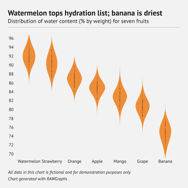
What is a violin plot?
A violin plot is a hybrid of a box plot and a density plot. Thanks to this, a violin plot depicts distributions of numeric data for one or more groups using density curves. Visually, it resembles a violin, hence its name.
When should you use a violin plot?
A violin plot combines the best aspects of a box plot and a density plot. This versatility allows it to be used for various audiences, from a general audience to scientists and analysts.
When you shouldn't use a violin plot
For a small dataset, a violin plot can be an excessive option. It can also fail for visualizing outliers. In this case, a box plot would be a better option.
6. Geospatial & other charts
Geographic heatmap
Alternative names: hot spot map, geo heat map, density heatmap
What is a geographic heatmap?
A geographic heatmap is a geographical representation of data that demonstrates where something occurs, specifying the areas of data’s high and low density. Geo heatmap does not limit displaying geospatial data to specified boundaries. Therefore, using the data’s location radius, it can cover a small and specific geographic area, as well as large regions, such as oceans or coasts. It uses color to highlight the areas of occurrence.
When should you use a geographic heatmap?
A geographic heatmap helps to understand the distribution and density of the given parameter on a map. The obvious application of geo heatmaps is weather forecasting, but there are many more spheres where it can be used: real estate, commerce, transportation, healthcare, environmental science, and many more.
When you shouldn't use a geographic heatmap
Geographical heatmaps have the same core drawbacks as regular heatmaps. It gives an approximate view and can lack important details. Extremes can dominate, which can sometimes be misleading. You should also take into consideration that geo heatmaps heavily rely on colors. This means you should be really attentive to color palettes and take color blind viewers into consideration while designing it.
Back to table of contents ⬆️
Choropleth map
What is a choropleth map?
A choropleth map is a type of map in which different administrative areas are colored (or shaded) according to the magnitude of their numeric value. The main difference between a choropleth map and a geographic heatmap is that a choropleth map uses border-defined areas, such as countries, states, or neighborhoods.
When should you use a choropleth map?
Choropleth maps display geographical data using normalized values, making them ideal for illustrating various rates and ratios across different regions.
When you shouldn't use a choropleth map
Choropleth maps can be misleading when used to display raw data that is in some way connected to population. If a region has a high population, it might automatically show high absolute values for population-related indicators. That’s why it’s important to use per-capita values for choropleth maps.
Sometimes, the size of the geographical area can be misleading, either increasing or decreasing the perceived importance of the region. To minimize this influence, you could consider alternatives such as tile maps, where all regions are represented by icons of the same size.
Back to table of contents ⬆️
Tile map

What is a tile map?
A tile map is a type of geographical map where a larger area (usually a country or a continent) is visualized by multiple equal-sized and shaped tiles, often square rectangles. Each tile represents a different region. A simple example of a tile map can be a collection of tiles forming the shape of the United States, where each tile corresponds to a state. What is important about tile maps is that all tiles do not vary in size, meaning that larger regions cannot dominate the visualization and smaller regions are not harder to read.
When should you use a tile map?
When the size of a geographical region is not relevant or might introduce a biased perception, a tile map is a perfect solution. Tile maps are also effective due to their clear structure and gridded view.
When you shouldn't use a tile map
In cases where the shape of the geographical region is important, tile maps should be replaced by regular or choropleth maps.
Back to table of contents ⬆️
Chord diagram
What is a chord diagram?
A chord diagram is used to show the structure of paired connections between the instances of the same level. Every instance is represented by an arc. Every connection is shown as a band with (potential) various start and end widths to depict differences in input and output.
When should you use a chord diagram?
Chord diagrams work well for showing the connection and the magnitude of the connection between the categories. It can reveal complex relationships that might be hard to find with other chart types. Common examples of chord diagrams vary from international trade flows to text and script analysis.
When you shouldn't use a chord diagram
Chord diagrams might not work that well with large datasets and many connections. Many connections on the chord diagram might look busy and confusing.
Arc diagram
What is an arc diagram?
An arc diagram, in its essence, is similar to a chord diagram. While the chord diagram focuses mostly on the quantitative aspect of the connection, the arc diagram is more focused on the existence of the link. In an arc diagram, nodes are placed along a single baseline, and connections are drawn as arcs between them.. Arcs could be placed above and below the baseline, showing a different attribute of the connection.
Although the focus of the arc diagram is to show the existence of the connection, it can also be used to show the quantitative aspect of the connection using the thickness of the arc.
When should you use an arc diagram?
Arc diagrams are used for showing connections between pairs of categories. It allows us to see the structure of connections in a visual way.
When you shouldn't use an arc diagram
Arc diagrams can be confusing to read if the dataset is too large. A lot of connection arcs can make the chart look cluttered and really hard to read.
Back to table of contents ⬆️
Sankey
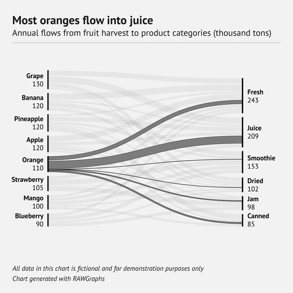
What is a sankey?
A Sankey diagram is a type of visualization that allows you to display flows from one set of values to another. It shows entities that represent the values and connects them by links, or flows. Each flow has a varying height, which depends on its quantity.
When should you use a sankey?
Sankey diagrams are commonly used to visualize supply chains, engineering and production processes, and energy efficiency. A known example is Google Analytics, which uses Sankey diagrams to depict the customer journey between pages of a website.
When you shouldn't use a sankey
Sankey diagrams can be very difficult to interpret if the data is complex and the number of nodes and flows is extensive, making it hard to follow the flow. Additionally, they can fail when a precise comparison is needed. While visually appealing, Sankey diagrams can be challenging to interpret, and the audience will likely require an introduction to read them properly.
Back to table of contents ⬆️
Network diagram
Alternative names: Network graph, Network mapping, Network visualization
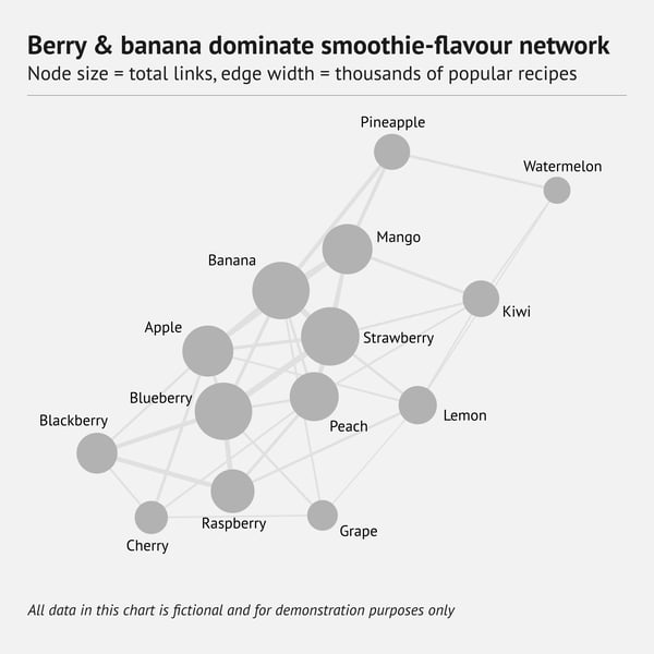
What is a network diagram?
A network diagram is used to show the connections between multiple elements. The structure of the data and the purpose are somewhat similar to the arc diagram. But while in the arc diagram, all of the points are placed on the same line, in the network diagram positioning of the peaks can vary. In some variations of the network diagram, the position of the point depends on the number of connections this point has and the group it belongs to.
When should you use a network diagram?
Network diagrams are often used to show the clusters of members based on the intensity of the connections. Network diagrams are effective for showing patterns, clusters, and hierarchical relationships. All these types of connections are really hard to grasp all at once using any other chart.
When you shouldn't use a network diagram
Network diagrams can also fail to be useful or meaningful in case the data lacks structure. They can easily become too crowded and complex if there are too many nodes and edges.
Flowchart
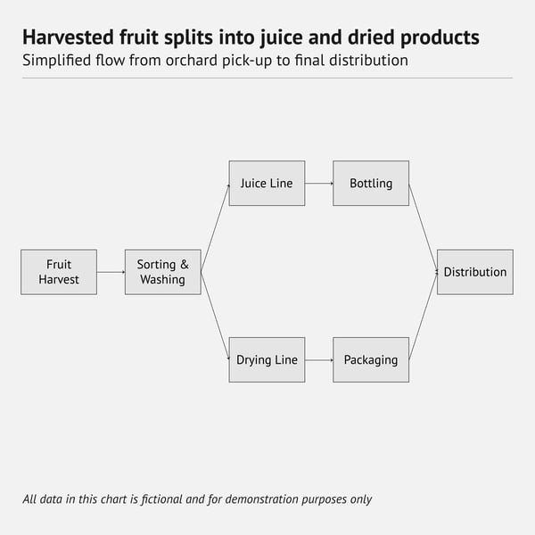
What is a flowchart?
A flowchart is a visualization of a workflow. It’s a diagram that depicts subsequent steps in the process. In other words, it shows what steps need to be followed to complete an action. A flowchart uses connecting lines and arrows to allow viewers to follow the process.
When should you use a flowchart?
A flowchart has many organizational use cases and can be a good tool to map out the customer journey and step-by-step instructions. It’s also popular in project management.
When you shouldn't use a flowchart
A flowchart works best for simple structures. If you need to visualize a complex process or a large dataset, a flowchart is not the best choice.
Charts in Illustrator
As mentioned at the beginning, many of the charts and graphs listed in this post can be made with Datylon. Currently, we offer 130+ chart templates in our Chart Library. You can sign up for free and try it for yourself.
What is even more interesting, a lot of charts from this list can be designed in Adobe® Illustrator®. Of course, Illustrator has a built-in graphing tool but unfortunately for many graphic designers and data visualization experts, it is seriously limited.
Check out the walk-through for our graph maker by "Yes I'm a Designer".
With Datylon for Illustrator, you get full freedom of chart design. It's a chart maker plug-in for Adobe Illustrator with extraordinary features that will help you make the most captivating chart design! Hey, did anyone say fully resizable charts?

To take your workflow even further, consider the Datylon Report Server. With Datylon Report Server, you can automate the production of your charts and reports, saving you a lot of manual work.
Curious about automated reporting? Explore our dedicated Automated Reporting article or schedule a personalized demo with one of our experts.
👉If you're keen on crafting custom data visualizations, visit our Bespoke Data Visualization Solutions page


