A deep dive into... treemaps
“Your disk is almost full. Save space by optimizing storage”. Does this sound familiar? Well, for me this is a frustration that keeps following me multiple times a year. First, I postpone it at least five times (don’t we all?), until the performance and speed of my computer reach the bare minimum.
This is the moment I go to my personal computer-doctor. He installs this super geeky disk space software to check which files and apps take up the most space. And there it is; the treemap.
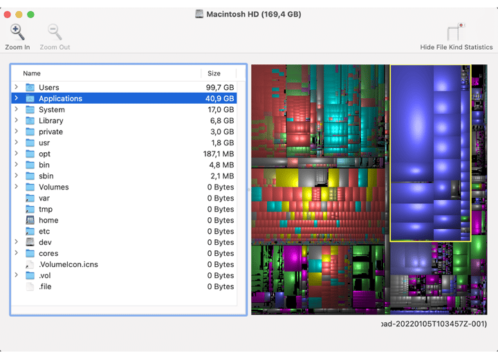 A screenshot of Disk Inventory X, showing the storage of files on my computer.
I don't think this treemap will win the information is beautiful awards, but it is useful and clearly shows what the treemap is made for. A treemap consists of multiple categories, shown on the left in this example, and each category in the treemap is given a rectangle, like the yellow one representing all applications on my computer. The categories of a treemap could be subdivided into smaller rectangles, all my applications, and files in this example. The size of the area of the rectangles communicates the value or size. Moreover, colors could be added to a treemap (among others) to differentiate between types of categories, such as the type of files in this case.
The main feature of the treemap, having multiple levels of categories in the form of rectangles, makes it possible to show hierarchical data in a space-constrained layout.
Table of contents
|
How does a treemap work?
Shapes of treemaps
The idea of hierarchies in the treemap was researched and introduced by Ben Shneiderman in the early ‘90s at the University of Maryland. He was inspired by the optical art he found in the Museum of Modern Art in New York and artists like Piet Mondrian and Gene Davis.
The treemaps Ben Shneiderman introduced in the 1990s were all of the type sliced and/or diced treemap. This type of treemap uses parallel lines in a vertical or horizontal orientation to divide the rectangles. A combination of the two can also be implemented where the lines are switched at each level of the hierarchy.
A recent example of a sliced treemap by Ben Shneiderman is called Urban Blues and is inspired by the work of Gene Davis. The map shows urban population counts and annual urban population growth for all countries in the year 2010 with an urban population of more than 20 million. All of Shneiderman's works are aesthetically pleasing to the eye, including this one. He beautifully managed to draw attention to one of the 36 countries with negative urban population growth; Ukraine.
 Urban Blues by Ben Shneiderman, inspired by Gene Davis.
The sliced and/or diced often results in thin and elongated rectangles which makes it hard to compare the sizes of the areas. Therefore, in 2000, Jarke van Wijk of the Eindhoven University of Technology researched and published a new method to create squarified treemaps.
In a squarified treemap, all rectangles are as close to a square as possible, which makes it easier to compare them. Though, with squarification, the ordering and structure of the rectangles are lost. However, for most treemaps comparing the size of the rectangles is more important than ordering. This is why nowadays this type of treemap is used extensively, including the treemaps used for showing disk space on your computer.
A really nice example of a squarified treemap is the one made by Ferdio about the most dominating flag colors in the world. In this map, seven color categories are shown which are subdivided into different color tones. To be fair, technically the rectangles are more flag-shaped than square-shaped, but this actually makes the chart even more interesting and communicates the message very well.
At the beginning of this blog, I wrote that the categories of a treemap could be subdivided into smaller rectangles like the first treemap I showed you. This is exactly what Ferdio did here as well, and therefore this type of treemap is not only a squarified treemap but is also called a nested treemap.
In a nested treemap, the big rectangle serves as the branch of a data tree, and the nodes within that branch are shown as smaller rectangles. Does it already make sense that this type of chart is called a treemap?
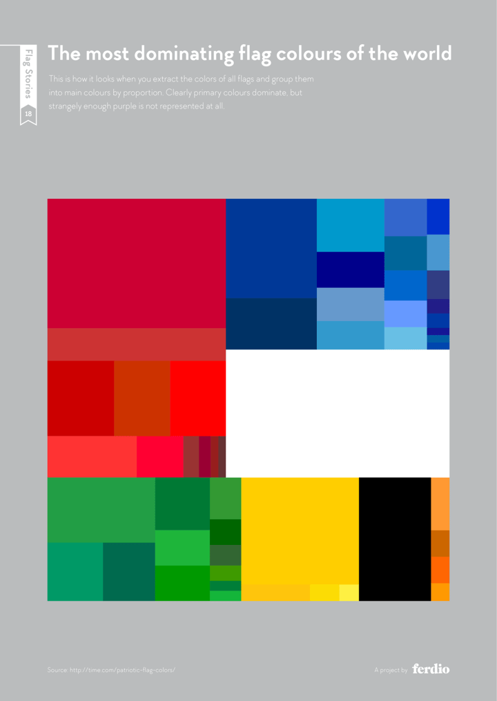 The most dominating flag colors of the world by Ferdio.
Like the nested treemap, there is another chart that is very convenient to use if you are interested in showing relationships between categories and their subcategories. This type of chart is called a Marimekko chart. At first glance, it looks like the child of a treemap and a stacked bar chart.
In this chart both the width and height of each rectangle are determined by the percentages on the x-axis and y-axis. This makes this chart very capable of showing a general overview of the data. If you are interested in precise comparison, a bar chart might be a better choice. Since every rectangle in the Marimekko chart has a different baseline, it is very hard to accurately compare them.
The next visualization shows the number of women in select tech companies in a Marimekko chart. The width of the columns represents the total number of employees working at the tech companies. The height of the yellow rectangles represents the percentage of women in the companies, and the area of the yellow rectangles represents the total number of women in the companies.
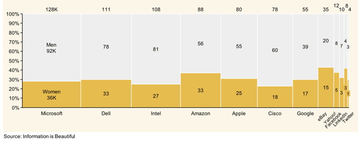 Marimekko chart showing the number of women in select tech companies.
What they did really well in this chart is coloring the chart based on the main focus; the women are represented by yellow rectangles and the men are represented by gray rectangles. It would be good though, to include more gender options next time in the collection of the data to be more inclusive, especially in big companies like this.
Moreover, it is not immediately clear which company performs best in the equal distribution of men and women. This is because the chart is sorted by the total number of employees in tech companies and because the labels of the rectangles show the number of employees in the companies. This results in the main focus on the sizes of the companies and not on the distribution of men and women in these companies.
Therefore, one option to improve this chart would be to sort the chart differently and start with the company that has the most women working in their company. Moreover, replacing the labels with percentage labels will make it easier to compare the companies and give more attention to the distribution.

Since there is a huge difference between the biggest and smallest companies, it is very hard in the Marimekko chart to see the data of the smallest companies very clearly. Therefore, another option would be to split the Marimekko chart into two charts; one stacked bar chart for the distribution of women and men in the companies and one bar chart for the total number of employees per company.
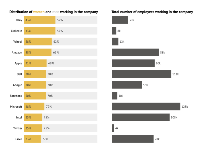
I created these two alternative charts in the Datylon for Illustrator plug-in to show you the differences with the Marimekko chart. It is always good to have a clear vision of the message you want to send to your audience and to check whether your chart conveys that message the way you wanted. Which chart do you think conveys the message the best? Let me know in the comments.
Another type of treemap that shows hierarchy very clearly is the circular treemap. This type of treemap consists of circles instead of squares, which makes them a bit less space-efficient. Though, because of the space in between the circles, the groups and subgroups are presented very neatly. Moreover, when designed properly, the circular treemap could be really pleasing to look at, like the one in the image below by Martin Šiklar.
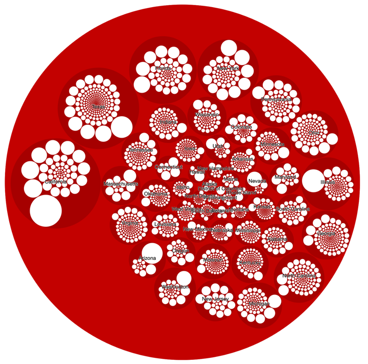
Circlepacker Visualisation of all US countries by population created by Martin Šiklar.
In a treemap, it is more essential to show the hierarchy than the ability to compare the (sub)groups with each other. However, sorting a treemap makes it easier to read and understand the chart. Since in most Western cultures we are used to reading from left-to-right, top-to-bottom, our primary optical area is located in the top-left area. Therefore, it is important to locate the biggest or most important category in the top left of the chart.
Martin Šiklar located the biggest category (California) in his chart more or less in the top left corner, however, the subcategories are all ordered differently, which makes it difficult to read and understand the chart in a short period of time.
Besides using circles instead of rectangles, it is also possible to create a treemap with convex polygons; the convex treemap or Voronoi treemap. With this type of treemap it is possible to create treemaps within arbitrary shapes like circles, triangles, or any shape you can think of like the example below. This makes it possible to lower the overall aspect ratio of the treemap as much as possible, which is not possible in standard rectangular treemaps. This holds especially for subcategories of the treemap. Moreover, with the use of polygons, it is possible to keep the hierarchical structure of the treemap, which is a very important aspect of this type of chart.
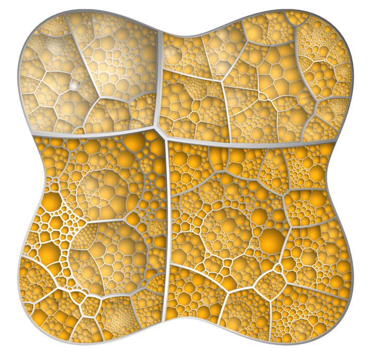
Voronoi treemap with ten levels of hierarchy, created by Michael Balzer and Oliver Deussen.
When I looked at these polygonal-shaped treemaps, these shapes immediately reminded me of body cells. It is probably not a coincidence that these treemaps are as space-efficient as the cells in our body.
Thinking about these shapes I walked around the house, checked my social media, and suddenly I could see them everywhere; the peel of a pineapple, the leaves on my plants, the skin of a giraffe, and so on. Let me know if you find yourself some Voronoi tessellations in your daily life!
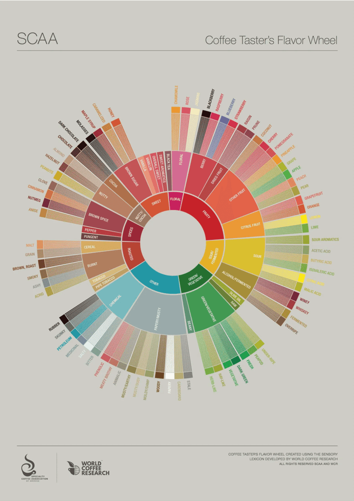 Sunburst treemap of the new coffee flavor wheel.
The beautifully designed chart above is created by the SCAA and contains the redesign of the coffee taster’s flavor wheel. It was created using the sensory lexicon developed by World Coffee Research. This wheel is used by people working in the coffee industry to help them talk about what type of coffee beans they prefer. This type of treemap is called after what it looks like; a sunburst chart or also called a radial treemap.
Compared to the squarified treemap, the amount of space for each level of hierarchy actually increases per level with most space for the outer level. This makes it very easy to read and analyze the subcategories and is therefore very suitable if you are interested in understanding the subcategories.
Therefore, if you are not bothered by the aspect ratio of the chart, the radial chart is a good choice to show how one ring is broken down into smaller related parts. Moreover, the radial layout of the chart makes this type of treemap a real eyecatcher, which is why you probably have seen this chart already in some coffee shops around the world.
Though, the coffee taster’s flavor wheel could be improved by starting the inner slices at 12 o’clock. This will result in an even calmer design because this is the way people are used to reading a clock.
The sliced and/or diced treemap, the squarified treemap, the nested treemap, and the Marimekko chart can all be created in our Datylon for Illustrator plug-in. For the other charts, you have to stay tuned until we will add them to our Datylon Chart Library.
To color or not to color
Speaking about eye-catchers; when a treemap is designed well, it has the potential to become a real piece of art. The biggest requirement to become such a piece of art is the use of color in the treemap. Since a treemap (most of the time) consists of multiple levels and subcategories, a lot of colors come into play. Therefore, picking the right colors for your chart becomes more important than ever.
A good example of a treemap with a perfect color scheme is one we already saw earlier in this blog; the coffee taster’s flavor wheel. The colors are beautifully picked according to the taste of the coffee and will not look out of place in a modern hipster coffee shop. Ferdio used the same tactic in the chart about the most dominant flag colors in the world; the colors perfectly match the data.
Using meaningful colors, something we already discussed in our deep dive into line charts is tremendously useful to convey a message more clearly and is definitely something you should think about when creating a chart. Especially, if you want to change your treemap into a piece of art.
Another example of a treemap in which a very appealing color scheme is used is the chart created by Stefania Guerra in the guide Issue mapping for an aging Europe. Almost all of the colors she used in the design are also actual food colors. Although she used them to represent the countries and not the actual food, it really helps in making the treemap more attractive to the audience. The only thing I would change about this chart is the color blue. Besides blueberries, the color blue is never represented in food and it actually reminds people of spoiled foods.
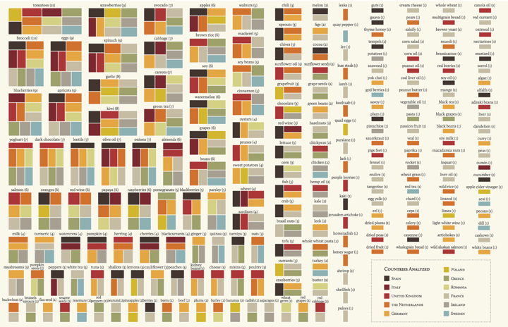 Issue Mapping for an Ageing Europe, Alternative version (not published) by Stefania Guerra.
The chart above created by Stefania Guerra is also a perfect example of a treemap that shows that borders around the highest level are a good option to make the chart less cluttered and complicated. If you have the space available, your design would benefit from some white space or empty space in between all the highest level categories, just like Guerra did in her design.
White space (not necessarily white) is known to be great for balancing all the elements in your design and organizing the content. Herewith, the user experience becomes better and the message of your design can be better communicated. Although treemaps are often used to preserve space, the use of white space is often not wasted space that could be used to present more information.
Another way of adding natural hierarchy to a treemap, but still preserving space is by shading every rectangle. This will result in a treemap that looks like a cushion. This way of coloring is commonly used in software for disk storage, like the first treemap I showed you at the beginning of this blog. Personally, I would only use this type of shading for treemaps that only have to be practical and not aesthetically pleasing to look at.
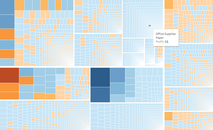 Treemap by Dick Holm shows positive and negative values.
Coloring the rectangles in the treemap is a valuable way to communicate your message more clearly and there are multiple ways to do it. Coloring could be used to differentiate between the categories of your chart. Most treemaps have different colors for each category of the first dimension and the subcategories have the same color.
It is also possible to apply color based on a secondary measure, like profit. This could be accomplished by using a diverging color palette, as Dick Holm did in the chart above. The reds represent the negative profits and the blues represent the positive profits. Though, be careful with showing negative values in a treemap and consider whether using another type of chart isn’t more convenient to use.
Some other aspect worth thinking about is creating a treemap that is also understandable by color blind people. Since 1 out of 12 men and 1 out of 200 women are color blind, and the colors of a treemap are very important to convey the message, it is useful to take this part of your audience into account. This could be done by picking a color-blind-friendly palette for your treemap. An example of an online available tool to create such a palette is Coolors. Moreover, to check what your Datylon chart looks like for color-blind people, the Adobe Illustrator functionality color proofing preview is very useful. The preview can be adjusted to both Protanopia and Deuteranopia, the most common forms of color blindness.
Information density
Since treemaps are most often used to show a lot of data in a small amount of space, there is always a risk of wanting to show too much information. This will make the treemap chaotic and hard to read.
One way to prevent confusing the audience is by thinking about the number of labels you are adding to the chart. Is it really necessary to add labels to the most inner subcategories? Are they important in conveying the message more clearly? These are questions that you have to ask yourself when designing a treemap. An option could be to combine small categories into one category and label it as “other”, to make your treemap less chaotic.
Moreover, if you are dealing with a lot of levels of hierarchy (more than two or three levels) in the data or a lot of subcategories, we recommend using an interactive version of the treemap. Not making it interactive will make the treemap unreadable because of the high number of labels. In an interactive treemap, you can decide to only show the labels of the main category and give more information when hovering over the rectangles of the subcategories.
An example of an interactive treemap is the chart I already showed you above by Dick Holm. Because he has a lot of subcategories in his dataset, the treemap would become unreadable if he added labels to every single subcategory in the chart. Therefore, it is a good decision to make it interactive with the information popping up when hovering over the subcategories. Though, I would suggest adding labels for the main categories to prevent people from taking a long time searching for the category of interest.
To conclude, a treemap is a very useful type of chart to visualize hierarchical structures in a compact way. There are a lot of variations and they most certainly will grab the attention of your audience.
With the Datylon for Illustrator plug-in, you can pick the ideal treemap for your data and apply a wide range of styling options. If you have reports including treemaps that need to be generated on a recurring basis, use Datylon Report Server to eliminate manual work. If you need multiple versions of the same treemap with different data, Datylon ChartRunner is the perfect solution. Not sure which tool fits? Book a demo with one of our experts.
Datylon Treemap Resources
- Tutorial: How to make a treemap in Illustrator
- Chart library: Treemap resource page
- Chart properties: Treemap properties

Dieuwertje van Dijk - Data Visualization Designer
Data, graphic design, illustration, food and mountains let her dopamine neurons spark on a daily basis. Most of the year she lives in Georgia where she spends her free time enjoying nature in a rooftop tent, eating khinkali and drinking wine.


