A deep dive into... pie charts

I have often said that pie charts are the Comic Sans of data communication, but over the last few years, that message has started to pinch a bit. It seems to stop short to compare a chart type to a font that is the target of an online hate campaign.
Don’t get me wrong, most of the pie charts that I come across are not used correctly or designed properly. They are usually chosen to get a bit of variety into data reporting, which is often made with tools with a limited charting library. That’s what we hear from clients anyway: if we could please add a pie chart, instead of the same old boring bar charts.
There are cases where a pie chart works really well to communicate the data, but attention must be paid to when and how.
Table of contents
|
How does a pie chart work?
A pie chart communicates values via 3 visual cues: the arc of the slice, the angle of the slice, and the surface of a slice. We thought for a long time that people read pie charts by comparing the angles of the slices. But research shows that we actually interpret the pie chart by the surface of the slice, maybe in combination with the arc length.
When comparing surfaces, you need to compare two dimensions with each other. Something that is very hard for our brain to do. Comparing rectangles of varying widths and heights is already quite the task, but to compare circles, or parts of that circle, is even harder. Especially small differences are very hard to distinguish, and trying to figure out just how much bigger one is compared to the other, is virtually impossible.

That’s why a pie chart is less suited to compare between categories. A pie chart visualizes a part-to-whole relationship. It shows how the data is divided into categories with a certain value, but it always keeps the link between the value of one category and the total sum of those categories. This relative approach of comparing a part to a whole is key to understanding how to use a pie chart. If the focus is on comparing values between categories, or between pie charts, it’s better to choose another chart type.
What makes a good pie chart
Rounding up to a meaningful whole
As said, a pie chart visualizes a part-to-whole relationship. This means that the slices should add up to a logical sum. If the data is in percentages, the sum should round up to a hundred. If the data is in absolute values, for example in euros, the categories should form a meaningful total.

The right amount of categories
A pie chart works best with only a few categories, otherwise, the chart becomes an unreadable mess. Pie charts with over 20 slices are so common, but look totally ridiculous. There is no way of getting the right information out of the chart. In this case, it’s better to choose another chart type, like a bar chart, or see if the data allows you to generate an ‘other’-slice, containing the rest of the values.

I always recommend a maximum of 5 categories when someone wants to use pie charts - and for me, that really is a hard maximum. The way I personally love to use pie charts is when I want to visualize and compare binary categories, like a yes/no answer to a question. In that case, comparison between the categories is quite doable - even when the differences are small - and the link with the total adds more context.

Enough difference in slice sizes
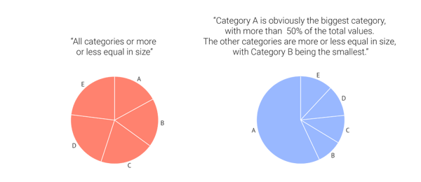
The reason that pie charts are less suited to compare between categories, is that it is very hard for people to compare areas with each other, especially when they are close in size.
In the below example, you can see how it is very hard to see the differences between the slices in a pie chart, but plotting it into a bar chart shows even the tiniest difference in size. That’s because we only have to compare one dimension across the categories: the lengths of the bars.
If the message of the pie chart is that all values are very close to each other, you could say that the pie chart does its best to communicate this. But when slices are not close in size, for example, when one category is very big or very small compared to the other categories, a pie chart shows more of its worth.

If you keep in mind how a pie chart works and what the most suitable conditions are for choosing one for your reporting, we can together change the pie chart’s questionable reputation one chart at a time!
Further reading
- Storytelling with data: An update post on pies
- Eagereyes: A pair of pie chart papers
- Steven Few for Perceptual Edge: Save the pies for dessert
- Policy Viz: F**k it, let’s use pie charts
Datylon Pie Chart Resources
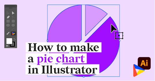
- Tutorial: How to make a pie chart in Illustrator
- Chart library: Pie chart resource page
- Chart properties: Pie chart properties

Leenke De Donder - Data Visualization Designer
Data Visualization Designer. She loves negronis and sees them as the perfect visualization of a well-balanced part to whole relationship.


