Data visualization within Adobe Illustrator
With a goal to dive deeper into the growing need for smarter dataviz solutions within Illustrator, some time ago we posted an online questionnaire.
And the people (n=244) have spoken! Scroll on down to check out the results.
We've also spent some time looking into what we learned from reviewing all the responder comments.
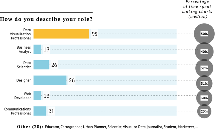
It is not a surprise that most of the respondents are dataviz professionals and graphic designers. This is because we mainly reached out to those specific networks.
The roles listed in 'Other' correspond with the trend that dataviz and chart-making are becoming widespread in different roles and industries.
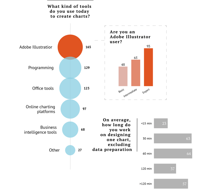
Graphic designers very often use Adobe Illustrator. What is interesting to see though is that most respondents supplement this with 2-3 (sometimes more!) other tools for data visualization.
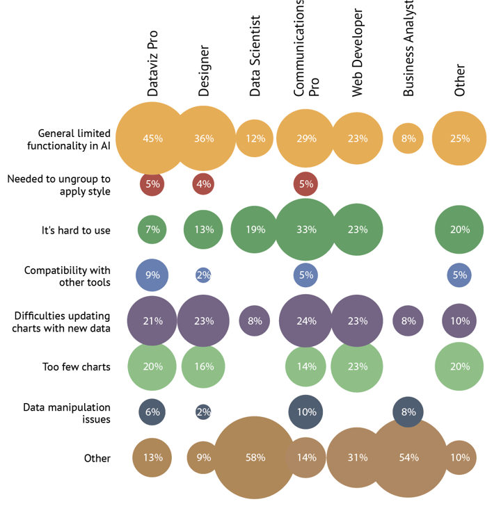
The fewer programming “skills” an individual possesses, the more they require better graphing tools in Illustrator.
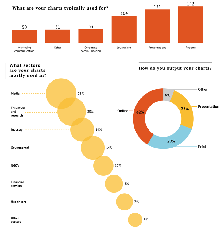
The respondents' comments are almost unanimous: Adobe Illustrator generally has too many limitations for advanced graphing. So, “Definitely Yes”, most wanted better charting tools available. And we might have just what they need 😉
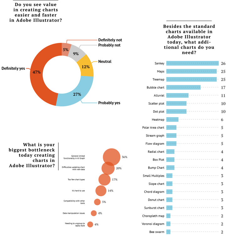
The most wanted: Sankey and Treemap. As it happens - very recently, we released a new Datylon version (R48) with a new chart type in it: THE TREEMAP!
Read more about the release and the treemap chart.
All of the responses in the survey were great and super insightful, we certainly learned a lot about the types of roles, industries, and chart types at the center of the demand for dataviz.
Important insights were also gathered on the challenges faced by those using Adobe Illustrator to produce data visualizations and data stories. Based on this type of feedback, we saw it as useful to spend some time outlining these (letting you know you are not alone in your frustrations!) and explaining how we can help to solve challenges with our chart maker plug-in for Adobe Illustrator, Datylon for Illustrator.
Challenge #1:
Losing the link with the data. Users cannot update or reuse charts.
This is without a doubt the single most reported issue when creating dataviz within Adobe Illustrator, where designers have been confronted with this quite major hurdle while attempting to repurpose their charts.
To style the chart elements, Illustrator requires the properties to be ungrouped. But to reuse or update the chart, where you need the link with the data - they have to be grouped. And before Datylon, there has been no alternative solution.
As a result, Illustrator has been limited in its use for one-off charts and graphs. Once a chart or graph needs to be repurposed, produced in multiple- or different versions, each item would need to be individually redrawn, which in turn is time-consuming.
Datylon to the rescue
Reusable charts
A reusable chart is a chart that can be updated, resized, or duplicated with new data without having to manually restyle it. Each graph object designed with Datylon for Illustrator consists of two components:
- the chart itself, which is the graphical representation you see on the screen,
- the data behind it - which can be managed in the data sheet manager.
Reusability of charts in Datylon is easy thanks to the following features:
- Responsive chart elements,
- Data-driven properties,
- Data sheet management options.
All chart elements in a Datylon object are responsive in some way, depending on the object type. The position of grids, ticks and legends, the length of an axis or text box, and padding between objects, for example, all adapt automatically to the new data.
New categories, columns, or rows in the data can be added or removed, and still, all the style elements will follow nicely.
Other styling properties, like text size or line width, keep their values as they should be.
Data-driven properties
Some chart properties can be data-driven, rather than individually defined. For example, scatter charts can be bound to the data by the size of the plots, making them into bubbles. But it doesn't stop there. The color of the bubbles, the color of the stroke, labels, and tooltips can all be data-driven as well.
Once the properties are defined, they can be updated by a simple upload of new data, meaning charts with a new look and feel can be easily created in seconds.
Data management
But what good is it if you’re able to drive properties by data and you have no means to properly manage the data itself?
Datylon for Illustrator provides a solution with the data sheet manager, where you can add, delete and rename data sheets. Users can upload data from different sources. The data sheets can be then assigned to specific charts and graphs within the data story or report that is being created.
After that, it is as simple as uploading new data when it arrives. You can even have one data sheet driving more than one chart. Not only does this simplify things considerably, but it also allows the user to combine two or more charts on top of each other while those charts will stay perfectly in sync.
You can even take it a step further by completely automating your charts using Datylon Report Server. This solution is perfect for any visuals that need to be generated on a recurring basis. If you’re interested, read our guide to automated data reporting or schedule a demo with one of our automation experts.
Challenge #2:
Overall limited charting functionality within Illustrator's standard tool
With comments left in the survey such as:
“There’s a lack of advanced features in Illustrator to create a chart…”
“The standard graph tool in Illustrator is too basic and needs an overhaul: it is not stable, not intuitive, and requires too much manual work.”
“Illustrator has cumbersome data binding and the data is not always displayed correctly”
“I’ve been known to cut up charts made using AI’s Graph tool and manually construct my own chart from there.”
… this pain point is another biggy.
And it doesn’t end there, as some of our respondents pointed out even more limitations we addressed in Datylon for Illustrator, such as:
- line charts not accepting dates,
- axis scaling and labeling problems,
- key styling properties not available,
- difficulties formatting charts to fit for print….
You see the point. Adobe Illustrator’s built-in graphing tool has limitations galore for those wishing to craft beautiful and functional dataviz.
How Datylon can help
In Datylon for Illustrator, the user has access to a range of specialized dataviz properties and features to style charts quickly and easily. This allows for full freedom in the chart design process.
While Adobe Illustrator has a very limited set of properties per chart type, with Datylon for Illustrator chart maker plug-in you’ll find many chart-specific data visualization properties, such as sorting, inner and outer padding, decimal separators, label position and rotation, spline type, etc. All next to your standard graphic effects, like stroke properties, shadow, font type... the list goes on!
These styles are always applied to all designated element types in the chart, or even per series if needed. This generates considerable time gains while creating charts with no more manual drawing or editing.
Labels and the axes can also be styled separately using many different options including alignment, offset, grid options, text formatting options, etc.
And when resizing the chart, or even adding extra categories, the styling properties perfectly adapt to the new dimensions where they need to, whereas other properties (like font size) remain unchanged (as they should). This makes Datylon for Illustrator the perfect tool for repurposing charts.
Challenge #3:
Limited chart types with poor defaults
Last but not least, rounding off our top three reported problems is the lack of more advanced and specialized chart and graph types available within Illustrator. And even for the charts that do exist within the standard Illustrator tool, the defaults are not deemed useful.
Data can be presented in many ways depending on the structure and the insights you want to communicate. A design tool should not be the limiting factor on how data is presented - dataviz professionals and designers need the freedom to choose between a large variety of fully customizable charts.
In the survey, respondents called for a larger range of chart types to visualize different datasets in the best possible way. The most wanted charts are sankey, treemap, and bubble charts. Closely followed by alluvial, dot plot, and scatterplot.
You may also like: Data Visualization With Excel And The Datylon Plugin
How we can help
We believe that a comprehensive charting library is essential for the success of a good charting tool.
Besides the standard charts, we are developing (or have developed) many of the ‘most wanted’ charts listed above and more. We also strongly encourage our users to let us know what kind of charts they prefer us to develop and look forward to seeing them used in many different publications.
At this moment, Datylon Online and Datylon for Illustrator support a wide range of chart types - with a treemap, bubble chart, scatterplot, and dot plot among many others.
A final note on respondent roles vs dataviz tools
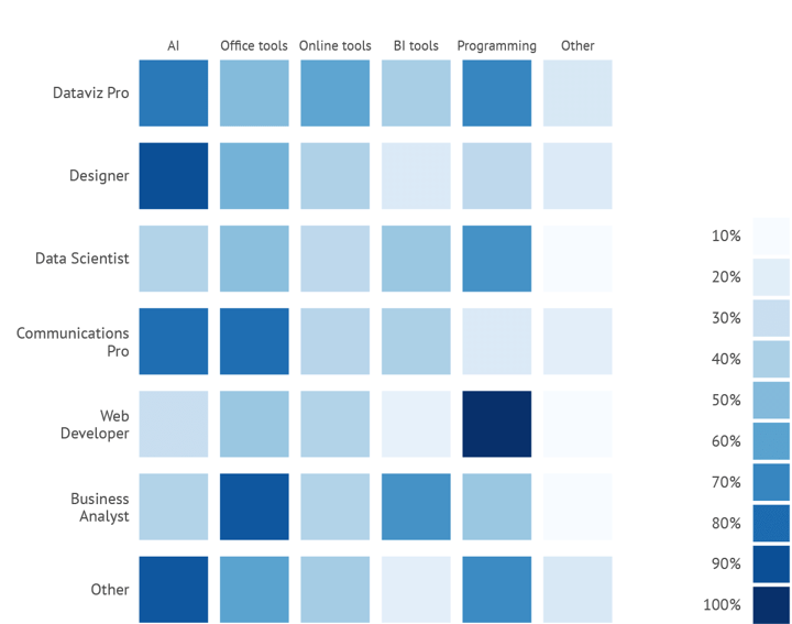
Alongside the insights relating to the challenges of vizzing in Adobe Illustrator, another matter of interest for us was the range of tools respondents use for data visualization. Many were reporting that they were using two-three different tools. Unfortunately, we don’t have more details as to why such a range of tools is being used. But, possibly based on the challenges and limitations listed above, the fact that each of these tools needs to be used for one in the same job, we can only assume as the main reason why the range exists. We’re sensing the possibility of another survey so we can test this hypothesis!
While creating workarounds may very well be the reason for this multi-tool approach, using the likes of D3, R, or even Excel to create the charts, then enriching later in Illustrator, may be a viable workflow in certain cases. This scenario is far from ideal in the long term.
Here at Datylon, our belief is that a consolidated dataviz design solution is needed, and what makes complete sense is to have that solution within the environment that all designers know already: Adobe Illustrator.
For this very reason, we have created a chart maker plug-in Datylon for Illustrator. Make sure to sign up on Datylon and try the charting tool for free for 14 days here (no credit card needed). And definitely check out our growing Datylon chart library!
👉If you're keen on crafting custom data visualizations, visit our Bespoke Data Visualization Solutions page.

Erik Laurijssen - Founder & CEO
What if more people could understand what the data means? That’s the "Big Hairy Audacious Goal" Erik set forth as co-founder of Datylon. When he’s not juggling the many facets of scale-up life you can find him rewind somewhere in nature hiking, biking, running or enjoying the slopes.

