A deep dive into... line charts
Am I right if I say that you have been bombarded with the ‘flatten the curve’ line chart the past year? And am I right that you are probably fed up with it? Good news: I will promise to show you some different line charts this time!
Let’s first take a deep dive back in time to 1786. William Playfair, a Scottish engineer, and political economist wrote “The Commercial and Political Atlas” (1786). Because of this book, he is known to be the first creator of the bar chart, pie chart, and line chart.
However, I have shocking news for you; the first line chart was created way earlier (I’m sorry William, we must play fair). In the 11th century, an unknown author plotted the Moon, the Sun, Mars, Jupiter, Saturn, Mercury, and Venus against celestial latitude in the appendix of the manuscripts De cursu per zodiacum (The Course of the Zodiac). Howard Gray Funkerhouser described this chart in a manuscript in 1936 discovered by Siegmund Gunther in 1877.
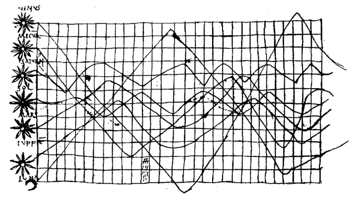 Manuscript De cursu per zodiacum from Funkhouser, H. Gray. “A Note on a Tenth Century Graph.
William Playfair should be credited though; he was the first one to make the line chart popular and successful. He presented 43 different types of line charts in his book, something we can only aspire to have in our Datylon for Illustrator plug-in.
Moreover, Playfair was the first to add shading, color, and hachure to his charts. Maybe his use of color was the reason for some academics to entitle his work as childish. The suspicion that he colored his charts all by hand was probably also not something that helped him get rid of this stigma.
His line charts included two quantitative axes, one for time and one for economic variables such as imports and exports. An iconic example of such a line chart created by Playfair is the chart shown in the next figure. The chart is very interesting because it is not just a typical line chart in which only the lines represent the main message of imports and exports from Denmark & Norway between 1700 and 1780. In this chart, the area between the lines is colored to clearly show the difference between these imports and exports.
In honor of his work, we recreated this famous line chart with our Datylon for Illustrator plug-in, the same way Playfair designed it. Can you spot the differences?
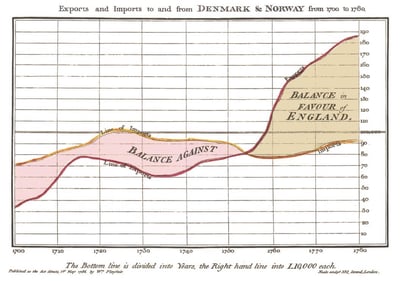
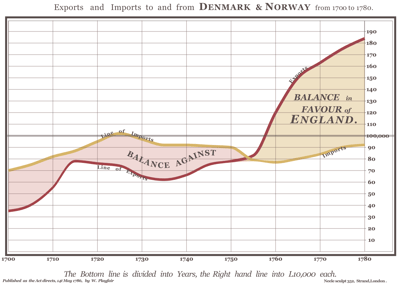 William Playfair’s trade-balance time-series line chart from his book “The Commercial and Political Atlas” (1786)
and our recreation of the chart with the Datylon plug-in for Illustrator.
Table of contents
|
How does a line chart work?
Coloring and positioning line charts
Playfair’s chart shows that a line chart could convey more information than just the trend in the data; coloring the areas between the lines makes the difference between the categories more clear. The areas between the lines in his chart are colored according to the difference between imports and exports. When the imports are higher than exports the area is colored red, meaning that the balance of imports and exports is against England. When the exports are higher than imports the area is colored yellow, meaning that the balance of imports and exports is in favor of England.
Since Playfair’s chart is about England more than about Denmark & Norway, Playfair may or may not have picked the colors of the areas at random. The color red is a sign of warning or danger and represents in this chart the balance against England. The color yellow symbolizes optimism and enlightenment and represents the balance in favor of England. Using meaningful colors in your chart to convey a message more clearly is tremendously useful and is something you should think about when creating a chart.
Another good example of a chart in which the colors are used in a purposeful way is the chart of Rody Zakovich. He changed an area chart created by datagraver in 2013 into a new chart. The chart shows the color popularity of new cars in North America. Each line in this chart represents the right color for the cars. Though, when designing a chart and using significant colors, don’t forget about color blind people. In this chart, the categories are only presented by colors and they are not labeled. Therefore, color-blind people will have a hard time understanding it. The chart could be improved by replacing one of the y-axes with a color label.
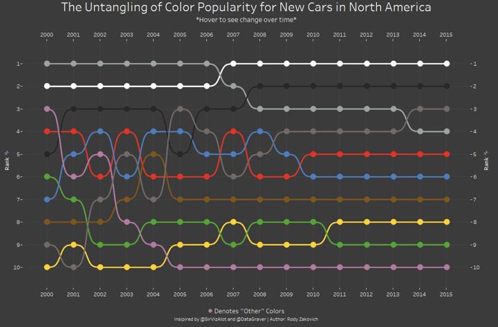 Bump chart created by Rody Zakovich as a revision of the bump chart created by Matt Chambers who created it as part of a makeover Monday. The original chart was created by datagraver in 2013.
Apart from colors and filling areas under the lines, positioning of the y-axis is also something that could help convey a message faster and more clearly. As you can see in the chart below, Playfair chose to draw the y-axis on the right side of most of his line charts.
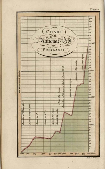 William Playfair’s Chart of the National Debt of England line chart from his book
“The Commercial and Political Atlas” (1786)
Nowadays positioning the y-axis on the right side is not very common. There is a general rule in data visualization to place the y-axis on the left side of a chart because in most languages we read from left to right. So what was the reason for Playfair to position his y-axis at the right side, you would ask. He often placed the most relevant, important, and recent data on the right side of his line charts. This might be the reason why Playfair decided to use the right side as the focal point of his line charts.
Shapes of line charts
As Playfair already has shown with his iconic charts, line charts work best with data that changes over time. The periodic variables should be placed on the x-axis and values on the y-axis. Examples are the amount of caffeine in your blood during the hours of the day, the number of visitors to your website during a month period, or the rise in temperature over the years.
In the chart, the data points represent the actual data, and these points are connected by lines to show the trends in the data, whether it is increasing or decreasing and during which periods. Besides using line charts for showing changes over time, they are also very useful in showing other periodic values such as age, price, or distance.
Playfair made the choice with his iconic line chart about imports and exports to use a multiple line chart. This type of chart is useful in comparing the trends of multiple series in only one chart. He added a curve to his chart to make the chart flowier and aesthetically pleasing to look at. In a curved line chart, the data points are connected by a curved line. This is done by interpolation, which means that there are guesses made about the data in between the data points. By using these curves in the line chart, you may miss small changes in the data because of the guessed data in between the data points. This could lead to incorrect interpretations. So use this type of line chart with care.
In the next example, you can see a line chart of www.unitedconsumers.com which shows that in October 2021, the average national list price of Euro95 (GLA Euro95) rose for the first time in history above two euros. We think they did a great job with zooming in on the data to make the changes in the data clear. Moreover, they really thought about how to keep the data-ink ratio as high as possible; the author used the right amount of ink to show the actual data compared to the total amount of ink by removing a lot of tick marks.
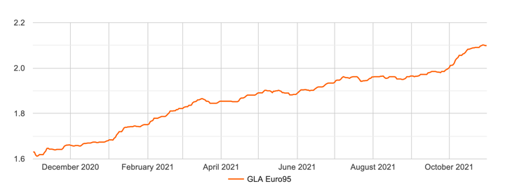 Line chart of United Consumers showing the development of GLA Euro95 prices in the current year.
It is clear that United Consumers wanted to show the trend of the data over the year, which is why they chose to create a line chart. But if you were more interested in showing, for example, on which dates exactly has the GLA Euro95 changed in October, a step line chart would be a more appropriate chart to use.
A step line chart is a good choice when you have to deal with data that changes in irregular intervals and if you want to show at what exact moment in time the data changes instead of the trend of the data. This type of data has an irregular interval; the price of GLA Euro95 stays the same for a period until, at some point in time, it suddenly changes. Therefore, a step line chart makes it easier to see when the change exactly occurs. In the step line chart, you will only find horizontal and vertical lines to connect the data points instead of using the shortest distance like in the standard line chart. To show you what such a step line chart would look like, we created a chart for price changes of GLA Euro95 for October 2021 with the Datylon chart maker.
To make the chart easier to read compared with the line chart created by United Consumers, we changed some of the elements of the chart. First, it is easier to read a chart if you make use of direct labeling instead of using a legend. Though, the benefits of using direct labeling over a legend will appear most relevant when using multiple lines. Therefore, you can also decide to leave out the legend or label and mention the topic in the title of the chart and color label the text. Secondly, using a prefix with a euro sign next to the tick marks on the y-axis makes it more clear that we are talking about prices.
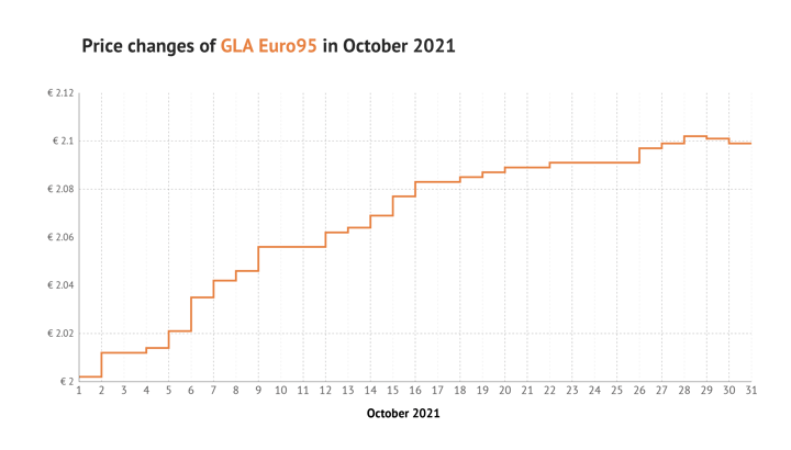 Step line chart created with the Datylon chart maker showing the development of GLA Euro95 prices in October 2021.
If you want to change your line chart to a curved or stepped line chart, you can change the interpolation in the styling pane to curved or stepped. Or you can change the chart type to the desired line chart in the chart library.
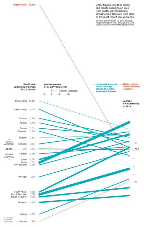 Slope chart created by Oliver Uberti for National Geographic.
The beautiful and interesting chart above is created by Oliver Uberti for National Geographic. He visualized the health care spending per person compared with average life expectancy in an impressive way by using a slope chart. This type of chart is known for showing the difference of a variable in two instances. It shows the beginning and end of the variable and is therefore simple, easy to understand, and less cluttered than a standard line chart. This type of chart will give insights into the rank of categories and the increase or decrease of a variable over two instances for these categories. Moreover, the chart clearly shows the steepness of the lines; the rate of change of a variable. The table with data for the slope chart is something to be careful with. In comparison with the charts I showed you before, the data table looks a bit different in the plugin. The categories are placed in rows instead of columns.
For a slope chart, it is very important to keep the data-ink ratio as high as possible. Oliver Uberti removed all unnecessary gridlines, tick marks, and data labels in his chart to keep the data-ink ratio high. Moreover, to stay away from a cluttered slope chart it is necessary to highlight the most important lines you want your audience to focus on. Oliver Uberti did a great job with coloring the relevant lines in red and all the other lines in blue.
If you want to show the difference of a variable in multiple instances instead of two instances, a bump chart is a better choice than the slope chart. Do you remember the chart I showed you with the color popularity of new cars in North America? That chart is called a bump chart. Bump charts are convenient to use when you are interested in the rank of the different categories. When planning to use a bump chart, keep in mind that when you are interested in the actual data of the different categories, this type of chart is not helpful as every step in ranking has the same size.
In the end, a line chart is a very capable and interesting type of chart. There are a lot of variations, each with its own specific function. Understanding all the possibilities can help you tell your data story in the best and clear way.
With Datylon, you can pick the line chart that is the most suitable for your story and you can apply numerous functions to it.
Further reading
-
Funkhouser, H. Gray. “A Note on a Tenth Century Graph.” Osiris, vol. 1, 1936, pp. 260–62. JSTOR, http://www.jstor.org/stable/301609. Accessed 12 Mar. 2024.
- Tutorial: How to make a line chart in Illustrator
- Chart library: Line chart resource page
- Chart properties: Line chart properties

Dieuwertje van Dijk - Data Visualization Designer
Data, graphic design, illustration, food and mountains let her dopamine neurons spark on a daily basis. Most of the year she lives in Georgia where she spends her free time enjoying nature in a rooftop tent, eating khinkali and drinking wine.


