How to make a treemap chart in Illustrator with Datylon
Climate change is one of the most heated (no pun intended) topic conversations today. This is not just a short-term agenda. It is an area in which the common future depends on our decisions today. The data visualization community is trying to draw attention to the problem in every possible way, from comics to visualizations of temperatures over the entire period of observation.
In this article, a more specific theme will be covered: CO2 emissions. CO2 (Carbon dioxide) is a greenhouse gas. In simple terms, it works as a blanket – trapping the heat that comes from the Earth that otherwise would radiate into space.
Recently, we added a new chart type to our Datylon chart library: a treemap. So we thought it would be a good idea to show you how to make a treemap chart in Adobe Illustrator using our chart maker plug-in Datylon for Illustrator. The visualization will be addressing the information about countries with top CO2 pollution per capita.
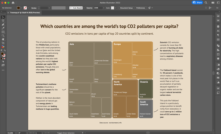
If you want to follow the steps, you can download the data that we are using here. Together, we will make this visualization, step by step. This will allow you to get familiar with the treemap chart properties in the Datylon chart maker plug-in for Illustrator. Hopefully, this will help you understand how to further design your own treemap in Adobe Illustrator. In the end, our treemap graph will look like this:
Download and install Datylon for Illustrator
For this tutorial, we assume you have already downloaded and installed the Datylon for Illustrator plug-in. If not, you can sign in and download the plug-in here. If you need help with installing the plug-in, make sure to check this article. |
Table of contents
Step 1: Preparing the artboard Step 2: Drawing the chart area |
Step 1: Preparing the artboard
It’s a good idea to prepare your artboard before creating a visualization. In most cases you need a chart of a certain size and proportions, so taking care of this in advance will make your life easier. You can set the height and width before creating a document or later in the process. For our design, we will set the size of our artboard to 1000 pixels by 700 pixels.
Step 2: Drawing a chart area
First off, we need to draw the chart area. Select the Datylon icon in the AI toolbar and draw a rectangle that more or less fits the desired dimensions of the treemap chart. You can later easily resize the chart if needed: chart elements will be redistributed in the same proportions. It means that changing the size of the chart does keep all relevant properties intact like font and label sizes or line widths.
It's a very handy feature in our chart maker. Datylon charts are smart and designed with reusability in mind. This scaling behavior of Datylon charts is a simple but huge time saver. Your chart can easily be repurposed to fit in another layout or output channel without redrawing.
By releasing the rectangle, a dummy chart and the Datylon pane will appear.
Scroll down a bit in the chart library on the left and click on the treemap card. Make sure you click the card and not the Select button. Clicking ‘Select’ will immediately select the first default chart of that chart type and that might not always be what you want. Instead, clicking on the entire tile will display all the different variations of a treemap chart.
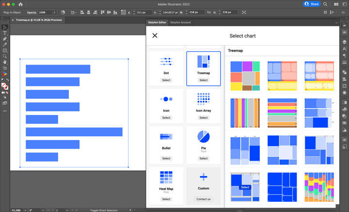
For this chart, we will go with the ninth default chart.
Step 3: Adding data
Once you have selected your default chart, the Datylon editor appears. On the left, you can see the data pane, and on the right the editor. The editor in itself contains a binding tab, a data formatting tab, and a styling tab.
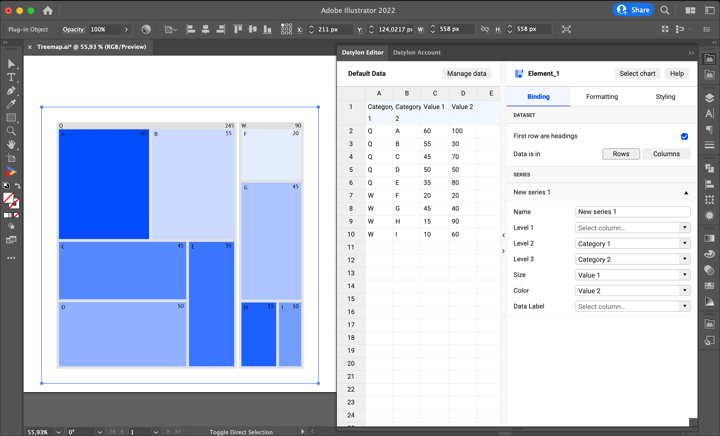
But let’s take a look at the data pane first. There are three ways of adding data:
-
You can start from a dummy sheet/an empty sheet and copy-paste your own data into it.
-
You can upload a file from the Datylon Report Studio if you have some data stored there.
-
You can upload a locally saved file.
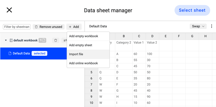
To create this treemap chart, we are going to use a file we have saved locally on our computer. Simply click Manage Data > Add > Import File and browse to find your workbook or datasheet. Click on the required datasheet and click the ‘Select Sheet’ button.
Step 4: Binding
In data visualization, binding the data defines which data drives which visual cue. Some data could drive size, some data could drive position, some data could drive color, etc.
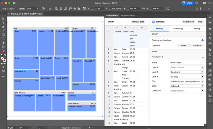
For every chart, there is a preferable data presentation type. For the treemap, it is a flat table. It means that every column represents one variable. For treemap, there are two obligatory bindings: Size and at least one of the Levels. The Size should be bound to a column or row containing numerical data. In our case, Size is bound to CO2 emissions per capita (tons). To visualize hierarchy, also Level 2 and Level 3 are used. Level 2 is bound to the Continent column. Level 3 is bound to the Country column. Once the binding is completed, we see that the treemap is updated with the new data.
If your incoming data contains dates, time, currencies, or other special data formats, the formatting tab allows you to convert them correctly. Our data is already in the correct format, so we can completely skip this tab.
Step 5: Styling the treemap
The general plan for styling the treemap chart is as follows:
-
Use categorial coloring for Level 2 (Continents).
-
Make the cells of Level 3 (Countries) transparent and use a light stroke to show the cell borders.
-
For Level 2 use only Category Labels and place them at the top-left corner of the cell.
-
For Level 3 place both Category and Value Labels at the bottom-left corner of the cell.
-
Also, tweak the padding and round corners of the cells.
All these manipulations can be done under the Styling tab.
First, let’s color the cells of the treemap. For Level 2 use a categorical palette. For this particular chart we used a custom palette made in Adobe Illustrator swatches with the following hex color codes: #877b63, #c3924e, #987244, #5b5b42, #6b6b6b. To apply it go to Level 2 > Cell > Color > Palette > Illustrator swatches and choose the palette.
In level 3 we only use outlines and do not fill the rectangles with a color. This groups the countries nicely into contents. To do that go to Level 3 > Cell > Color > None.
Now none of the cells are visible. To make them visible add a thin border using a stroke property:
Level 3 > Cell > Stroke > Weight > 0.2px
Level 3 > Cell > Stroke > Color > Solid > #eadcc7
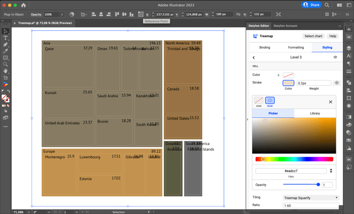
Now adjust the form and positioning of the cells. First, change the Inner and Outer padding of Level 2. Inner padding will change the gap between the cells of Level 2 (Continents). Outer padding will change the gap between the border of the Level 2 cells and the cells of Level 3:
Level 2 > Cell > Inner Padding > 4px
Level 2 > Cell > Outer Padding > Cogwheel Icon > 5px
Round the corners of the cells of Level 2 using the Corner Radius:
Level 2 > Cell > Corner Radius > 9px
To change the order and arrangement of the cells use a different Tiling method. For this chart we use Treemap Binary:
Level 2 > Cell > Tiling > Treemap Binary
Make similar adjustments for the Level 3 cells:
Level 3 > Cell > Inner Padding > 2px
Level 3 > Cell > Corner Radius > 9px
Similar to Level 2 we use Treemap Binary for Level 3:
Level 3 > Cell > Tiling > Treemap Binary
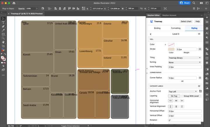
Now let’s move to labels. In this chart for Level 2, it makes sense to use only Category Labels since not all countries from the indicated continents are present here and the value that is calculated as a sum of all the values of the countries won’t be representative.
Let’s start with positioning. Continents (Level 2 Category Labels) are to be placed in the top-left corner of the cell. To give it some space, add horizontal and vertical offset. To do all that go to:
Level 2 > Category Labels > Anchor Point > Top Left
Level 2 > Category Labels > Horizontal Alignment > Left
Level 2 > Category Labels > Vertical Alignment > Top
Level 2 > Category Labels > Horizontal Offset > 9px
Level 2 > Category Labels > Vertical Offset > 6px
Some of the labels (North America and South America) are overflowing with cells, so it makes sense to move the second word of the label to the next line. It can be done using Paragraph properties:
Level 2 > Category Labels > Paragraph > Width > 50px
Level 2 > Category Labels > Paragraph > Horizontal Align > Left
For Level 2 labels we use a relatively large bold font as it stands on the top of the visual hierarchy of this chart. The color of the cells is rather dark, so the white font color should look nice:
Level 2 > Category Labels > Character > Typeface > PT Sans Bold
Level 2 > Category Labels > Character > Color > #ffffff
Level 2 > Category Labels > Character > Size > 14px
Moving to Country (Level 3) Labels. The plan was to place them in the bottom of the cell. Let’s start with value labels.
Level 3 > Value Labels > Anchor Point > Bottom Left
Level 3 > Value Labels > Horizontal Alignment > Left
Level 3 > Value Labels > Vertical Alignment > Bottom
Level 3 > Value Labels > Horizontal Offset > 2px
Level 3 > Value Labels > Vertical Offset > 2px
For the Value labels, it’s a good idea to use a small font, but don’t forget to compensate for the size with the boldness of the typeface. As for the color, we’ll stick with white for all the labels. Also to make all labels look consistent use the same decimal place option:
Level 3 > Value Labels > Character > Typeface > PT Sans Bold
Level 3 > Value Labels > Character > Color > #ffffff
Level 3 > Value Labels > Character > Size > 8px
Level 3 > Value Labels > Number Format > Precision > 2
The placement for Category Labels of Level 3 will be the same; the only difference is the vertical offset. It will be a bit bigger so there is no overlap of Category and Value labels.
Level 3 > Category Labels > Anchor Point > Bottom Left
Level 3 > Category Labels > Horizontal Alignment > Left
Level 3 > Category Labels > Vertical Alignment > Bottom
Level 3 > Category Labels > Horizontal Offset > 2px
Level 3 > Category Labels > Vertical Offset > 15px
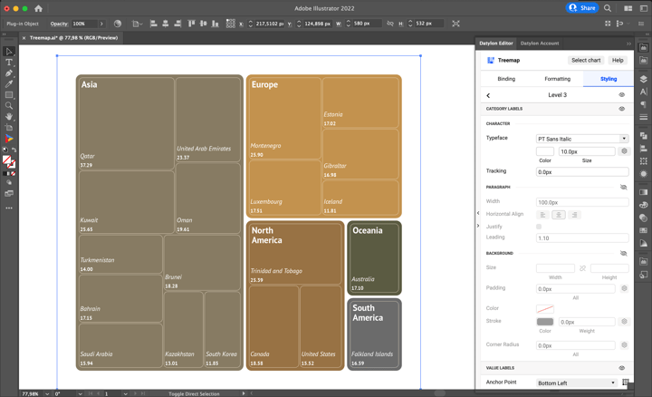
The font of the Categorical Labels can differ from Value Labels both in Size and Typeface. The Size of the font can take the place in the middle between the Category Labels of Level 2 and Value Labels of Level 3. As for the Typeface, the Italic will make the Categorical Labels stand out:
Level 3 > Category Labels > Character > Typeface > PT Sans Italic
Level 3 > Category Labels > Character > Color > #ffffff
Level 3 > Category Labels > Character > Size > 10px
And the treemap itself is done. Now all that is left is adding background, annotations, title, subtitle, and data source.
Step 6: Adding a title, subtitle and annotations
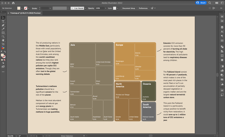
Before adding all the text elements to this treemap, let’s add a background – a simple rectangle with #eadcc7 hex color fill (don’t forget to send the background rectangle to the back). Add the annotations to the left and right sides of the chart. Try to use the same font size as in the largest labels from the visualization to make the font scale consistent and pleasing. Use bold font to highlight important details in the annotation. To connect the cells and annotations use curved lines.
The next step is to add the title, subtitle, and data source to our treemap chart design. The title should have the largest font (29 pixels in this case) and we decided to make it bold too. The font for the subtitle can be approximately ⅔ of the size of a title (18 pixels). The font for the data source can be approximately the size of the labels that were used in the chart. In this particular case, it is 10 pixels. Font colors for a title, subtitle, and data source are different variations of brown. This makes them a bit calmer than a plain black font.
Step 7: Using and sharing
And you're done! Congratulations.
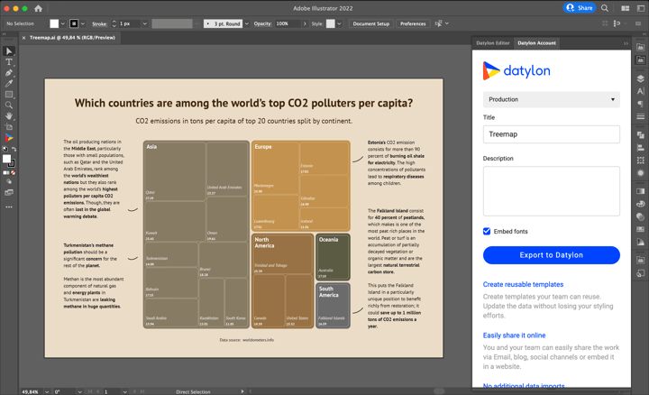
Once you are happy with your design, you can export this treemap chart as an image (PNG, SVG, etc.) like you would do with any other Illustrator project and use it in all kinds of tools like PowerPoint, Word, Excel, Google Slides, etc. You can also add the AI file to your Indesign documents and when updating the chart in AI, the link will make sure it is also updated in the Indesign document.
You can also export this treemap to our Datylon Report Studio and start collaborating on the template.
To do this, open the Datylon Account pane in Illustrator via Windows > Extensions > Datylon Account. Log in to your account, give the treemap a title and description, and export it to the Datylon platform. From here, you can easily receive and manage data, reuse your template by updating it with new data, or share the treemap design by publishing it for the world to see! You can also learn more about how to work with Datylon templates here.
Datylon Treemap Resources
- Blog: Deep dive into... treemaps
- Chart library: Treemap resource page
- Chart properties: Treemap properties


