A deep dive into... scatter plots
When I think about scatter plots, my mind takes me back to the years when I studied and worked as a neurobiologist, and performed a lot of research. During these years I created a lot of scatter charts to answer questions like: “Is there a correlation between age and the dopamine sparks in our brain?” or “Is depression related to brain activity in specific brain areas?
Scatter plots are regarded as the best choice for discovering correlations in data, like the questions I tried to answer. Ironically, it was the scatter graphs itself that probably helped create the notion of correlation and basic principles of modern statistics. But let’s start from the very beginning of the scatter chart history.
Table of contents
1. The history of scatter plots 2. How does a scatter plot work? 4. Using color in a scatter plot 5. Scatter plot as a basis for a beautiful visualization 6. Conclusion |
The history of scatter plots
It all begins in the 17th century when René Descartes created the cartesian coordinate system – a 2D plane with X- and Y-axes. Seems that it is all you need for a proper scatter chart, but at that time it was used solely for math studies. It was only the beginning of the 19th century when William Playfair started using the bar, line, and pie charts for visualizing real-world data. It seems that just a small step was needed from the line chart to create a scatter plot. But Playfair was more interested in exploring time series rather than the relationships between the variables, so there was little motivation for him to alter the charts he was using.
So when was the first scatter plot actually created? There’s no consensus about that. It’s apparent that what we today know as a scatter graph has been gradually developed over the years. That’s why it’s rather impossible to give full credit to just one person. But there are, in fact, some ongoing discussions in this regard. Michael Friendly and Daniel Denis suggested that the first scatter plot was created by John F. W. Herschel in 1833. He used a scatter chart in a scientific article to show the relationship between the positional angle of double stars and the year of measurement.
The scatter plot takeoff happened in 1870 when Francis Galton, the very creator of the correlation concept, started using scatter charts for his studies of genetics. From that point scatter graphs began to emerge and by now it is considered to be the most popular chart type used in scientific papers. But how do scatter plots work, you might wonder.
How does a scatter plot work?
A scatter plot is a set of dots plotted on a plane coordinate system representing two numerical variables: independent variable and dependent variable. A scatter graph is usually the first choice for the exploration of a data set since it makes it easier to find correlations between variables and to identify patterns in the data. When one of the dots does not fit the overall pattern of the data, it is called an outlier.
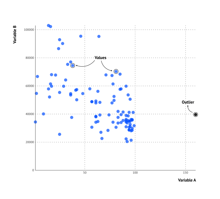 A basic scatter plot example
In order to draw conclusions from a scatter plot, you first need to know how to interpret them.
The first thing you can see is the form of the correlation: is it linear, exponential, or (inverted) U-shaped? A linear correlation means that the ratio of change is constant, so the value on the x-axis changes in the same way as the value on the y-axis. An exponential correlation means that the value on the y-axis changes more rapidly in relation to the value on the x-axis. Lastly, an (inverted) u-shaped correlation means that the lowest (highest) point is in the middle, and the peaks (minimum) are at the lowest and highest values on the x-axis.
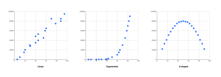 The forms of a scatter plot
Next, you can observe if the correlation is negative, positive, or if there is no direction. A negative correlation means that higher values of one variable are related to lower values of the other variable. For a positive correlation, it is the other way around. There is no direction observed if the value of one of the variables stays more or less the same and the other variable is changing.
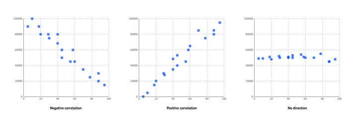 The directions of a scatter plot
Last, you can see if the correlation is strong, moderate, or weak. A correlation coefficient of 0 means that there is no correlation, a correlation coefficient between 0 and 0.3 means that the correlation is weak, between 0.3 and 0.7 means that the correlation is moderate, and between 0.7 and 1 means that the correlation is strong. You can see this in a scatter plot by the way the dots are following a pattern, or deviating from a pattern.
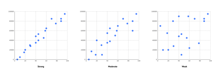 The strength of a scatter plot
Apart from finding an overall pattern in the data, a scatter plot is very functional in detecting clusters in the data. Clusters are groups of data that follow a specific pattern and there can be multiple clusters in one scatter graph.
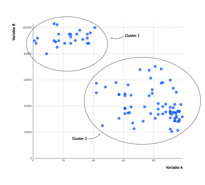 Clusters in a scatter plot
Types of scatter plots
We already showed you the scatter chart in its most basic form in the visual in the last paragraph. A basic scatter plot is plotted with the use of two numerical variables on the y-axis and the x-axis.
An example of such a basic scatter graph is shown in the next visual below (on the right). In this data visualization, the scatter chart shows the correlation between the distance and the speed of some Runkeeper results for 2019. As a practice, you can observe the correlation and think about the aspects you just learned; form, direction, and the strength of the correlation. Can you also find outliers in this plot?
The designer of this chart highlighted some of the dots by using the outline strokes on four of the dots. This gives context to the data and makes it easy for the viewer to retrieve conclusions from the data very quickly.
Sometimes a third variable comes into play to answer a research question. It is possible to add a third variable to the scatter plot as well and it can be binded flexibly. The type of scatter graph where the third variable is binded to the size of the dots is called a bubble chart.
A famous example of a bubble chart is from Hans Rosling. He presented a bubble chart animation in a TED talk and now this visualization is widely known as Hans Rosling or Gapminder chart.
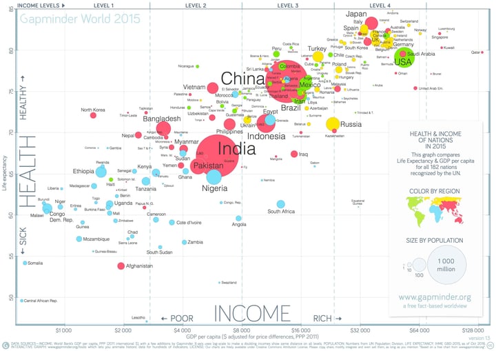 Famous Gapminder chart by Hans Rosling
In this scatter plot the income and health of all countries are plotted on the axes and the population of the countries is represented by the size of the dots. Moreover, a fourth variable is added to the color of the dots; the regions of the world.
This Gapminder chart clearly shows that scatter plots have a lot of flexibility in terms of variable binding; with some expansions, they can represent up to seven variables at once. You can use the X- and Y-axes, size, color, stroke color, icons, and labels to represent variables. But be careful. Too many binded variables can easily confuse the reader. It’s, therefore, better to limit the number of binded variables to a maximum of four, just as in the Gapminder chart.
Most of the time a scatter graph is created with two numerical variables. However, a scatter graph also works with one or two categorical variables. This type of scatter chart is called a categorical scatter plot.
In the visual above, one categorical variable and one numerical variable is shown; on the x-axis the years are plotted (categorical variable) and on the y-axis, the money spent is plotted (numerical variable). The dots represent movies of the 21st century.
If you are wondering why "year" is a categorical variable, we recommend you read our article about terminology in data visualizations.
As you can see in the data visualization above, the dots within one year are distributed horizontally within the year. This has no meaning in itself but is done because otherwise, the dots will be overlapping, making them less visible. This way of distributing the dots is called jitter and the plot is therefore not only a categorical scatter plot but also a jitter plot.
There is also another way of using categories in a scatter chart. It is possible to divide the scatter graph into four equal parts, or quadrants; hence the name quadrant chart. A quadrant chart is useful if you want to group data marks for some specific type of analysis.
An example of such a quadrant chart that you probably see once in a while is the political spectrum where political parties are placed in a quadrant. An example is shown below where the political parties of the Netherlands are located as dots in the quadrant. The left bottom quadrant represents the conservative left wing, the left top quadrant the progressive left wing, the right bottom quadrant the conservative right wing, and the right top quadrant the progressive right wing.
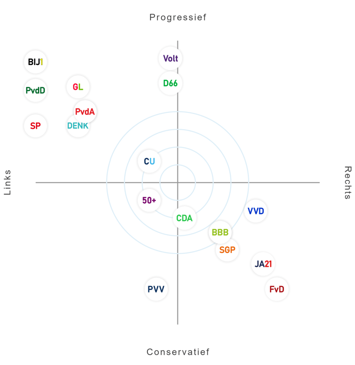
The Dutch political spectrum in a quadrant chart
Besides using quadrant charts for categorical data like the political spectrum, they could also be used for numerical data. In this way, the origin of the axis lies in the middle and represents zero. The values of the y-axis increase to the top and decrease on the bottom and values of the x-axis increase to the right and decrease to the left. The origin, or zero, is most of the time located in the middle of visualization.
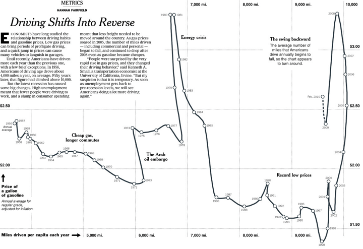 Connected scatter plot by Hannah Fairfield
The beautiful visualization above is created by Hannah Fairfield of the New York Times. This visualization shows the relation between driving habits and gasoline prices in a connected scatter plot. The miles driven per capita each year are shown on the x-axis, the price of gasoline is shown on the y-axis and the dots represent the years.
What makes this type of scatter chart so fascinating is that the dots are connected by a line to show the order of the data. This makes it possible to show some remarkable moments in time such as the energy crisis when the price of gasoline drops enormously. At Datylon we are a big fan of using annotations to give context to the data, which is something Fairfield did really well. She pointed out all notable moments in time where the data doesn’t follow the standard pattern.
To make the chart even faster interpretable, Fairfield could also have used highlights to show what annotations belong to which dot or period. In that way, the viewer is drawn immediately to the most important parts of the chart and doesn’t have to find out themselves which annotations belong to which dots or periods. This could be done by using different colors or strokes for the concerned dots.
Using color in a scatter plot
Speaking about using colors; there are a lot of ways to use color in scatter charts. First, categorical coloring can be used for groups or clusters in the data. In the Gapminder chart, the regions of the world are binded to the color of the dots; all different regions are represented by a different color which makes it very easy to distinguish them. Along these lines, colors can also be used for different clusters in the data. In the example I have shown, the clusters are emphasized by a line around the dots. Though, these clusters can also be shown by using different colors for the clusters. Besides categorical coloring, it is also possible to use numerical coloring in a scatter plot. We do not particularly advise you to do this, but if you don’t mind challenging the audience’s chart reading skills, you can go for it!
Check out this resource page to learn more about the numerical coloring of scatter plots.
Moreover, the color could be used to highlight important information in a scatter graph, as shown by the data visualization about Runkeeper results in 2019. Highlighting with colors can be done in a lot of different ways and they can also be combined. Highlighting could be done by using color fillings of the dots or strokes. These color highlights can be combined with other types of highlights like size, icons, or labels. In the data visualization of 2019 Runkeeper results, three types of highlights were used: size, stroke, and labels for four of the dots. This immediately draws attention to these dots which makes it easy to draw conclusions quickly.
As already shown in the data visualization about the highest-grossing movies of the 21st century (above), colors can also be used to show ranges in the data. In this chart, the dots of every $500M are colored differently, making it easier to quickly see which movies belong to which price range. For this chart, the ranges are used for the values of the y-axis, but ranges can also be used to show different categories for values on the x-axis or even a combination of these two.
In the next visualization below about grand slam tennis champions created by Mark Edwards, colors are used very creatively to show ranges for a combination of the x-axis and y-axis. The x-axis shows the years, the y-axis shows the age at the win and the color ranges represent the years in which the champs were born.
Edwards beautifully shows how colors can be used in a unique way and how size can be binded to an extra variable, in this case, a number of titles won at that age. As you can see in this chart, overlapping dots are a very characteristic feature of scatter plots. Sometimes, one scatter graphscan have quite a few such overlapping dots. There are several ways to make every dot clear and visible. Edwards used strokes around the dots to clearly show the overlapping values, which works really well in this case. Though, sometimes using strokes can make the chart look cluttered. An alternative is to apply opacity to the dots between 0.5 and 0.8 for the best effect.
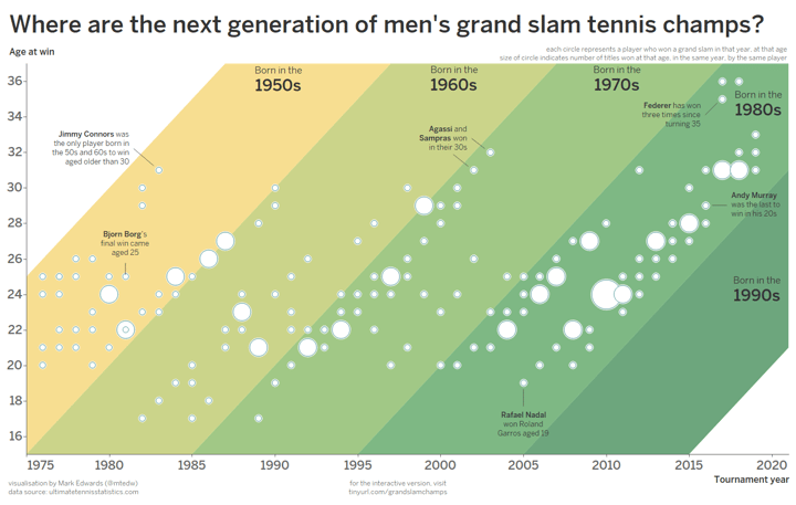
A scatter plot with colors used for ranges. Visualization by Mark Edwards.
Scatter plot as a basis for a beautiful visualization
Scatter plots can really well serve as a basis for a beautiful data visualization. One famous data visualization designer that uses scatter graphs sometimes as a base for her unique data visualizations, is Federica Fragapane. She starts with data that she visualizes in a scatter chart and then creates beautiful elements around this base.
An example of such a creative and appealing chart is shown below in the visualization of the most violent cities in the world in 2017. Do you recognize a scatter plot in it? Fragapane plotted the population in millions on the y-axis and for the x-axis, she used the cities ordered for homicide rate as categories. She really mastered the scatter graph and decided to take it to a whole new level.
Discover how to master the rules of data visualization, and thoughtfully break them.
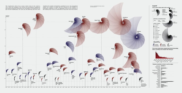
What also really stands out in this chart is the use of icons/symbols. The data in the scatter plot is subdivided into countries and these countries are represented by several different symbols. Moreover, in this chart, the use of colors is not meant to represent categories, like most scatter graphs, but rather represent an increase or decrease in the number of homicides compared to 2016; really intriguing.
Federica Fragapane is truly an inspiration, which is why I attended her data visualization workshop last year. During this workshop, I started with the design shown below about Vincent van Gogh’s letters to his brother Theo. After the workshop, I finished the design for my participation in one of the storytelling with data challenges, which was perfect for this dataset. Do you see the influence of Federica Fragapane in it?
The data visualization was created by first visualizing a scatter plot with the number of letters on the y-axis and the years as categories on the x-axis. Hereafter the flower petals were added to show the topics they wrote about and how these topics were divided per year. To give context to the data, some annotations were added to the chart.
Conclusion
In conclusion, scatter plots, with their simple yet powerful design, have become indispensable charts for exploring and understanding data relationships. From their humble beginnings in the 17th century to their modern-day applications across various fields, scatter charts have proven their ability to reveal hidden patterns, uncover correlations, and inspire innovative visualizations.
By mastering the art of creating and interpreting scatter plots, you can find valuable insights and communicate your findings effectively to audiences of all backgrounds. So, whether you're a scientist, a business analyst, or simply someone curious about data, embrace the scatter graphs as a versatile and essential tool in your data visualization toolkit.
The simplicity of the scatter plot's data structure and design makes it a prime candidate for automation. With Datylon's Report Server, you can easily set up a connection to your data source, provide the scatter chart template, and automate the generation of new charts with updated data. While using data labels for each dot can sometimes be challenging when automating the scatter plot, you can mitigate this by leaving them out or by conditional formatting. With conditional formatting, you can add data labels for specific data points within the scatter graph based on a specific value for example. For more advanced automation tips, explore our dedicated article on future-proofing your charts for automated reporting.
To learn more about automated reporting and how Datylon can benefit your organization, schedule a demo with one of our experts or consult our comprehensive guide on automated reporting.
Further reading & resources
- Scatter plot resource page - Your starting point to create scatter plots, full of useful design tips for stunning data visualization.
- Scatter plot properties - Discover all styling properties in Datylon and use them to design your own scatter plot.
- "Correlation Coefficient: Simple Definition, Formula, Easy Steps" - Learn how to calculate correlation coefficients or how to perform statistical analysis on your data.

Dieuwertje van Dijk - Data Visualization Designer
Data, graphic design, illustration, food and mountains let her dopamine neurons spark on a daily basis. Most of the year she lives in Georgia where she spends her free time enjoying nature in a rooftop tent, eating khinkali and drinking wine.

