Do you speak dataviz?
Are you a newcomer to the data visualization world? Or are you struggling with some terms in data visualization? This blog article will guide you through the most common terms that will come in handy when designing your own data visualization.
Table of contents
1. The dataset 2. Types of data visualization 4. Connecting the data variables to a chart 6. Annotations 7. Scales 8. Colors 9. Automated data visualizations |
The dataset
A good place to start with terminology in data visualization is with the dataset that you will be using for your data visualization. In this blog article, we will not go into the terminology of the dataset. In our previous article in the series, "Do you speak data?" we wrote about the essential data and statistic vocabulary. Make sure to get yourself familiar with key terms and phrases in regard to your dataset.
Types of data visualization
If you understand the terminology of data and statistics, you are ready to continue with our glossary of common terms in data visualization that we will discuss now. Creating a data visualization starts with thinking about the goal and type of chart that you will use. And for this topic, there are a lot of terms that might sound unfamiliar to you.
Let’s start with two ways of visualizing data, which are dependent on the goal of your visualization. An explanatory data visualization is a visualization that should be easy to understand without any interaction from the reader, like an infographic or report.
On the other hand, an exploratory data visualization such as a dashboard, interactive chart, or interactive website requires some interaction from the reader to fully understand the information that is presented. It might be done by having to hover on the chart to see details, or to click on the visualization in order to filter the data.
These two general ways of visualizing data can take different forms.
Types of charts
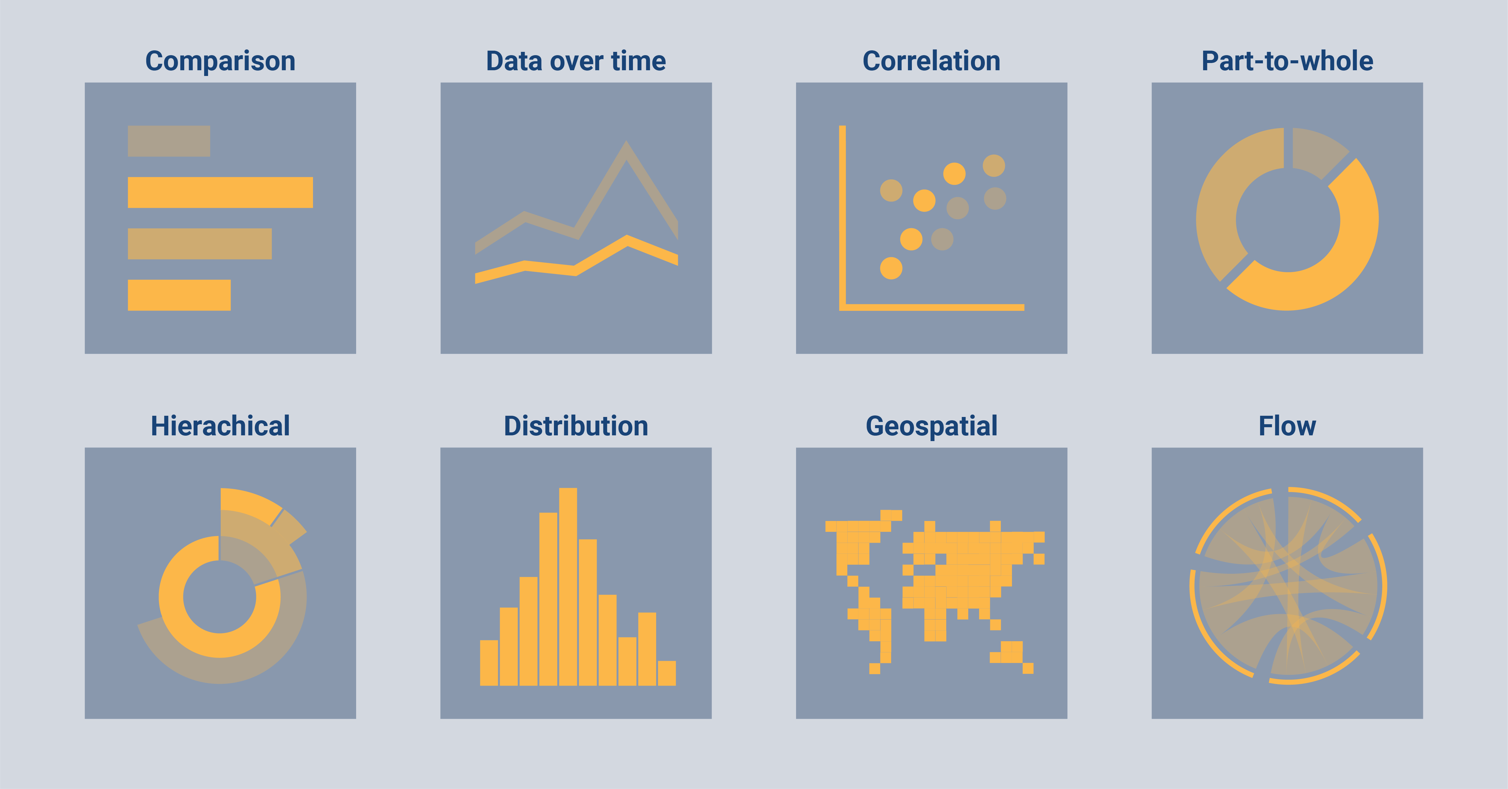
Besides categorizing types of data visualizations, we can also categorize types of charts into eight categories:
Comparison: Charts of this type are a good choice if you want to compare the value of multiple categories with each other. Examples of comparison charts are bar charts, dot plots, or spider charts.
Data over time: For this type of data you want a chart that can show the evolution of the data (or in other words, how the data changed with time). Examples of such charts are line charts, area charts, or bump charts.
Correlation: When you are interested in the relation between two variables in your data, you can best visualize the data with a correlation chart. Examples of charts that are suitable to show correlation are a scatter plot, a bubble chart, or a heatmap.
Part-to-whole: It can also be that you are not (mainly) interested in comparing between categories but within one category. For this, you can use a part-to-whole chart such as a stacked bar chart, a pie chart, or a donut chart.
Hierarchical: Sometimes categories are related to each other because one category can be subdivided into smaller subgroups. This type of data is called hierarchical. You can visualize hierarchical data with a treemap, a dendrogram, or a sunburst chart, among others.
Distribution: During the exploration phase of the data, you might be interested in the distribution of one of the variables. With a distribution, you can see the frequency of a value in a dataset. Charts that are perfect to show the distribution can be a histogram, a density plot, or a box plot.
Geospatial: It could be that one or more variables in your dataset are geospatial. This means that the data includes information about the location and characteristics of the variable combined with information about the time when the characteristic at the specific location existed. A geographic heatmap, a tile map, or a choropleth map can all be used to visualize geospatial data.
Flow: The last category includes data where flows or connections exist between several categories. Examples to visualize flow data are a chord diagram, an arc diagram, or a Sankey diagram.
We had previously researched and elaborated on different types of charts and graphs. For your convenience, we listed 80 of the most common charts in data visualization in one article, grouped them into their categories, and provided visual examples of those charts that can be designed with Datylon. If you haven't seen it yet, don't miss out on the most comprehensive resource available on the Internet!
Connecting the data variables to a chart
Now that you know everything about all types of charts and their categories, you are ready to learn all terms related to connecting the data variables to a chart.
First, you need to bind your data variables to specific elements of the chart. This means that you let the tool or programming language know which variable you want to connect to a specific part of the chart. You can for example bind variables to the x-axis, y-axis, color, size, icons, or labels. The types of binding possibilities differ for every type of chart.
Some charts can only fit one series whereas others can fit multi-series. Series represent the number of subgroups that are shown in one chart. For example, a bar chart can only fit one series, whereas a grouped bar chart can fit multiple series (which is why it belongs to the multi-series chart types).
It can differ per tool how you should be able to bind series or multi-series to a chart. With the Datylon for Illustrator plug-in, it is very easy to see if you are dealing with one series or multi-series; every series has its own binding tab.
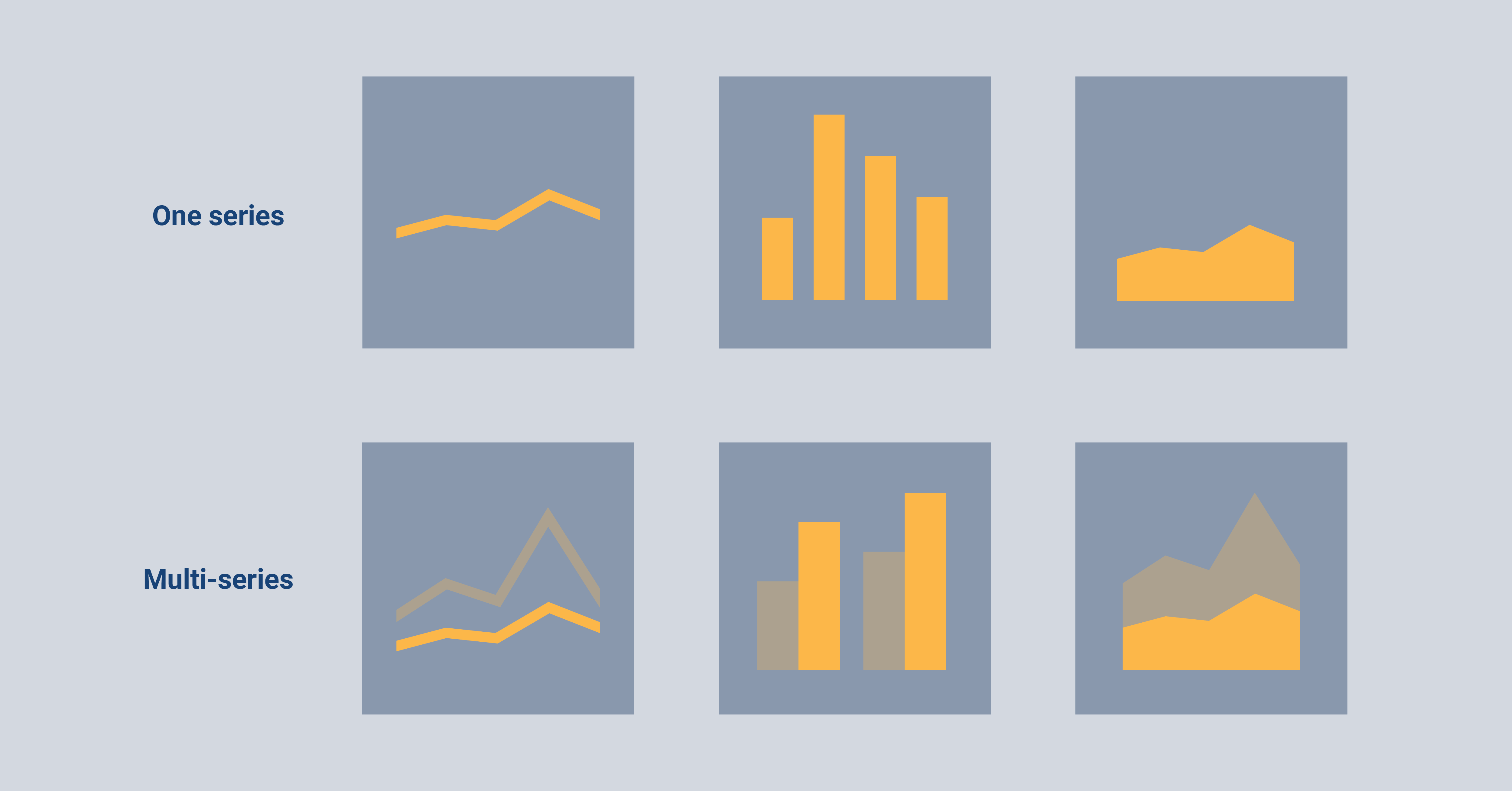
After you are done binding your variables, it might sometimes be necessary to check the formatting of the data, depending on the tool or software you are using. We will not go into detail about the formatting of data in this article, but if you're interested, you can check out our resource of all terms related to data and statistics, which includes data formats.
Chart elements
All charts consist of different elements that should be carefully thought about and designed to your preferences. With the Datylon for Illustrator plug-in, you are able to style each of the elements according to your liking. In the next paragraphs, I will discuss all elements in detail.
The background
Let’s start with an easy one; the artboard. This is a surface on your screen in which a design or chart will be located. In the case of building a chart, the terms artboard, chart area, or background area can be used interchangeably. You can see it as the background of your design and with most tools or software you have a lot of flexibility in the styling options for the artboard.
When zooming in a little, the background of the actual plot is called the plot area. This is the area that is as wide and high as the plot itself. Often it is not necessary to give the plot area a specific design when you already have styled the artboard.
The axes
Then we can continue with the most important elements of a chart, the axes. The horizontal axis in a chart, also called the x-axis, is the line that usually stretches from left to right for left-to-right scripts. On the other hand, the vertical axis that usually stretches from bottom to top is called the y-axis. My mnemonic to differentiate between these axes is that the tail of the y goes down. However, axes can also be flipped (i.e. to adjust your chart for right-to-left reading audiences) and we made it easy to do this for both axes in the Datylon for Illustrator.
The point where both axes intersect is called the axis origin, which is at the (0,0) point; at this point, the y-axis and x-axis are both zero. Sometimes it is necessary to let your y-axis start at a different point than zero because it makes the data easier to interpret. We then speak about changing the baseline of the chart.
As Edward Tufte once said: “Use a baseline that shows the data, not the zero point.” However, be really careful with this since this is not recommended for most types of charts. The line chart is an exception where it is more important to show the trend in the data rather than letting the y-axis start at zero.
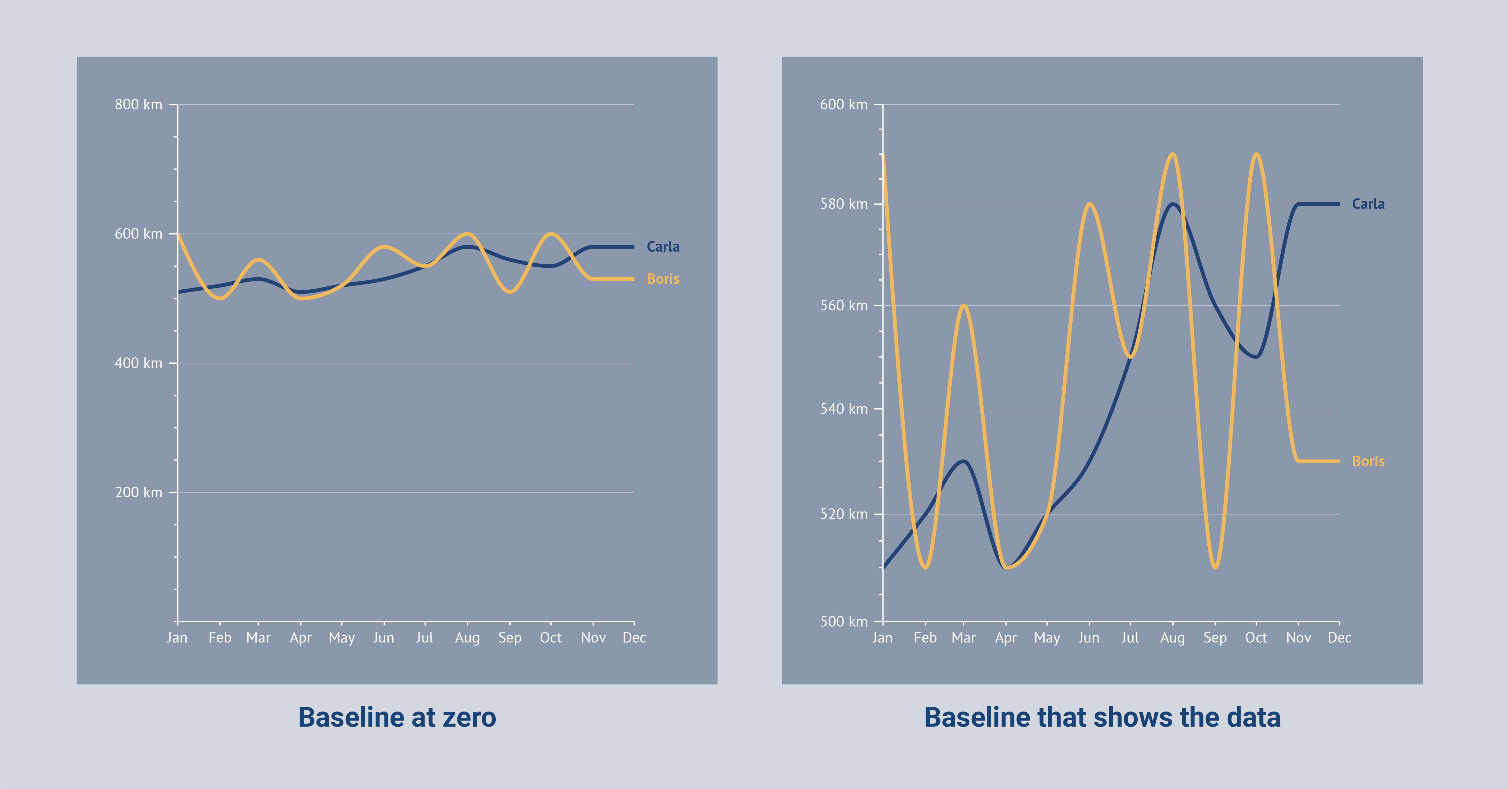
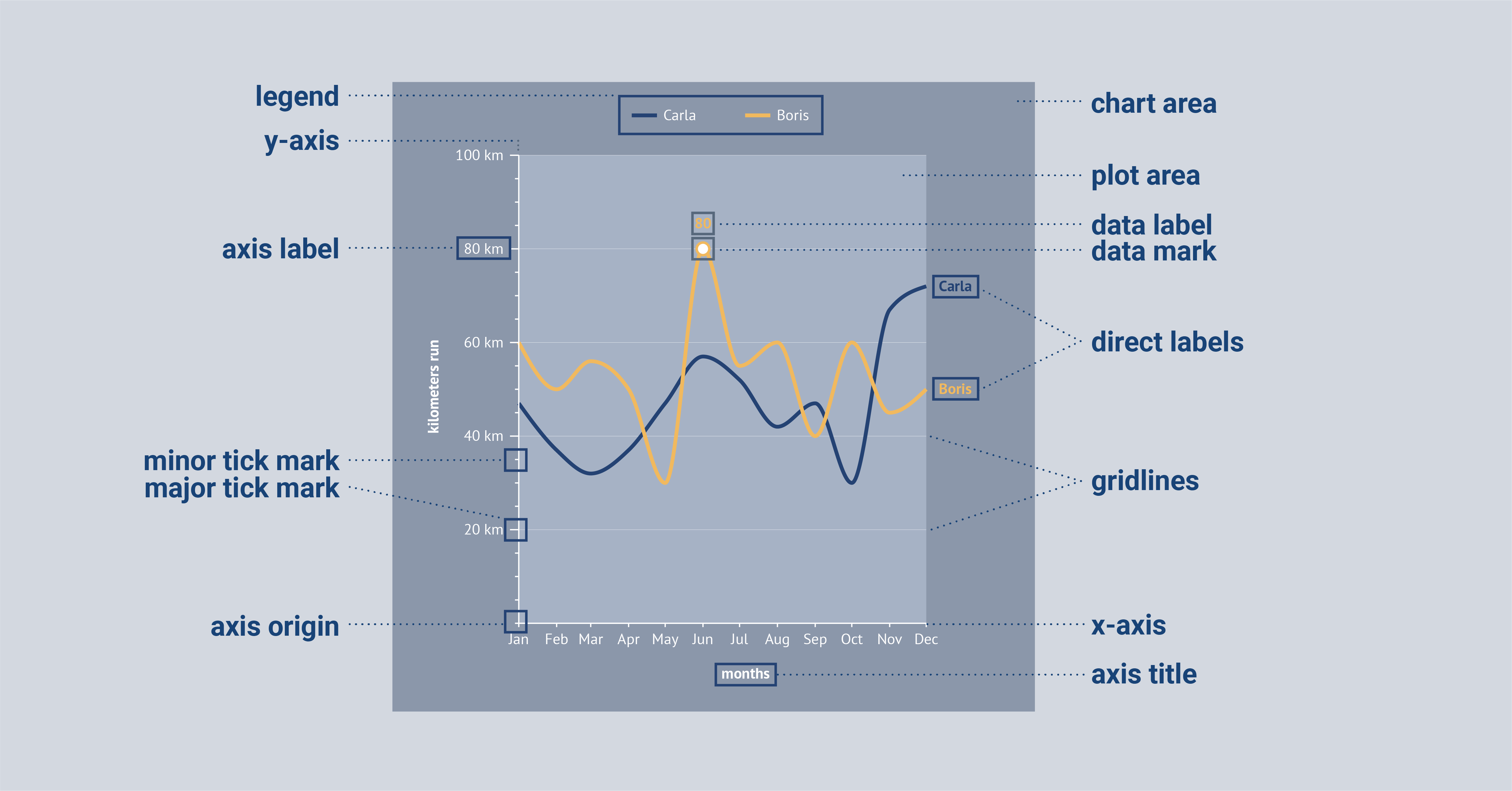
In a chart, both axes have some common elements. They both (can) have an axis title that shows what the values or categories on the axes mean. The axis labels are textual marks that show the divisions of the axes in the form of a category or value. To make the demarcations of the axes even more clear, ticks/tick marks can be used in place of or with the axis labels (major tick marks) and in between the axis labels (minor tick marks) to show the smaller divisions. Horizontal and vertical lines can also be added to the chart to create small squares in the chart, also called gridlines. These gridlines make it easier to locate and interpret a data point in the chart, especially when the data point is not labeled.
Other elements
Gridlines and axis labels can sometimes better be replaced with data labels. Data labels contain the value of a data point and are directly located next to a data point. In this way, the reader can interpret the data faster.
Generally, we recommend keeping a data visualization as calm as possible by limiting the use of extra design elements. In other words, the data-ink ratio should be maximized as much as possible. This means that all elements of the chart should be removed that do not add to conveying the message as clearly as possible. Besides removing gridlines and axis labels, tick marks often also do not add to the understanding of the data. So tick marks are a good candidate for removal for maximizing the data-ink ratio.
Another element that you can add to a chart (and now also to your data visualization vocabulary ;)), are data marks. Data marks are icons that can be placed to accentuate a data point. For some charts, they are essential, e.g. the dots in a dot plot or in a scatter plot. For other charts, it is a possibility to add them but often they do not add anything to the understanding of the chart, e.g. bar charts. Line charts are an example of where they can be useful but often they can be removed from the chart as well.
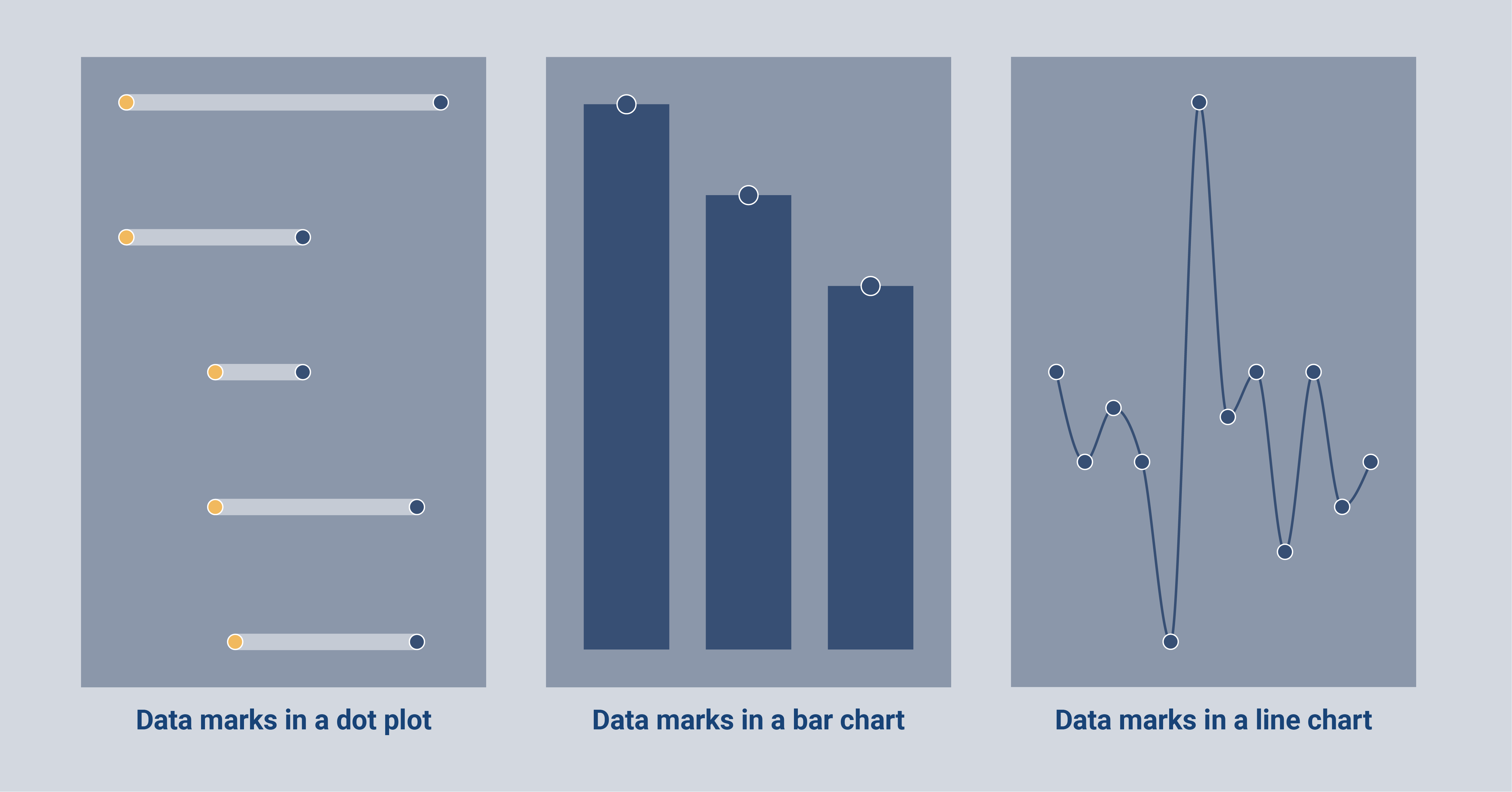
Just as data marks, legends can also often be removed from charts to maximize the data-ink ratio and to interpret the data faster. Legends are the part of the chart where its elements are explained in detail. In many types of charts, the legend can be effectively replaced by direct labeling.
Direct labeling is a way of explaining the data in a more convenient manner. Categories can for example be placed next to the lines in a line chart, or in the bars of a bar chart. This way, the reader doesn’t have to look back and forth to the legend to find out which element belongs to which group. Moreover, this type of labeling is also very beneficial for people with visual impairments.
Next to adding data marks on top of data points, error bars can be applied as well. Error bars are those little vertical lines that you might have seen on some charts, like bar charts or line charts. They are used to indicate the uncertainty or variability in the data. In other words, they show how much the data points on the chart might vary from the true value. This can be helpful for understanding the reliability of the data and drawing conclusions from the chart.
Annotations
In the above visual, I showed you the elements of a chart with the use of some explanatory texts. The texts that can be added in a visual or chart to explain an element in more detail are called annotations. At Datylon we are evangelists of using annotations in data visualizations to give context to the data. Therefore we made it very easy to include annotations in data visualization made with our Datylon for Illustrator plug-in.
Besides giving context annotations can be used to explain a topic, highlight specific information or add some data storytelling to your visualization. Check out this article to see how annotating your charts adds to the effectiveness of your data visualizations.
Scales
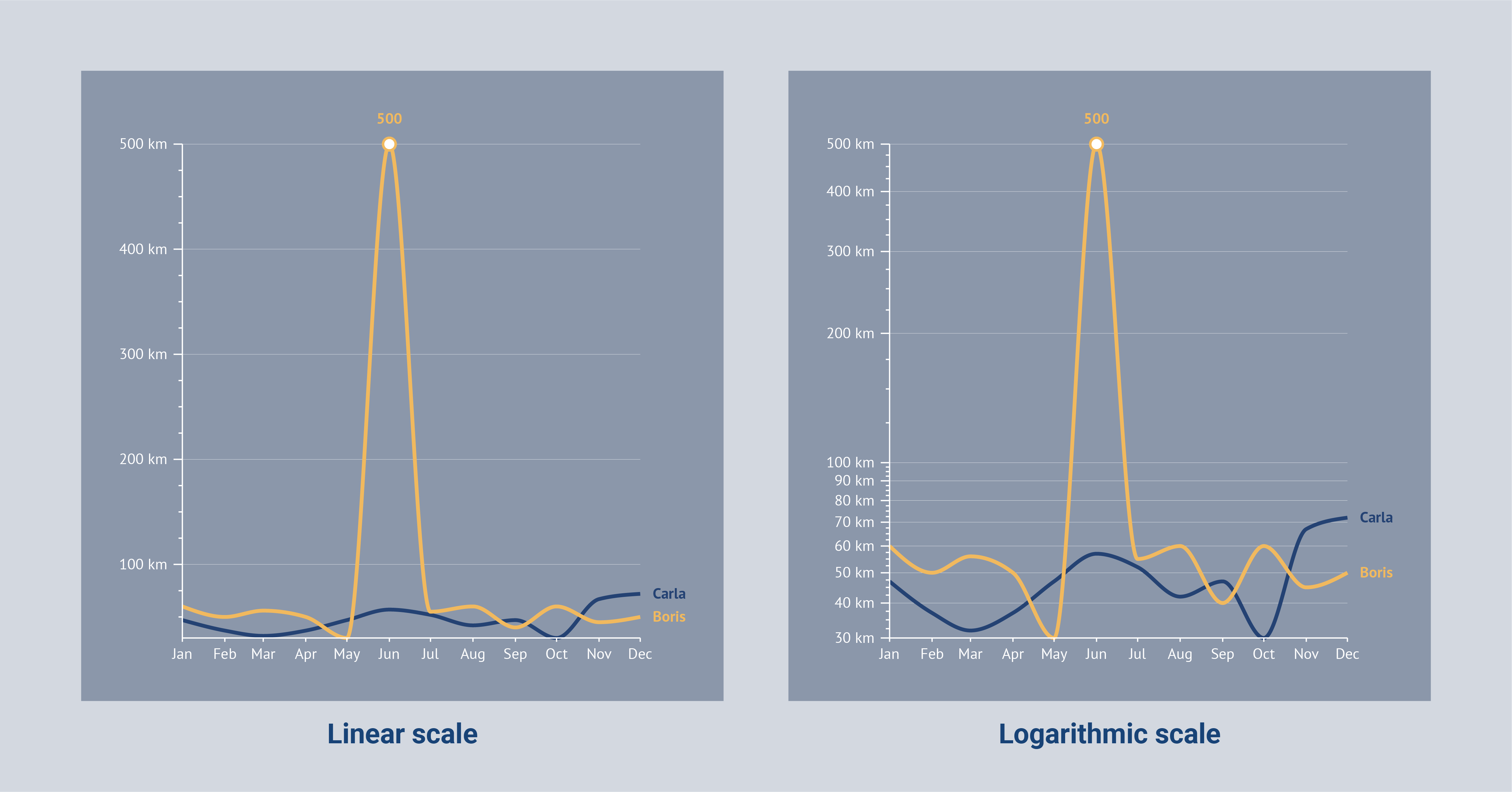
Now let’s look closely at the axis of a chart. Axes always have a scale; the parts into which the axes are subdivided. Scales are an important aspect of data visualization as they help to effectively display the data in a way that is easy to understand. There are two types of scales that are commonly used in data visualization: linear and logarithmic.
A linear scale is a straight-line representation of the data, where equal distances on the scale represent equal differences in the data. This is the most common type of scale and is typically used for data that is evenly distributed.
A logarithmic scale, on the other hand, is a nonlinear scale that is used to represent data that has a large range of values. In this type of scale, the distance between each tick mark on the scale increases exponentially as the value increases. This allows for smaller differences in the data to be more easily visible.
Both linear and logarithmic scales have their advantages and disadvantages, and choosing the right scale for your data visualization is important to effectively convey the information.
Colors
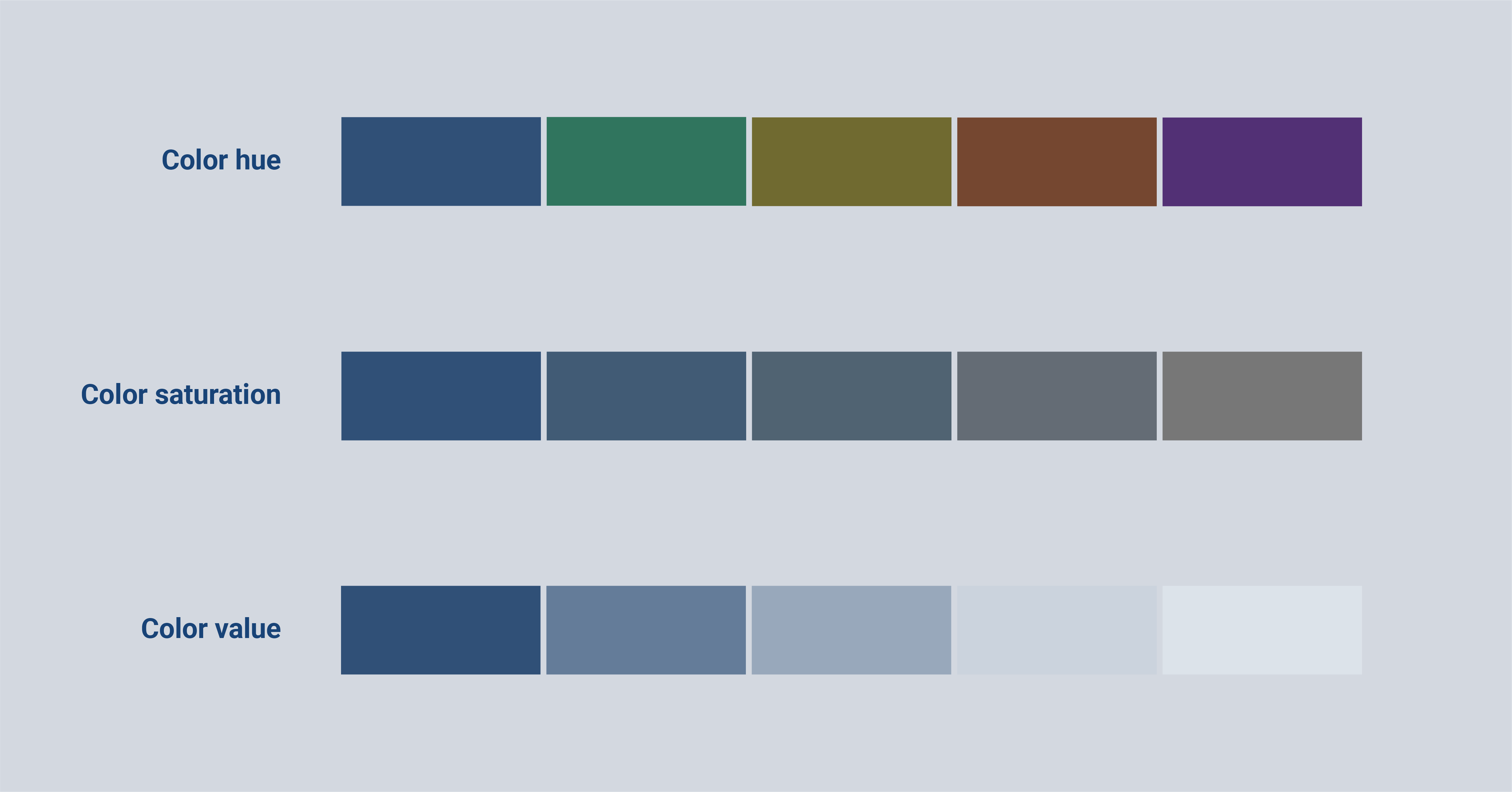
Choosing the right colors for your project is a very essential step in data visualization. And I can imagine that some terms can be a little bit confusing. Let’s start with the most elemental term; color hue. Color hue is the one people speak most about, it’s what we mean by green, blue, or red.
The next term is already a bit trickier; color saturation. With color saturation, we mean how intense the color is. When the saturation is very high, the color is very intense. When the saturation is very low, it comes very close to being gray. To dive even a little deeper, the color value means how dark or light a color is, while the hue stays the same.
Colors in data visualizations can be used in different ways. Almost all elements of data visualization can be styled and when we style it, we speak about fillings and strokes.
The filling of color is the color you add to the whole element that you are styling.
The stroke of an element is the outline of an element and can generally be adjusted as well. The color and the size of the stroke can usually be adjusted to style a data visualization totally up to your wishes.
To convey the message of the data the best, you want to choose a good color palette.
A color palette is the range of colors that you will be using for your data visualization.
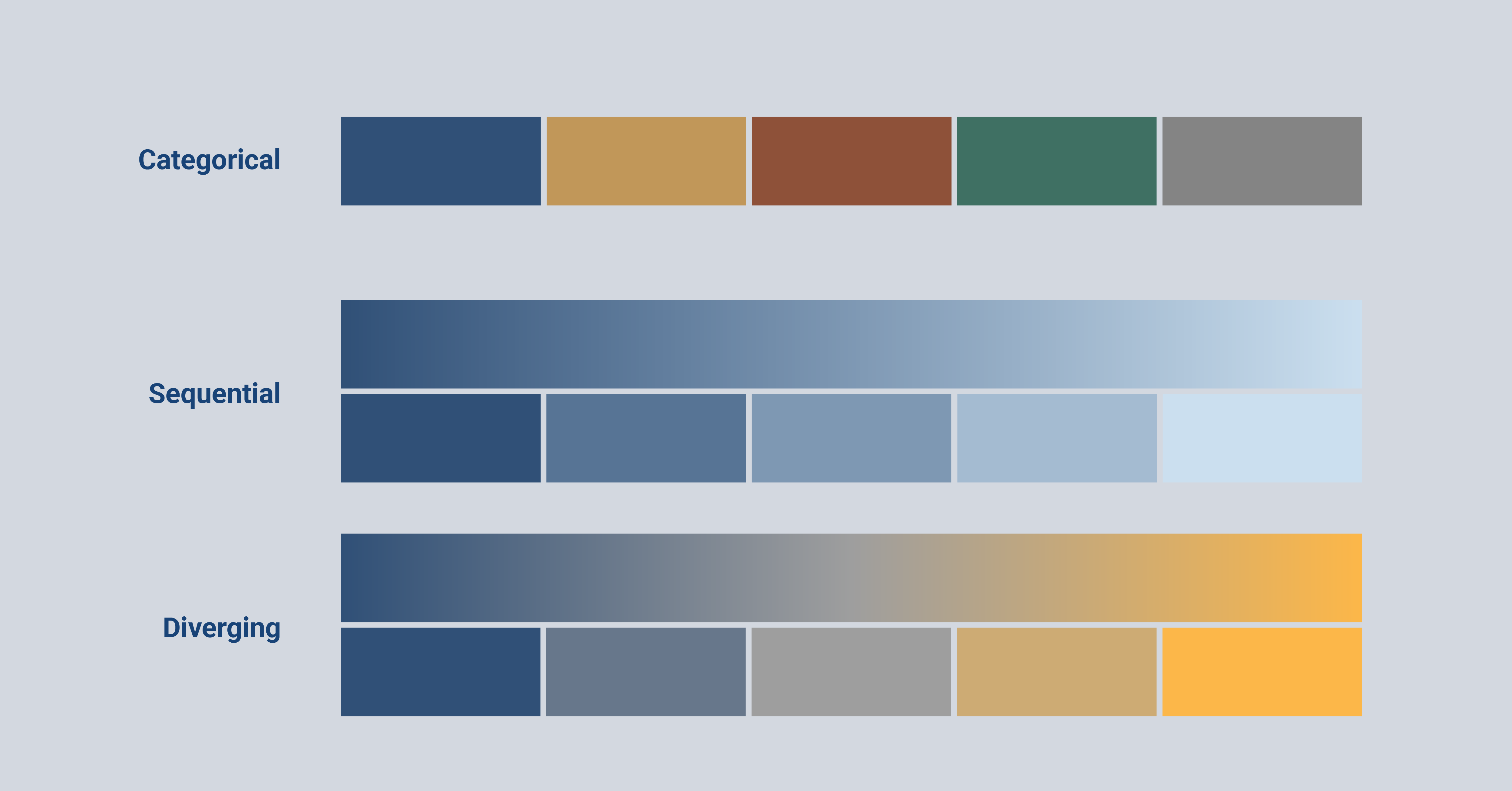
There are three types of color palettes that are commonly used in data visualization.
A categorical color palette is used in data visualizations where categories are compared. This type of color palette uses a number of distinct colors with differences in color hue and color saturation. The colors in this palette each represent a different category of the data.
In contrast, a sequential color palette is used for numerical values. This type of palette uses a range of colors where a light color value represents low data values and a darker color represents higher data values. This range can be in the form of a stepped color scale where the colors are split into bins. Or they can be in the form of a gradient which we call a continuous color scale. It is possible to use one, but also multiple color hues for this color palette to make the colors more distinct.
The last color palette is a variation of the sequential color palette; a diverging color palette. This type of color palette is also used for numerical values with the difference that this one is used for data with a clear midpoint. This type of palette generally consists of two different color hues that vary around a midpoint. The color becomes lighter closer to the midpoint and turns darker further away from the midpoint. Just like the sequential color palette, this color palette can include a stepped color scale or a continuous color scale.
Automated data visualizations
Once you've created your perfect chart or report, you might want to reuse it for recurring tasks. For instance, if you create monthly reports, you can avoid the hassle of manual updates by using chart templates or report templates. These templates act as blueprints, allowing you to quickly generate new charts or reports with fresh data.
Automated reporting tools like the Datylon Report Server make this process a breeze. By providing your template and connecting to a data source using an API (a set of rules that allows different software programs to communicate), you can automatically generate updated charts or reports whenever new data becomes available. This saves you time and ensures consistency in your reporting.
Let us know what we should include
In this article, you learned many terms that are commonly used in the data visualization field that might come in handy when you are interested in creating your own charts or graphs, reports, infographics, and other visualizations. We explained to you the most prevalent terminology in steps from beginning to end of creating a data visualization.
If you have any data visualization terms that you struggle with and want them to be included in this blog article? Let us know 😉
👉If you're keen on crafting custom data visualizations, visit our Bespoke Data Visualization Solutions page.
Further reading & resources
- Do you speak data? - the essential data glossary will help you cover the basics of the most important terms in data and statistics you might need for your data visualization.
- A guide to effective data visualization - visualizing data makes it easier to process, analyze, and communicate the data. Check out the five steps to improve your next dataviz project.
- 80 types of charts & graphs for data visualization (with examples) - the most complete list of popular and less known types of charts to use in data visualization.
- 9 types of data visualization - discover the world of dataviz and learn about the way you can display your data and how to tell your data story to your specific audience.
- The best data visualization tools - a comprehensive list of the best data visualization tools for your data stories and various dataviz projects.

Dieuwertje van Dijk - Data Visualization Designer
Data, graphic design, illustration, food and mountains let her dopamine neurons spark on a daily basis. Most of the year she lives in Georgia where she spends her free time enjoying nature in a rooftop tent, eating khinkali and drinking wine.

