A guide to effective data visualization
The total amount of data in the world is increasing extremely fast. It is forecasted that the total amount of data created, captured, copied, and consumed will grow to over 180 zettabytes by 2025. Also in organizations, data is becoming more important than ever. Decision-makers in organizations use data to gain insights into their operations and customers and to find out about developments in the industry.
To avoid overwhelming the brain when consuming data, visualization plays an important role. Visualizing data makes it not only easier to process it, but also to analyze and communicate the data, which will help in making important decisions. But what is the most effective way to visualize data, you would ask.
We created a guideline for effective data visualization for you, which consists of five essential steps. In the next paragraphs, we will elaborate on them in detail.
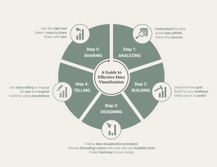
The five steps of effective data visualization
Step 1: Analyzing
A data visualization starts with the main ingredient: data. According to Elevate, there are four genres of data stories, each with its own type of data. The first genre is a question you want to answer with the data. This means that you can approach your data project in a scientific way by setting up a hypothesis and finding a conclusion with the results. For setting up a hypothesis it is helpful to use a falsifiable universal statement, such as “all cats like to cuddle”.
Another type of genre is to show how an event happened, which is most of the time a chronological story. An example could be: “Are there more protests happening nowadays than before?”. Besides these two types of data story genres, there are two more: showing how some process works or just exploring a really cool dataset to find out what you can learn from it. Do you recognize your data stories in one of the four genres from Elevate?
For all these types of data story genres, it is really important to take confounding variables into account. For the example of the protests, you can ask yourself if it really is the case that more protests are happening or that there is an information access bias at work here. A change in data due to changes in information access is a typical data pitfall you want to avoid in your data story. So be really careful with your data and always think about the perspective of the data you are working with.
Another important thing to keep in mind is that most data is collected from a sample of the population, so always remember that the data does not reflect the whole world. Therefore, it is best to mention in your data visualization what sample was taken. Moreover, for all types of data stories it is really important to check the sources you are using and find out if they are reliable. You can do this by checking the reputation of the source, the reviews and endorsements, credentials and affiliations, the sources the author used, and if the data is up to date.
If you reviewed your dataset and passed this first step, you are ready to start thinking about the building process of your data story.
Step 2: Building
Now it is time to build, you would think. However, before you start building your data visualization there are some really important points to review. The first one is the goal of your data visualization. Are you creating a data visualization to explore or explain a specific topic? Does your data visualization need to be detailed and scientific or is it more important that a broader audience understands it? These are some questions you should ask yourself before you start building your data visualization. Select the right type of data visualization(s) that will help you tell the data story, following the answers to these questions. For example, an infographic is perfect to explain a topic to a broad audience and make it fun and engaging to look at. However, it is less effective to use if you want your viewer to explore the topic in detail.
In line with this, it is essential to think about the audience you are building your data visualization for. Do they have basic knowledge about data visualization or do they need some guidance? Which details should I include to make the visualization easier to understand? How can I make my data visualization engaging to the public? And last but not least, is my data visualization even useful to them? For example, if you have to design a data visualization for someone to make decisions about hiring new employees in a hospital you would make other choices in your building process than when you are designing a data visualization to show the public how to use a facial mask.
If you made it clear to yourself what the goal of data visualization is and who you are building it for, it is now time to start with the next part: designing.
Step 3: Designing
When designing a data visualization there are a lot of aspects you have to take into account. Start with the basics and think about the data visualization principles you have to pay attention to.
It is generally recommended that:
- Bar charts should always start at zero.
- Data should be ordered if there is no logical/natural order in the categories.
- Gridlines should be removed (for most charts).
- Axis text shouldn’t be rotated. Instead, it is better to swap the chart from vertical to horizontal.
- Direct labels should be used.
- Data-ink ratio should be minimized.
Though, sometimes it is fine to break these rules if it helps to convey the message of the data story more clearly.
Another really important thing to consider in the design of data visualization is the use of colors. Don’t use colors just because you want to use them. Colors are a very powerful tool in data visualizations to bring the message of your story clearly across. Therefore, we recommend only using colors if it really adds something to the visualization, like for example highlighting the most important category.
In addition, colors can be used to support the branding of an organization. But even then we recommend using them with care.
When adding colors to your visualizations, we suggest using a colorblind-friendly palette.
There are around 300 million people in the world who are colorblind. About 8% of men and 0.5% of women are colorblind, so making your chart color blind safe is a reasonable thing to do.
Besides color, fonts play an important role in the readability of your design. You should think about how you are going to present your data visualization; will it be printed, or will it be a visualization to show on a website?
For printed data visualization we recommend not using a font size smaller than 6pt; as for screens, it's best to use at least 9pt.
Moreover, fonts are a powerful tool in showing hierarchy in your visualization. The most important parts like the title and subtitle deserve the most attention and will work best with big font size. Less important parts like the axis labels or legends will work with smaller font sizes. Though, it makes sense to think about the type of data visualization you are creating. For example in infographics numbers are often depicted in bigger font sizes than numbers in a scientific report. Besides the size of a font, the type of a font is really important for the readability of a data visualization.
We strongly advise against using any handwritten or script typefaces.
If you care about making your data visualization truly effective, there are more things to take into account. Think of the combination of fonts and colors. The contrast between the color of the fonts and the color of the background is really essential for the readability. You can use an online color contrast checker, such as this one, to see if you're on the safe side.
I don’t know if you noticed, but a lot of the things we discussed in this paragraph come down to the basic design principles, which are also used in other types of design like graphic design, UI, UX, or interior design. Laura Keung wrote a really helpful article about the basic design principles, which could also be applied in data visualization. Some of them were already discussed throughout this article - did you recognize them?
Besides the concepts already covered above, such as contrast, proportion, and emphasis, there is one other principle we want to bring to your attention: harmony. Harmony is a really hard topic to grasp, but oh-so-important. As Laura Keung mentioned:
“Harmony is the sense of cohesiveness between the elements in a composition”.
All elements in a data visualization should be related in some way. It doesn’t mean they all have to be the same but they can be linked by using similar colors, shapes, or styles. However, using too many lookalike elements will make your data visualization boring. On the other hand, using elements that are too different from one another will put your project at risk of looking chaotic and hard to understand. Practically, this means that you can bring harmony to your design by connecting the graphs, legends, titles, and annotation with relevant colors, sizes, and locations of these elements.
Apart from the basic principles of design, you can also work with the Gestalt principles to trigger the brain and make data visualizations more effective.
Learn how to present your data effectively by getting the most out of your viewer's brain.
The recommendations listed in this article are a good basis to start visualizing your data. If you are interested in more design tips for your data visualization, check out our blog or Chart Library where we discuss best practices for individual charts.
Step 4: Telling
When creating data visualization, it is not only important to focus on how it looks but also on what you tell and how you can make it more engaging and easier to understand.
At Datylon, we believe that using storytelling and annotations really makes the difference.
Without it, you leave the viewers in the dark forcing them to figure it all out by themselves. This is less time-efficient and can lead to misinterpretation of the data and consequently to misguided decisions or wrong insights.
Storytelling can be used to engage the public and tell a new and original story. It is useful for adding context, finding meaning, and obtaining value from the data. We encourage you to read Ling Wong's article about using storytelling in data visualization.
Ling Wong mentions that there are four key elements of telling a data story: the plot, the setting, the characters, and the end. The plot consists of research questions you want to answer with your data visualization. With the setting element, you let your audience all start at the same position by providing contexts like the current situation or benchmarks. With characters, we mean the viewers. How can the data visualization help them find value and make the right decision? The last part of the data story is the end, which could contain a conclusion or summary of the data presented.
At Datylon we find using annotations very important, as it helps in data communication.
This is also why it is really easy to create them with our Datylon plug-in for Illustrator. Annotations are extremely useful to highlight the most important information from your data visualization. It makes the viewer focus immediately on the most important part, which will lead to fast interpretation and/or efficient decision-making.
Annotations give the viewers context. For example, sometimes there is a confounding variable at work in the data which makes your data visualization spike at some point. Without annotations, the viewer could possibly make misguided interpretations and decisions based on this.
After you added your data story and annotations to the data visualization, it is now time to share your story!
Step 5: Sharing
Using the right tool for creating the data visualization is really important if you are interested in sharing your data story easily and effectively. So think about it the moment you start building your data story. Before adding new tools to your data stack, it’s wise to audit what you already use. Platforms like SavingTool help teams identify unused or duplicate subscriptions, allowing you to reinvest savings into more advanced data visualization tools.
With the Datylon for Illustrator plug-in, we made it very easy to share your data story with a broad audience or within an organization. The documents can be exported as SVG, PNG, or PDF, which makes it easy to import them in Powerpoint, Google Slides, or other tools.
If you are looking for a way to tell your data story in an interactive way but also with a lot of space for texts, a dedicated website might be a good idea. Creating a website is a really powerful tool for communicating content and stories. Besides, a website is easily sharable and it is available to a broad audience. Also with Datylon for Illustrator it is very easy to share your URL or embedded code on your website or social media. This makes it easy to reach the right people fast and effectively.
Many reports or infographics are still printed to reach the right audience. Therefore, it is good to already think about this aspect the moment you start. It is important you design your data visualization in CMYK color mode to make sure your on-brand colors are printed accurately. The Datylon for Illustrator plug-in also supports CMYK color mode enabling on-brand color consistency for printing.
When sharing your data visualization, always do it with care. If you are using not publicly available data sources, always ask for permission from the data owner. Not only that - make sure you always refer to all the data sources used for creating the data visualization.
👉If you're keen on crafting custom data visualizations, visit our Bespoke Data Visualization Solutions page.
Further readings & resources

Dieuwertje van Dijk - Data Visualization Designer
Data, graphic design, illustration, food and mountains let her dopamine neurons spark on a daily basis. Most of the year she lives in Georgia where she spends her free time enjoying nature in a rooftop tent, eating khinkali and drinking wine.


