Blog

Designing charts can be a challenge. We want to help and inspire you with expert knowledge and practical advice.

datylon-blog-A-Guide-to_data-Visualization-best-practices-featured-image

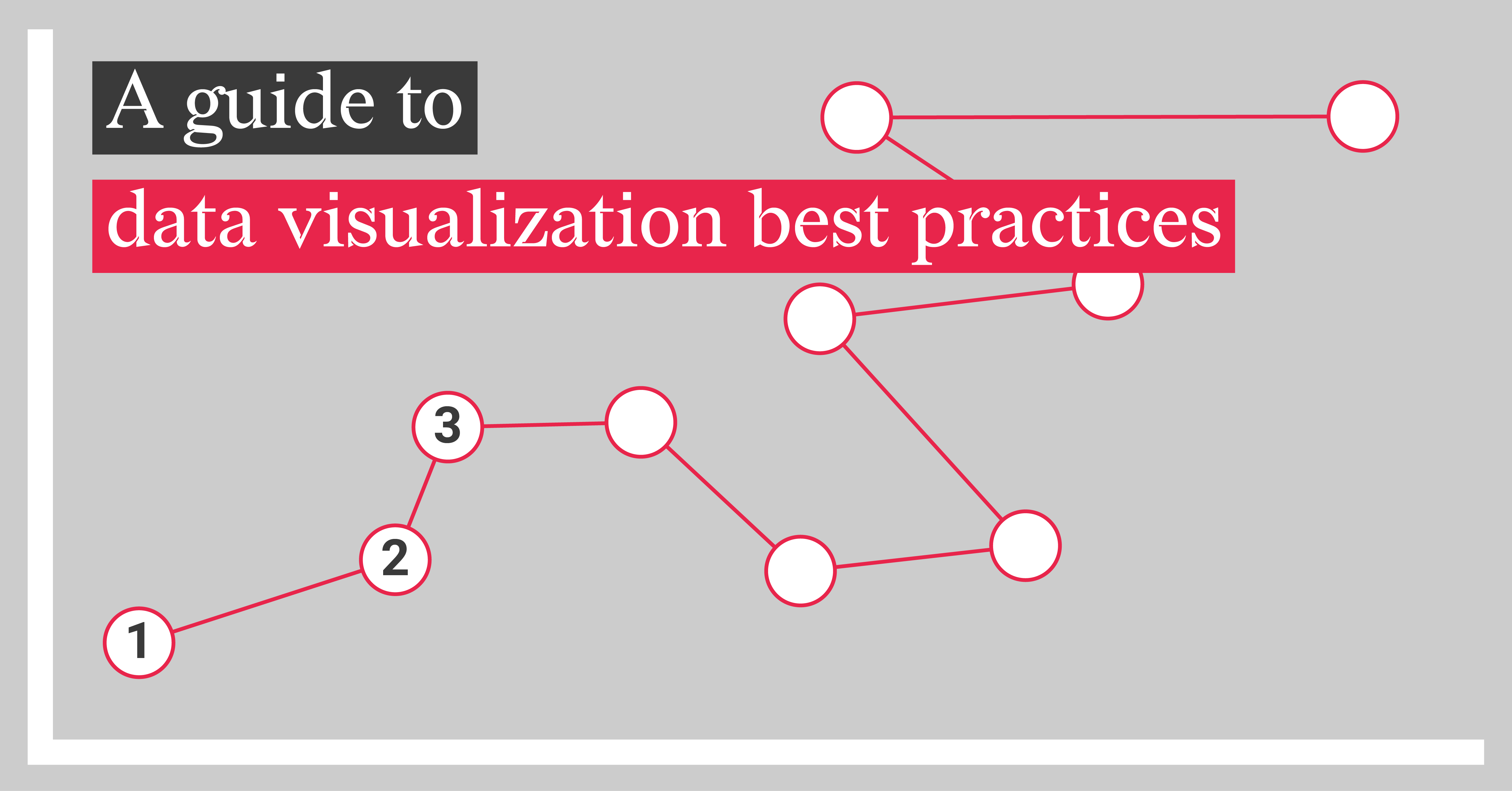
A Guide to Data Visualization Best Practices

The world is inundated with endless information. Navigating it successfully requires effective data communication. One way ...
Read more

The Ultimate Double Materiality Chart

In Part 2 of this educational guide, we identified key best practices for designing an effective...

Read more

Real-world Double Materiality Chart Examples

Now that we’ve introduced in Part 1 the concept of double materiality, how it’s measured, and why...
Read more

Understanding Double Materiality with Impactful Charts

At Datylon, we’ve become increasingly passionate about ESG reporting over the past few years—not...
Read more

Data Visualization Automation Tools for Non-Techies

In today’s data-driven world, the ability to turn raw data into visually engaging insights is...

Read more

Top 10 Excel Essential Automation Tools

Excel is a staple in the world of data analysis, offering an impressive array of features to...

Read more

Top 7 charting add-ons for Excel

For professionals working with Excel, the need for advanced charting and visualization...

Read more

Support Your Executives: Optimize Reporting for Strategic Success

Executive reports are crucial for supporting decision-makers to quickly understand the most...

Read more

Datylon vs Power BI for automated reporting

In the dynamic landscape of business intelligence, Datylon and Power BI stand out as premier tools...

Read more

Climbing the Ladder of Automated Reporting Solutions with Datylon

The arrival of report season can feel like encountering kryptonite for many office workers. Hours...

Read more

Operational vs. Progress ESG Reports: A Deep Dive

The urgency to address environmental, social, and governance challenges has propelled ESG...

Read more
1 2 3 4 5