Mind your data visualization
If I am to believe my mom, I was already pasting stickers next to each other in a neat pattern when I was around four years old. Twenty-five years later and I still use structured week planners to organize my life.
This makes me wonder, is it just my brain that is extremely into structure and patterns, or is there some human commonality at work here? And is looking at patterns and structure the reason why I get really happy when seeing data visualizations?
Well, I dug into your viewer’s brain and read a lot of articles to find out if they are like me and like patterns and structure. Moreover, in this process, I discovered how you can present your data most effectively by getting the most out of the brain capacity of your audience.
Table of contents
1. 180 zettabytes of data by 2025 2. Using your brain's memory capacity |
180 zettabytes of data by 2025
Let’s first start with the main element to consider in data visualization: data. The total amount of data in the world is increasing rapidly. According to Statista, it is forecasted that the total amount of data created, captured, copied, and consumed will grow to over 180 zettabytes by 2025.
To avoid overwhelming the brain when consuming our daily dose of data, visualization comes into play. Our brains are built to digest visual information much faster than textual information. But even when data is presented in a visual way to quickly retrieve insights, it is important to make sure our brains are not overloaded with information. So how are we going to do that, you would ask.
Using your brain’s memory capacity
When presenting data it is extremely important to take the limitations of the brain into account. The brain can not remember everything we see because we have a limited capacity of information we can store in our heads, just like a computer.
Our short-term or working memory can only hold up to around five items at once and can only maintain information for a few seconds. Though, there is a trick to make it for example much easier to remember your long list of groceries. This has everything to do with chunking information, or in other words, grouping the items on the list into smaller batches. For your grocery list, this could be done by grouping the items into smaller groups like vegetables/fruit, snacks, and dairy.
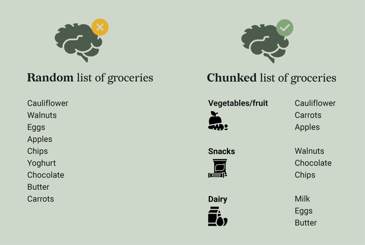
Data visualization also takes advantage of chunking which is why it is much easier for our brain to digest data visually than in the form of a table. When creating data visualizations with useful patterns and structure, the information displayed can be easier chunked together by our brain.
Besides grouping information to make the most use of the limited capacity of our brain, visual information is also remembered for a longer period of time. According to Dr. Lynell Burmark, writer of the book Visual Literacy: Learn to See, See to Learn, textual information is only stored in our short-term memory while visual information goes directly to our long-term memory. This is exactly what we need if we are not only interested in processing data, but also in actually remembering and using the data.
System 1 and System 2
So presenting data visually instead of textually makes it easier to remember and faster to digest by the brain. But how can you visually present your data most adequately by hacking your viewer’s brain?
First, it is important to understand that the brain works with two systems, as described in the book of Daniel Kahneman, Thinking, Fast and Slow. System 1 or the pre-attentive system is the brain’s automatic, fast, and subconscious system. This system takes little to no effort and we have no voluntary control over it. System 2, or the attentive system, is the brain’s analytical, slow, and conscious system which we use when we are making choices or must decide what to do.
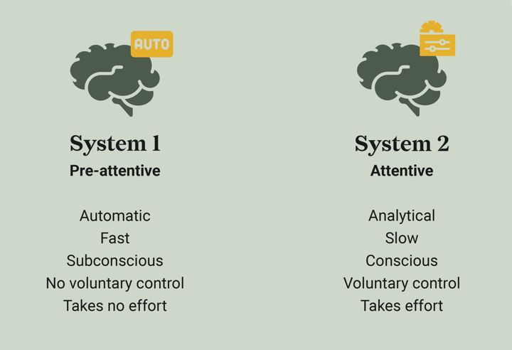
Creating a data visualization makes the most use of the attentive system; you think and make decisions about which data to use for your story and how the visualization should look. For the processing of a new data visualization, your viewer will need both of these systems. Ideally, the pre-attentive system should be activated as much as possible to lead to a faster understanding of the data you’re presenting.
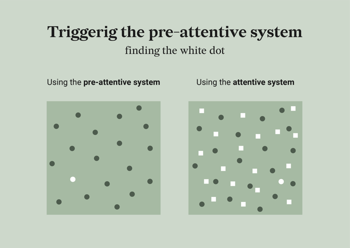
To make it clear why it is so important to activate the pre-attentive system as much as possible to make your data visualizations faster to read, I will show you two visuals. In the left visual your pre-attentive system will make sure you will see the white dot immediately. In contrast, in the right visual it will take you probably much longer to find the white dot; the attentive system needs to be activated. The key element to remember is that you should make your data visualizations easy to digest by triggering the pre-attentive system. Read further to learn how to accomplish this.
Object recognition
When looking at data visualization, you use three brain tools: object recognition, feature distribution, and comparison. The first two make use of system 1 and are very fast processes that happen subconsciously. The last function is slower and is used consciously.
The object recognition tool is used to identify objects in the world we are living in. This tool is very important to experts in data visualization since it can help you find patterns in data. This function could also potentially be dangerous as people who see your visualization for the first time might recognize the wrong objects or patterns in it. (Steven Franconeri, OpenVis Conference 2018).
Visual attributes
Not every possible object in the world is stored in our brain and identified by our object-recognizing tool. Because of this, we need another tool to distinguish, for example, a large pink elephant from a small blue elephant. This other visual tool is feature distribution and it is necessary for recognizing visual attributes.
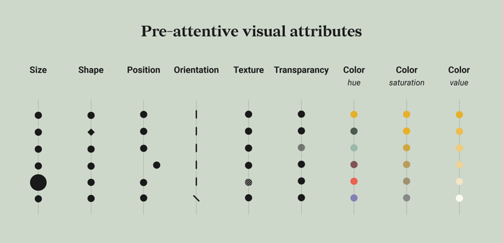
Visual attributes are very useful for creating patterns and structure in your data visualization and for triggering your viewers’ pre-attentive system. Jacques Bertin, a French cartographer and graphic designer published in his book “Semiologie Graphique” in 1967” visual attributes which you can use to visually differentiate objects from each other. Nowadays, these visual attributes have been expanded by others and most data visualization tools have made them available for their users. These pre-attentive visual attributes include size, shape, orientation, texture, transparency, color hue, color value, and color saturation.
Moreover, the feature distribution tool is also very useful for identifying simple statistics of data like the mean, outliers, trends, delta, maximum, minimum, ranges, and clustering. Using these simple statistics that are fastly processed by our brain is also useful in avoiding comparison, which makes it the third most important brain tool. Comparison of individual objects is processed consciously and slowly which means that insights are retrieved very slowly. Using simple statistics is therefore something to keep in mind when creating data visualizations.
Gestalt theory and principles
The statistics I just mentioned are largely based on specific principles called the Gestalt principles. The Gestalt principles are principles based on the Gestalt Theory which states that the brains of organisms are programmed to detect patterns and structures and not only individual components. Yes, it isn’t just me! It is even suggested by one study that our brain’s reward system will be activated when finding patterns. This same reward system is for example activated when you are eating your favorite food or when you look into your lover’s eyes. So, now I understand why I get so happy looking at data visualizations: my dopamine neurons are just on cloud nine!
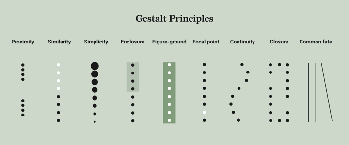
The Gestalt theory led to eight commonly known Gestalt principles which are very useful in creating effective data visualizations that trigger the pre-attentive system.
Proximity: When looking at several objects you will perceive the ones that are close to each other as a group. Do you recognize the first basic statistic in this principle? It is the clustering of data points. Moreover, the law of proximity could also be applied to the direct labeling of the data. When a label is placed next to the corresponding data, the law of proximity will make sure we perceive the data including the label as one group.
Similarity: When looking at several objects you will perceive the ones that are similar to each other as a group. Remember the different visual attributes used for data visualization I just mentioned? Similarity can occur in the form of one of these visual attributes like size, shape or position. Just as with the law of Proximity, Similarity could also be applied to direct labeling. If you color the label the same as the data group it belongs to, it will be perceived as one group.
Simplicity: This law is also called the law of Prägnanz which means pithiness, being concise and meaningful. When creating data visualization, it means it has to be simple and easy to understand. Sorting your data is a good example of making your chart simple and organized. In addition, using a high data-ink ratio is a good way to make your chart concise and meaningful.
Enclosure: When looking at objects you will perceive the ones that are enclosed with a border as one group. This could be applied to data visualization by using a background behind a chart to differentiate it from another chart. Though, this might not be really necessary because of the law of Closure; you already create an imaginary border around the chart in your head. Though, placing a background behind part of the chart could group the items located on this background as one group.
Figure-ground: When looking at objects you will differentiate between the front (the figure) and the background of the object. In data visualization, it is important to make sure you use the right amount of contrast between the front and the background of your visualization in both text and design. To check whether you picked the right amount of contrast for your text, you can use this website to be sure.
Focal point: Steven Franconeri, Professor of Psychology at Northwestern University, stated that data visualizations are a form of ambiguous figures; you can look at the same data visualization but you might see many different patterns in it. Moreover, Fraconeri explains that, as an expert in your visualization, you might see things differently than your audience; your focal point might be different than the one your audience has. Therefore, it is extremely important to make your data visualization unambiguous by helping and guiding your viewer through your data visualization. You can create for example focal points in your visual by highlighting the most important finding or annotating the parts that deserve the most attention.
Continuity: When looking at several objects you will perceive the ones that are arranged on a line or a curve as a group. In data visualization, this could be applied by aligning all elements that belong together. Moreover, sorting the elements in a chart will create continuity.
Closure: When looking at several objects you will perceive the ones that are part of a closed figure or tend to be part of a pattern, as a group. When an object has missing parts, our brain will fill in the gaps to make a pattern out of it. So when you are dealing with missing data and showing this by a gap in the data, take into account that our brains will fill in the gaps to close the pattern. Therefore, it might be better to use other solutions like a dotted line or continuation of the line but with data marks to show that some data is missing.
Common fate: When looking at several objects you will perceive the ones that move together as one group. For example, if you have multiple lines in your chart that all go up and only one line goes down, the ones that go up will be perceived as one group while the other line will be the odd one out and be perceived as different.
I am not the only one!
So presenting data visually instead of textual makes it easier to remember and faster to digest by the brain. Using patterns and structure makes it easy to chunk the information and leads to faster insights because the pre-attentive system will be triggered. Ways to accomplish this are by using visual attributes like size, shape, or color or using simple statistics like the mean, deltas, or ranges. These attributes and statistics are largely based on Gestalt principles such as proximity, similarity, and simplicity which you can use to your advantage to tell your data story most effectively.
With this conclusion, I think we found the answer to my question that I am most definitely not the only one who gets excited by patterns and structure in life. Though, my brain might get a bit over-enthusiastic.
But at least it seems to be that I have found the right career for me working as a data visualization designer at Datylon, where we aim for expressive data visualizations that maximize the opportunity for a viewer to understand the data.
👉If you're keen on crafting custom data visualizations, visit our Bespoke Data Visualization Solutions page.

Dieuwertje van Dijk - Data Visualization Designer
Data, graphic design, illustration, food and mountains let her dopamine neurons spark on a daily basis. Most of the year she lives in Georgia where she spends her free time enjoying nature in a rooftop tent, eating khinkali and drinking wine.

