In Part 2 of this educational guide, we identified key best practices for designing an effective double materiality chart. Now, we’ll take those insights further by conducting experiments to refine the design and uncover the most impactful solution. From real-world examples, it became clear that a scatter plot with background zones—showing levels such as high, medium, or low materiality—is one of the most useful approaches. However, several open questions remain, which we will explore in this part through experimentation.
Through the below questions, we aim to refine the chart’s design and optimize it for clarity, impact, and usability. While we strive to find the most effective design, it’s important to note that there is no single "perfect" solution. The best chart design will always depend on the specific data and context it represents. Consider these insights as inspiration and guidelines to inform your work, rather than a one-size-fits-all blueprint.
Join us as we experiment and uncover new possibilities for visualizing double materiality!
|
In this three-part educational series, we’ll explore the interplay between double materiality and data visualization:
|
Zone Style
In part two of this series, we discussed the use of matrices, organic zones, and linear zones to represent double materiality, focusing on their ability to balance clarity with the fluid nature of materiality categories.
The choice of zone style—whether quadrants, organic zones, or linear zones —plays a crucial role in how effectively the chart communicates information. Here, we delve into these zone styles, analyzing their potential to enhance clarity and usability while meeting the needs of diverse audiences.
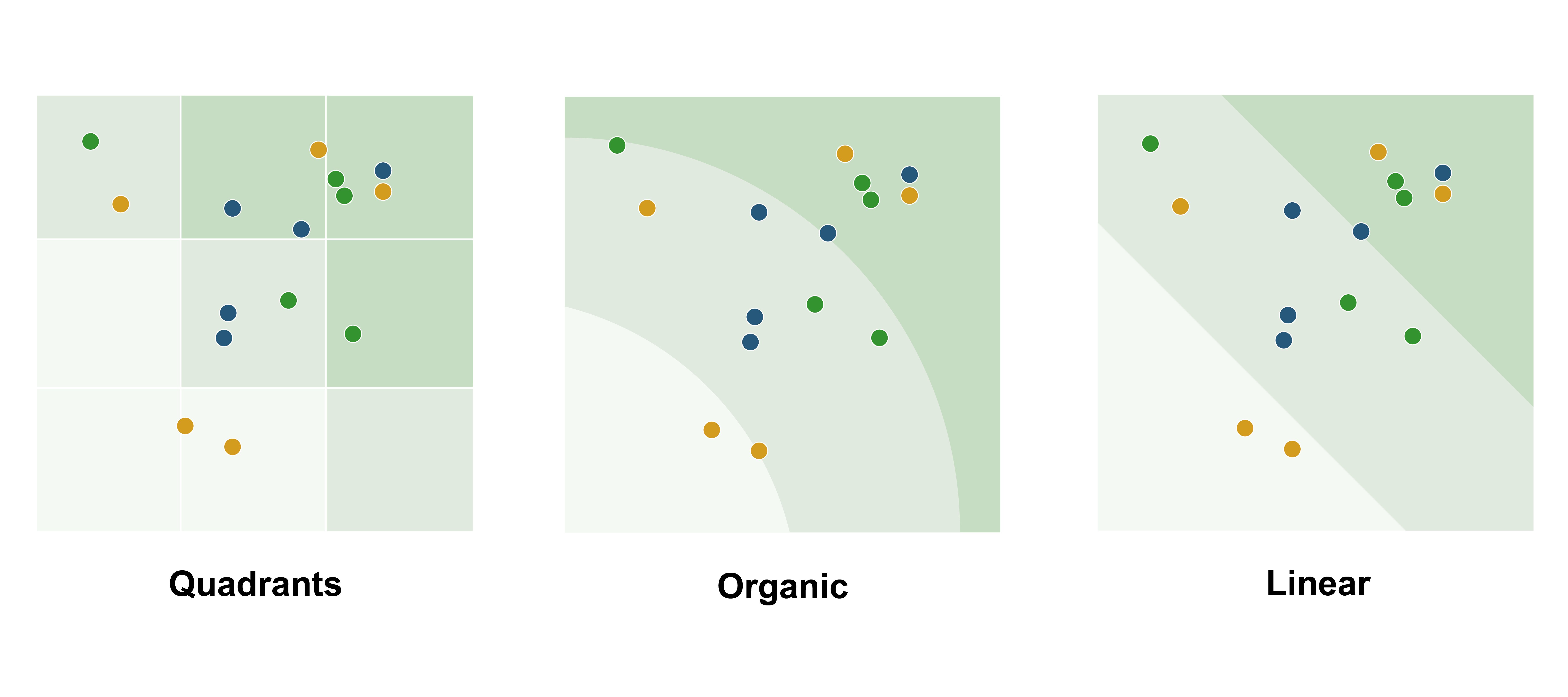
Quadrants
Quadrants offer a structured and straightforward approach, clearly defining low, medium, and high materiality—or more levels, depending on the number of divisions. They are intuitive, easy to interpret, and ideal for precise categorization. However, this structure can feel rigid and can lack the nuance needed to represent gradual transitions between materiality levels.
Organic zones
Organic zones are dynamic and visually engaging, offering a flexible way to represent how one dimension alone can result in high materiality. This approach provides a fluid interpretation of materiality while maintaining clarity, making it an intuitive choice for visualizing complex relationships. However, organic zones are inherently subjective, as they often lack a clear mathematical basis.
Linear zones
Linear zones use straight, diagonal lines to define materiality levels, offering clear, objective boundaries based on simple mathematical principles. This ensures consistency and easy justification of categorizations. However, they can feel rigid, creating a rigid perception of materiality.
| After extensive discussions, we chose linear zones for our ultimate double materiality chart due to their clear, objective boundaries and consistent interpretation across reports. Their mathematical basis makes categorizations easier to justify, and they’re simple to automate. As future regulations may standardize materiality thresholds, having well-defined boundaries will be even more valuable. |
Softening Boundaries
In the previous paragraph, we explained our choice to use linear zones for our ultimate double materiality chart. While this approach provides clear, objective boundaries, a key drawback is that the sharp lines can create a sense of rigid categorization, suggesting that topics fall neatly into one zone without accounting for gradual transitions. This can overlook topics that sit on the threshold and may require more nuanced consideration.
In this section, we will experiment with soft transitions and color transitions to see how they impact clarity and interpretation. Based on the results, we’ll make a final decision on whether this approach adds value to the chart while maintaining its overall simplicity and usability.
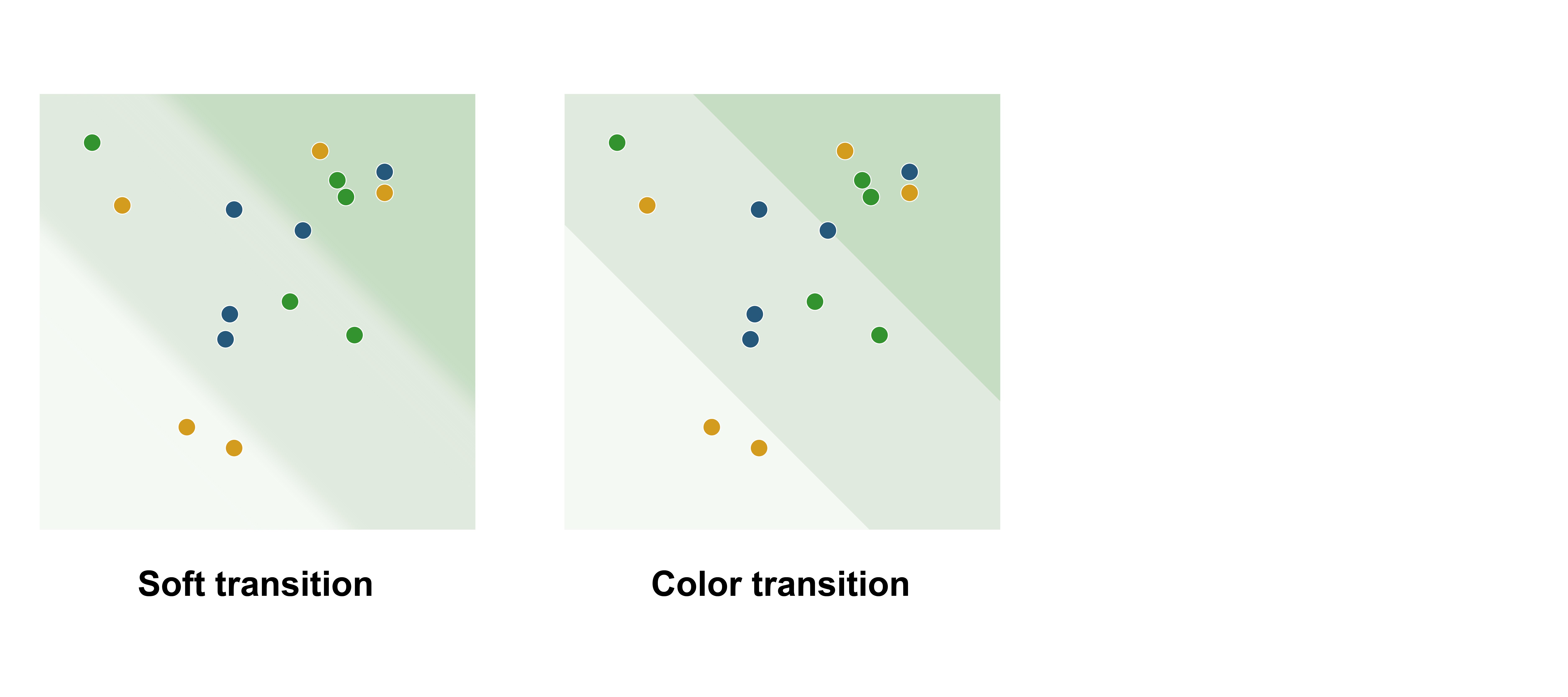
Soft transition
To address the issue of rigid categorization, one approach is to create soft transitions between zones, visually blurring the boundaries to suggest a gradual shift rather than a strict cutoff. This reflects the reality that materiality often exists on a spectrum, with topics near the borders sharing characteristics of multiple zones. However, this can reduce clarity, making it harder for viewers to quickly determine which zone a topic belongs to, especially in dense charts. The absence of clear boundaries may also complicate decision-making when precise categorization is required.
Color transition
Another approach is to use gradual color transitions or subtle shading within the same hue to reinforce the idea that materiality exists on a spectrum. This method creates a smooth flow between zones, visually suggesting that the boundaries are not fixed and that topics near the edges may share characteristics of adjacent categories.
| We decided to use gradual color transitions to soften the boundaries in our ultimate double materiality chart. This approach subtly reflects the fluid nature of materiality and is easy to implement with reporting tools, maintaining both clarity and simplicity. |
Matrices
While we chose linear zones for our ultimate double materiality chart, matrices with quadrant zones can also be a strong option, especially for those seeking a more structured approach. If you’re interested in using quadrants, there are additional factors to consider, such as how to color the quadrants and how many divisions to include. In this section, we’ll explore these options and provide insights to help you design an effective matrix-based chart.
Grids
When selecting a matrix, you can choose from a 2x2, 3x3, 4x4, or even more quadrants. But how do you determine the appropriate number of quadrants for a double materiality chart?
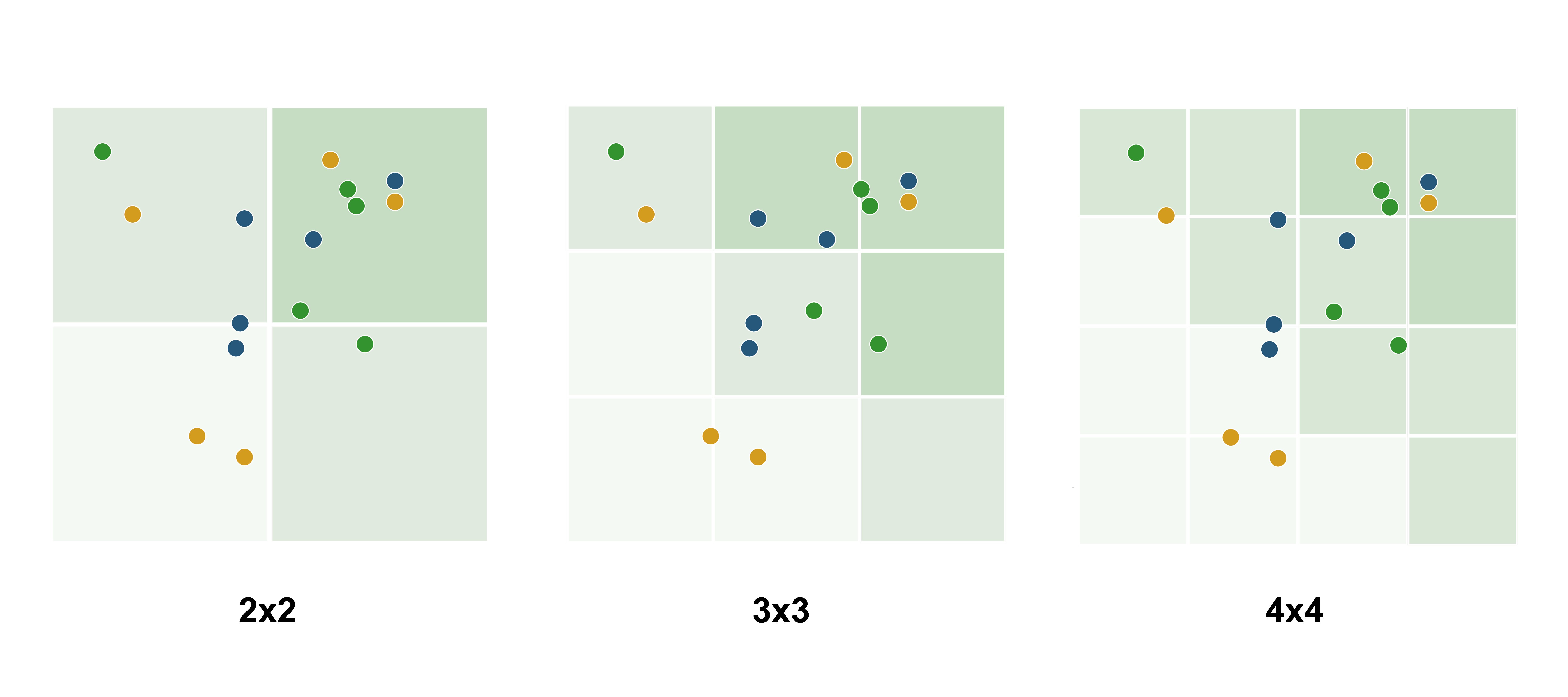
2x2
This option is perfect for simplicity, providing a clear and straightforward categorization into broad levels: low materiality (both dimensions low), medium materiality (one dimension low and the other high), and high materiality (both dimensions high). It’s well-suited for audiences seeking quick, high-level insights with minimal complexity.
3x3
This option strikes a balance by offering more granularity while remaining accessible to the viewer. It’s particularly suited for audiences, such as sustainability professionals, who value finer distinctions in materiality. For these reasons, we recommend this approach.
4x4 or more
Best for highly detailed analyses where precise categorization is essential. However, it can risk overwhelming viewers if the chart becomes too crowded. This option is most suitable for technical experts or analysts who require deeper insights.
Coloring
When coloring the matrix, a common approach is to use darker colors for high-materiality quadrants and lighter colors for lower-materiality ones. Alternatively, you can apply a heatmap style, highlighting quadrants based on where most topics are concentrated. This approach emphasizes density and distribution over strict materiality levels.
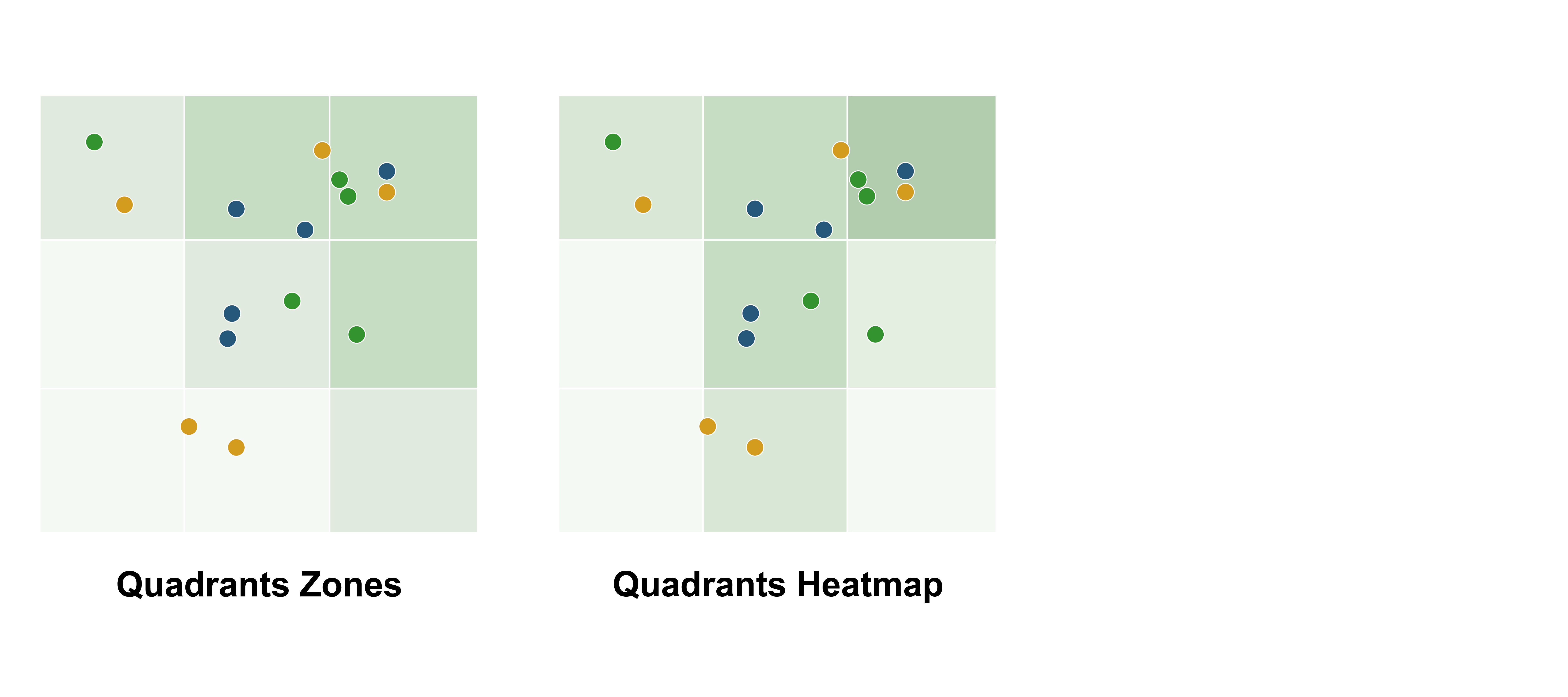
Quadrant Zones
This traditional approach uses darker colors for high-materiality quadrants and lighter colors for lower-materiality ones. It provides a clear and intuitive way to represent materiality levels, making it easy for viewers to focus on the areas of greatest importance. This method works well for audiences prioritizing clarity and straightforward interpretation of materiality.
Quadrants Heatmap
This method colors quadrants based on the concentration of topics, with darker shades indicating areas of higher density. While it highlights patterns and clusters, it may not add significant value, as the scatter plot itself already makes it easy to identify where most topics are located. For this reason, it may be redundant for some audiences.
Organic Zone Placement
While we chose linear zones for our ultimate double materiality chart, organic zones can also be a strong option as they strike a balance between clear boundaries and fluidity. It’s important to consider how these zones are placed within the chart. There are two valid approaches to positioning organic zones, each with its own strengths, depending on how you interpret and communicate double materiality.
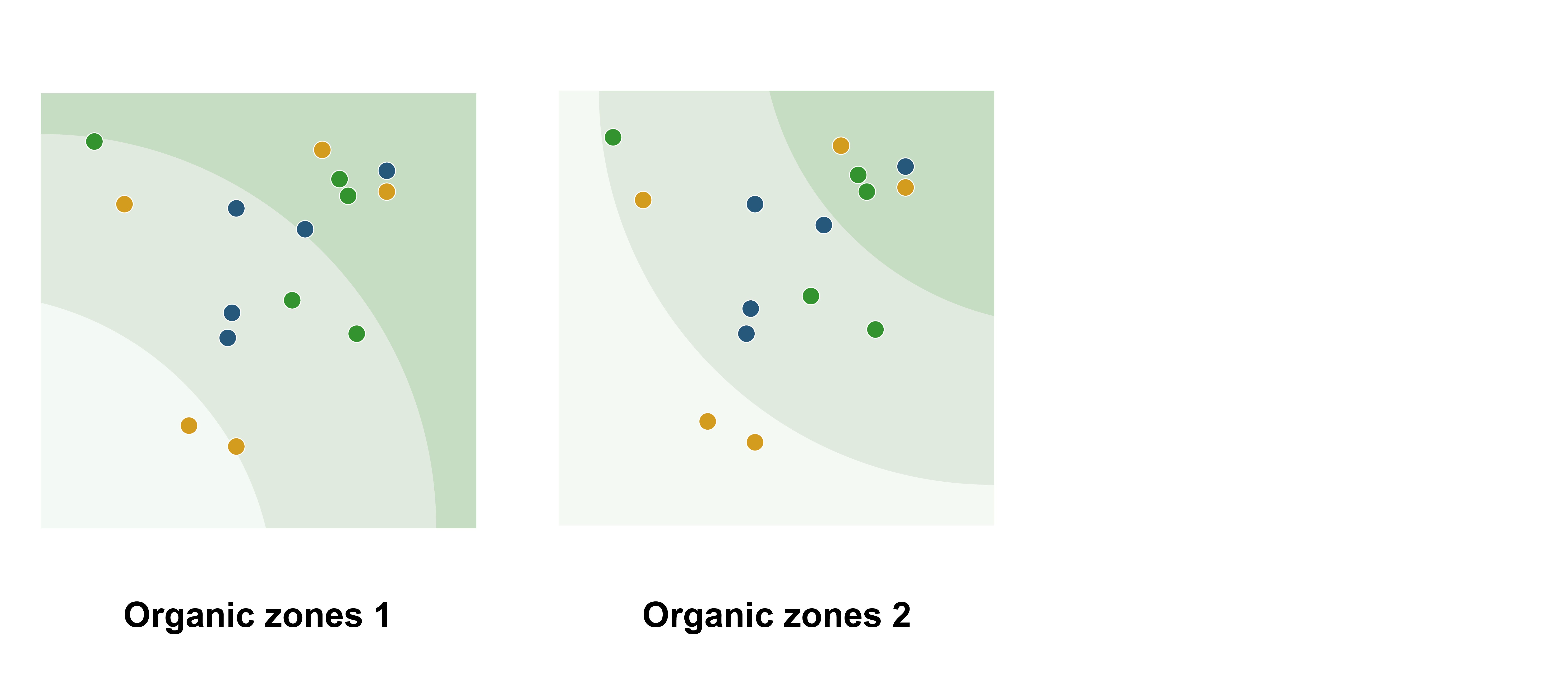
Organic zones 1
This approach aligns the zones with the typical placement of axis labels, improving consistency and interpretability. It also supports the European Sustainability Reporting Standards (ESRS) guidance, which states that topics can be considered material even if they score very high on only one dimension.
Organic zones 2
This alternative design emphasizes the need for high scores on both dimensions to qualify as "high." By requiring topics to score strongly in both impact and financial materiality, this approach is better suited for scenarios where a balanced consideration of both dimensions is critical to the categorization.
Critical Zone Emphasis
To simplify the decision-making process and make high-materiality topics stand out more clearly, you can highlight the relevant zone, the topics, or both. This can be useful since companies typically prioritize actions based on these topics.
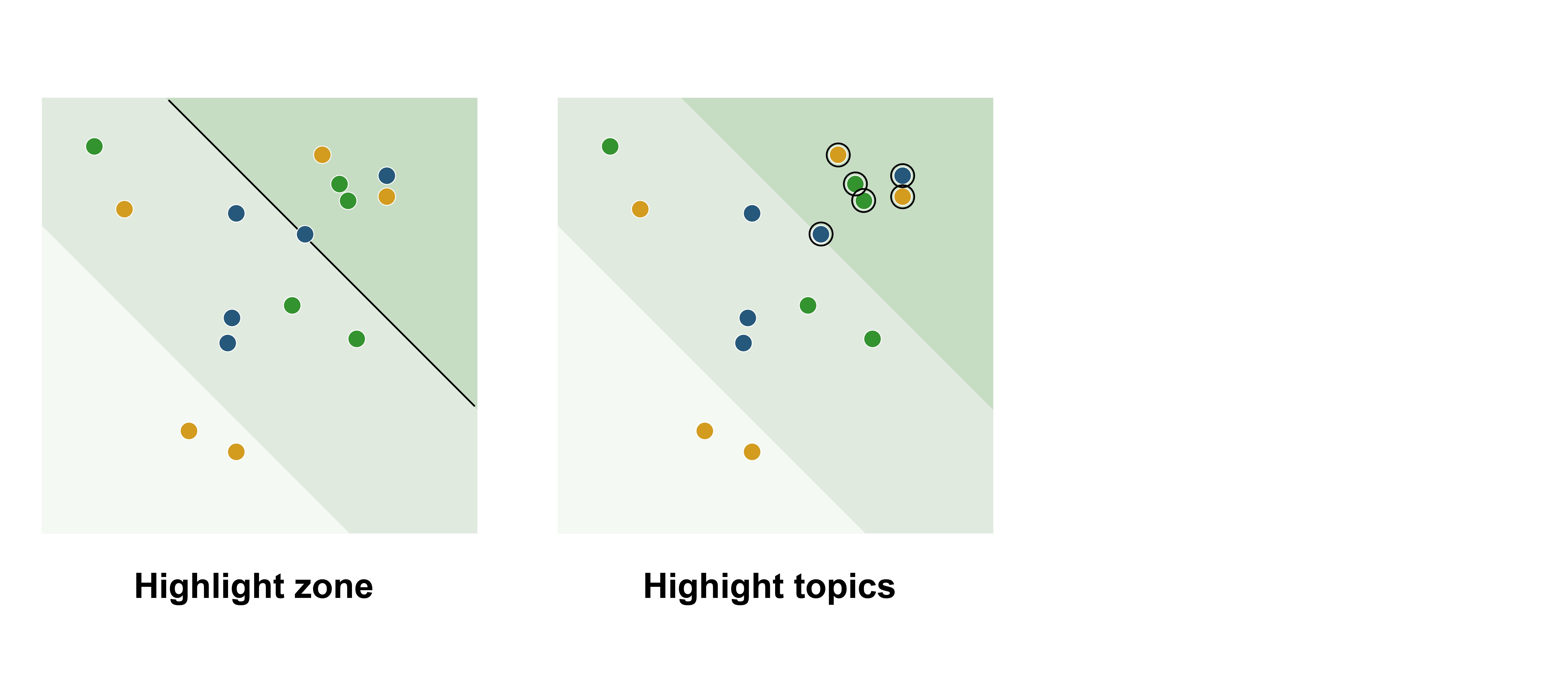
Highlight zone
Highlighting the highest zone draws attention to critical topics, aiding quick decision-making by making high-materiality topics stand out. However, excessive highlighting can clutter the chart and reduce clarity. Using strong highlights, like stroke lines, may also create rigid boundaries, diminishing the sense of fluidity.
Highlight topics
Highlighting topics subtly ensures they stand out without overwhelming the viewer, making high-materiality topics easier to spot. Techniques include adding a stroke color, making other topics more transparent, or combining both.
| For our ultimate double materiality chart, we chose to highlight the topics in the “high” zone, ensuring they stand out while maintaining a clean and balanced design. We decided against adding a division line, as it could disrupt the sense of fluidity in the data. |
Bubble Dimension
Adding a third dimension, such as bubble size to represent stakeholder importance or urgency, provides additional context and depth, offering a more comprehensive view beyond the two primary axes.
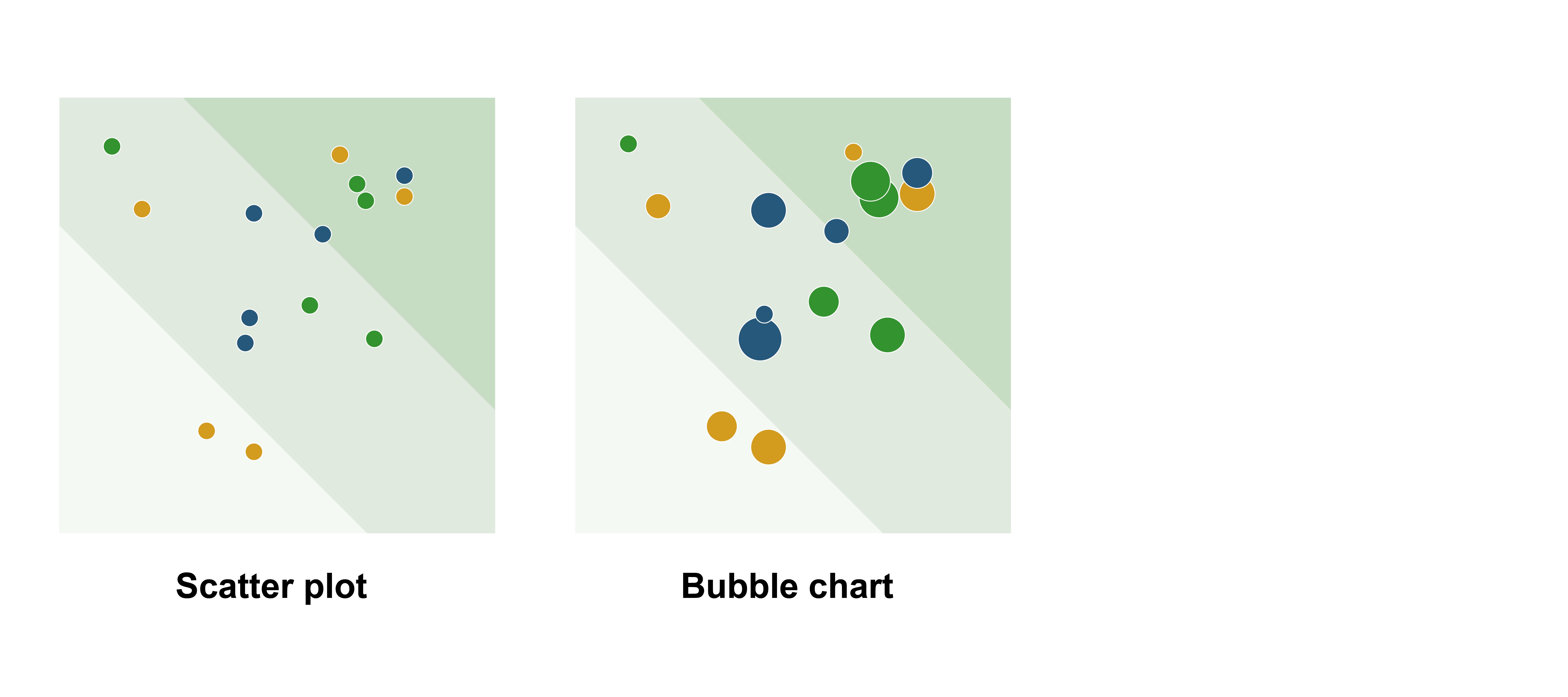
However, it can also increase complexity, making the chart harder to interpret, especially for less experienced audiences. Interpreting bubble sizes accurately may require extra explanation, which can detract from clarity. To maintain effectiveness, it’s important to balance these added insights with simplicity to avoid overwhelming the viewer.
| For our ultimate double materiality chart, we decided not to add an additional variable, as the scatter plot with linear zones in the background already provides a wealth of information. Adding even more details would risk overwhelming the viewer and detracting from the chart’s clarity. |
Axes Styling
The way axes are labeled in a double materiality chart significantly influences how viewers interpret the data. Labels can use exact numbers, relative categories, or a combination of both, each offering distinct advantages and challenges. In this section, we explore these options and their impact on clarity, precision, and usability.
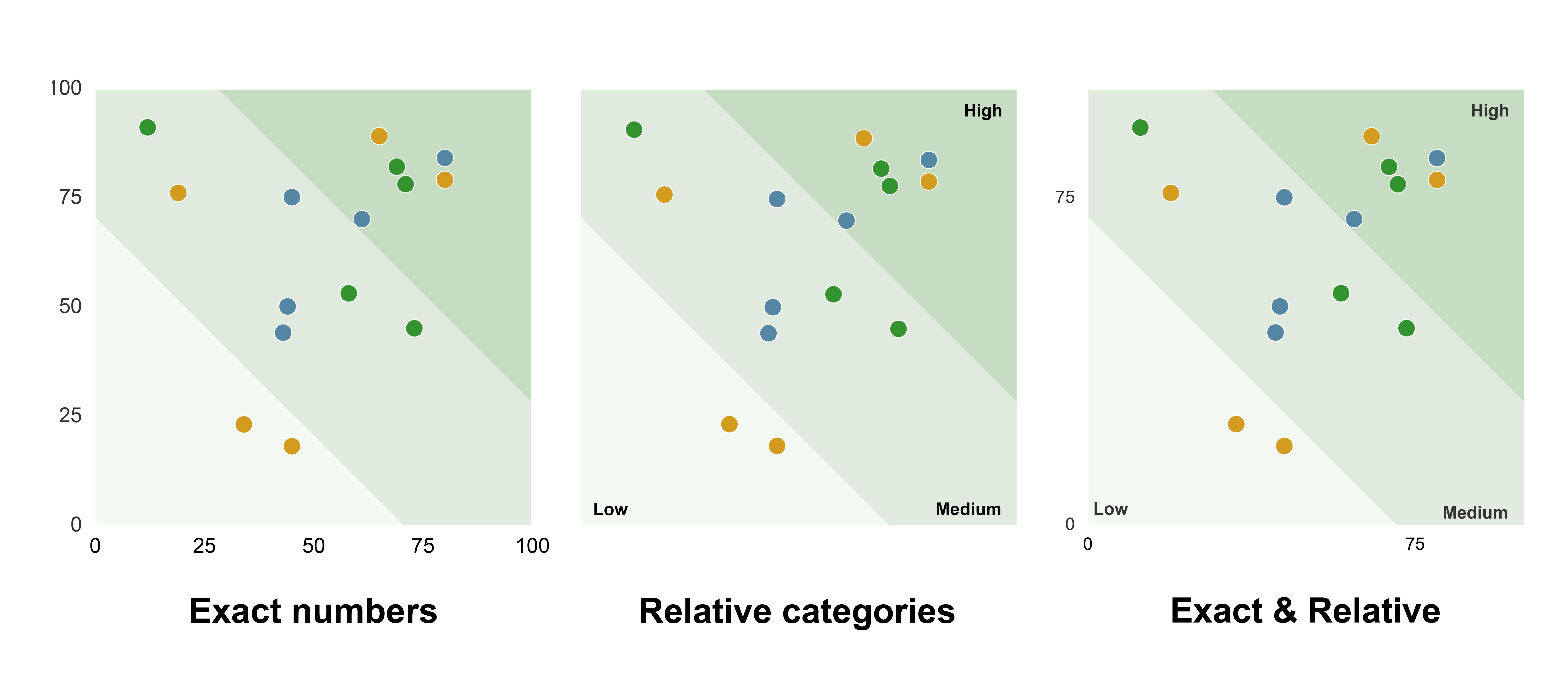
Exact numbers
Using exact numbers on the axes provides precision and allows for detailed comparisons between topics, which can be valuable for in-depth analysis. However, since there’s no standard measurement for double materiality, companies may use different scales (e.g., 0-5 or 0-100), making it unclear what the numbers truly represent. This lack of standardization can confuse viewers and reduce the chart’s interpretability.
Relative categories
Labeling axes with relative categories like low, medium, and high offers a simpler and more intuitive approach. It helps viewers quickly understand the general materiality levels without requiring detailed knowledge of specific scales. While this approach is more accessible, it lacks the precision needed for technical analysis and may feel too generalized for some stakeholders.
| For our ultimate double materiality chart, we will combine exact numbers with relative categories to balance clarity and precision. Categories like low, medium, and high aid quick interpretation, while exact numbers offer deeper insights. |
Overlapping Categories
A common challenge in double materiality charts is how to visually represent topics that fall into multiple categories. Should these topics be placed in a single category or highlighted differently? Addressing this issue is crucial to ensure the chart accurately reflects the nuances of the data while remaining clear and easy to interpret.
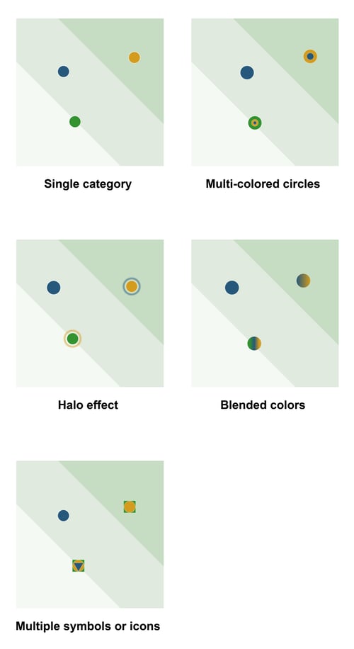
Single category
Assigning a topic to a single category simplifies the chart, making it visually clean and easy to interpret. This clear structure supports quick decision-making and helps highlight key priorities without overwhelming the viewer. While it may not capture every nuance of topics that span multiple categories, these additional dimensions can be effectively represented in the legend, ensuring the chart remains both clear and informative.
Highlighting in chart
Highlighting topics in the chart, such as for ESG (Environmental, Social, and Governance) categories, allows for nuanced representation of overlaps. This method visually communicates complexity while maintaining clarity by limiting the palette. It effectively signals multidimensional relevance without forcing rigid classification.
Though, the chart can become visually busy if many topics require overlapping highlights. Interpreting these combinations may still take more effort, especially for audiences unfamiliar with the categories or the color scheme.
Various techniques can be used to highlight the categories in the chart:
Multi-colored circles
Use segmented rings or layers within dots, with each color representing an ESG category. This clearly highlights overlaps but can clutter the chart if too many categories are shown.Blended colors
Apply gradients or mixed tones for topics spanning multiple categories. While visually smooth, blended colors can reduce clarity, so it's best to limit this to three distinct categories.Multiple symbols or icons
Combine shapes like circles, triangles, or squares within the same space to represent different categories. This provides clear cues but may look crowded with too many overlaps.Halo effects
Add subtle halos around dots to indicate secondary categories. This keeps the chart clean while subtly showing additional layers of information.
Highlighting in legend
An effective approach is to highlight ESG categories in the legend rather than directly in the chart. This keeps the chart clean and simple while still providing clear category references. It also helps maintain focus, making it easier to spot patterns for the main category while preserving the chart’s overall clarity and readability. However, this approach can make it harder to identify patterns related to other categories at a glance.
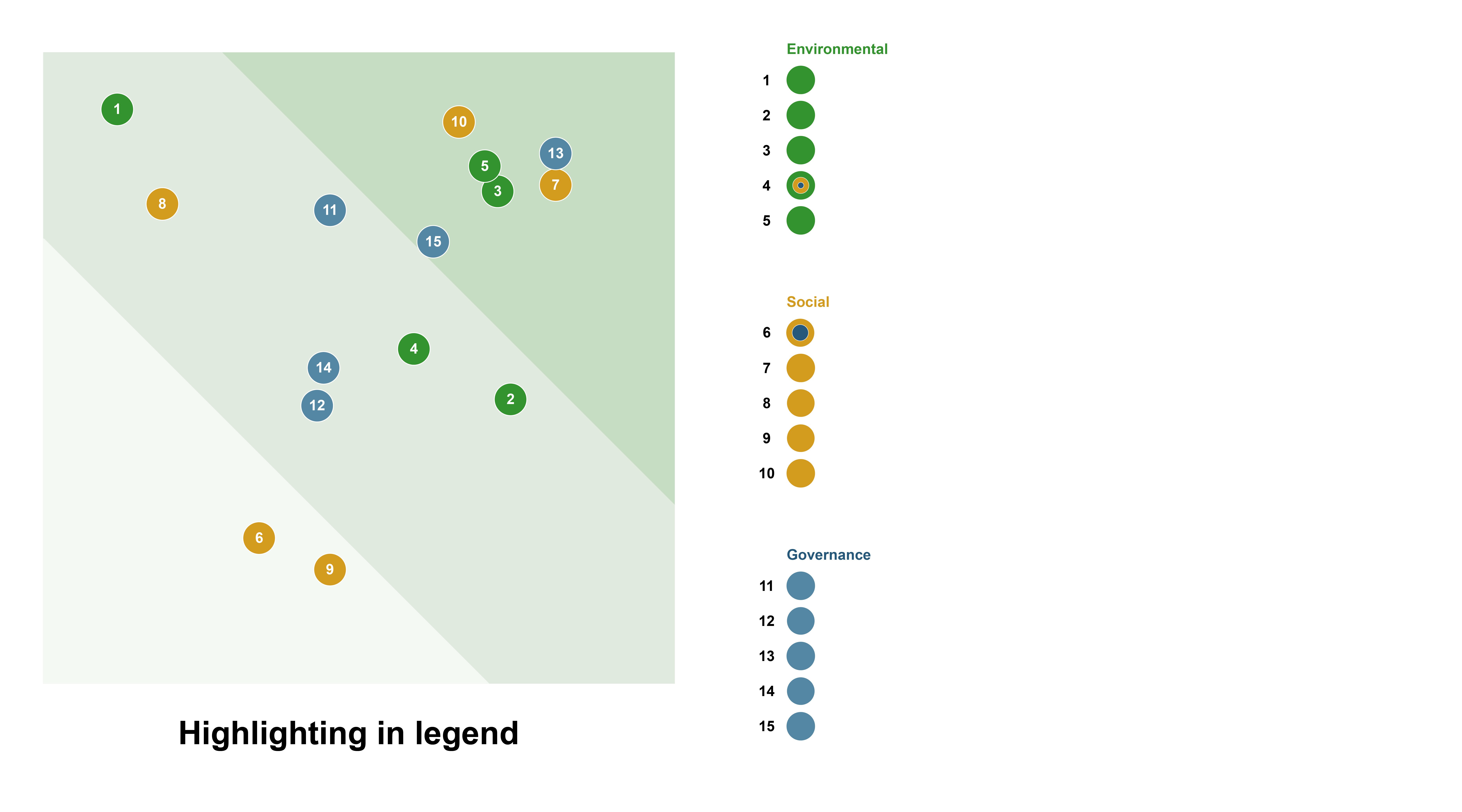
| We believe the most effective and practical approach is to highlight the categories within the legend. This keeps the chart clean, avoids clutter, and clearly represents overlaps without distracting from the data points. Additionally, focusing on the main category makes its patterns easier to identify. |
Ultimate Double Materiality Chart
For the ultimate double materiality chart, we combined the best practices from part two of this educational guide with the insights gained in this part.
Arriving at this design involved extensive discussions within our team, as we think there’s no single “ultimate” chart that fits every context. However, the following chart represents the most balanced approach, incorporating key compromises to address clarity, precision, and usability, making it a strong foundation for visualizing double materiality.

The chart features a scatter plot with linear zones in the background, defining low, medium, and high materiality in a subtle way. To ensure these zones don’t distract from the data, we used gray tones, providing a sense of fluidity without overwhelming the reader with too many colors. The axes also include exact numbers, ensuring both precision and accessibility. We added gridlines to enhance readability, making it easier to compare data points and interpret their positions within the chart.
To emphasize the topics in the “high” region, we added a black stroke around those data points. A legend is placed on the side to keep the chart clean, with numbers inside the dots replacing potentially overlapping labels. These numbers are organized chronologically in the legend, making it easy for viewers to quickly match them to the corresponding topics.
Each topic is represented by a distinct color based on its main ESG category, ensuring color-blind friendliness while enhancing pattern recognition. By focusing on the main category, the chart remains visually clear, making trends easier to identify. Additional category details are provided in the legend to maintain context without adding clutter.
This approach balances clarity, precision, and depth, creating a comprehensive tool for understanding double materiality.
Concluding Paragraph for the Blog Series
Creating effective visualizations for double materiality has been an exciting journey for us at Datylon. Through this three-part guide, we’ve explored real-world examples, tackled common challenges, and experimented with design choices to arrive at what we believe is the ultimate double materiality chart.
For us, these charts are more than visuals—they’re a way to help businesses communicate their sustainability stories with clarity and purpose. Double materiality is complex, but with the right design, it can support companies to meet CSRD reporting requirements, engage stakeholders, and make informed, impactful decisions. We’re passionate about helping organizations turn data into action, and we hope this guide inspires you to push the boundaries of sustainability reporting. Let’s keep driving change—one thoughtful visualization at a time!
We’d love to hear your thoughts too! Send us your ideas via email or leave a comment below. Or Book a Demo to explore how Datylon can bring your double materiality assessments to life.
Resources & Further Readings
ESG reporting: a comprehensive guide to communicating ESG results
https://finance.ec.europa.eu/capital-markets-union-and-financial-markets/company-reporting-and-auditing/company-reporting/corporate-sustainability-reporting_en
https://www.efrag.org/en/sustainability-reporting
https://www.globalreporting.org/