A significant milestone in this journey is the Corporate Sustainability Reporting Directive (CSRD), which came into effect in Europe. Unlike voluntary ESG initiatives, CSRD is a legally binding framework that requires companies to adhere to strict standards for sustainability reporting. This means that companies have to provide measurable, transparent, and comparable data on how their operations impact society and the environment, as well as how these factors influence their financial performance.
With the start of 2025, CSRD is now at the forefront, and its impact is becoming tangible. Large companies are finalizing their first reports, while others are still navigating the challenges of data collection, organization, and compliance. The scope of CSRD is broad—it requires reporting on everything from carbon footprints to social equity—and its level of detail can feel overwhelming. Companies must manage large volumes of data, interpret complex regulations, and meet high expectations for accuracy and transparency.

One key element of CSRD is the concept of double materiality, which demands a dual perspective:
- Impact materiality: How your company's actions affect society and the environment.
- Financial materiality: How social and environmental factors influence your company's financial performance.
This dual consideration requires careful analysis and clear communication. Effectively sharing double materiality results is essential for several reasons. Transparent communication builds trust with stakeholders by demonstrating accountability and a genuine commitment to sustainability. It also equips decision-makers with the insights needed to prioritize resources effectively, aligning financial success with societal and environmental goals.
Furthermore, openly sharing these findings enhances a company’s reputation, attracting socially conscious investors and fostering stronger engagement with stakeholders. Visualization plays a key role in this process, turning complex data into accessible insights that resonate with diverse audiences and lead to meaningful impact.
At Datylon, we specialize in building software solutions for data visualization, helping companies transform complex data into clear, impactful stories. We believe our expertise in data visualization can enhance the communication of double materiality assessment results within the context of CSRD reporting. Learn more about how we can help your company with double materiality visualization—Book a Demo.
|
In this three-part educational series, we’ll explore the interplay between double materiality and data visualization:
By the end of this series, you’ll have practical insights and strategies to create impactful visualizations for double materiality assessments, supporting your organization to tell a compelling sustainability story. |
The Concept of Double Materiality
In this part, we’ll first dive deeper into the concept of double materiality, exploring what it means, what is measured, and why visualizations matter.
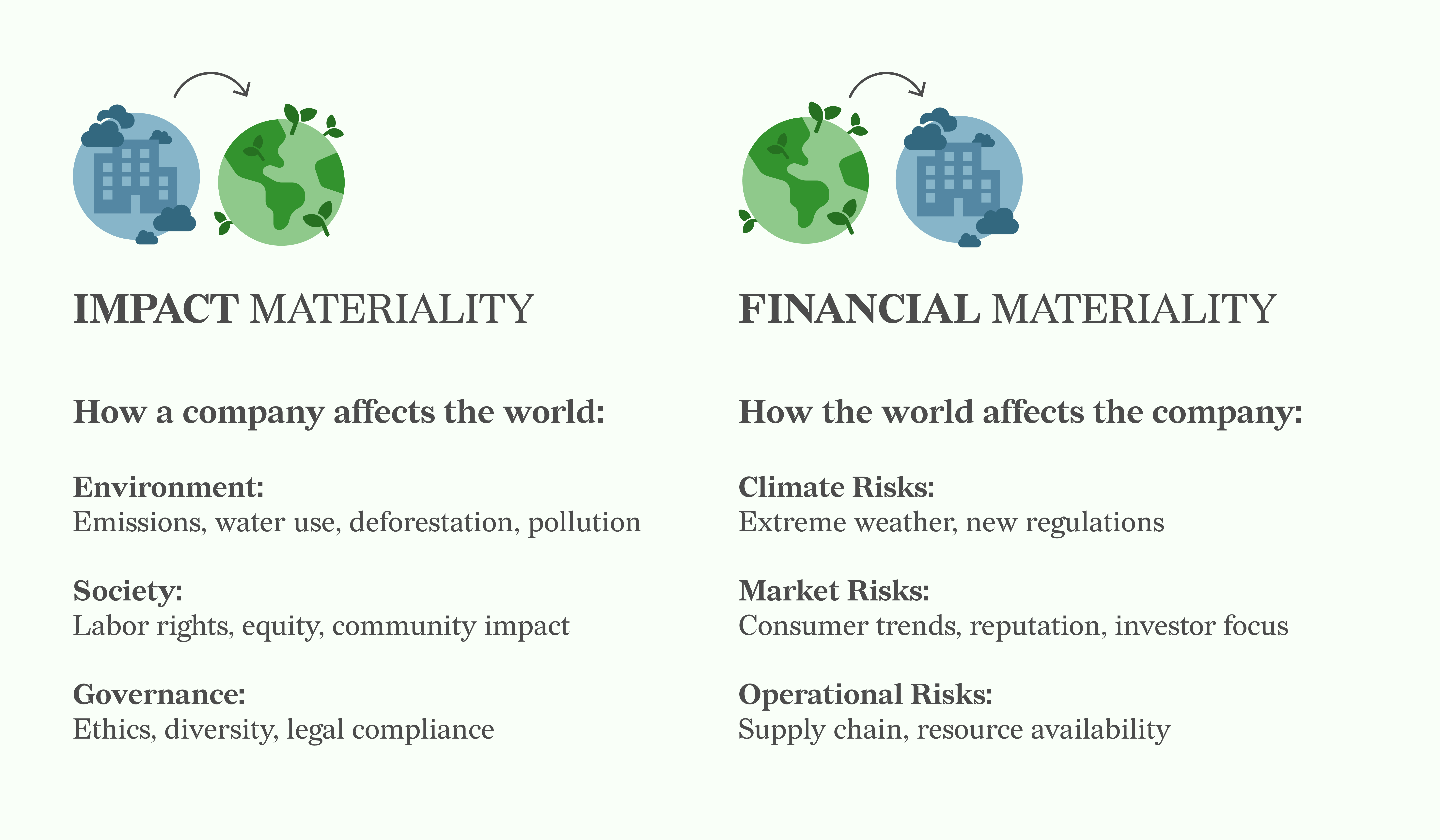
What is measured?
Double materiality requires companies to evaluate topics from two perspectives:
- Impact materiality: This measures how a company’s operations, products, and services affect the environment, society, and broader systems. It focuses on topics such as:
- Environmental impacts: Greenhouse gas emissions, water usage, deforestation, and pollution.
- Social impacts: Labor practices, human rights, community well-being, and equity.
- Governance impacts: Ethical behavior, diversity, and compliance with laws and standards.
- Financial materiality: This dimension examines how environmental, social, and governance factors impact a company’s financial performance and position, both in the short term and in the future. It considers both risks and opportunities across topics such as:
- Climate impacts: Physical impacts like extreme weather or long-term climate change, and transition impacts such as new regulations or carbon taxes.
- Market influences: Changes in consumer behavior, reputational challenges, or shifts in investor priorities.
- Operational challenges: Supply chain disruptions, resource scarcity, or other issues affecting the company's ability to operate effectively.
The topics evaluated in double materiality assessments vary for each company and industry, depending on the nature of operations and external context. Relevant topics are typically identified through stakeholder engagement, industry benchmarks, and established frameworks and guidelines.
Once identified, topics are assessed for significance using a scoring system. This system often categorizes topics as low, medium, or high in importance for both impact and financial materiality. Some companies may use numerical scales for greater precision. However, there is currently no universal standard for how these scores are defined or applied, meaning companies have some flexibility in designing their assessment methods.
For a deeper understanding of CSRD and double materiality assessments, we recommend neutral resources from EFRAG, GRI.
Why Double Materiality Visualization Matters
Effectively visualizing double materiality results is crucial for several reasons:
- Clarity: Visualizations make complex interrelationships between impact and financial materiality easier to understand. They help reveal quickly where these dimensions are scoring high or low or are interconnected.
- Decision-making: Clear visualizations help prioritize topics that score high in one or both dimensions, enabling companies to focus on areas that matter most. By highlighting interconnected topics, businesses can better align their sustainability and financial strategies, ensuring efforts are directed where they have the greatest impact.
- Transparency: Presenting double materiality results in an accessible, transparent manner builds trust with stakeholders. Stakeholders—including investors, regulators, and customers—can easily see how the company addresses its most critical issues, fostering credibility and engagement.
Understanding the interconnectedness of impact and financial materiality is particularly important. These dimensions often influence each other—for example, human rights violations (impact materiality) can lead to reputational damage and financial losses (financial materiality). Recognizing and communicating these relationships through visualizations not only helps businesses manage risks but also highlights opportunities for integrated solutions. For example, a topic in the high-impact but low-financial quadrant could signal a reputational risk that might grow into a financial risk over time, prompting preventative action.
Double materiality allows companies to address both external and internal risks and opportunities. By evaluating and visualizing key topics, businesses can communicate their sustainability strategies more effectively, build stakeholder confidence, and drive sustainable success.
Revealing the Ultimate Double Materiality Chart
At Datylon, we had extensive discussions about what the ultimate double materiality chart should look like. Through these conversations, we realized there’s no single “ultimate” chart—the best visualization depends on context, audience, and the specific needs of each organization.
However, after thorough research, analysis of real-world examples, and multiple design iterations, we identified key principles that make a double materiality chart both effective and intuitive. The chart we present here reflects a carefully considered approach that balances these insights, though different situations may call for alternative designs.

Our final design features a scatter plot, with impact materiality on the x-axis and financial materiality on the y-axis. To provide clear structure while maintaining flexibility, we added linear zones in soft gray tones to indicate low, medium, and high materiality. These zones create objective, easy-to-interpret boundaries without overwhelming the data. We emphasized topics in the high materiality region with a black stroke to ensure they stand out clearly.
To achieve both precision and accessibility, the axes combine exact numbers with relative categories, allowing for detailed analysis while remaining intuitive for a broader audience. We also added gridlines to enhance readability, making it easier to compare data points and understand their relative positions within the chart. To reduce clutter, each topic is represented by a number within the dot, with a legend on the side linking these numbers to their descriptions.
For ESG categories, we used distinct colors focused on the main category of each topic, enhancing clarity and pattern recognition. This approach keeps the chart clean, while additional category details are provided in the legend for context.
This chart represents the result of many design decisions and trade-offs aimed at balancing clarity, depth, and usability. While it’s not the only way to visualize double materiality, it incorporates the most important compromises based on our discussions.
In the third part of this blog series, we’ll dive deeper into the design process, the reasoning behind these choices, and the lessons learned along the way. We hope this inspires you to create visualizations that best fit your specific needs!
We’d also love to hear your ideas! Send us your thoughts via email or leave a comment below—we’re always curious to learn how others approach double materiality visualization. Or, if you're ready to explore Datylon's tools, Book a Demo today!
Check out Part 2, where we’ll analyze real-world double materiality chart examples, and Part 3, where we’ll reveal the journey behind designing the ultimate double materiality chart.
Resources & Further Readings
https://www.efrag.org/en/sustainability-reporting