Scatter plot
DATYLON > CHART LIBRARY > SCATTER PLOT
What is a scatter plot?
Alternative names: Scatterplot, Scatter chart, Scattergram, Scatter diagram, Scatter graph
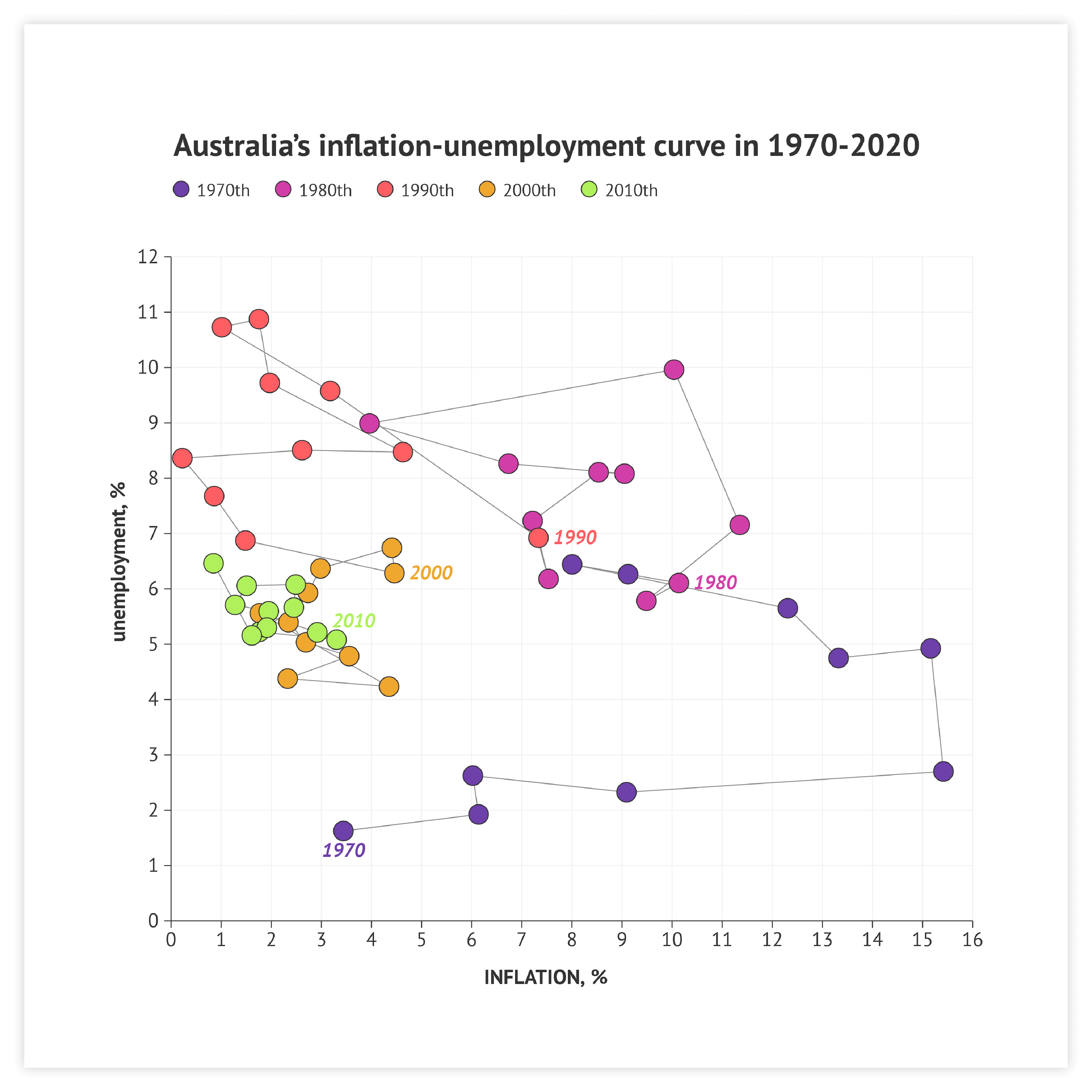
A scatter plot is a set of dots plotted on a plane coordinate system representing two variables.
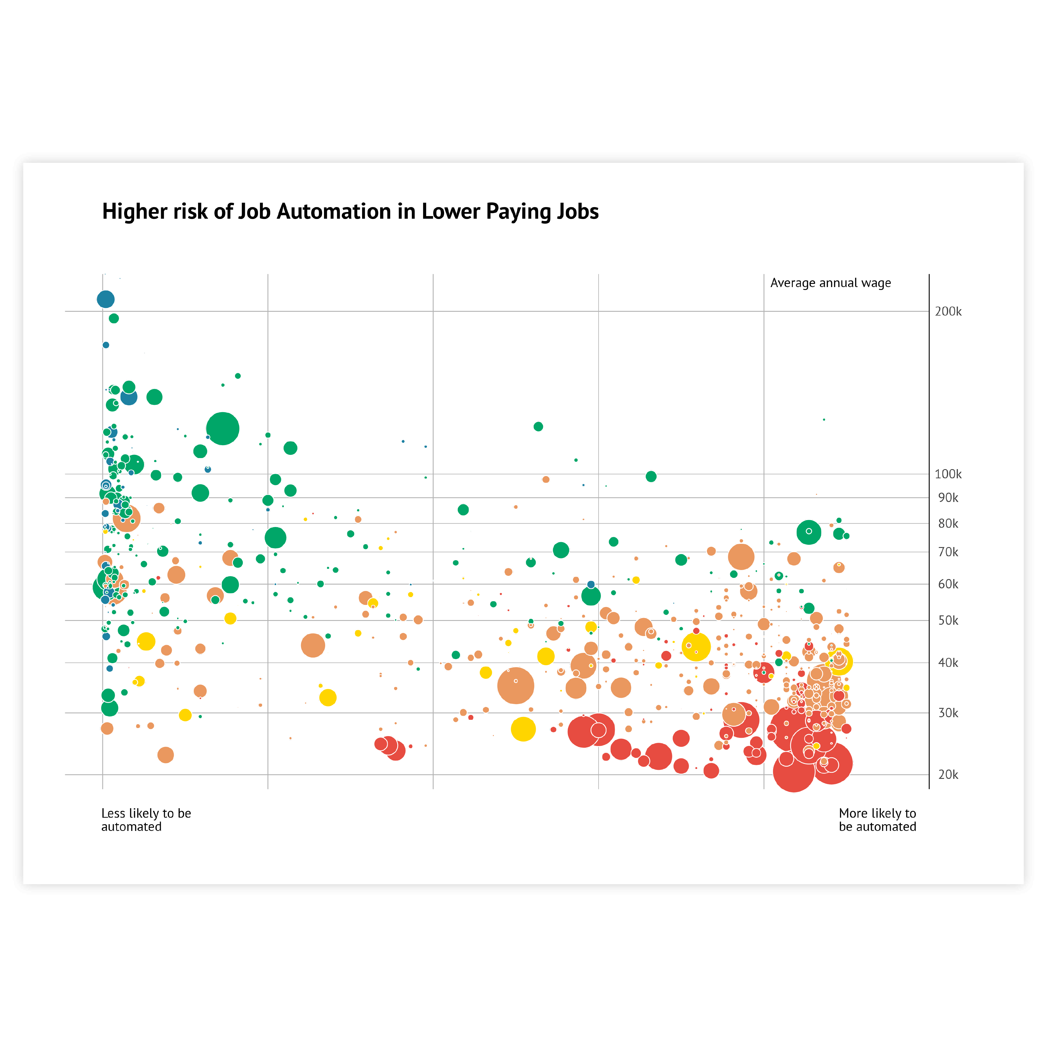
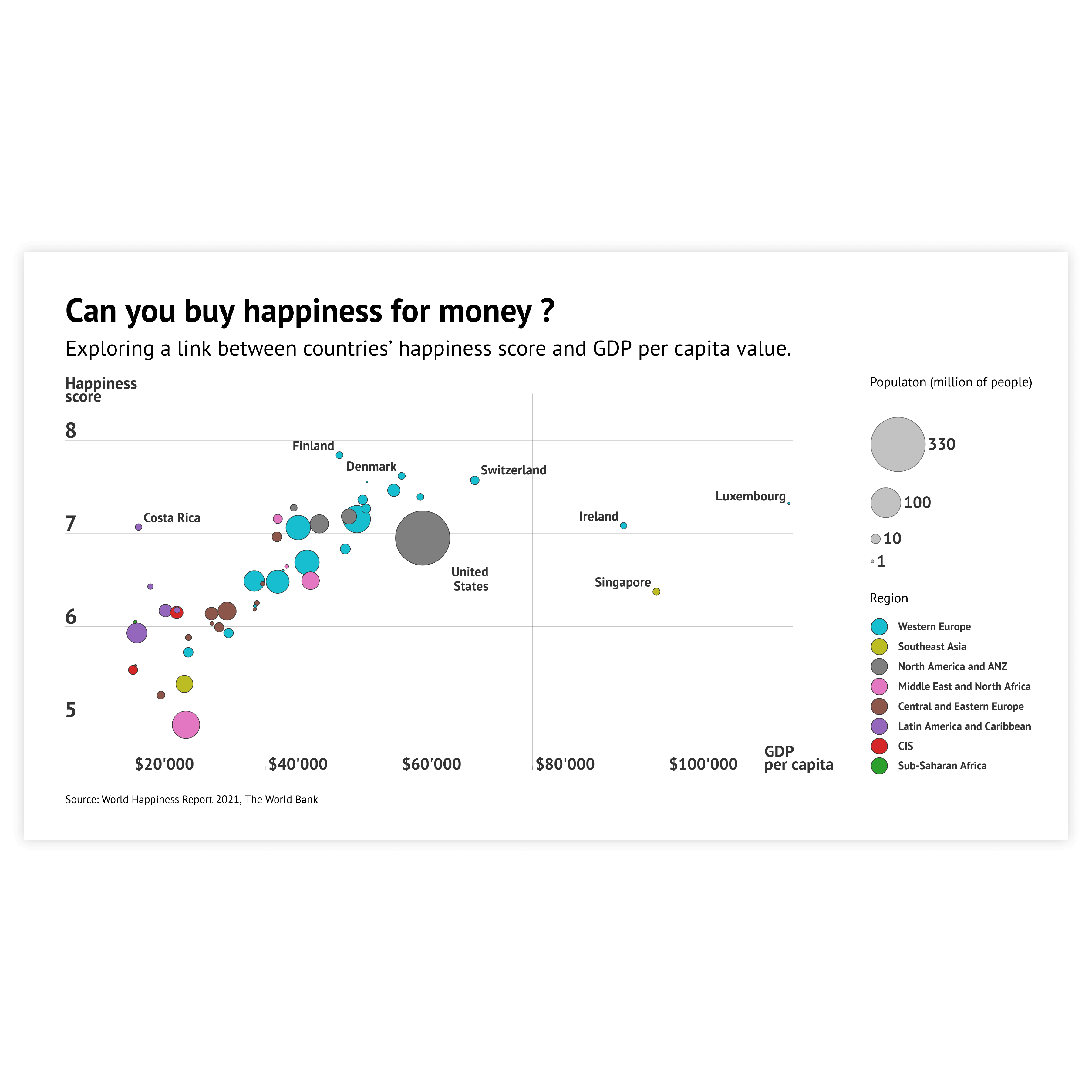
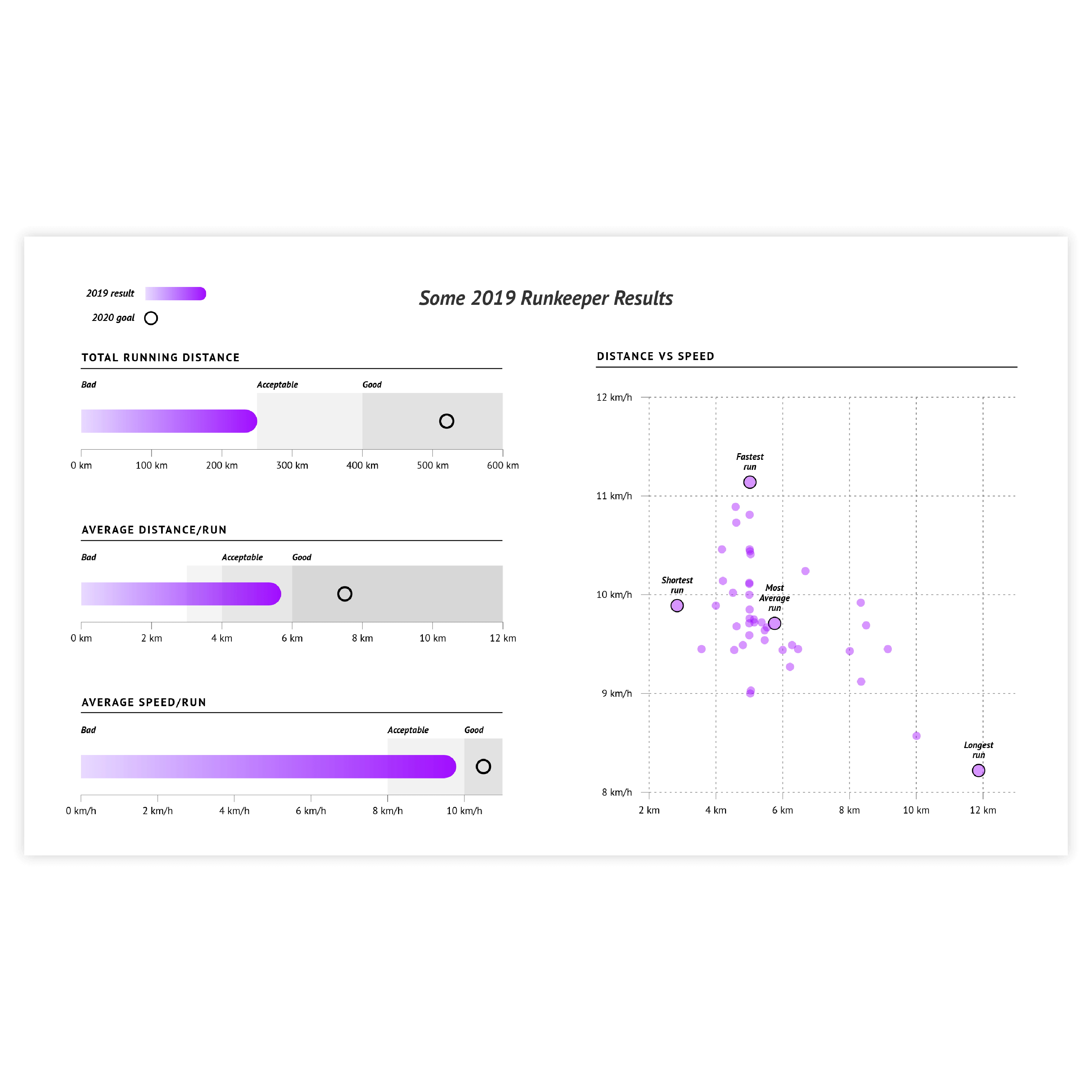
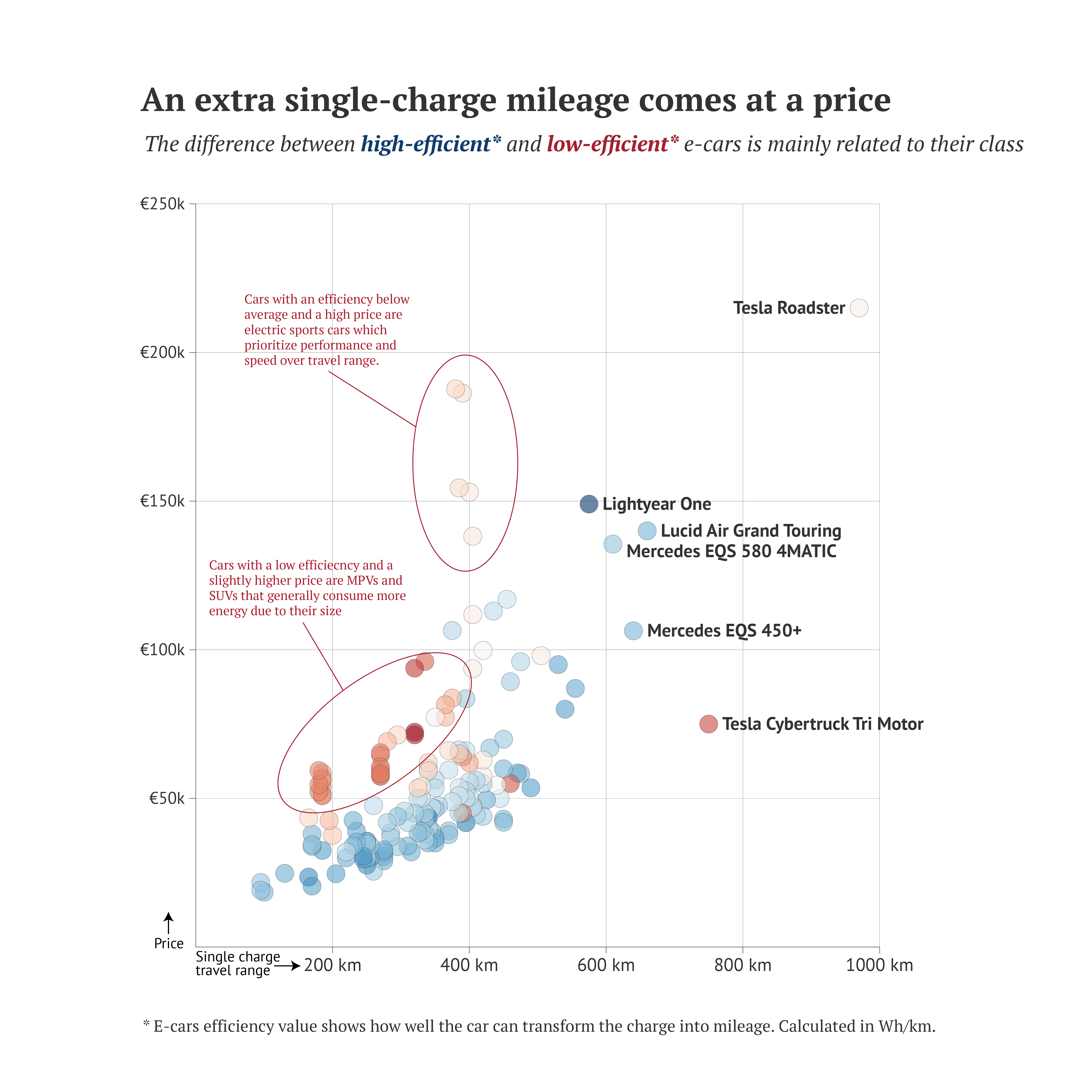
A scatter plot is usually the first choice for data exploration. Simple one-sized data marks give a clear view of every observation’s positioning. A scatter plot is often used to find correlations between two numerical variables and identify patterns. Clusters, as well as outliers, are also easy to spot using scatter plots.
A scatter plot is a chart with one of the best data/space ratios.
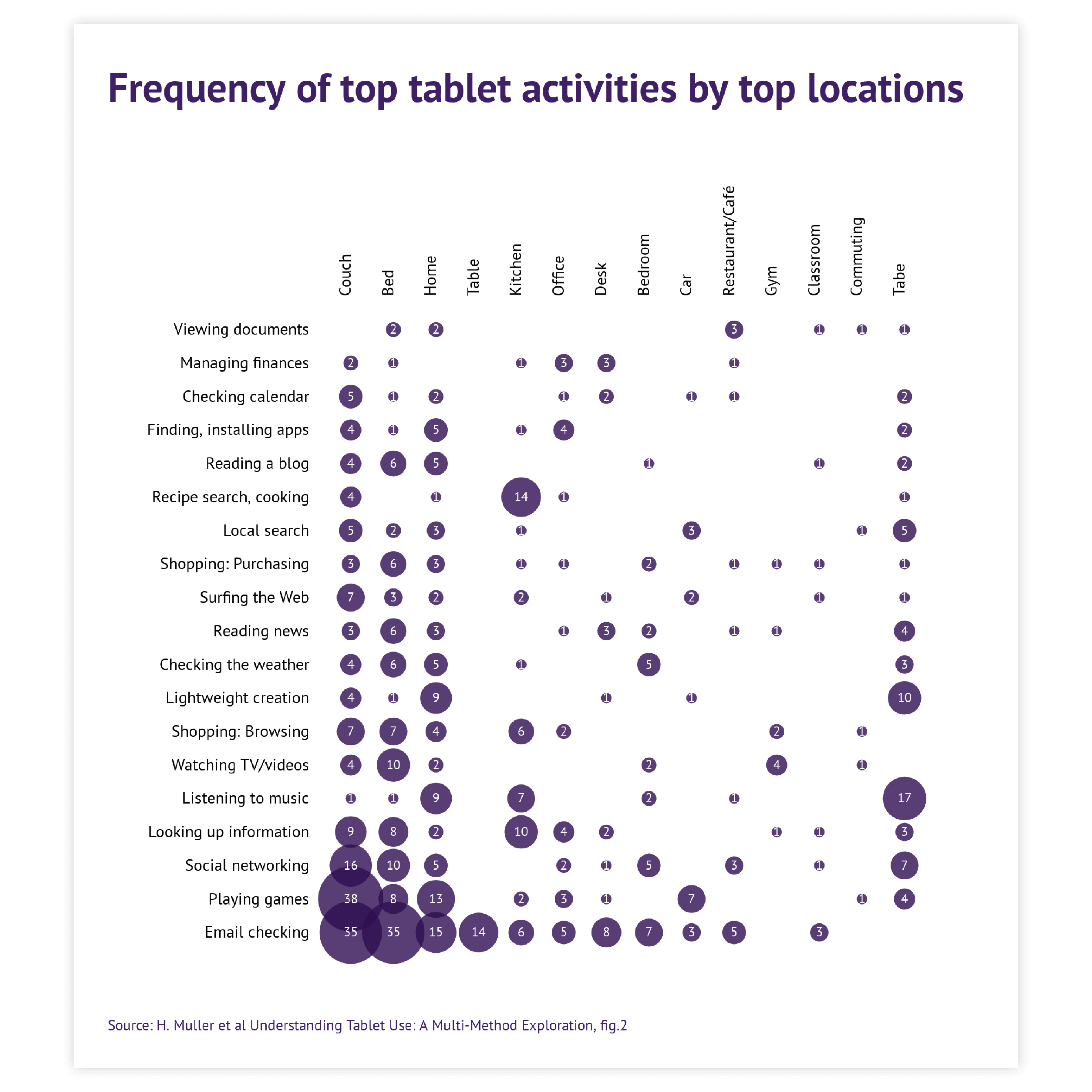
A scatter plot is also known for its versatility. It gives a lot of inspiration to infographic designers and data visualization specialists. It can be turned into almost any chart: heatmap, dot plot, icon chart, tilemap, or some hybrid chart.
Start making your own scatter plot with DatylonVariations of scatter plots
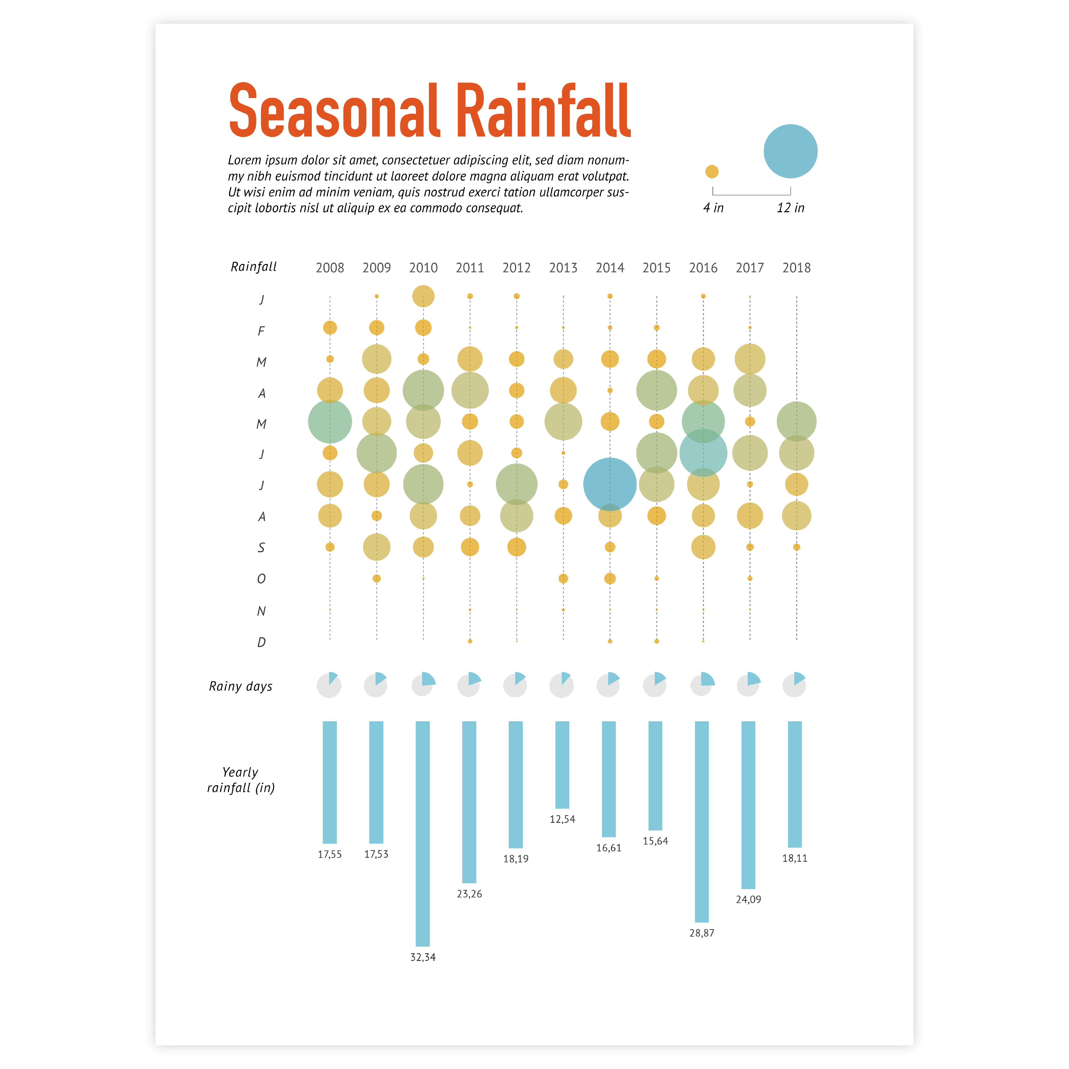
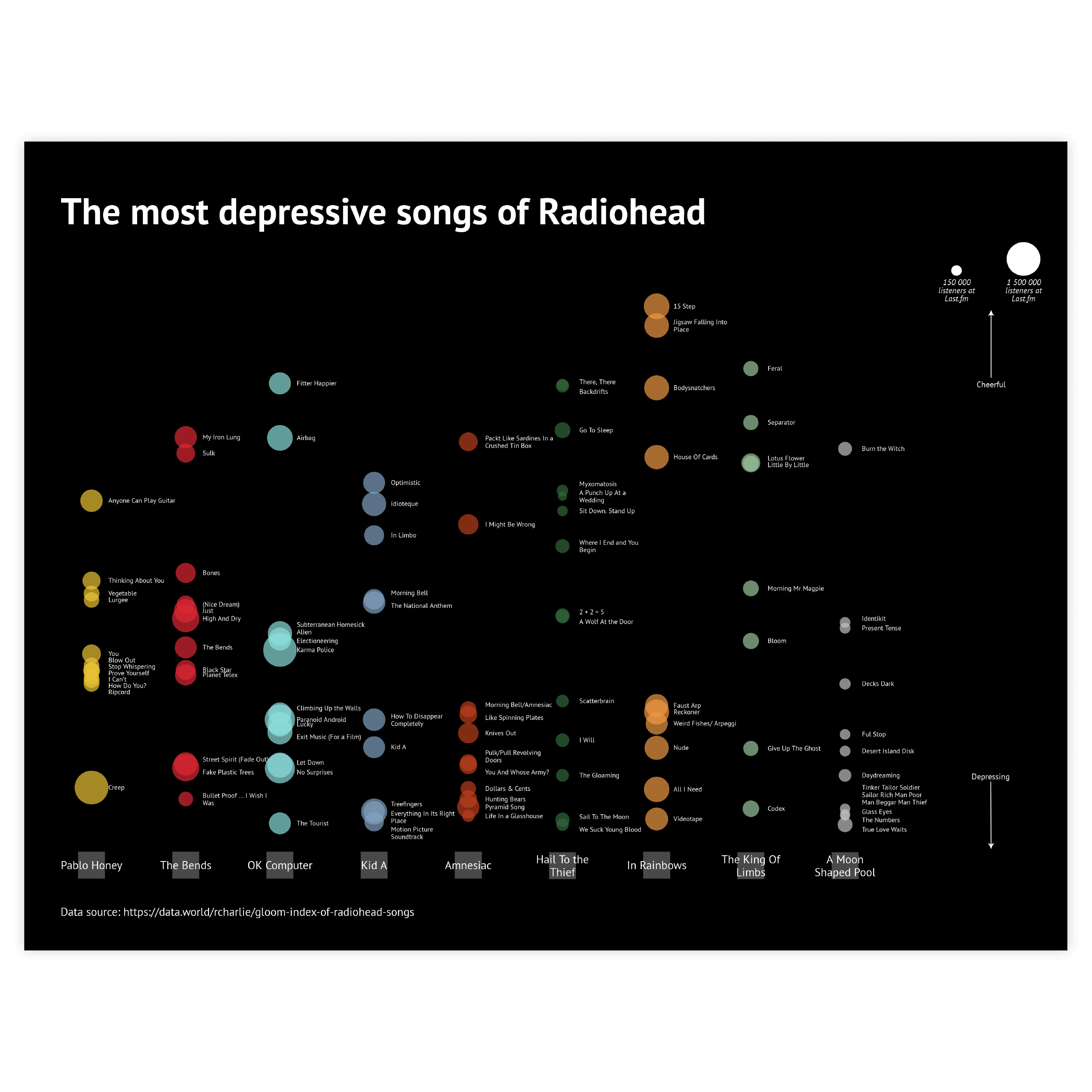
The charts below are variations of a scatter plot. To learn how to make them with Datylon, check out the scatter plot user documentation in our Help Center.
Alternatives to a scatter plot
Substitute your scatter plot with any of the charts below when you want a visual alternative that still allows you to use color binding or different icons.
Pro tips for designing a scatter plot
Learn how to improve the readability and visual appeal of your scatter plot.
Binding
Up to seven variables can be bound in the scatter plot: X and Y axes, size, color, stroke color, icon, and label. It’s a record among Datylon charts. But be careful. Too many bound variables can easily confuse the reader. It’s better to limit the number of bound variables to 3 or 4.
Read moreSorting
If an axis type is set to categorical, sorting can be applied: in ascending, descending, and reverse order. This can be a huge timesaver if the sorting of categories hasn’t been prepared in the spreadsheet beforehand.
Read moreColoring
All the possibilities of coloring are available in the Scatter plot. Three types of color scales allow detailed communication of both categorical and numerical data.
Read moreHighlighting
Every bubble can be styled separately to the finest detail. This enables endless options to highlight data marks.
Read moreLabels instead of data marks
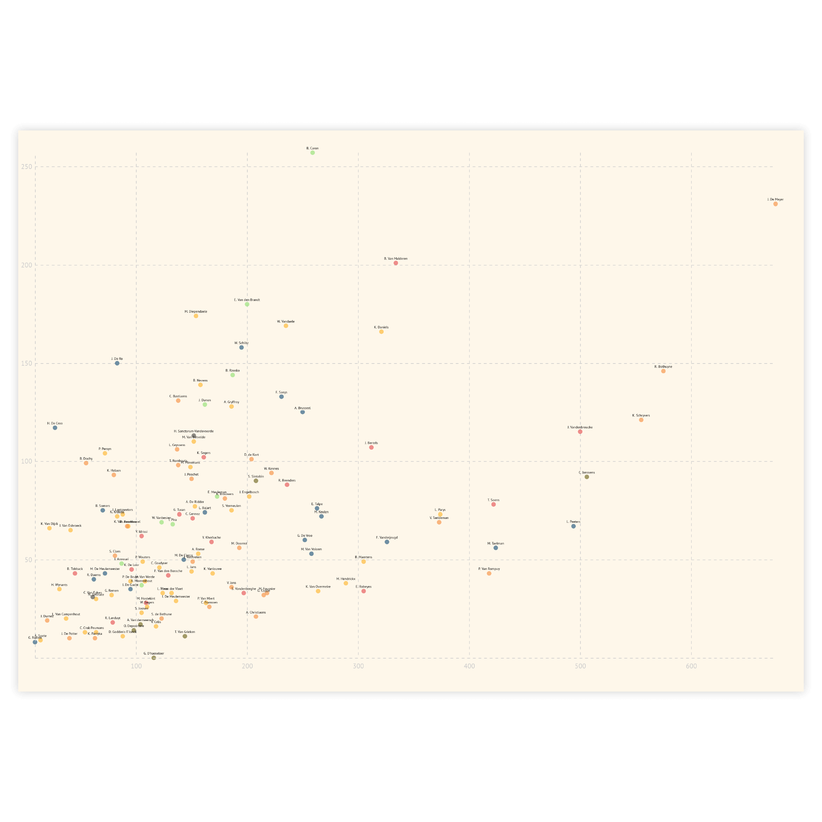
Sometimes we don’t even need any data marks. A label on its own can be enough for communicating the message. This is done by hiding the data marks and leaving the labels only. The labels can be colored just like the data marks by using the link option for label color.
Read moreJitter
If you use a combination of numerical and categorical axes and the plots on the numerical axis are dense, you might run into overlapping data marks. To avoid that you can use the Jitter property along the categorical axis. It allows you to spread data marks near the category line and make the data marks more visible.
Read more