A deep dive into... bar charts
Bar charts and pencils: what do they have in common? When writing this blog, I really don’t know how to start. What can I write about a bar chart that is interesting for you to read or hasn’t been already said? Everybody probably has seen this type of chart and most people have even used it at least once in their life. Data visualization experts often consider bar graphs boring and they often encourage others to avoid using them in their projects.
But consider a bar chart to be like a pencil. A pencil is probably the first tool we learn to use to write and draw. After learning to use a pencil, we discover there are also other tools that do the job. Think about ballpoint pens, felt tip pens, fountain pens, markers, brushes, or even digital pencils nowadays. At first glance these writing tools might look more appealing and less boring than a pencil; they are more colorful, elegant, and sometimes have a feather and glitter on top of it.
All these types of writing tools have their own purpose; the feather pen is used to make a real impression, the marker is used to highlight specific topics, and a brush is used to convey emotions to the audience. But what writing tool would you choose if you want to communicate something in a clear, easy, simple, and reliable way? Indeed, the pencil. This type of tool can be used without any additional expertise or manual and it is useful in almost any case of message you want to convey.
As for the pencil, the same holds for the bar chart. This type of chart is commonly used because of its simplicity. It is very easy to understand and the general public is fairly capable of reading them. A bar chart consists of several rectangles, or bars, that correspond to a specific value. Each of the bars represents one category and a cluster of bars can represent an underlying category. This is why the viewer only needs to decode the bars’ length and position, which makes it easy to compare the different categories.
Because of their simplicity, I recommend always considering using a bar chart in your data visualization if the data structure and the actual message you want to convey allow for it.
Table of contents
3. 3D bar charts: Deluding, Distracting and Difficult 5. References |
How does a bar chart work?
Shapes of bar charts
A chart that has a lot of similarities with a bar chart, the so-called “proto bar chart” was first created in the 14th century by Nicole Oresme. In his publication titled On the Latitude of Forms, Oresme visualized the velocity of an accelerating object against time.
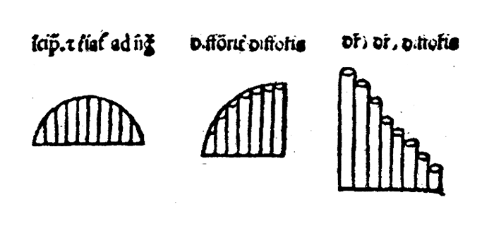
Proto bar chart discovered by Nicole Oresme and published in On the Latitude of Forms
However, the first bar chart resembling the one we see nowadays was invented by William Playfair. This bar chart is titled Exports and Imports of Scotland to and from different parts for one year from Christmas 1780 to Christmas 1781 and was published in The Commercial and Political Atlas.
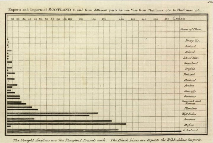 William Playfair’s bar chart in The Commercial and Political Atlas from 1785
This chart is now known as a bar chart. In this type of graph, values are represented by the horizontal length of the rectangles. This makes it easy to label each bar without the risk of overlapping texts. This type of chart is most suitable for showing nominal variables; data without a specific order. An example of a nominal variable is the variable Playfair used in this bar chart; places. Using nominal data in a bar chart makes it possible to order the bars based on value, from low to high or high to low.
However, if we play fair (pun intended), the above chart is actually a grouped bar chart. A grouped bar chart is a multi-series variation of the bar chart. Each category is divided into several subcategories. For example, in the above bar chart, the places on the right represent the main categories and these categories are subdivided into imports and exports. The top bars (ribbed bars) in each category represent imports, and the bottom bars (black bars) in each category represent exports.
The bars of each category are separated from other categories by using spacing. This leads back to one of the Gestalt principles: Proximity. This theory states that when looking at several objects, you will perceive the ones that are close to each other as a group.
Learn more about gestalt principles in our blog Mind your data visualization
When interested in building a grouped bar chart with our Datylon for Illustrator plug-in, keep in mind that, in contrast with a bar chart, the data for the grouped bar chart must be first organized.
When you turn the bar chart 90 degrees, you will get a column chart or vertical bar chart. This type of chart is perfect for showing ordinal data; data with a natural sequence or order. This holds for example for data about different age groups. Though, remember that if the category labels are too long to fit, a bar chart is always a good alternative.
An example of a column chart is shown in the visual below created by Column Five Media. What they did really well in this chart is labeling the chart by using data labels instead of axis labels and axes themselves. By using only data labels the visual clutter is reduced and the essential information is provided.
Though, we think this chart would work better as a bar chart. First, the category labels are too long to fit under the bars, which is why they decided to turn the labels by 90 degrees. This makes them really hard to read. Secondly, since the order of the categories does not have a natural sequence, the chart would also work fine as a bar chart with horizontal bars. Therefore, in the second chart below, I recreated a bar chart with our Datylon for Illustrator plug-in to show you what this would look like.
Column chart by Column Five Media
 Alternative chart redesigned with the Datylon for Illustrator plug-in
It could be that you don’t have a lot of space for the chart and that you think a column chart would save up some space. As shown in the above chart, it is also possible in a bar chart to place the category labels inside the bars (if there is enough space inside).
In contrast with the standard bar chart, there is another type of bar chart in which colors actually should be used to communicate the data. This type of bar chart is called a stacked bar chart and is a good alternative to a grouped bar chart. It is a good choice when you want to compare the total of each group instead of comparing the values of the individual categories.
In a stacked bar chart, the categories should be colored or filled in differently to make it easy to compare them. We recommend only using the stacked bar chart for a maximum of 5 categories per group. Otherwise, the smallest categories become impossible to compare and it will become a circus of colors.
When you are interested in showing the relative differences within each group, instead of the real values, a 100% stacked bar chart is the solution. In the next example, you can see the relative differences between customers, employees, and tourists for different types of transportation. This chart uses only three categories which makes it easy to compare the bars. When using more categories, the individual categories will be really hard to compare because of different baselines. To make it easier to compare the different categories, it is important to order the bars based on one of the outer categories.
Sometimes you find yourself working with data with several categories of which some are negative-sentiment values and some are positive-sentiment values. For example, the Likert scale ranges from strongly disagreeing to strongly agreeing with some steps in between. This type of data would be perfect for a stacked bar chart, you would think.
Though to make it easier to compare the different individual values, you can choose to create a baseline in the middle of the chart with the negative-sentiment values left from this baseline and the positive-sentiment values right from this baseline. This type of chart is called a divergent bar chart.
There is still a big debate about whether divergent bar charts are a good alternative to stacked bar charts. In our opinion stacked bar charts are a good alternative if you are using it with a maximum of 5 categories and if you make sure that the neutral value is placed next to the divergent bar chart. A good example of such a chart is shown in the next figure. Moreover, we recommend only using this type of chart when there is enough space to clearly show all elements of the chart. Otherwise, go for a 100% stacked bar chart.
If you are interested in this debate we recommend you to read the articles and discussions of datawrapper, datarevelations and perceptualedge.
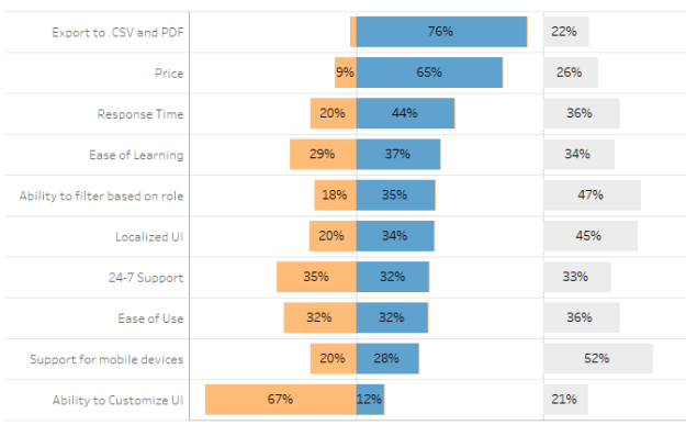
Divergent bar chart created by Data Revalations
Talking about space: the lollipop chart is known to be a good alternative for a bar chart if optimizing space is important to you. This type of chart consists of a line, which represents the magnitude, and ends with a dot, or a circle, which highlights the data value. Using lines instead of rectangles makes this the perfect chart when you have to deal with a lot of categories and save up some space.
In the below example you can see the difference between a bar chart and a lollipop chart. As you can see, the lollipop is less cluttered than the bar chart and has a much better data-ink ratio. When you are dealing with data that have more or less the same value, there is also some risk of the Moiré effect; an effect where the viewer can see not-intended patterns because of overloading the brain with visual information. To avoid this effect, the lollipop chart is the best solution.
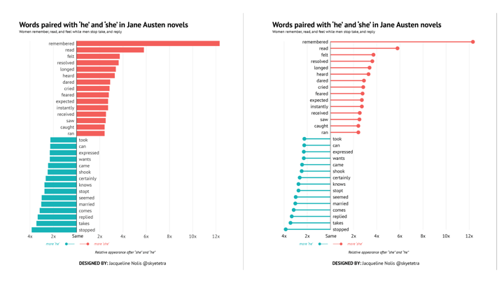 Lollipop and bar chart recreated with Datylon for Illustrator plug-in, design by Jacqueline Nolis.
If you are still not convinced that the bar chart is actually a really cool chart that comes in handy most of the time, I have an alternative for you. If you really want to impress the audience with your chart and the appearance of your data visualization is more important than the interpretation of the data, an option is to create a radial bar chart. This type of chart looks visually appealing but you really need to be careful with it.
The beautiful chart below is part of the infographics for Nike’s Summer of Fuelband program and was developed by Script & Seal together with Doubleday & Cartwright. Normally, a radial bar chart consists of one bar chart wrapped around a circle. In this case, they created two radial bar charts for two genders and connected them to each other; very creative.
However, a radial bar chart is really hard to interpret. The most outer bars are longer than the most inner bars for the same value, which can be very misleading. Therefore, always consider whether this disadvantage really outweighs the visual appearance of the chart.
The designers tried to overcome this disadvantage by adding shapes in the background that show where the range starts and ends for all the bars. This makes it a bit easier to interpret the data, but still, it is hard to interpret the precise percentage of active users for the most inner bars.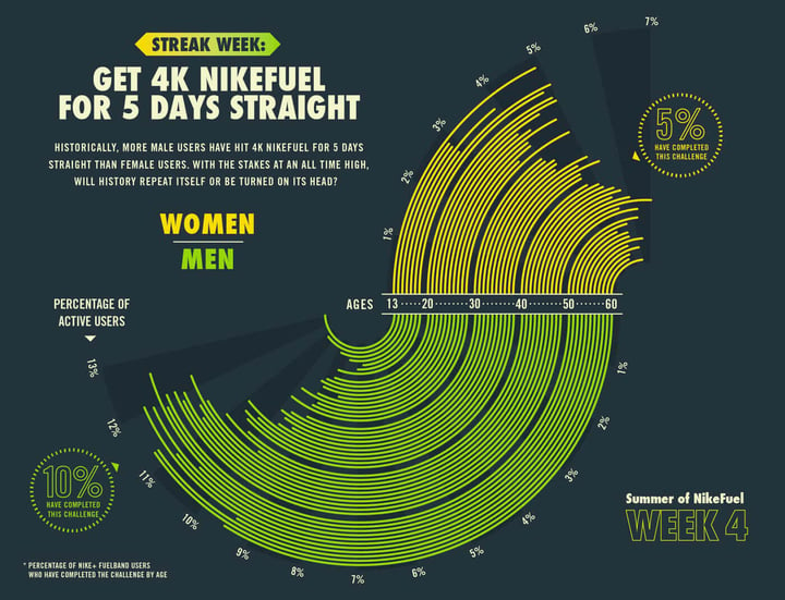 Radial bar chart created by Script & Seal together with Doubleday & Cartwright for Nike’s Summer of Fuelband program
The bar chart, grouped bar chart, vertical bar chart, stacked bar chart, divergent bar chart, and lollipop chart can all be created in our Datylon for Illustrator plug-in. For the radial bar chart, you have to stay tuned until we will add it to our Datylon Chart Library.
Creative bar charts
Since a lot of designers think the bar chart is boring and are trying to avoid using it, a lot of them become really creative with using the bar chart as a base for their data visualization.
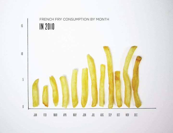
An example could be to use real-life objects as a bar chart. In the next example by Lauren Manning, fries were used instead of columns to communicate the French fry consumption by month. These types of bar charts work really well if you want to draw attention or provoke specific emotions.
3D bar charts: Deluding, Distracting and Difficult
There is always the risk of going too far with your creative bar chart. One way of stretching creativity is by using 3-dimensional (3D) bar charts.
The bars in a 3D bar chart are really hard to compare with each other which makes it difficult to interpret the data in the right manner and find the exact value of the bars. Moreover, these types of charts can be misleading, since you will interpret bars differently when they are located more closely or further away from you.
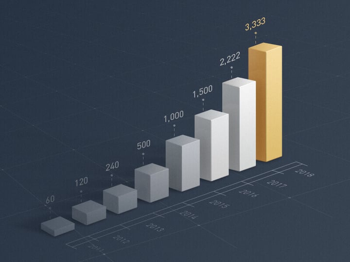
If you take a look at the 3D bar chart in the next example, you will notice that you will perceive the bars differently when they move further away. Therefore, this chart would work way better when a normal bar chart was used instead of a 3D version.
Passing with flying colors
At Datylon, we always follow the general rule of only using color if it communicates additional information. Therefore, for most basic bar charts, one color should be enough. Using colors to make a bar chart more beautiful will only make them harder to read.
The designer of the above chart used yellow to highlight the most important category of the chart, which was in this case the most recent year. This is actually a really good reason to add color to a bar chart. Highlighting is useful in drawing attention to the most important categories of the bar chart. All the other bars could be colored the same way in a neutral color. Our brain is programmed to notice deviations instantly. This can be done, for example, by applying changes in size, movement, or color. Therefore, highlighting a specific bar will help catch the reader’s eye immediately.
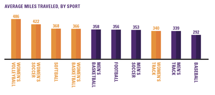
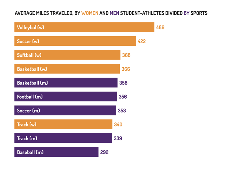
Another reason to color a bar chart is for specifying subgroups in the chart. The chart about the average miles traveled by women and men student-athletes divided by sports is an example of a chart where coloring the subgroups is really well shown. In this chart, they used color to show the differences between men’s and women’s sports. They also could have decided to only mention the differences in the labels, but using the colors for gender makes it way easier to interpret the chart in a few seconds. Moreover, I really appreciate that they didn’t use stereotyping colors to differentiate between genders.
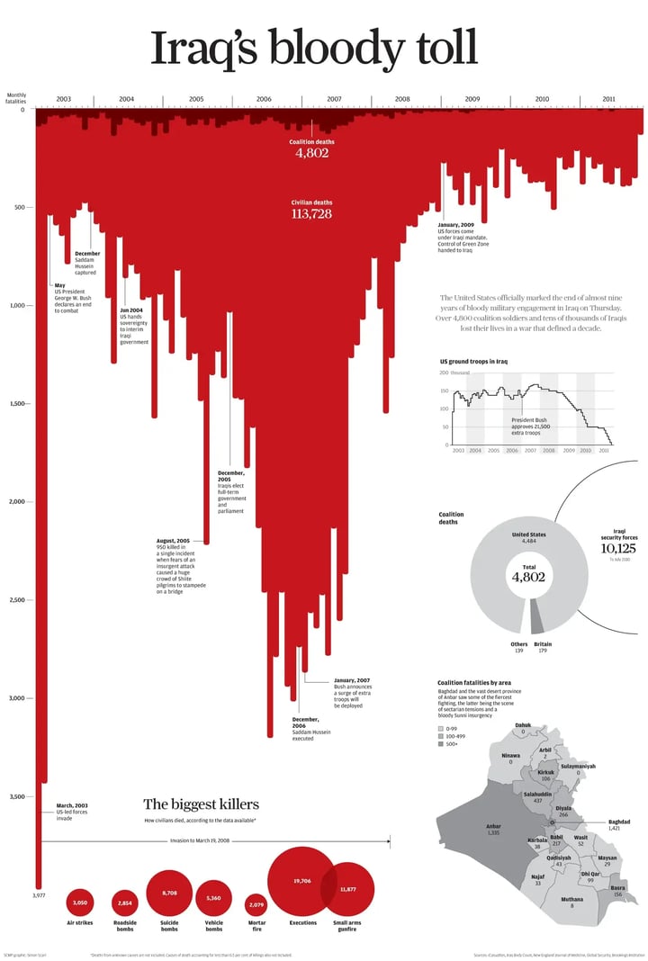
In the striking data visualization by Simon Scarr below, the use of color was really well used to draw attention. The color red was used to refer to the blood of the tens of thousands of Iraqis that lost their lives in the war. Moreover, Simon Scarr turned the bar chart upside down to make the chart even more memorable.
References
- Clagett, Marshall (1968), Nicole Oresme and the Medieval Geometry of Qualities and Motions; a treatise on the uniformity and difformity of intensities known as Tractatus de configurationibus qualitatum et motuum, Madison: Univ. of Wisconsin Press, pp. 85–99, ISBN 0-299-04880-2
Further reading & resources
- Bar chart resource page - Your starting point to create bar charts, full of useful design tips for stunning data visualization.
- Bar charts 101 - Tips and suggestions for your next bar chart.
- Mind your data visualization - How to present your data effectively by getting the most out of your reader’s brain capacity.
- Bar chart properties - Discover all styling properties in Datylon and use them to design your own bar chart.
➡️ If you want to apply what you just learned and present your data effectively to your audience, Datylon can help! Create the most stunning bar charts or other types of charts and graphs. Datylon offers styling options like no other chart maker tool to allow you full freedom of design. Sign up using this link — it’s free and only takes a few seconds.

Dieuwertje van Dijk - Data Visualization Designer
Data, graphic design, illustration, food and mountains let her dopamine neurons spark on a daily basis. Most of the year she lives in Georgia where she spends her free time enjoying nature in a rooftop tent, eating khinkali and drinking wine.

