Datylon Chart Library - Bar Chart Resource Page

Bar chart

An example of a bar graph designed with Datylon for Illustrator, a chart maker plugin for Adobe Illustrator
DATYLON > CHART LIBRARY > BAR CHART

What is a bar chart?

 
A bar chart is a set of rectangles with a length proportional to the values it represents. Each rectangle – the bar, is a representation of one category.

Bar charts are great for comparison. The differences in bar length are easier to perceive, than, for example, differences in size and color.

Bar charts are commonly used charts due to their simplicity. Viewers mostly need to decode their bars' length and position, making bar charts very easy to understand. The general public is fairly capable of reading bar charts, so no additional dataviz expertise is necessary. For this reason, bar charts are doing their job really well. That's why, if the data structure and the actual message you're trying to convey allow for it, you should consider using bar charts in your data visualization.
 
Start making your own bar chart with Datylon

Variations of bar charts

The charts below are variations of a bar chart. To learn how to make them with Datylon, check out the bar chart user documentation in the Datylon Help Center.
Datylon chart library: use a column chart as a variation of a bar graph

Column chart

This chart is a bar chart turned by 90 degrees. The main difference is in the usage of categorical labels. Long labels don't suit column charts because of easy overlapping. But it might be useful if the labels are short and don’t take a lot of horizontal space.

Datylon chart library: use a grouped column chart as a variation of a bar graph

Grouped column chart

This is a variation of a column chart where every category is represented by several columns communicating different aspects of the main category. Columns of each category are separated from the other categories using spacing.

Datylon chart library: use a stacked column chart as a variation of a bar graph

Stacked column chart

A stacked column chart shows a relation of stacks to the whole column and relations between whole bars. The whole column can be also presented as 100%. In this case, the stacks show a relative part to the whole column in percentages.

Datylon chart library: use a diverging bar chart as a variation of a bar graph

Diverging bar chart

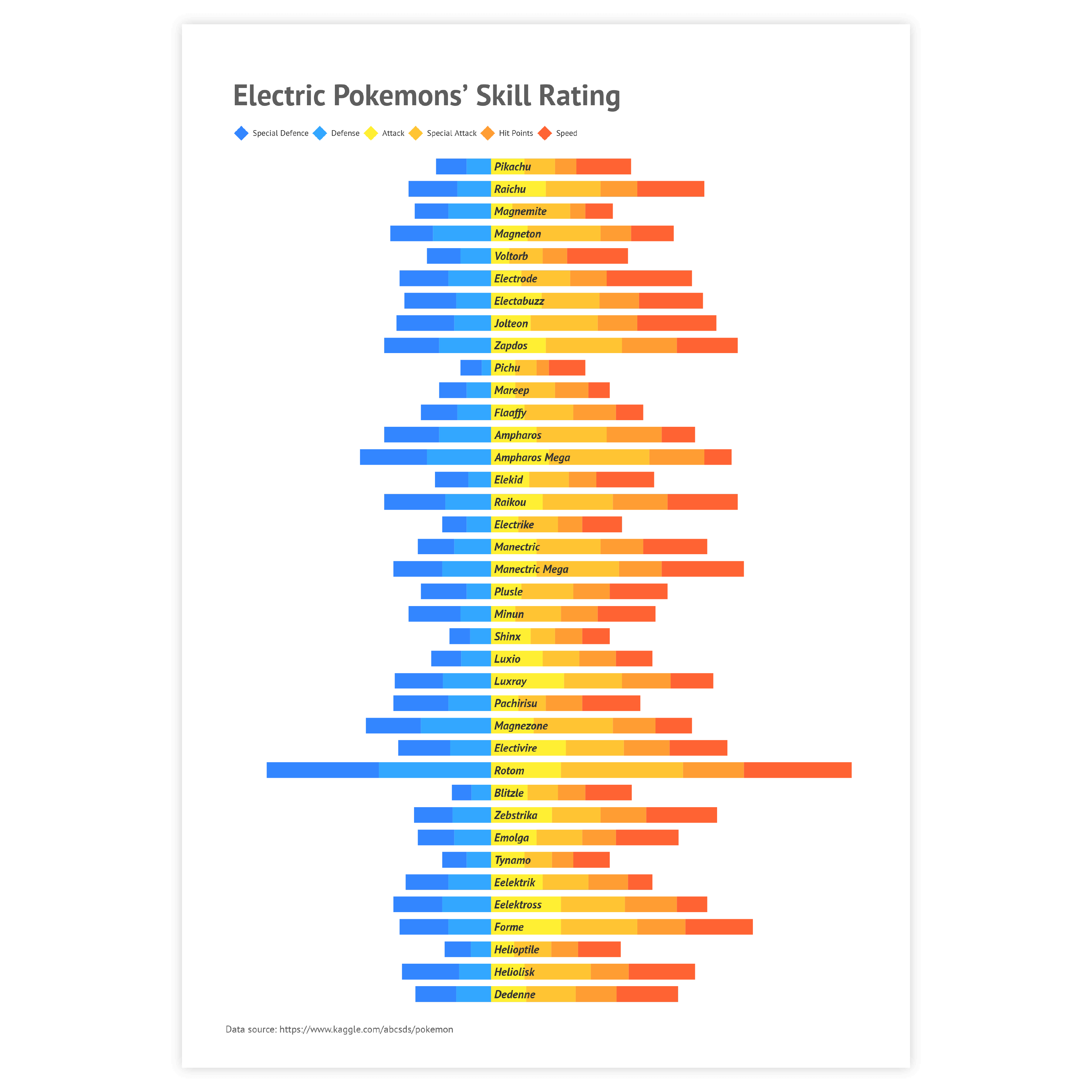
This is a stacked bar chart that separates stacks with the axis baseline. This can be useful for the comparison of paired categories.

Datylon chart library: use a lollipop chart as a variation of a bar graph

Lollipop chart

Lollipop charts are a sweet alternative if you are dealing with a lot of categories and want to make optimal use of space.

Datylon chart library: use a histogram as a variation of a bar graph

Histogram

A histogram might look like a column chart but the data structure is different. Each column represents the number of items that fall into a certain data range.

Alternatives to a bar chart

Substitute your bar chart with any of the charts below when you want a visual alternative that still allows you to compare values within and between categories.
Datylon chart library: use a dot plot as an alternative for a bar graph

Dot plot

A dot plot visualizes (two or more) numerical values per category in a very space-efficient way. So replacing your bar chart with a dot plot can be valuable when the number of items under one category is too numerous. The whole bar can be replaced with just one dot.

Datylon chart library: use a icon chart as an alternative for a bar graph

Icon chart

If the range of the values that are visualized is too wide and some of the bars can be lost, using an icon chart can be a good alternative. Icon charts use area rather than length to visualize values, which allows them to display a larger range of values in a compact way.

Datylon chart library: use a line chart as an alternative for a bar graph

Line chart

It's possible to substitute your bar chart with a line chart if the number of plotted bars is too large and both of the axes represent numerical or datetime values. Line charts can be a good alternative to a grouped bar chart as they can noticeably reduce the visual clutter.

Pro tips for designing a bar chart

Learn how to improve the readability and visual appeal of your bar chart.
Use data labels instead of axis labels and gridlines in a bar graph to improve its readability

Labeling

The rule of thumb for using labels in bar charts is to use data labels instead of axis labels and axes themselves. By using only data labels the visual clutter is reduced and the essential information is provided.

Read more
Use one color in a bar chart instead of a range of colors to improve its visual appeal

Coloring

Coloring of bar charts follows the general rule of using color in data visualization – use color only if it communicates additional information. For any basic bar chart, one color should be enough. Don’t use a new color for every bar chart just to make it beautiful. It will just make a bar chart harder to read.

Read more
In order to highlight a bar in a bar graph, use one color for a bar you want to highlight and a neutral (i.e. grey) color for the rest

Highlighting

To draw attention to the most important categories of the bar chart, a good solution is to highlight these bars and color all the other bars the same way in a neutral color. Our brain is programmed to notice deviations instantly. This can be done, for example, by applying changes in size, movement, or color. This way, highlighting a specific bar will help catch the reader’s eye immediately.

Read more
Use ascending or descending sorting in a bar chart and make your bar graph more readable

Sorting

Using ascending or descending sorting puts the bars in order and helps the user to read the chart. It also reduces the time needed to compare the differences between different bars.

Read more
Use overlaying bars in a bar chart to compare the value against the target value.

Overlaying bars

While grouped bar charts can be useful for comparing two instances of the same order, overlaying bars can spot the slightest difference between two groups of values, for example between the actual and the target value.

Read more
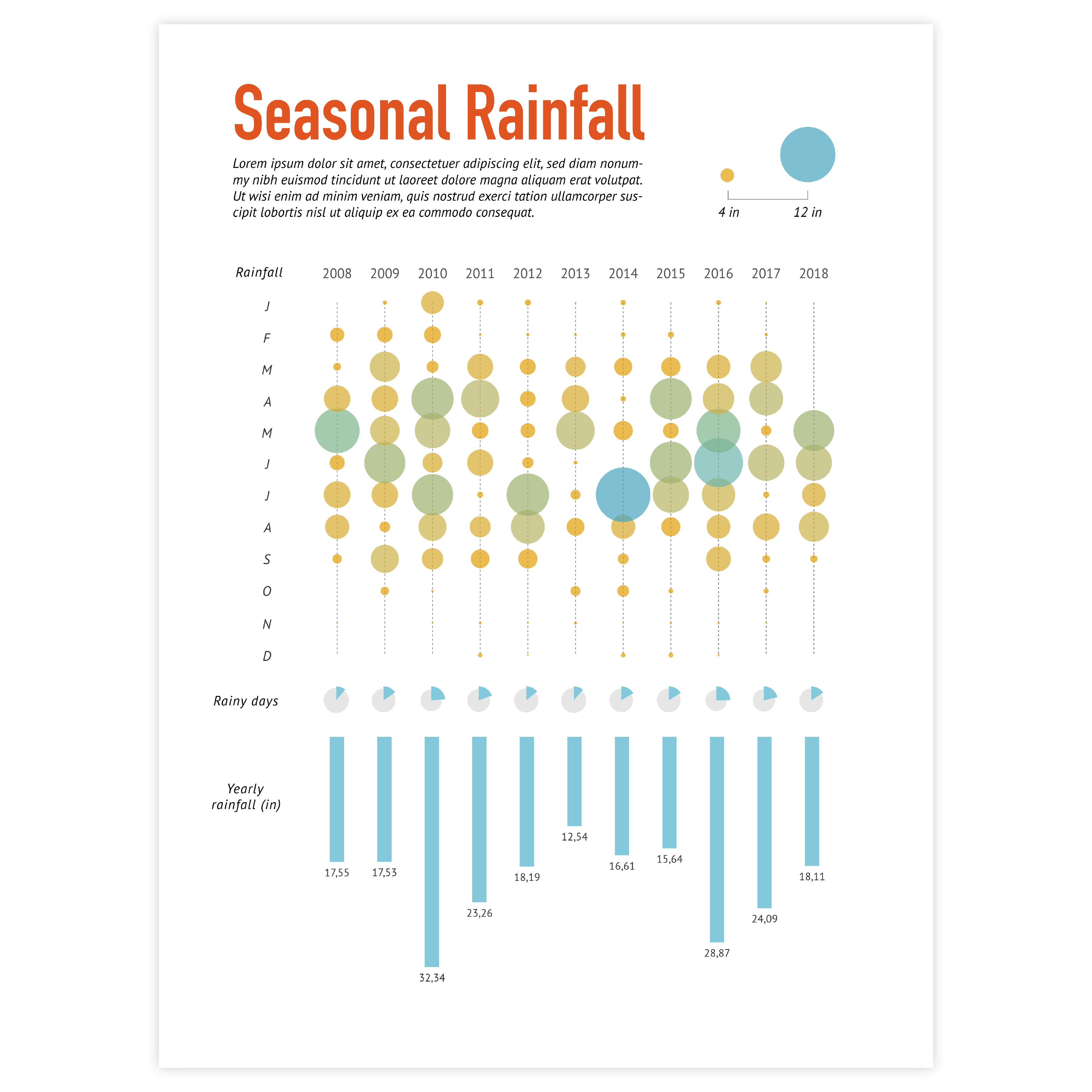
Create your own bar chart

Join Datylon for free and get started online or download our Datylon for Illustrator plug-in with a 14-day trial. Connect with a Datylon expert for a demo session.

Bar chart examples & inspiration

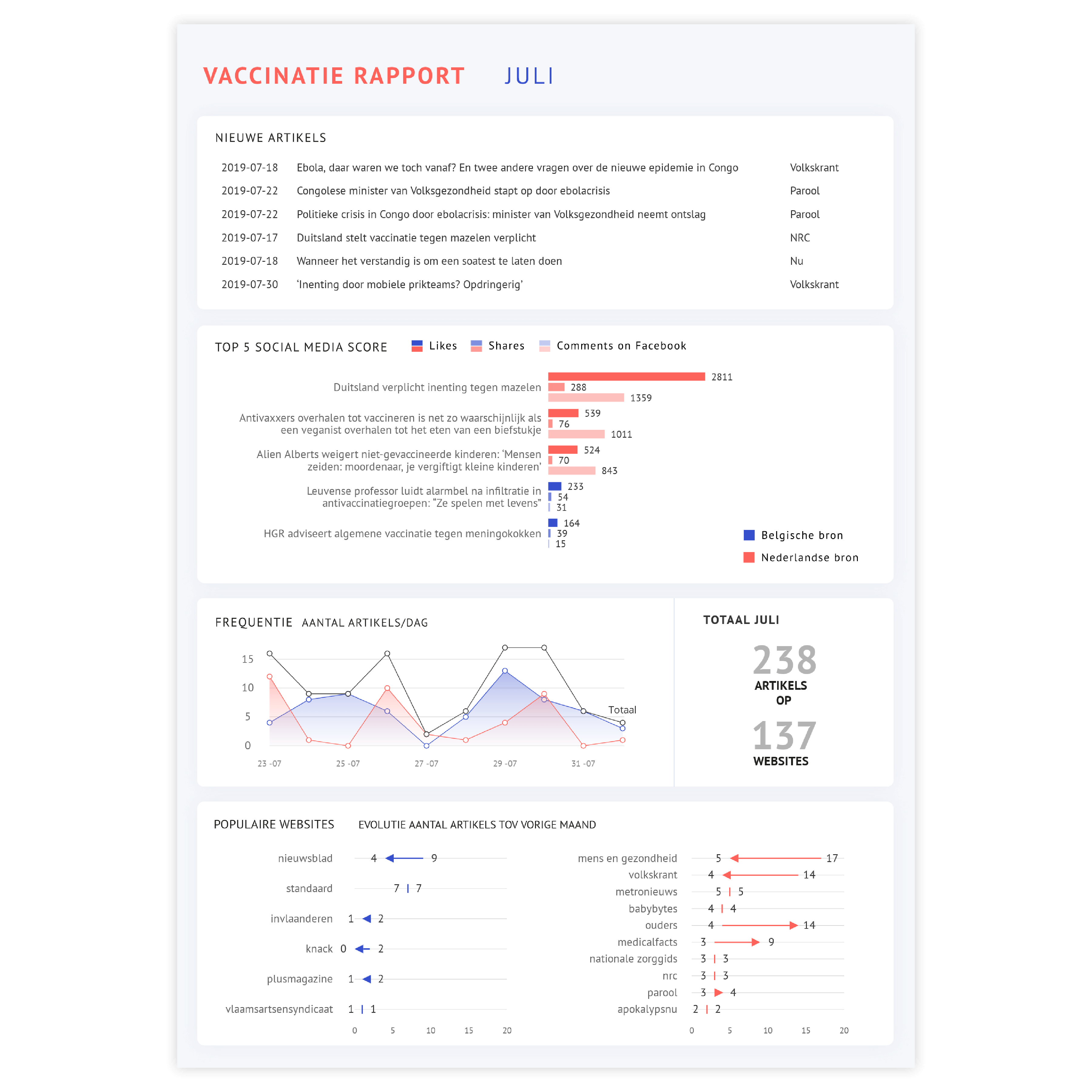
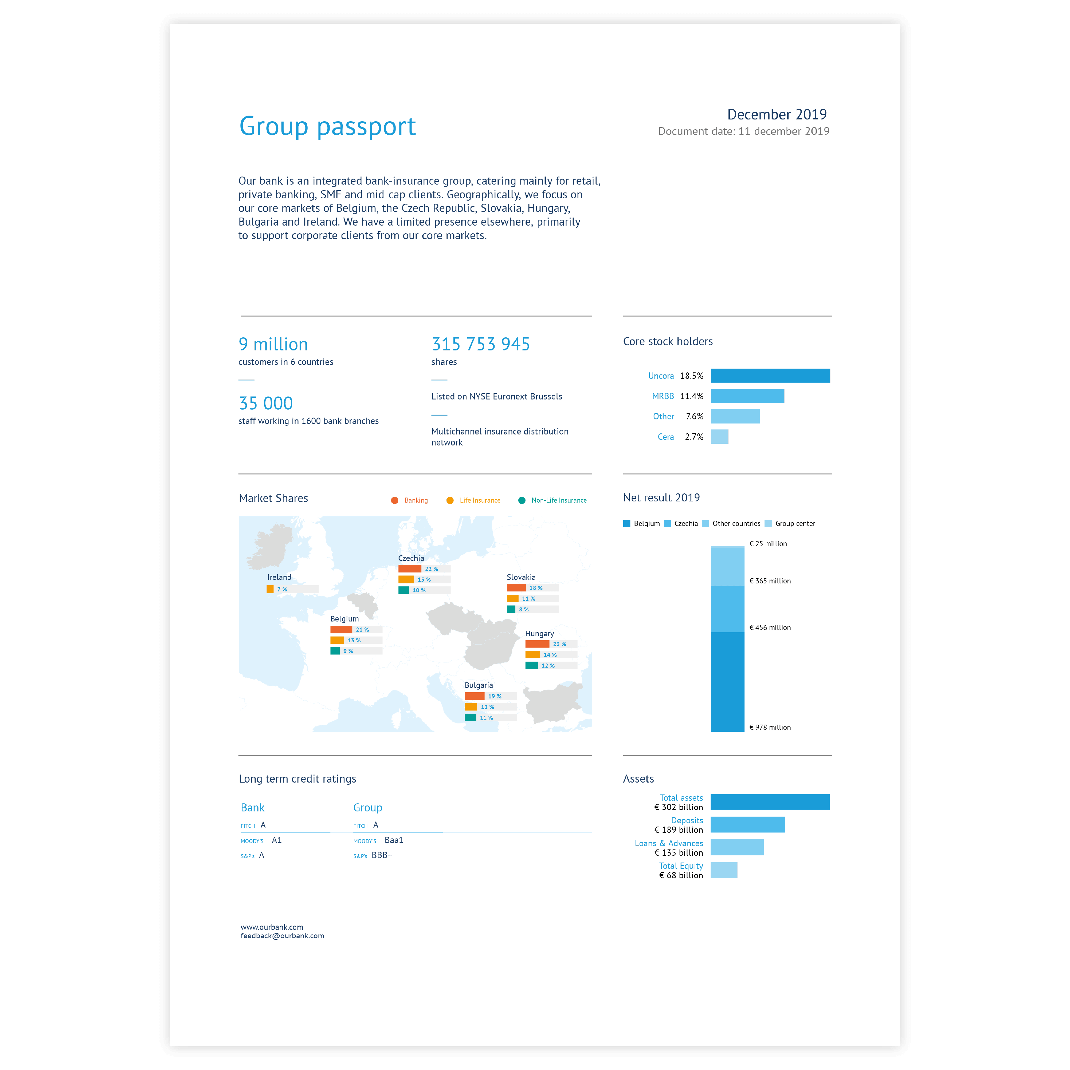
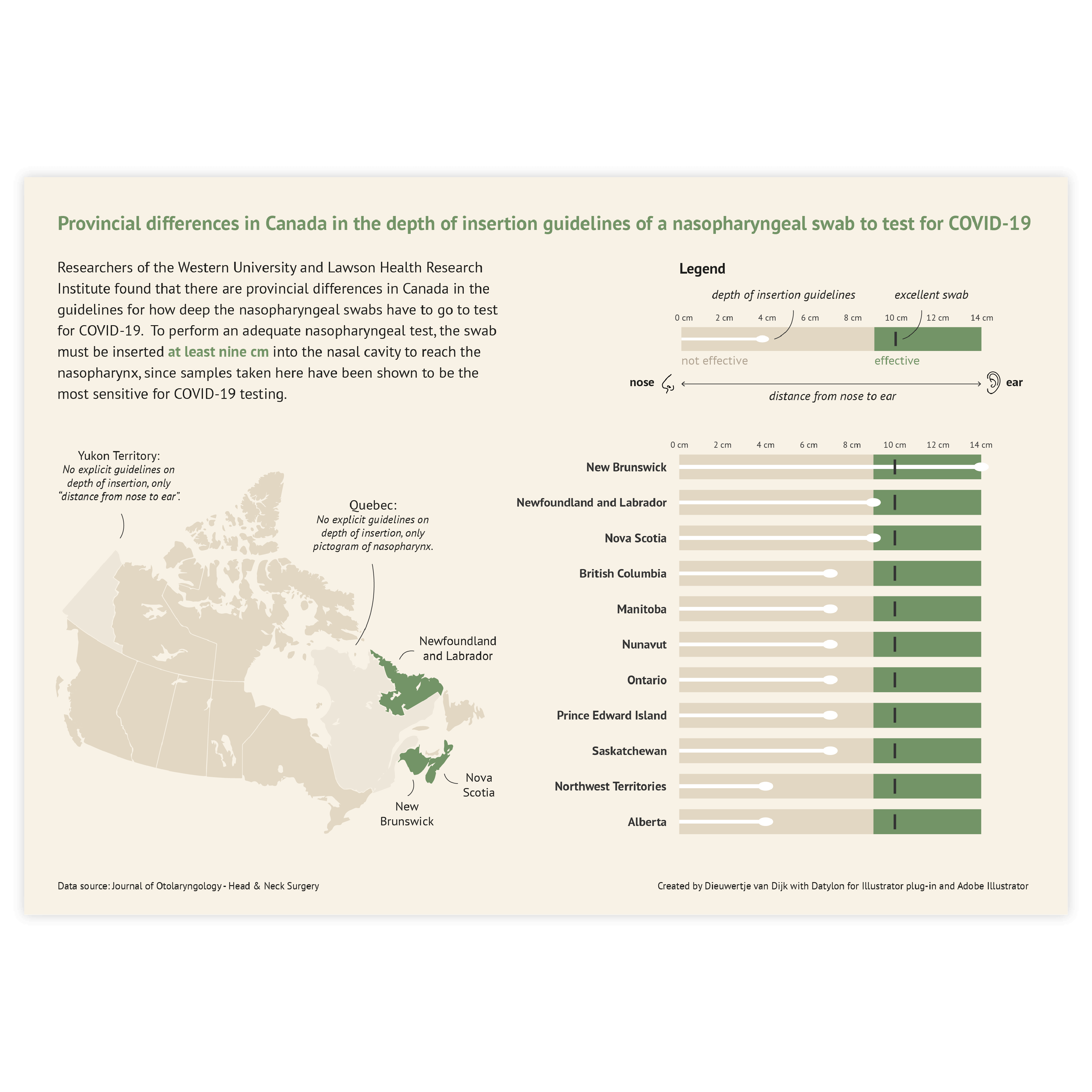
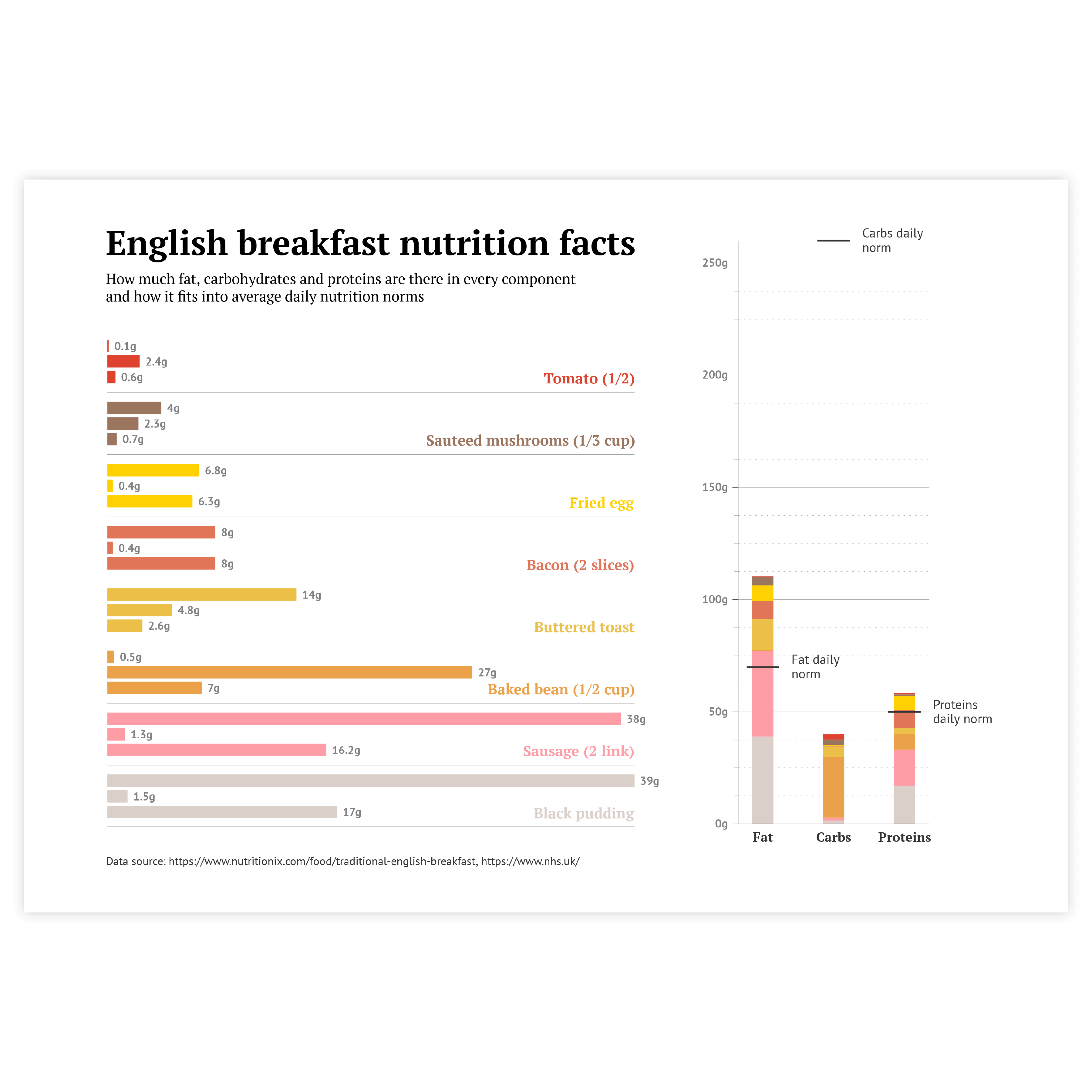
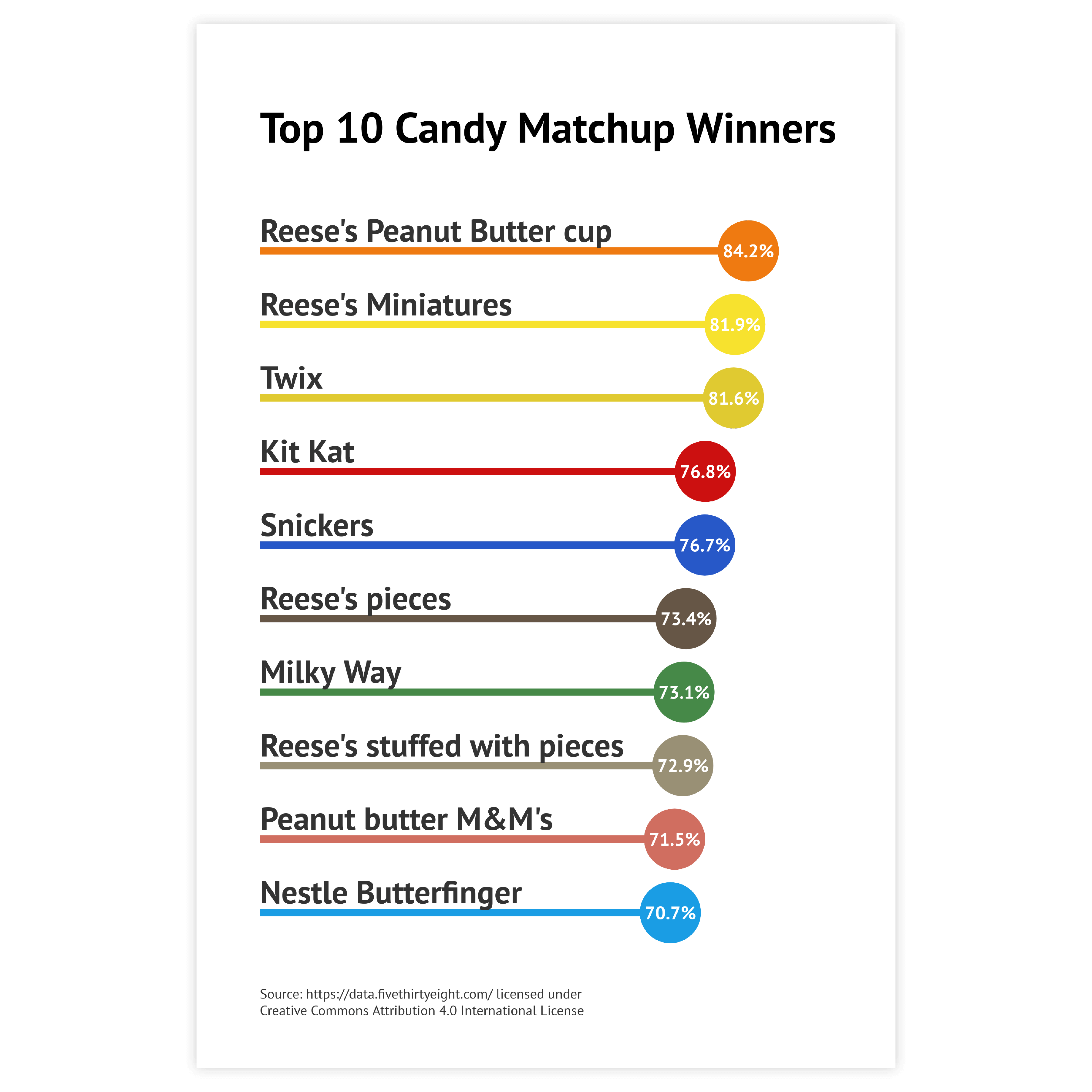
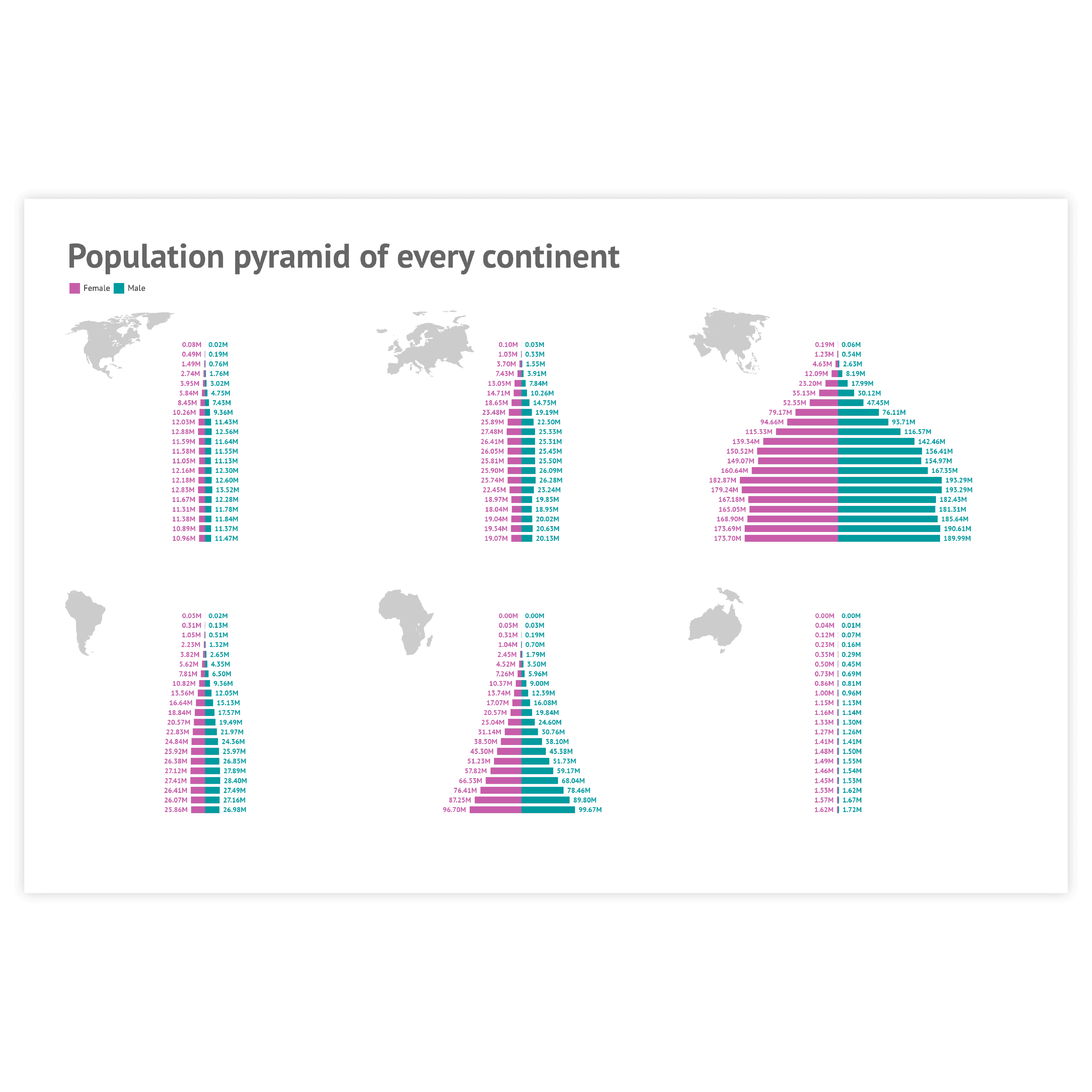
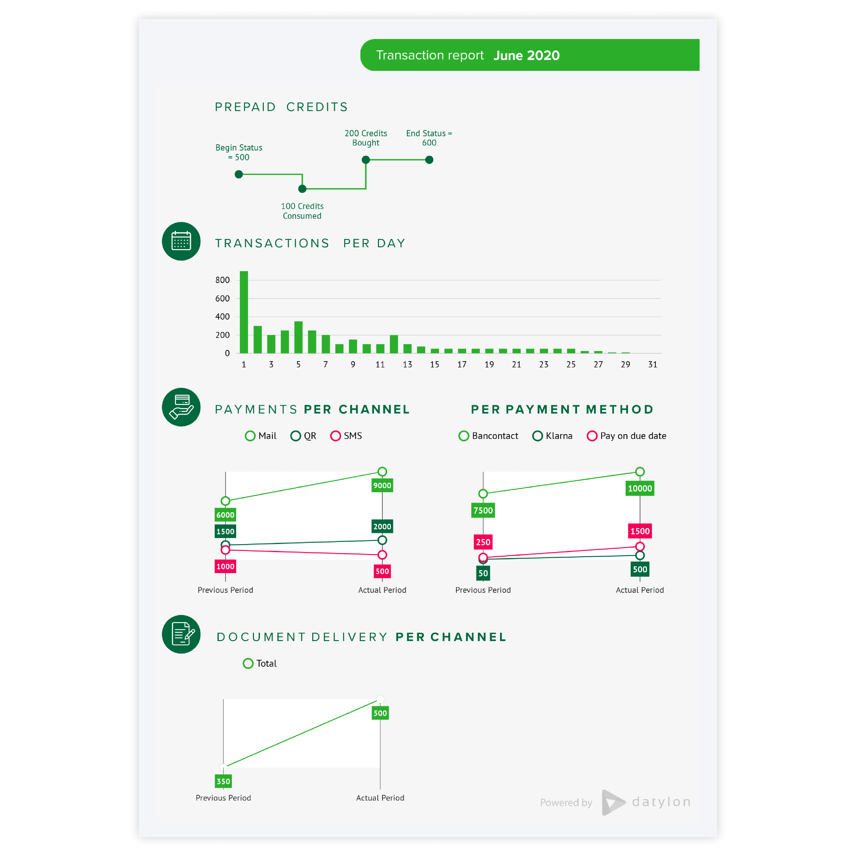
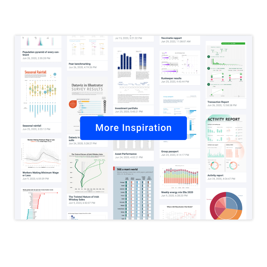
Scroll and click on the images below to find inspiration samples of bar charts. With your Datylon account, you can use these designs, customize them and update them with new data. 

Discover more charts in our Chart Library

Learn more about the different types of charts and graphs you can design with Datylon. Discover other resource pages in our Datylon Chart Library.