Area chart
DATYLON > CHART LIBRARY > AREA CHART
What is an area chart?
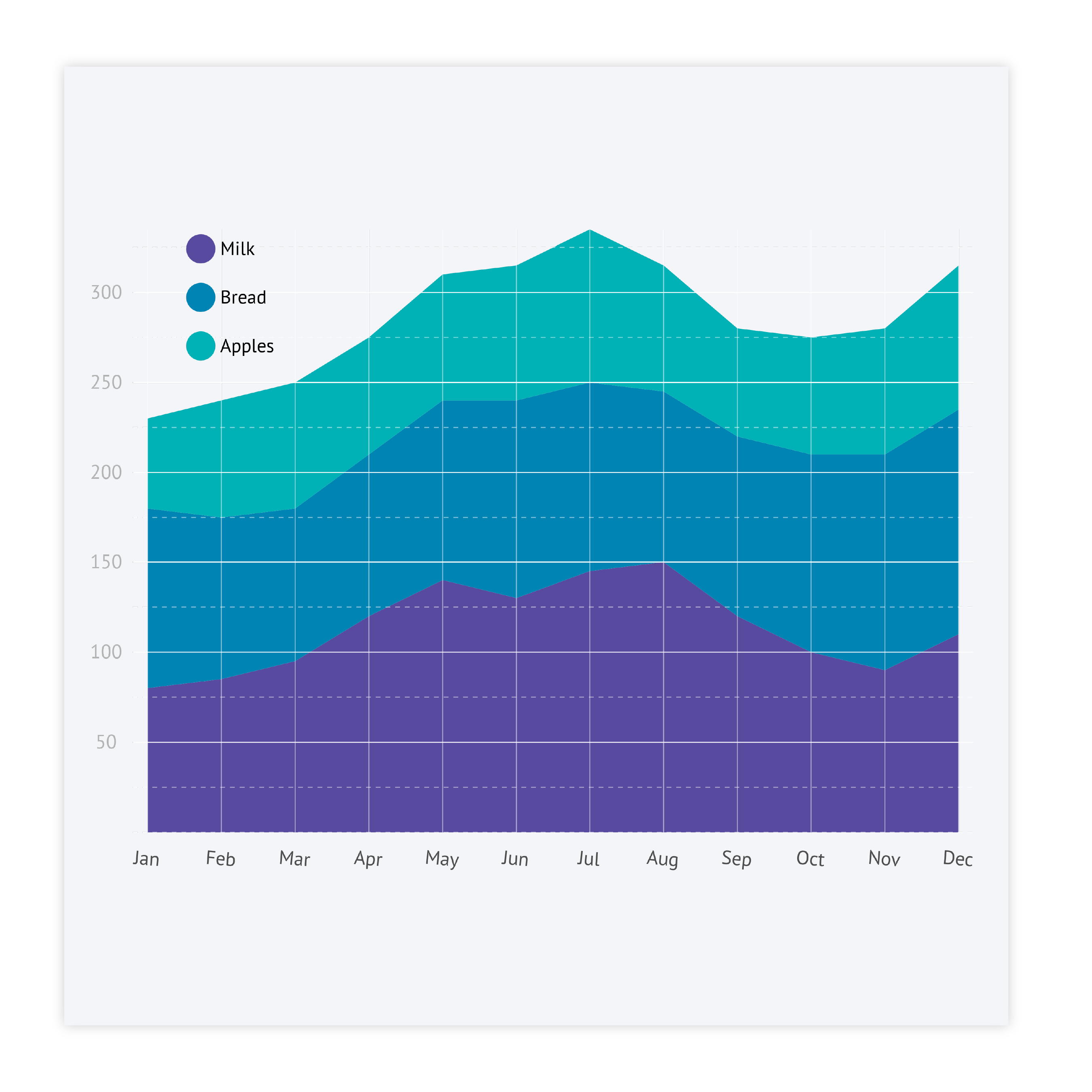
An area chart, just like a line chart, is used to visualize data over time. Visually, the main difference is that in the area chart, the space under the line is filled with color. The area chart is used instead of a line chart in case one needs more notable visuals. Also, area charts are more useful than line charts to visualize the summation or difference between groups in the chart. The space filled under or between the lines makes it cognitively easier to understand the relationship.
The X-axis, or independent variable, is mostly used to show time intervals, while the Y-axis, or dependent variable, shows the numerical variable. Area charts are handy for indicating trends. When using area charts in your data visualization it’s important to remember that the Y-axis should start from (or include) a zero. Otherwise, the chart perception might be distorted.
The area chart is one of the oldest chart types. It was popularized by William Playfair, who used this type of chart in his 1786 book “The Commercial and Political Atlas”.
Area chart examples & inspiration
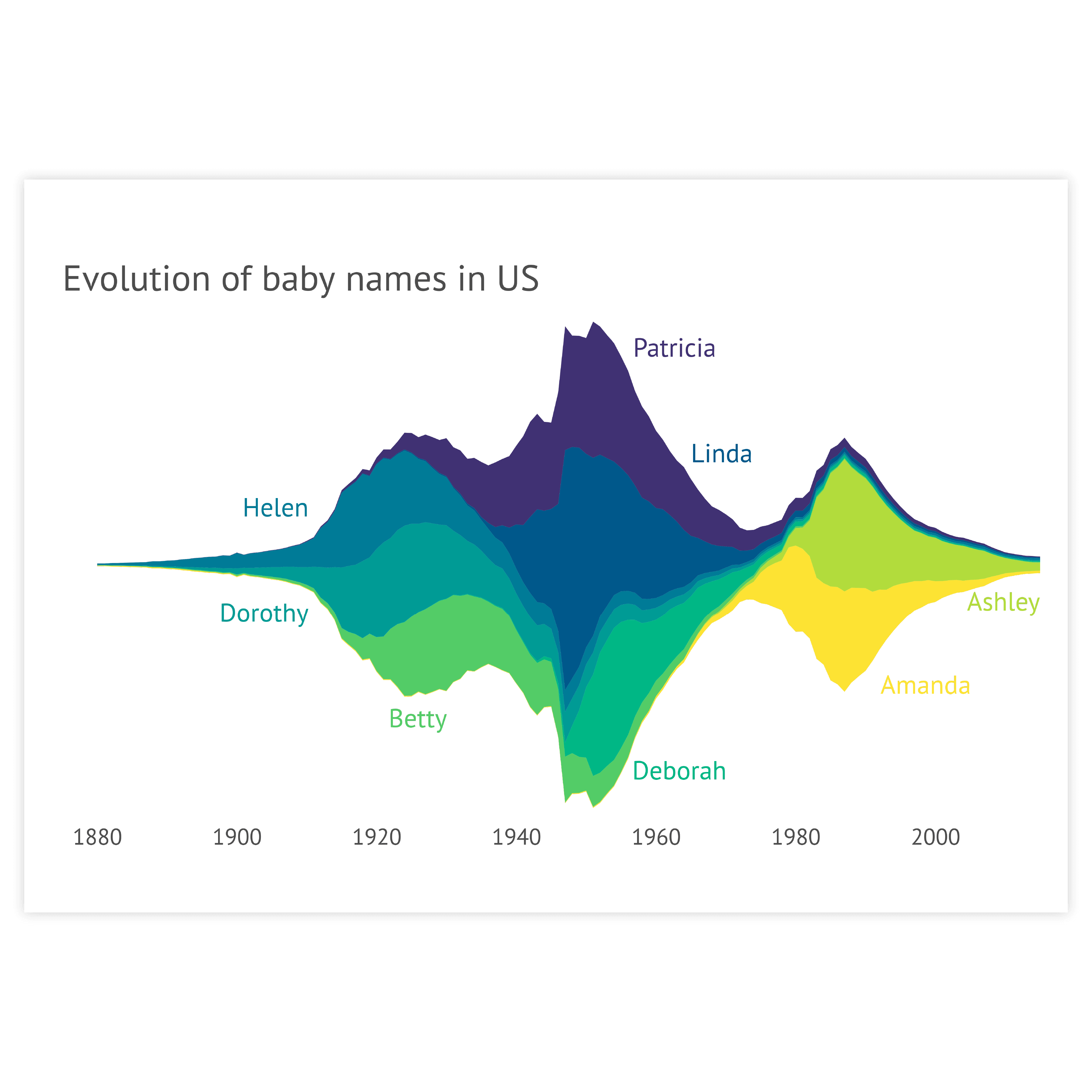
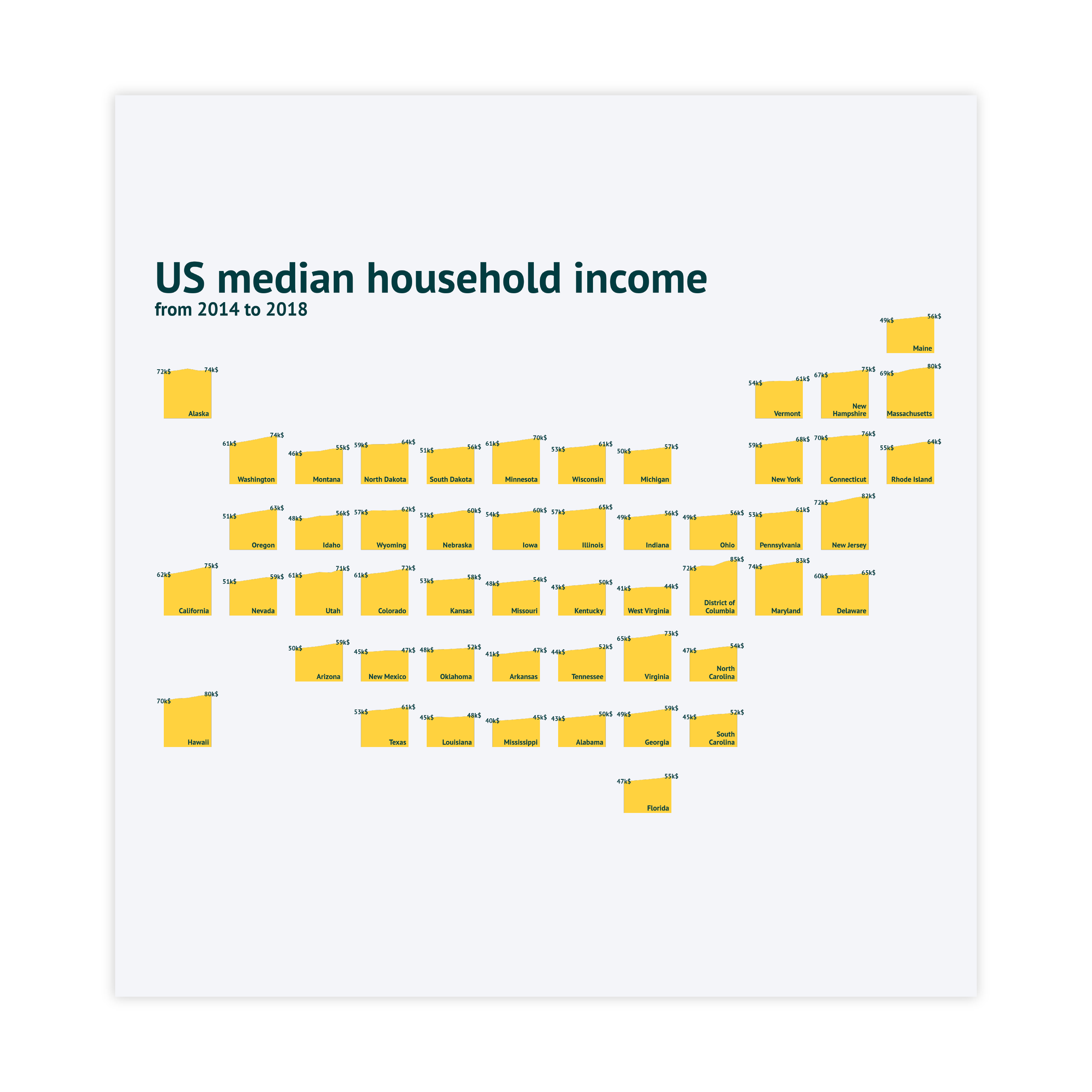
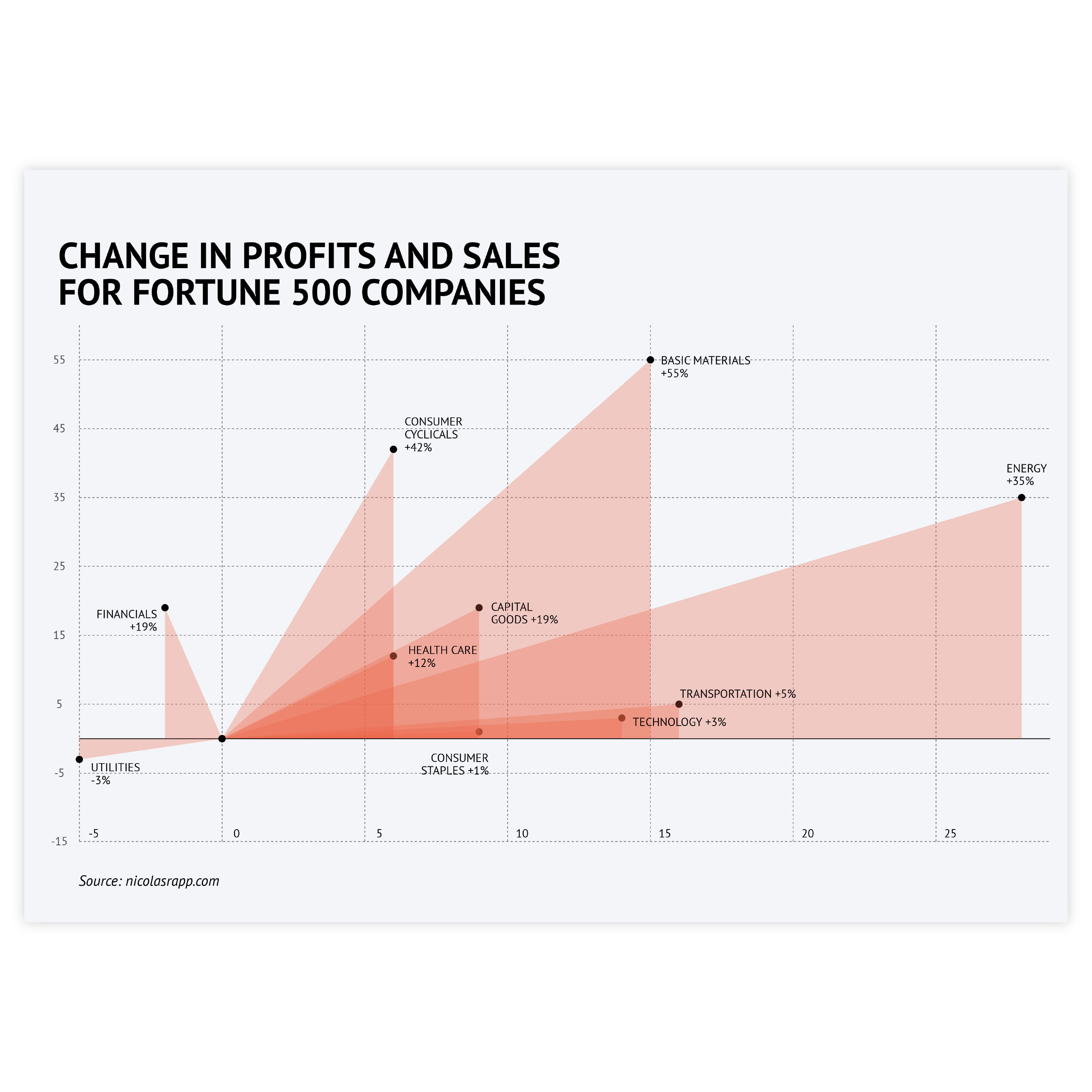
Scroll and click on the images below to find inspiration samples of area charts. With your Datylon account, you can use these designs, customize them and update them with new data. Or start designing your very own area chart!
Variations of area charts
The charts below are variations of an area chart. To learn how to make them with Datylon, check out the area chart user documentation in the Datylon Help Center.
Alternatives to an area chart
Substitute your area chart with the charts below when you want a visual alternative with filled areas under the data points or a functional alternative that allows tracing data over time.
Pro tips for designing an area chart
Learn how to improve the readability and visual appeal of your area chart.
Labeling
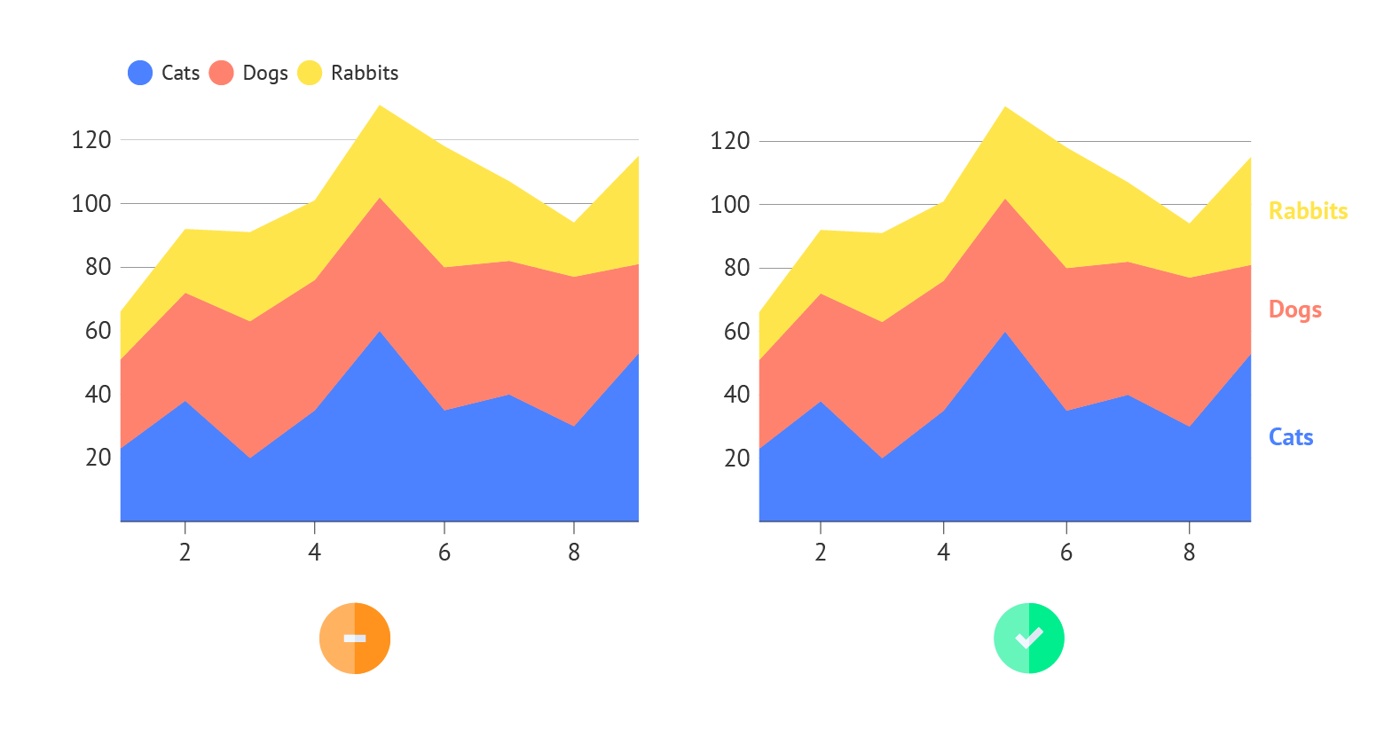
You can label every series in your area chart directly or via a legend. In general, direct labeling is preferred. Direct labeling includes placing the names of the categories right next to the corresponding area. This is more beneficial as the viewer does not have to switch its view between the chart and the legend to learn which areas correspond to which category. Moreover, it makes it easier to read the chart by color-blind people or readers of the chart printed in greyscale. To make it even easier for your viewer, color-code the label with the same color as the corresponding area. In Datylon chart maker you can use the color link option to make the colors of the Direct Labels the same as the corresponding areas.
Highlighting
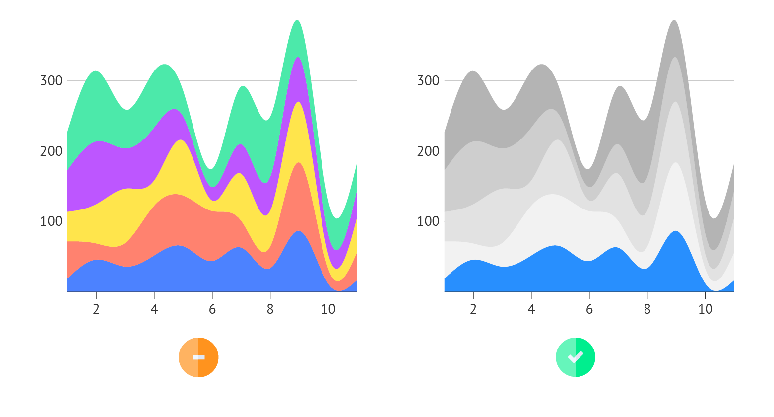
Our brain is programmed to notice deviations instantly. So to draw attention to the most important categories of the area chart, a good solution is to highlight these areas and color all the other areas in a pale grayscale palette. It’s also better to place the highlighted category at the bottom, so it’s easier to interpret it. In general, applying changes in size, movement, or color will make highlighting a specific area easier. And it will catch the reader’s eye immediately.
Read more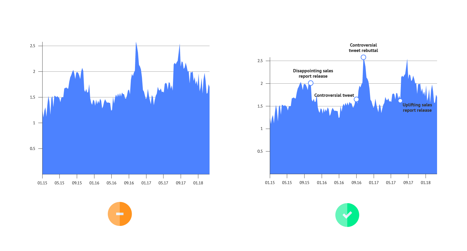
Annotations
As area charts are mostly used for showing trends, there’s no need to add labels for every data point. But at the same time, a reader needs an explanation of what changes the chart is representing. In this case, text annotation for every major direction change is the best solution for highlighting certain events.
Read more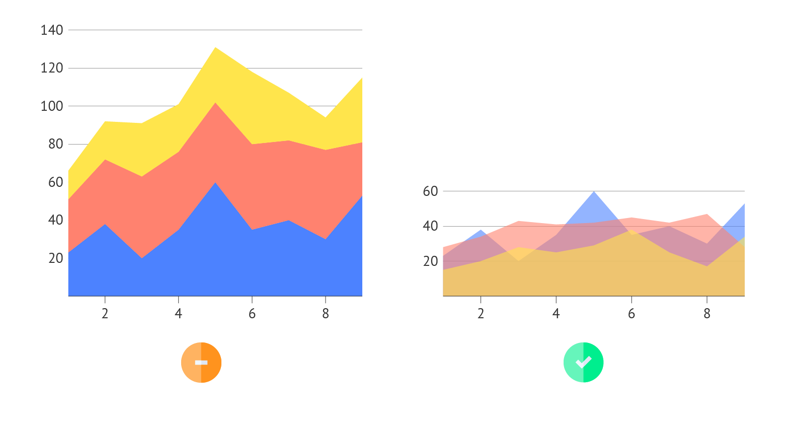
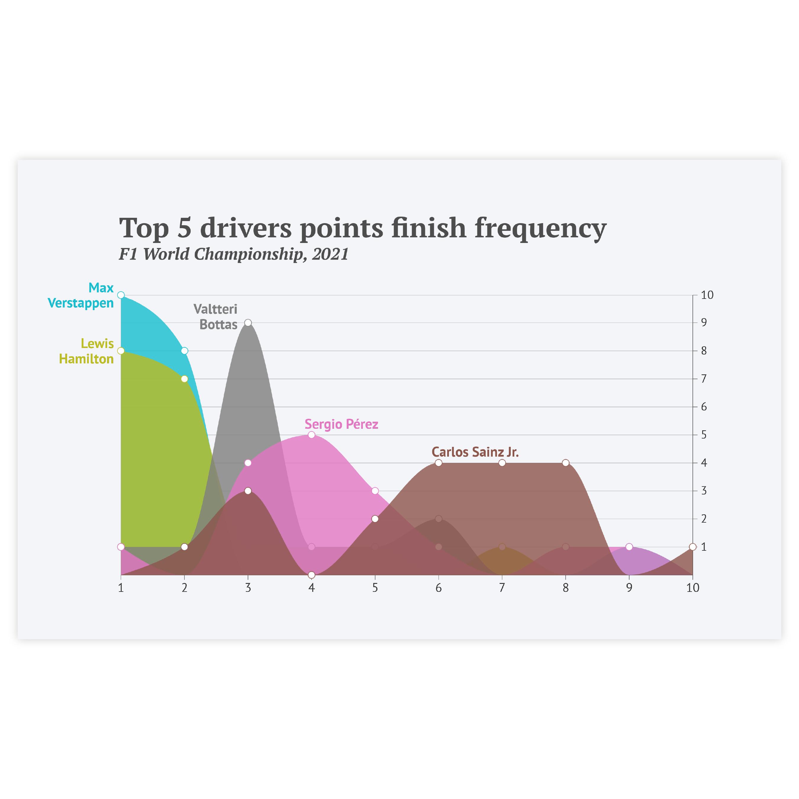
Overlaid series
When multiple series need to be shown but the stacked type isn’t suitable, an overlaid series with decreased opacity might be the right choice. It allows you to show all of the series starting from the same point. The intensity of overlaps of different series might also work as a separate visual clue.

