Why Is Data Visualization Important?

Data visualization is vital in the digital age due to the vast information available. A picture says a thousand words. That’s how the method works, using visuals to simplify complex data.
Professionals use it to present information to non-technical audiences. Everyone involved in communication benefits from understanding data.
The process uses visual elements, as our eyes gravitate to colors and shapes. Charts, graphs, and maps are easier to understand than data in tables.
Discover how to use data visualization in communication. Choose and design powerful visuals to present insights clearly and maximize their impact. Explore data design and reporting tools that make your job easier.
Let’s proceed.

What is data visualization?
We live in a data-driven world, and using data to make informed decisions is critical. Data visualization puts information into a visual context using graphs, charts, and maps. It makes identifying patterns, trends, and outliers easier.
You can also use the technique to:
- Explore and analyze data to discover insights and answer questions.
- Present and share data to inform, persuade, or educate audiences.
- Make data-driven decisions based on the evidence and facts.
Why is this approach popular?
- Speed: Studies show that our brain processes images 60,000 times faster than text. People understand trends and patterns when seeing them in visual form.
- Clarity: There’s no need for lengthy data analysis, when using charts, graphs, and maps.
- Communication: Visuals transcend language barriers, enabling clear communication across diverse audiences.
The following steps help you create impactful data visualizations:
Knowing your audience
Start with an idea of your audience and the questions you’re answering. This knowledge helps you decide on the data to prepare and the tools to use in your presentation.
Choosing the right visual for the purpose
There’s no one-size-fits-all format. Select the types of graphs and charts that tell your story and answer your audience’s questions. Combining related visuals may provide an easy-to-understand message.
Designing charts has never been easier with the right tools. Impactful formats include the following:
- Bar charts: Horizontal or vertical bars display different data groups. Their lengths are proportionate to the values they represent.
- Bullet graphs: A bar chart using an extra line or icon to show progress toward a goal or performance. Ranges can be added to show categories of performance.
- Line graphs: As the name suggests, lines plot data over time, revealing trends and patterns.
- Histograms: This chart uses bars to show the distribution of numerical data and groups your data into intervals.
- Treemaps: Nested rectangles represent hierarchical data.
- Pie charts: Each slice represents the proportion that each category contributes to the total.

Using colors
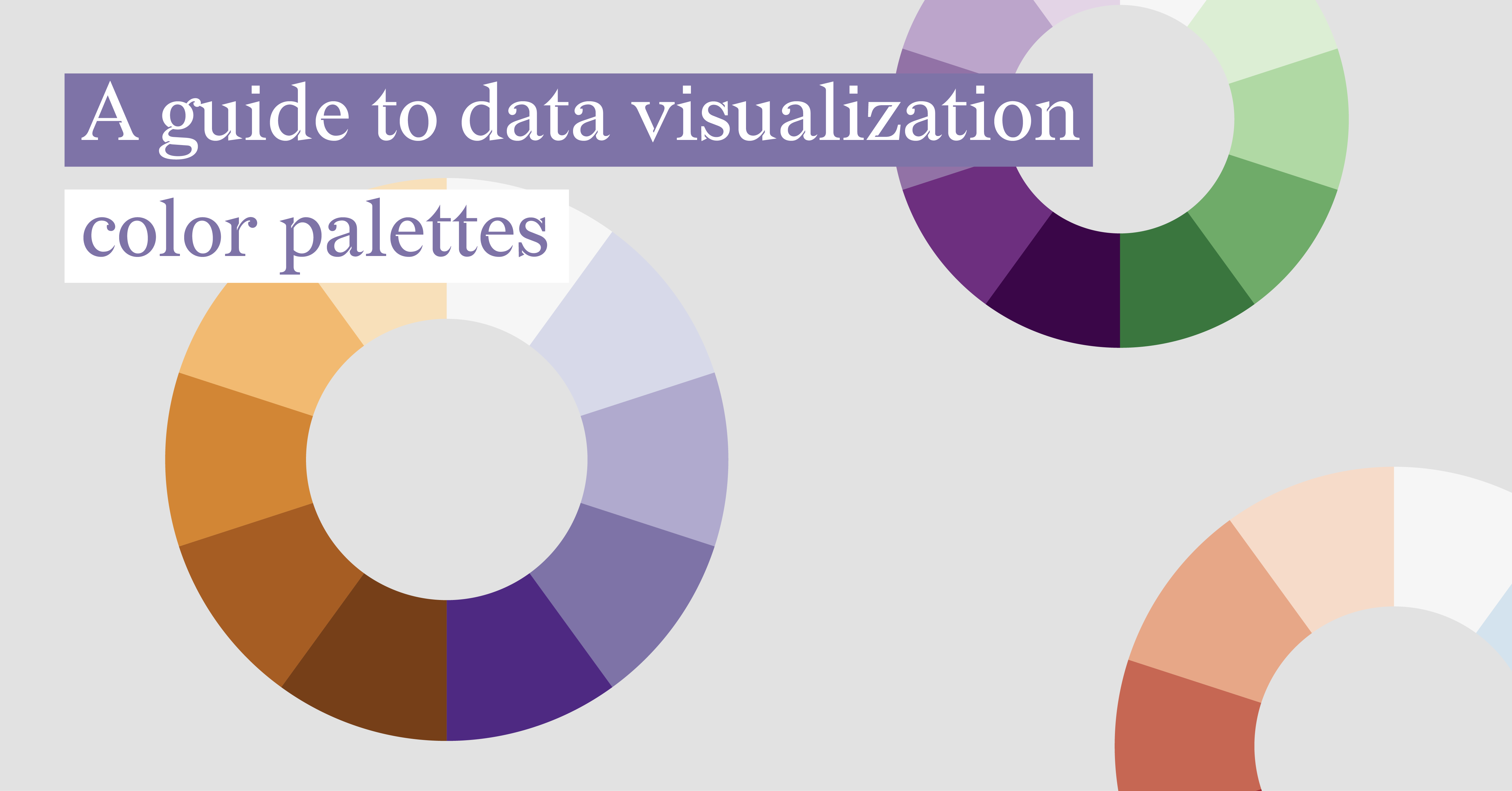
Colors help convey messages more effectively than words, but keep it simple. Use hues to highlight and emphasize information. Avoid too many shades or tones that make your data fuzzy. Choose colors that don’t confuse color-blind people.
Color association matters. Use intuitive hues to help users process the information faster. When depicting temperatures, red usually indicates heat, and blue means cold.
Maintaining color consistency when representing data sets is also critical. Colors that mean one thing on a chart and something diverse in another can confuse.
Incorporating shapes to provide context
Context helps us interpret information without scrutiny. Using identifiable shapes and intuitive colors makes a presentation more engaging. Such charts require very little explanation.
For instance, you could use animal shapes in charts in a report on endangered species. Charts where you can use such shapes are pictorial or icon charts.
Enhances data comprehension
Data visualization takes advantage of how fast humans process visual information. According to research, our brain can process images that we see in 13 milliseconds.
Graphs and charts present complex data in chunks that viewers can immediately understand. Using the right colors and shapes also helps accentuate the information.
An example of how data visualization can enhance comprehension is “The Next America”. This visual presents the United States demographic data in several interactive visualizations.
Its age and gender breakdown pyramid shows the population shift since the 1950s in a few seconds.The annual chart uses bars to represent five-year age groups, from 0 to 85 years and over. The display is animated, so you can see and understand the population shift from 1960, projected into 2060, at a glance.
Another example of how data visualization enhances comprehension is Charles Joseph Minard’s famous graph. It depicts how Napoleon’s attempt to attack Moscow ended in defeat. 422,000 men advanced to the Russian capital from the border.
The wide graph narrows, as he loses soldiers along the way. It continues to get thinner when it shows Napoleon’s retreat from Moscow.Looking at the change in the graph shape, you can imagine the loss of lives during the campaign.
Facilitates quick decision-making
Quick decision-making is critical in a fast-paced business world. The speed at which this happens relies on information clarity.
Executives must be able to see the big picture at a glance. Data visualization transforms abstract numbers into information bits that all skill levels understand.
Identifying trends and patterns is a breeze compared to analyzing tables and spreadsheets. Visual elements allow decision-makers to quickly pinpoint areas of concern and the solution.
Apply the following practices to benefit from data visualization:
- Use relevant visuals that suit the source data.
- Include background information that provides context for the charts, figures, and symbols.
- Present important data in a manner that suggests sound courses of action.
To give you an idea of how data visualization can facilitate quick decision-making, we will show some examples of how businesses can incorporate data visualization in their decision-making process.
Service Hotel
Service Hotel is a family-owned boutique hotel chain that emphasizes personalized service. The hotel focused on gathering the following conventional performance metrics:
- Financial indicators: Revenue, net profit margin, and profit per available room.
- Customer-related metrics: Complaints, loyalty, and service feedback.
- Operational indicators: Room occupancy rate, energy consumption per room, and maintenance expenses.
- Employee-related metrics: Staff attrition rate, employee satisfaction, and staff training.
The existing management reports were not furnishing the necessary information. The reporting format was also ineffective. Deriving insights and identifying performance trends and patterns was challenging.
The hotel introduced a set of dashboards for 22 analytics questions. Each produces a monthly one-page summary that includes:
- A concise headline defining the current situation.
- A traffic light visual with red, amber, and green hues to indicate performance vs. target.
- A data chart.
- A narrative to provide context.
Walmart
Walmart uses data visualization to create interactive dashboards, for reporting purposes. It launched Performance Dashboards for its advertisers. Suppliers get on-demand reports, showing how their campaigns are performing in Walmart stores. The dashboards use graphs and charts to allow advertisers to view their performance and identify trends.
Improves communication and collaboration
Data visualization helps clarify your message and avoid confusion or misunderstanding. You can highlight the important points by using visual elements. Trends, patterns, or relationships become straightforward to grasp and remember.
An image, chart, or diagram does more than represent numbers and facts. They can evoke emotions and stimulate reactions. You do this by choosing the right fonts, colors, and designs.
Proper data visualization communicates a clear message, reducing the need for lengthy explanations. Use specialized tools to produce recurring reports without repeating the design process.
Identifies trends and patterns
Charts and graphs allow the viewer to identify trends and patterns at once. There’s no risk of misinterpretation when looking at lines, bars, or pie slices.
Here are two real-life scenarios where data visualization plays a critical role in identifying trends and patterns:
E-commerce sales analysis
E-commerce companies use graphs such as heat maps, line charts, and bar charts to analyze sales data. They use it to identify trends, popular product categories, and customer behavior.
Financial portfolio management
Investment firms review their client portfolios’ performance to make investment recommendations. Popular charts in financial portfolio management include line charts, bullet charts, and bar charts. Moreover, scatter plots comparing investment returns to benchmarks also help clients make informed decisions.
Makes data more accessible
Information needs to reach all audiences to have an impact. Often, the message gets lost in translation because of jargon and complex facts. An analyst can make sense of tables and spreadsheets, but non-technical users may not.
Visualization tools overcome this problem. They allow communicators to present information that transcends comprehension levels. Most charts and graphs are self-explanatory. You can add notes to explain certain aspects in more detail.
Online software makes chart design straightforward. Just choose the chart and plug in the data.
Supports storytelling with data
Reading lengthy reports with lots of text and numbers in tables can be tedious. There’s a risk of misinterpretation as users may skim through and not grasp the key points.
Visual elements make presentations attractive and insightful while getting their message across. Everyone loves stories with pictures. That’s data visualization, where complex details come to life with colorful images.
You're more likely to remember a story than a report. Choosing graphs, charts, and maps allows you to design effective and memorable presentations. Data visualization tools or online apps, including chart makers, simplify this process.
Enhances data value
Information only has value if it impacts the audience. In organizations, achieving this result can be challenging with different personnel levels.Everyone in the establishment must be on the same page to reach business goals. Unlike conventional reports with jargon, data visualization conveys messages that everyone understands.
Drives innovation and creativity
Visualization is a science and an art. Since no two people perceive ideas the same way, it takes creativity to select the visuals that convey clear messages. It applies to innovation in a business, which needs to thrive amidst fierce competition. Meeting ever-changing customer demands requires everyone involved to be on the same page.
Data visualization allows you to transform complex data into graphical presentations that transcend technical knowledge. Since humans are mostly visual learners, it makes sharing simplified information across the board easy.
The intuitive charts and graphs facilitate team members’ understanding of emerging trends and technological advancements. They help to spark new ideas and incorporate insights into complex decision-making processes.
Comprehending your current and future market and identifying trends early helps you innovate to stay ahead of your competition. Data visualization makes it possible for collaborators to share input as the information is readily available.
Challenges and considerations
While data visualization offers many disadvantages, it has limitations.
- Information misinterpretation is possible.
- The presenter may use biased or inaccurate data to deceive the audience.
- Unverified and outdated facts may lead to a wrong representation of the situation.
- Improper selection and use of visuals may make the visualization hard to understand.
- Poor color selection and jargon use might confuse the viewer.
The following practices help overcome these challenges:
- Understand your audience. Your knowledge allows you to choose appropriate visuals that convey your message.
- Learn powerful ways to use data visualization. Use tools to design presentations that capture attention and deliver comprehensible messages.
- Provide notes and explanations to support your visuals to avoid misinterpretation.
- Be honest. Verify the data to avoid misleading your viewers.
Overcoming Challenges with Automated Data Visualization
Another common hurdle is the time and effort required to create and maintain data visualizations. This is where automated data visualization tools can play a crucial role. By automating the generation of charts and reports, you can streamline your workflow, reduce errors, and ensure consistency in your visualizations. This allows you to focus on data analysis and interpretation, rather than spending hours on manual tasks.
Datylon Report Server is a powerful tool that can help you automate data visualizations and reports. By connecting to your data source and providing a template, you can easily generate customized visualizations on a regular schedule. This eliminates the need for manual intervention and ensures that your reports are always up-to-date and consistent.
Conclusion
Data visualization is a powerful tool for simplifying complex information. As data grows, it’s crucial to share information without overwhelming users. Many professionals use visuals like charts and graphs to deliver their insights.
The popularity of data visualization stems from its speed, clarity, and ability to transcend language barriers. It helps to enhance comprehension and facilitate quick decision-making. It also has an impact on communication, collaboration, and trend identification.
Misinterpretation is one of the main challenges of data visualization. Overcoming them involves understanding the audience, using powerful visualization techniques, and ensuring data accuracy. Additionally, ensuring efficiency and consistency is crucial for successful data visualization. Automated charting or reporting tools like Datylon Report Server can streamline the process, automating tasks and reducing manual effort. This allows you to focus on creating insightful and impactful visualizations while maintaining high standards of quality.
Contact us for more information about how to effectively use data visualizations or book a demo with one of our (automated) reporting and dataviz solutions experts.
Julia Vorontsova - Chief Marketing Officer
Julia Vorontsova, a seasoned marketer and the CMO of the company, finds joy in guiding businesses through growth. Based in Belgium, having recently relocated from Canada, she immerses herself in diverse cultures while nurturing her passions for travel and jazz.

