Are you dealing with mountains of data but struggling to make sense of it? Spreadsheets and tables can only take you so far. At some point, you need a clear picture. That is where data visualization comes in. With the right charts or visuals, patterns become visible and decisions get a lot easier.
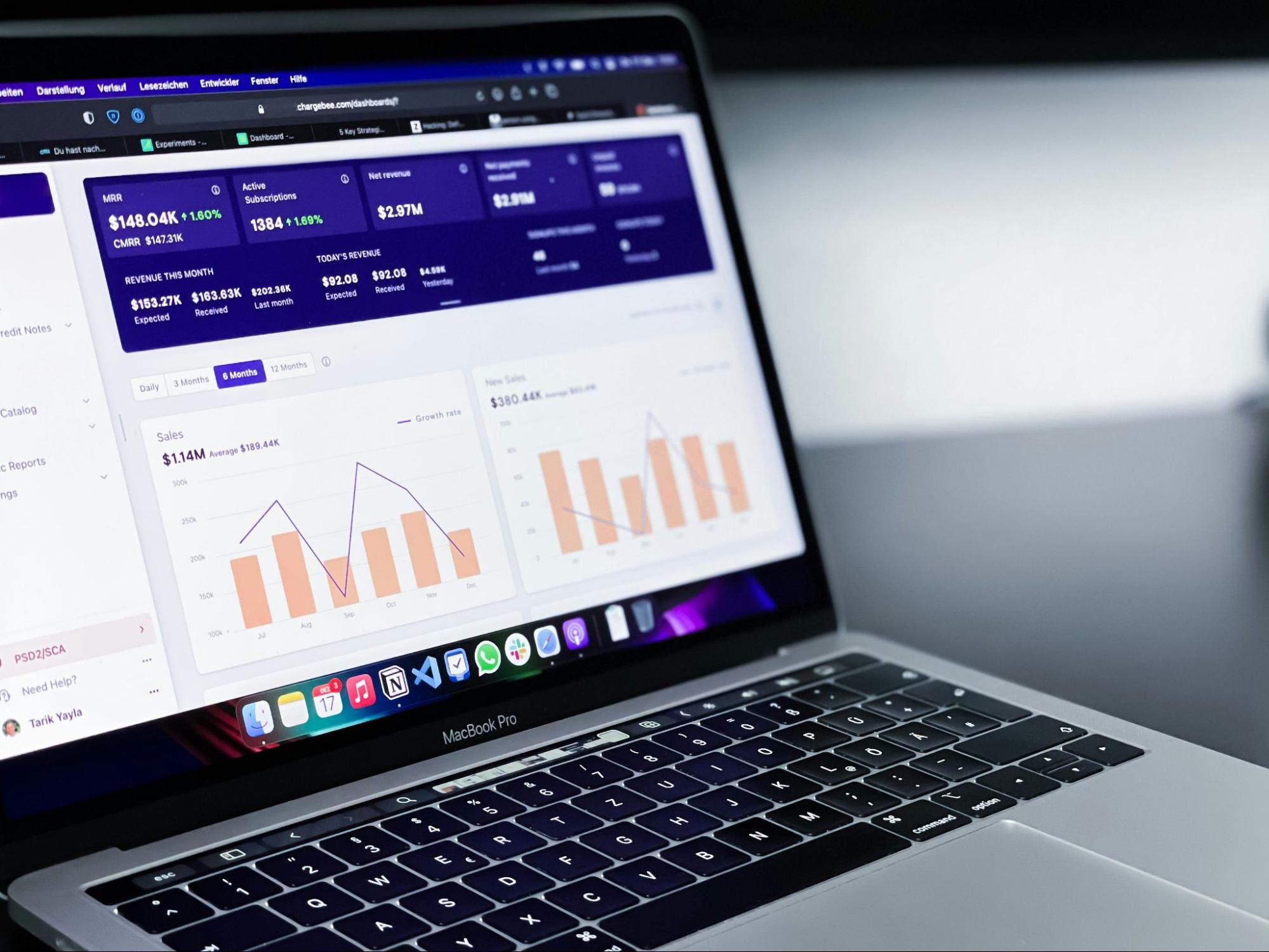
But as your data grows, a single chart often isn’t enough. You might need to track several metrics, compare results over time, or bring different data sources together. That’s when dashboards come into play. They combine multiple visualizations in one view, turning complex information into a clear story.
There are plenty of tools that can help you turn raw numbers into something useful. Some are made for real-time exploration, while others focus on creating engaging reports or static dashboards. The best ones do more than make data look nice. They help you uncover patterns and share insights in a way that everyone can understand.
With so many options out there, it can be hard to know where to start. In this article, we will break things down step by step. First, we’ll look at what data visualization tools are and what makes dashboards so valuable. Then we’ll share some tips on how to choose the right tool for your needs. From there, we’ll explore six popular tools for building dashboards and highlight their strengths. Finally, we’ll walk through some practical advice on how to create an effective dashboard of your own.
Note: Information such as pricing, features, and product availability may change over time. We recommend checking each tool’s official website for the most up-to-date details.
What is a data visualization tool?
A data visualization tool helps you turn raw information into visuals that are easy to understand and share. It uses charts, graphs, maps, and other visuals to show patterns and relationships in your data. With these tools, you can create everything from individual charts and infographics to full reports and dashboards.
Most tools let you connect directly to your data sources, so your visuals stay up to date as the data changes. They come in many forms: web-based platforms, plugins that work inside design software like Adobe Illustrator, or business intelligence applications used for analysis and reporting.
Many data visualization tools are designed to be easy to use, even without coding experience. You can usually drag and drop your data, pick a chart type, and customize colors, labels, and layouts to fit your brand.
For example, if you're tracking sales performance across different regions, a data visualization tool can transform your spreadsheets into a clear, visual dashboard. This makes it easy to spot trends, outliers, and opportunities instantly.
When you integrate these visuals with EOS implementation software, they become even more powerful. This combination helps align your data directly with your company's goals, track important metrics, and ensure your teams are accountable for achieving measurable results.
Whether you want to help your team make better decisions internally or share insights with clients and stakeholders, data visualization tools make complex information easier to explore, explain, and act on.
What are data visualization dashboards and why are they important?
One of the most common ways businesses use data visualization tools is to create dashboards.
Dashboards bring different metrics together in a single view, making it simple to track progress, monitor KPIs, and spot trends. They are widely used in areas like sales, web analytics, and marketing to guide decisions and communicate results.
Instead of jumping between spreadsheets or reports, you can see the bigger picture at a glance and quickly understand what is going on.
Most dashboards highlight key performance indicators (KPIs) and other essential metrics that decision-makers need to monitor regularly. They provide a fast, visual way to track progress and identify trends.
When people think of dashboards, they often picture interactive platforms that let you filter, drill down, and explore data in real time. But we believe there is also an important place for static dashboards. These are designed more like reports: polished, branded, and consistent, but fixed at the moment of creation. Both types play an important role in turning data into meaningful insights, a topic we’ll explore in more detail later in this article
Using automated reporting or interactive platforms allows you to keep your dashboards up to date. These tools make it easier to gain a clear understanding of current events and navigate complex developments.
Whether interactive or static, the main goal of a dashboard is the same: to support better decision-making by bringing the right data together in a clear and accessible way.
How do I choose what data visualization tool is best for dashboards?
Choosing the right tool depends on your goals and how you plan to use the dashboard. Some teams need real-time, interactive exploration, while others benefit more from polished, static reports that highlight the key insights. Whatever your situation, here are some of the most important factors to keep in mind:
- Visualization and customization options: A strong data visualization tool offers many chart types and gives you the flexibility to adjust the design, layout, and style to suit your goals. This includes flexibility in styling, branding, and layout so your dashboards are both functional and on-brand.
- Ease of use: Look for a tool that is easy to learn and navigate. Many platforms now offer drag-and-drop features or templates, so you do not need technical expertise to create a dashboard.
- Performance: Your tool should be able to handle the size of your datasets without slowing down. Scalability and responsiveness are key if you plan to work with larger or more complex data.
- Format and accessibility: Think about how your audience will use the dashboard. Do they need mobile access for quick updates on the go, or is a desktop experience more appropriate? In some cases, a static PDF or report is the better option for clarity and shareability. Look for a tool that matches the way your audience will actually consume the dashboard.
- Integration: A strong tool connects easily to your data sources, so your dashboards and reports stay current with minimal manual effort. For interactive dashboards, this usually means live connections to your databases or cloud services. For static dashboards, it can mean automating report updates, so you don’t have to repeat the same steps every time new data comes in.
Static vs. interactive dashboards: Which should you choose?
Before diving into specific tools, it helps to understand the two main types of dashboards you can create: static and interactive. The main difference lies in their purpose: static dashboards explain, while interactive dashboards explore.
Static dashboards
Static dashboards are designed to communicate a clear, focused message. They guide the reader’s attention, emphasize key insights, and tell a story through thoughtful design, hierarchy, and annotation.
Because they don’t rely on user interaction, the designer controls the narrative from start to finish. This makes static dashboards ideal when you want to explain findings clearly and guide your audience to the main message.
They’re also easier to share across media and faster to produce. And with automation tools, static dashboards can still be updated regularly with fresh data, combining clarity with efficiency.
Interactive dashboards
Interactive dashboards, on the other hand, are made for exploration. They invite users to click, filter, and investigate the data themselves. This makes them powerful for uncovering trends and relationships in large or frequently changing datasets. However, interactivity requires more design and development effort, careful UX consideration, and can raise accessibility challenges.
In summary
- Choose static dashboards when your goal is to explain insights clearly and guide your audience to the main message.
- Choose interactive dashboards when your goal is to explore data, discover patterns, and invite your audience to investigate.
If you’d like to dive deeper into the pros and cons of static and interactive visualizations, check out our article To click or not to click: static vs. interactive charts.

What data visualization tool is best for dashboards?
Many platforms offer a solution to the question: what data visualization tool is best for dashboards? We’ve compiled a list featuring well-known platforms like Microsoft Power BI and Looker Studio, along with design-focused tools such as Datylon.
Some tools are designed for interactive, real-time dashboards where users can explore and filter data on demand, while others focus on static, design-driven dashboards made for storytelling and reporting. Both have unique advantages depending on your needs.
Here’s our list of leading data visualization tools for dashboards:
Datylon
Best for static, design-driven dashboards and reports where branding and clarity matter most
Datylon is a data visualization platform that lets you create and share engaging, on-brand static data stories. It allows you to create a variety of visualizations rich with information, including dashboards, infographics, and reports. Use our Illustrator plugin to create the most captivating on-brand visualizations. Datylon lets you design freely within the Adobe workflow without requiring any coding knowledge.
Datylon offers engaging and beautiful templates for a wide range of dashboards, charts, and reports. It lets you customize them to your heart's content with various styling options, too. You’re able to export charts, reports, and dashboards to the Datylon Report Studio. It allows your team to reuse them freely. Moreover, with the Datylon Report Server, it is easy to automate the process of generating recurring dashboards.
Therefore, we believe Datylon is the answer to the question: what data visualization tool is best for dashboards? It’s not just because of an inherent bias, it ticks the most important boxes necessary for dashboard design.
Key features
- Design beautiful and on-brand data visualizations for your dashboards, reports, presentations & more
- Embed your customized charts and reports into your application
- Update data manually with a single click or use the server for automated reporting to produce periodic dashboards and report
- Integration with various data sources
Pros and cons
Pros:
- User-friendly interface
- Powerful free version
- Lets you fully customize all charts, graphs, dashboards, and reports
- Integrates with Microsoft Excel and Google Sheets
- Free trial for paid plans
Cons:
- Focused on static rather than interactive dashboards
- Not mobile compatible
- Very large documents (25+ charts) may impact performance
Pricing
Datylon offers six different products:
- Datylon Report Studio: Free plan
- Datylon for Illustrator professional plan: $22.50 a month per user (billed annually)
- Datylon for Illustrator premium plan: $37 a month per user (billed annually)
- Datylon ChartRunner: $120 starting monthly price (billed annually)
- Datylon Report Server: $275 starting monthly price (billed annually)
- Enterprise plans: Contact for custom contracts
Microsoft Power BI
ideal for interactive dashboards and real-time data exploration
Microsoft Power BI is a robust business-intelligence platform that helps you track business goals and coordinate with your data. It offers analytical capabilities, including trend analysis, natural-language Q&A, and real-time dashboards, to enable data-driven decision-making.
This tool is versatile for business solutions: you can connect to data across cloud and on-premises sources, integrate with the rest of the Microsoft 365 and Azure ecosystem, and deploy it for everything from self-service dashboards to enterprise-scale analytics.
Its strong data modelling, security controls, and seamless sharing make it suitable for both analysts and decision-makers.
Key features
- Connect to dozens of data sources (Excel, SQL Server, Azure...)
- Build interactive dashboards with drag-and-drop visuals and AI features (Key Influencers, Q&A)
- Support for large datasets and scalable models
- Share and collaborate via Power BI Service
Pros and cons
Pros:
- Excellent for interactive dashboards
- Extensive connectivity
- Free version (Power BI Desktop) allows individuals to create rich visuals before upgrading
Cons:
- Sharing and collaboration require a paid licence (Power BI Pro or higher)
- Advanced features may require Premium tiers and optimization
- Licensing and capacity planning can be complex for organizations
Pricing
Power BI offers a free version (Power BI Desktop) for individual use. Paid plans start from $14 per user/month for Pro, and $24 per user/month for Premium Per User, both billed annually.
Tableau
Designed for interactive data analysis with extensive visualization options
Tableau is a leading analytics and data visualization platform. Its focus is on helping you explore information and share insights. It’s a flexible tool that lets you create interactive dashboards and charts.
It supports many data connection options, such as CSV files, SQL databases, cloud services, and Salesforce. Tableau offers a wide range of visualizations, though optimizing dashboards for very large or complex datasets may require technical knowledge or performance tuning.
Key features
- Create interactive dashboards and charts with drag-and-drop functionality
- Connect and blend data from multiple sources and formats
- Build detailed maps using postal codes, administrative boundaries, or custom geographies
- Use built-in analytics features to uncover key insights
Pros and cons
Pros:
- Excellent variety of visualizations and powerful mapping capabilities
- Can handle large datasets effectively when well-optimized
- Active user community and extensive tutorials
- Free version available (Tableau Public)
Cons:
- Tableau Public doesn’t keep your data private, since all content is public
- Steep learning curve, especially for complex dashboards or data modeling
- Collaboration and version control can be limited compared to competitors
- Pricing can be high for larger teams
Pricing
Tableau offers a free version (Tableau Public) for public sharing. Paid licence tiers (billed annually) include Creator ($75/user/month), Explorer ($42/user/month), and Viewer ($15/user/month).
Yellowfin BI
Blends interactivity with storytelling tools that help explain insights clearly
Yellowfin BI is a comprehensive business intelligence and analytics platform designed to help organizations turn data into actionable insights. It provides robust tools for reporting, dashboarding, and data storytelling that enable users to spot trends, respond to real-time changes, and communicate data effectively. With flexible deployment options and seamless integration capabilities, Yellowfin supports embedded analytics, standalone dashboards, and enterprise-scale reporting.
Key features
- Interactive, customizable dashboards for real-time data exploration
- AI-powered augmented analytics that automatically detects patterns and outliers
- Signals feature for real-time alerts on significant data changes
- Intuitive reporting tools with fast, visual-based insights
- Data storytelling that combines narrative with visuals for clear communication
Pros and cons
Pros:
- Strong data storytelling capabilities
- Real-time data alerts with Yellowfin Signals
- Easy-to-use interface with minimal learning curve
- Suitable for embedded analytics in SaaS platforms
Cons:
- Limited customization compared to some competitors
- Smaller third-party integration ecosystem
- Advanced features may require a higher pricing tier
- Requires data preparation outside the platform in some cases
Pricing
Yellowfin BI offers customized pricing based on deployment type, user count, and feature needs. Pricing details are available upon request through their sales team.
Klipfolio
Great for interactive, real-time dashboards with live data connections
Klipfolio is a cloud-based data analytics and dashboard platform that offers an extensive gallery of pre-built templates. It includes powerful features for data modeling, formula building, and metric tracking. The platform helps users collect data from multiple sources and organize it into reliable, shareable dashboards.
Klipfolio integrates with a wide range of data connectors, allowing teams to maintain a single, always up-to-date hub for their metrics. It enables users to make data-driven decisions without needing coding skills.
Key features
- Create customized dashboards useful for team and client reporting
- Access a library of pre-built dashboard templates for marketing, finance, and operations
- Automate data refreshes and updates to keep dashboards current
- Integrate with hundreds of data services, including Google Analytics, HubSpot, and Excel
Pros and cons
Pros:
- User-friendly, drag-and-drop dashboard builder
- Integrates with hundreds of popular services (Google Sheets, HubSpot, Asana, etc.)
- Enables real-time data tracking and trend analysis
- Mobile-friendly interface
Cons:
- Some advanced visualizations require a technical setup
- Some integrations (especially niche or non-standard data sources) are reported to require manual configuration or coding knowledge
- Performance may suffer with larger datasets or complex dashboards
Pricing
Klipfolio offers a 14-day free trial, and its Base plan starts at $120 per month (billed annually). Other tiers include Grow at $190 per month, Team at $310 per month, and Team+ at $600 per month.
Looker Studio (formerly Google Data Studio)
Best for interactive and share-friendly dashboards
Looker Studio is Google’s free web-based data-visualization and dashboard tool. It lets you connect data from multiple sources, build interactive reports and dashboards, and share your results easily. You can import data from Google Sheets, Google Analytics, BigQuery, and many other cloud or on-premises sources, then drag-and-drop visualizations to explore insights.
Because it’s part of the Google Cloud ecosystem, Looker Studio integrates smoothly with other Google products. The drag-and-drop interface makes it easy to build dashboards without coding, making it a great option for marketers, small businesses, and anyone new to BI tools.
Key features
- Connects to hundreds of data sources, including Google Sheets, BigQuery, and external connectors
- Drag-and-drop dashboard builder with interactive filters, date controls, and parameter options
- Easy sharing, embedding, and collaboration through Google Drive
Pros and cons
Pros:
- Free for most teams; excellent value for small and marketing-use cases
- Highly collaborative, with sharing options similar to Google Docs
- Browser-based, no installation required; integrates tightly with Google ecosystem
Cons:
- Some enterprise features (permissions, team workspaces) are only in the Pro version
- Performance or usability may degrade with very large or complex datasets
- Many non-Google data sources require third-party connectors that may carry extra cost
Pricing
Looker Studio is free for creators and viewers. The upgraded Looker Studio Pro plan starts at around $9 per user per month, depending on users and projects.
How do I create a dashboard visualization?
There are many factors to consider when creating a dashboard visualization. You need to focus on elements such as your audience's goals, picking the right graphics, and keeping it simple.
According to this LinkedIn article, dashboards can take many forms, such as operational, strategic, analytical, tactical, or hybrid. Identifying which type suits your needs best is a good starting point.
Here are the key factors to pay attention to when creating dashboard visualizations:
- Identify your audience and their goals: Ensure you know who your dashboard is for and what they need to get from your data.
- Choose the data you want to present: Find the most relevant information for the topic you’re presenting. Ensure it’s useful to your audience and their goals.
- Double-check your sources: It’s important to ensure the data you’re using is clean and accurate before presenting it in your dashboard.
- Pick your visualizations: Select the charts and graphs that best fit your story, and consider whether your dashboard should be interactive or static, depending on your audience and goals.
- Make use of templates: Templates are especially useful for recurring reports or dashboards that need to be updated regularly. They help maintain a consistent look and feel across projects, save time on setup, and ensure design and branding stay aligned even when new data is added.
- Keep it simple: Be consistent with colors and styles, and adhere to dashboard design principles. It helps you avoid overwhelming users with too much information and clutter.
- Repeat and improve: Repeat and refine the process until your project meets the requirements. Request feedback from your audience. Find out if your dashboard conveyed the data you intended accurately. Improve on areas where necessary.

Conclusion
Dashboards remain one of the most powerful ways to turn data into decisions. The right tool for you depends on your goals, whether that’s interactive exploration, automated reporting, or polished, static dashboards for clear communication. What matters most is choosing a platform that fits your audience, your data, and the way you want to share insights.
If visual design and brand consistency are high on your list, Datylon stands out. It combines creative freedom with efficiency, making it easy to design on-brand dashboards. And with Datylon Report Server, you can take things one step further: automating static reports and dashboards so they stay up to date without extra effort.
Whatever tool you choose, remember that a well-designed dashboard does more than just display numbers. It tells a story, guides decisions, and inspires action.
Frequently Asked Questions
What factors should I consider when selecting a data visualization tool for dashboards?
The most important elements to focus on are customization, ease of use, performance, accessibility, and integration.
How do I determine which data visualization tool suits my specific project or organization best?
You need to pay attention to what types of projects each tool specializes in. Look at the amount of data you need to visualize and the quantity each tool is capable of handling. It’s also important to consider the type of dashboard you want to create, static or interactive, and who will be using it.
What’s the difference between interactive and static dashboards?
Interactive dashboards let you filter, click, and explore live data in real time. Static dashboards are fixed visual reports designed for clarity and storytelling. They’re often branded, consistent, and ideal for sharing results or presentations.
Which tools are best for interactive dashboards?
Power BI, Tableau, Yellowfin BI, Klipfolio, and Looker Studio all focus on interactivity and real-time exploration.
Which tools are best for static dashboards?
Datylon specializes in static, beautifully designed dashboards and reports, offering full creative control inside Adobe Illustrator or its web-based Report Studio.
Can I integrate multiple data sources into a dashboard created with these tools?
Yes, all these dashboard visualization tools allow for integration from various data sources.
Are there any free data visualization tools that are suitable for creating dashboards?
Yes. Several data visualization tools offer free versions or trials that are suitable for creating dashboards. For example, Looker Studio is completely free to use, while tools like Datylon and Microsoft Power BI provide free tiers or trial periods of their paid products. These versions are often great for testing features, building smaller projects, or exploring whether the platform fits your needs before upgrading.
Do you require any technical expertise to use these data visualization tools effectively?
Not for most of them. All the tools covered in this article offer intuitive interfaces designed for users without coding experience. Most use drag-and-drop dashboards, templates, or guided workflows that make building visualizations straightforward. However, for more advanced customization, automation, or complex data modeling, having some technical background or understanding of data structures can be beneficial.
How customizable are the dashboards created with these tools?
Most of these dashboard visualization tools offer a high level of customization. Platforms like Datylon and Tableau stand out for their extensive styling, layout, and design flexibility, allowing users to fine-tune nearly every visual element. Others, such as Power BI, Klipfolio, Looker Studio, and Yellowfin BI, also provide strong customization options but tend to focus more on functionality and ease of use rather than full visual freedom. The right choice depends on whether you prioritize design control, interactivity, or speed of setup.
What kind of support and training options are available for users of these data visualization tools?
Most of these tools offer tutorial videos or help centers to aid in the learning process.
Can I share and collaborate on dashboards with colleagues or clients using these tools?
Yes, many of these tools allow you to share and collaborate with teammates or clients.
Additional Resources
What is automated data reporting? A complete guide
The 5 best data visualization dashboards: Exploring automated reporting solutions
The Great Report Debate: Manual, Automated, or Interactive?
Automated reports: Defining Data Resources, Data Extraction and Transformation Options
Building an automated reporting solution with Datylon Report Server
Automated Data Visualization Trends: What to Look for in Report Server Tools