The birth of a new chart
Creating effective and beautiful visualizations is a process. Very rarely (along with many things in life) do you get it right the first time. Instead, you work through versions, trial and error, iterations, and receiving feedback until you land on the best way to tell your story as simply and clearly as possible.
Having designed, some time ago, a new chart for one of our clients, we think the process that led to reaching the final product is a useful story to tell. With lots of visual testing of the different designs and presentation methods, we certainly learned a lot. Here’s an overview of how our new chart came to be.
A summary of the visualization brief
Our chart was to serve the supply chain sector consisting of a large network of stakeholders, including those in different locations, suppliers, and third parties, such as transport companies, sending and receiving information.
The chart was to exist in a context where multiple issues needed to be monitored across all the transfers taking place.
Finally, in order to easily compare the values, it was preferred that we used a stacked bar chart to display the different kinds of issues over time.
More on the issues (the data)
The three issues we needed to communicate were:
- “Minors” – which were general, smaller, issues that didn’t prevent goods from being delivered
- “Majors” – which were all issues that lead to the failure of a delivery
- “No Shows” – which were a subset of the majors. One of the reasons why issues fail to be delivered is if the supplier just doesn’t show up. This was important for the client to monitor because it triggers action.
Visualization challenge: using the stacked bar chart to communicate the categories
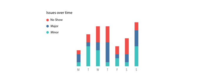
As the categories did not carry the same level of the hierarchy, with one category being a subset of another, it was quickly seen that applying a standard stacked bar chart format was not going to work. This is because the height of the bar did not equate to the number of issues when categories were stacked on top of each other.
Investigating how to solve our visualization problem, we saw three possible solutions to test:
- Changing labels
- Changing the visualization
- Changing how the data was processed – before your data team freaks out, just altering how the data is defined, with say a calculation in the backend, rather than altering the way the data is gathered.
First, we looked at the data labels, to see how these could be clarified in order to help the visual.
Understanding that “No Shows” were included within the “Major” category, it made sense to offer more clarity here. Renaming “Major’ to “Delivery Failures” and using visual cues to make “No Show” a clear subset would help to simplify the data presentation. The third category was also renamed from “Minor”, to “Other”, as it was not so important for the purposes of the dashboard’s reader, but needed to be there in order to complete the data feed. It also seemed weird to have a ‘minor’ without a ‘major’ category.
After renaming the labels, the next design change was steered by an enlightening quote from the client:
“Issues as such are not the worst thing, it's when you have a lot of major issues, that the issues become a problem.”
Next, we experimented with different layouts and color applications to explore the best way to present and emphasize the issues that could result in a problem.
Experimenting with shading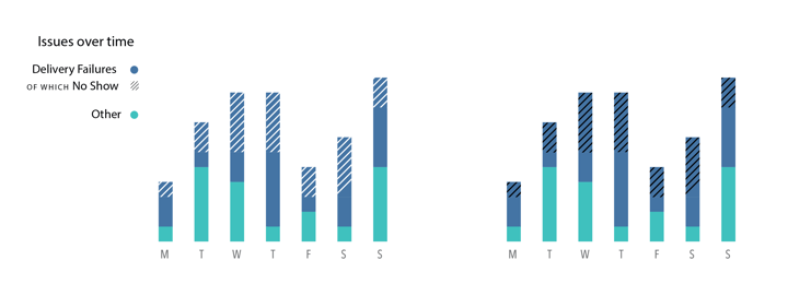
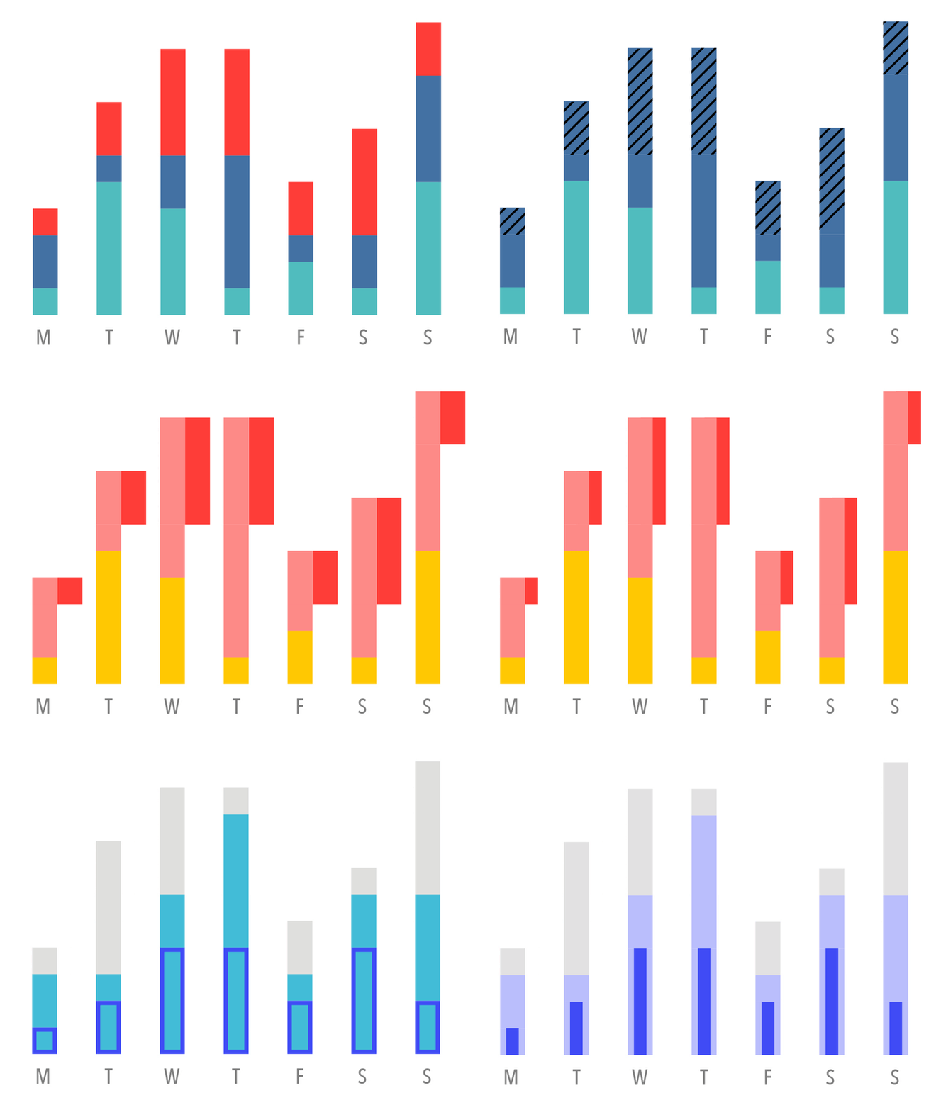
First, we tried sectioning off the same color with light or dark shading. Both of these options didn’t work as white shading made the “No Shows” look less important –they were! While black shading didn’t work aesthetically, making it harder to read. Remember that anything added to a chart (such as shading) needs to operate as a useful visual cue when applied.
After testing, it was clear that shading wasn’t the answer, so we moved on to the next potential solution.
Experimenting with color families
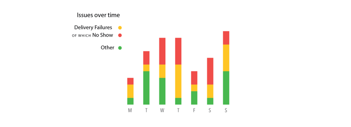 A common request, particularly with dashboard designs, is to follow a traffic light color theme. The problem for us (and for many designing dashboards), is that this visual needed to communicate issues, so making one category (most likely the “Other” category) green could be interpreted as no issue, go, all good. The international understanding of the red/amber/green trio means they are very subjective colors that carry a lot of extra meaning. Our word of advice would be to proceed with caution when the traffic light request is made on your own visuals to make sure it doesn’t alter the key message.
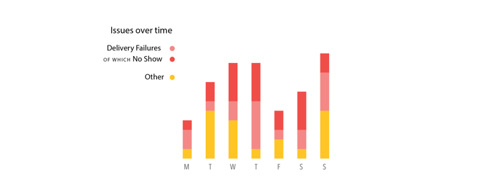
Using red and amber together could also imply that categories are ‘stepped’, or leading to another – which in the case of our chart they were not, it was important that they were interpreted as part of each other, rather than following on from each other.
So we experimented with lighter colors to communicate being a subset of a larger category. In the case of red, pink is a lighter version. This was still leaving the visual open to subjective interpretation, for us pink was not carrying the right professional vibe we were looking for.
Experimenting with size and placement
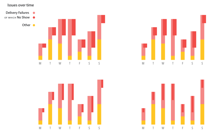
You will also notice from the series of frames above that we experimented with the widths and placement of the “No Show” category when testing the placement. Along with color, these are cues that carry extra information, or visual shortcuts, for the reader, making some categories appear more or less significant than others.
After experimenting with different color families and widths, still not feeling that we had correctly communicated the data, we looked at other visual cues to better tell our story. We still had more work to do…
Experimenting with layout
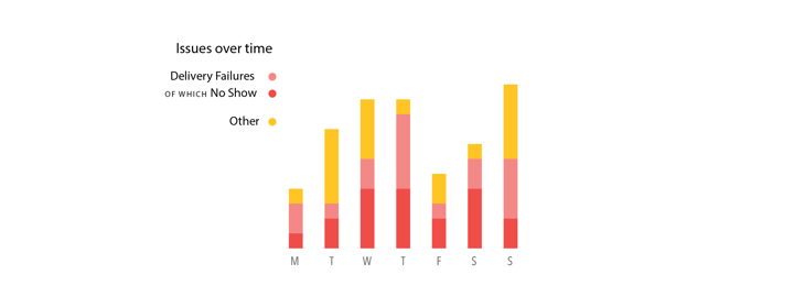
Placed at the top of the bar, we felt was not the right place for “No Shows”. Instead of ordering the categories on the bar based on significance, we switched them, so that “Delivery Failures” and “No Shows” were closest to the x-axis. The remaining height of the bar was made up with “Other”.
This was a major breakthrough for reader clarity, as it allows for the most important values to be easily compared along the same axis. Placing the most important at the bottom is something to consider when making your next stacked bar chart with hierarchical categories.
Visually though, we started to question the use of red altogether. Red carries a sentiment of warning/extreme/alert, so it should be used in an explorative context where issues need to be discovered among non-issues. In our case, every category was in fact an issue, so theoretically all 'red', meaning we were not benefiting by using it.
Experimenting with outlining
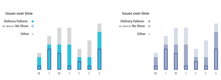
With the bars now flipped, we wanted to explore if adding a stroke line communicated the ‘No Show’ subset better. We also continued to explore what colors worked best, as mentioned above, we were not sold on the use of red in a chart dedicated to communicating issues.
The final product
After exploring the stroke line we still couldn’t find the correct visual balance, so we reverted back to presenting the “No Shows” within “Delivery Failures”, which gave a more natural sentiment of being part of the category.
So let us present to you, a brand new chart design, and something we like to call the 'Piano Chart'… or the 'Nailpolish Chart'... there’s actually still some office debate on the name of our new baby!
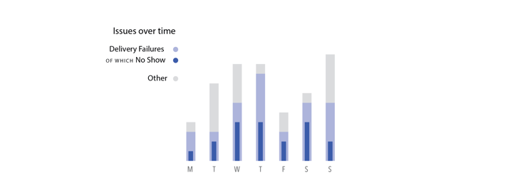
Yes, the width is narrower than the others, but with the darker color, it does not lose visual prominence. In this case, it works, and as with every chart, individual decisions need to be made based on the data, the chart’s purpose, and the audience who will be reading it.
Recapping the key changes that we like about our new chart’s effectiveness:
-
The layout gives the reader the ability to easily compare the two most important categories along the same axis,
-
There’s a clear emphasis on the “No Shows” whilst keeping the hierarchical link to the “Delivery Failures” category that it is part of,
-
The colors that have been applied are not loaded with strong or distracting sentiments.
What is important to remember, and what I hope this post has demonstrated, is that when creating a chart it takes time to find the correct way to tell the story in the data. Every decision that is made is most likely connected to a viz theory – whether that be size, color, or placement of the elements applied. In the case of this chart, Stephen Few’s points, Shouting to Emphasize What’s Important, perfectly articulates the process of creating this chart:
“Not all information is created equal. This is certainly the case when we’re trying to communicate a particular message. Key points might need to be emphasized to get the message across. When presenting information graphically, this emphasis must be created visually to express the equivalent of a raised voice and more precise enunciation.”

Erik Laurijssen - Founder & CEO
What if more people could understand what the data means? That’s the "Big Hairy Audacious Goal" Erik set forth as co-founder of Datylon. When he’s not juggling the many facets of scale-up life you can find him rewind somewhere in nature hiking, biking, running or enjoying the slopes.

