Reporting, Automated Reporting
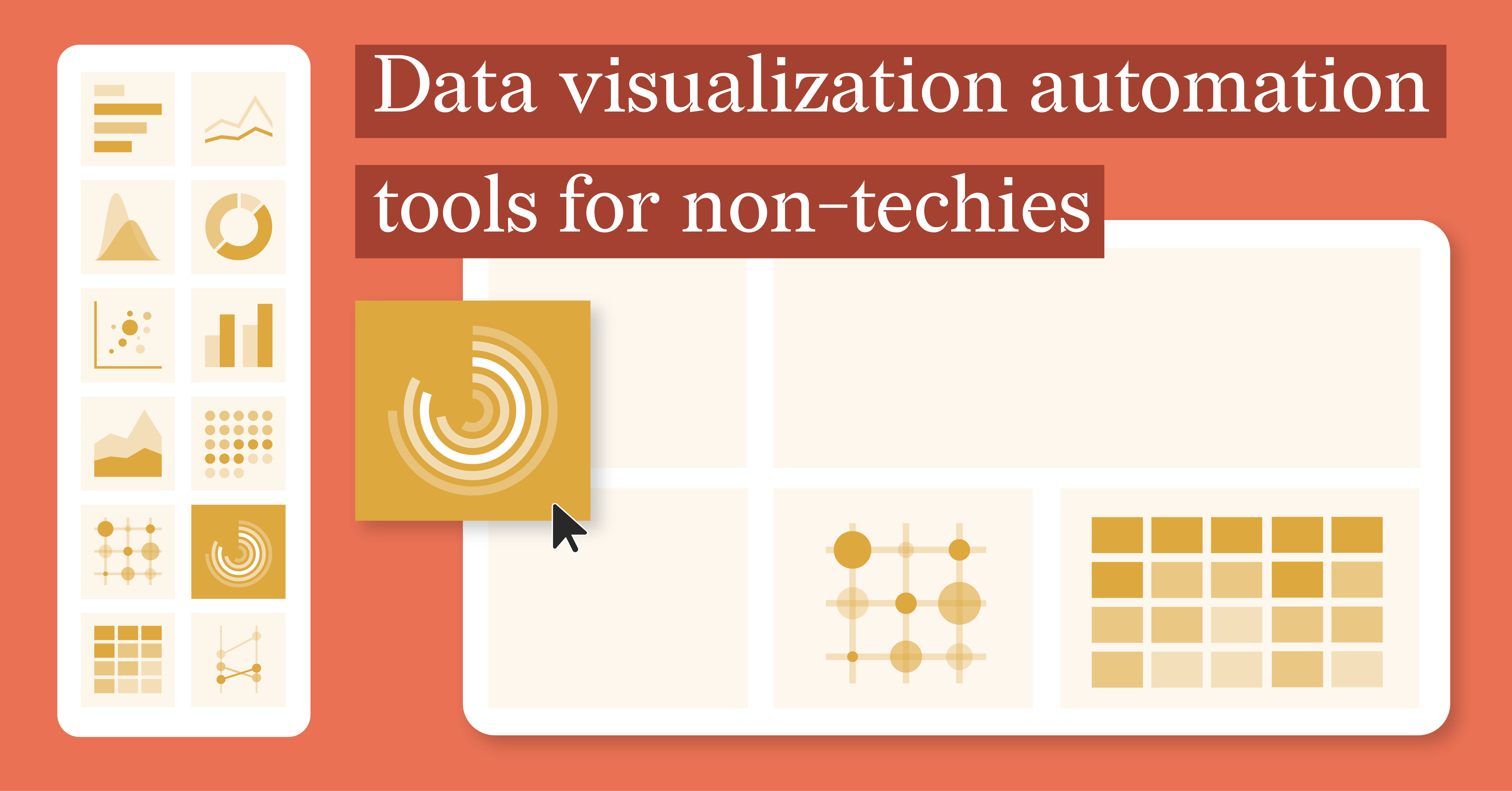
Data Visualization Automation Tools for Non-Techies
In today’s data-driven world, the ability to turn raw data into visually engaging insights is...
Reporting, Automated Reporting
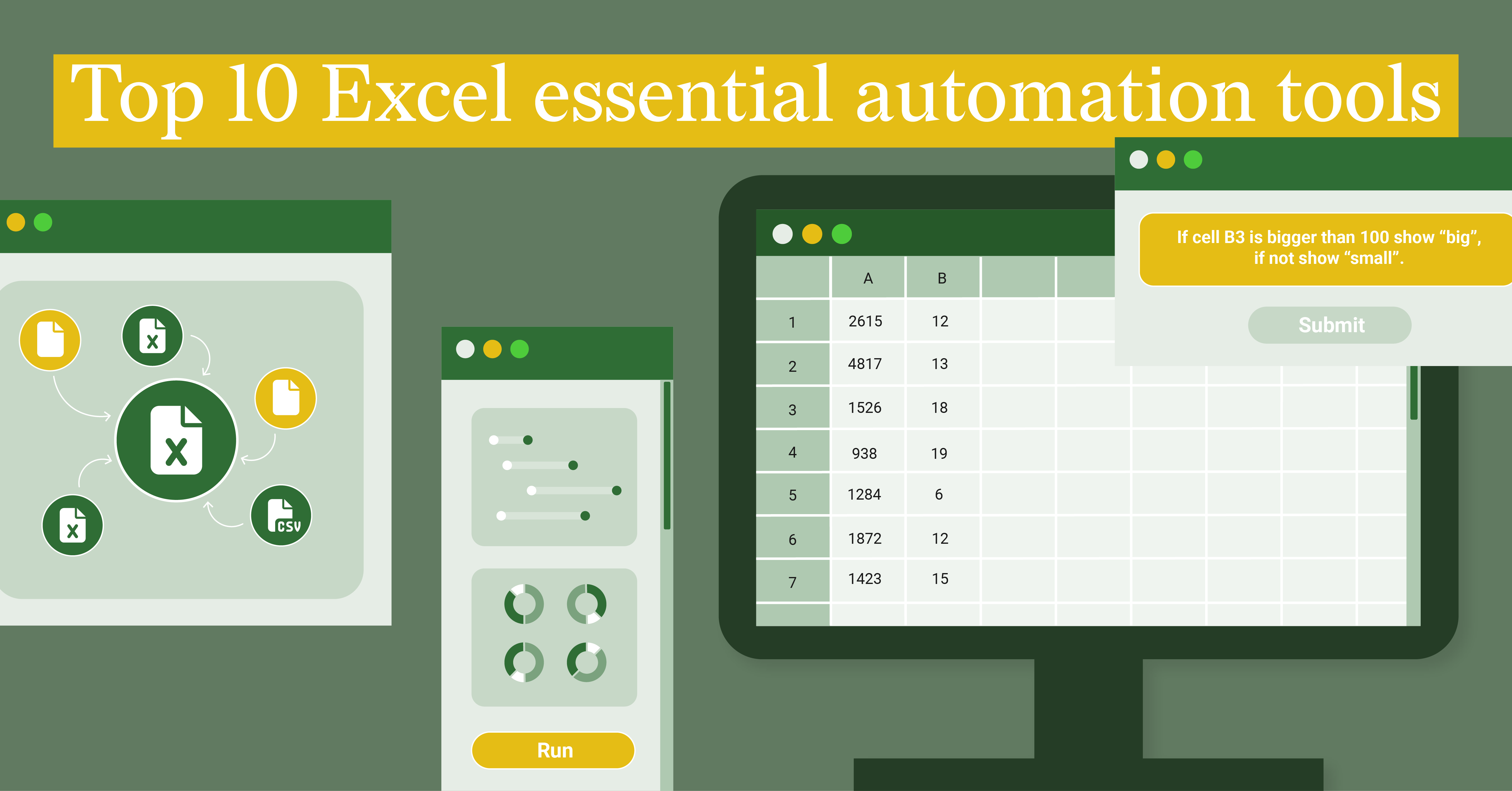
Top 10 Excel Essential Automation Tools
Excel is a staple in the world of data analysis, offering an impressive array of features to...
Subscribe to our newsletter
Receive inspiration, practical advice, customer stories and news right in your mailbox

Report Design, Dataviz Resources, Report Server, Automated Reporting
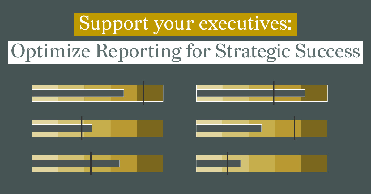
Support Your Executives: Optimize Reporting for Strategic Success
Executive reports are crucial for supporting decision-makers to quickly understand the most...
Product, Report Server, Reporting, Automated Reporting
Climbing the Ladder of Automated Reporting Solutions with Datylon
The arrival of report season can feel like encountering kryptonite for many office workers. Hours...
Report Design, Dataviz Resources, Report Server, Automated Reporting
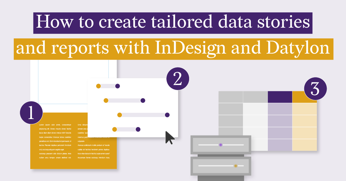
How to Create Tailored Data Stories and Reports with Indesign and Datylon
Are you tired of manually creating multiple versions of your data stories and reports? And what...
Report Design, Food For Thought, Report Server, Automated Reporting
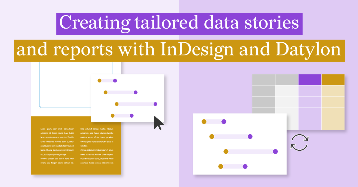
Creating Tailored Data Stories and Reports with InDesign and Datylon
Data-driven reports are essential tools for businesses seeking to make informed decisions and...
Financial Services, Report Server, Reporting, Automated Reporting
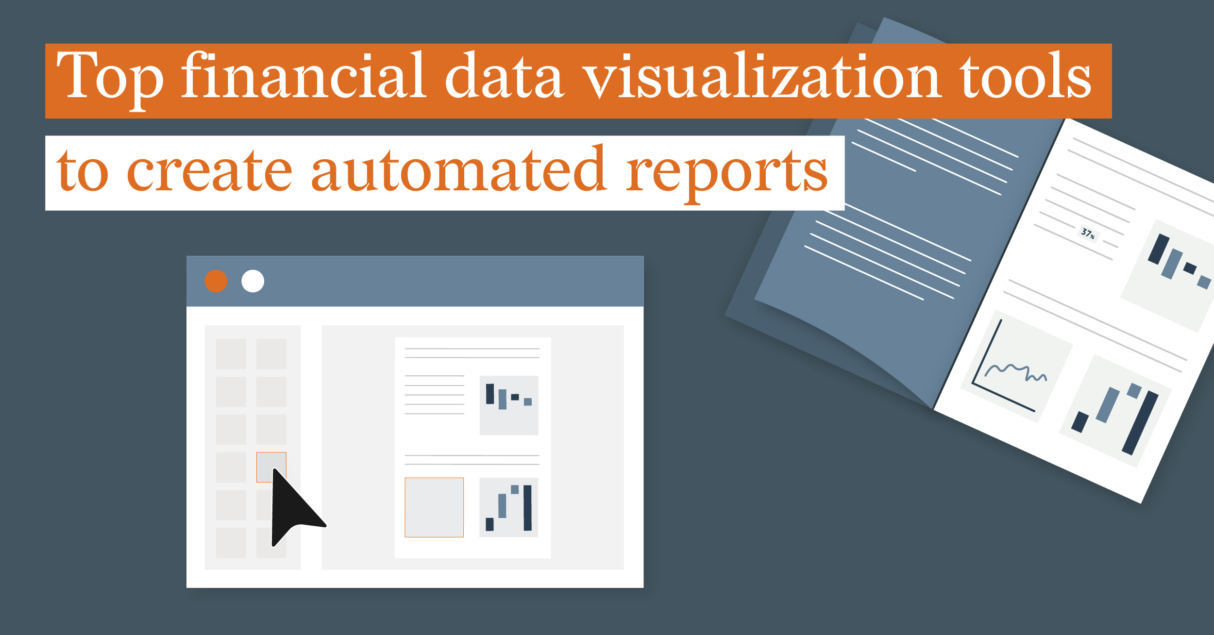
Top financial data visualization tools to create automated multi-page reports
In the finance industry, report generation is a crucial aspect of operations. Manually creating...
Dataviz Resources, Report Server, Reporting, Automated Reporting
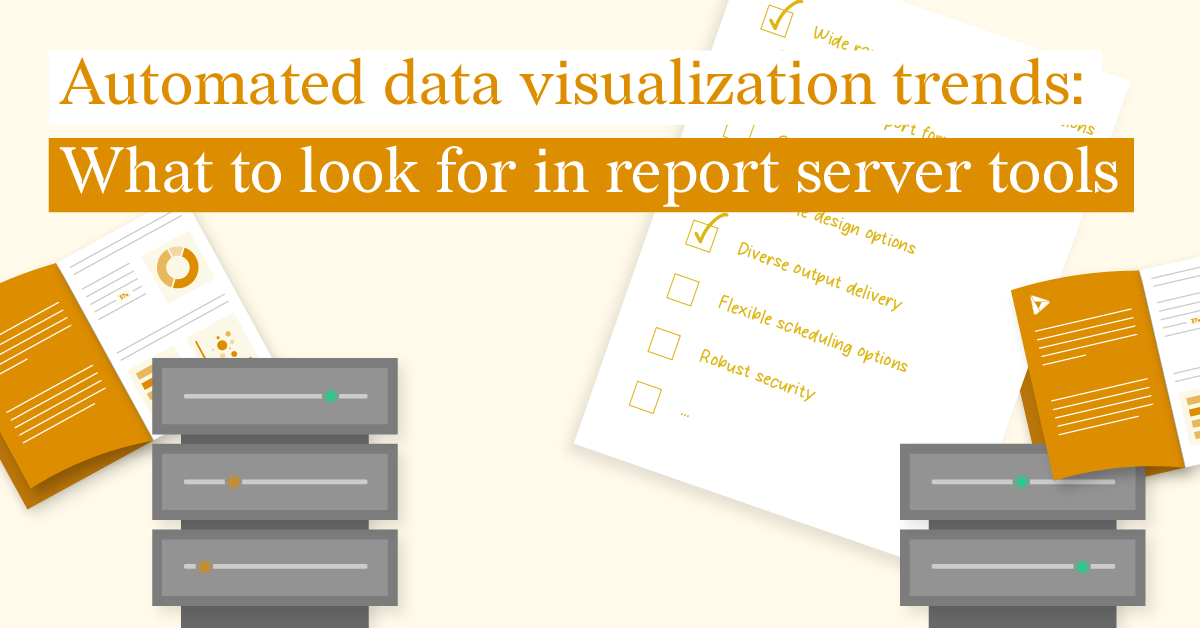
Automated Data Visualization Trends: What to Look for in Report Server Tools
In today's data-driven world, manually creating reports and charts is a time-consuming and...
Dataviz Resources, Report Server, Reporting, Automated Reporting
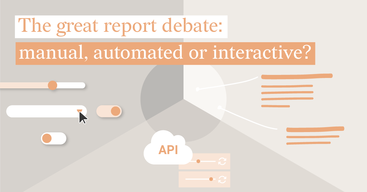
The Great Report Debate: Manual, Automated, or Interactive?
Let's face it, crunching numbers in spreadsheets isn't exactly thrilling. But when it comes to...
Report Server, Reporting, Automated Reporting
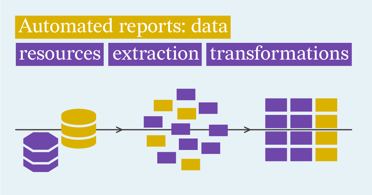
Automated reports: Defining Data Resources, Data Extraction and Transformation Options
In today’s fast-paced business environment, making timely and informed decisions requires more...