Illustrator Chalk Talk
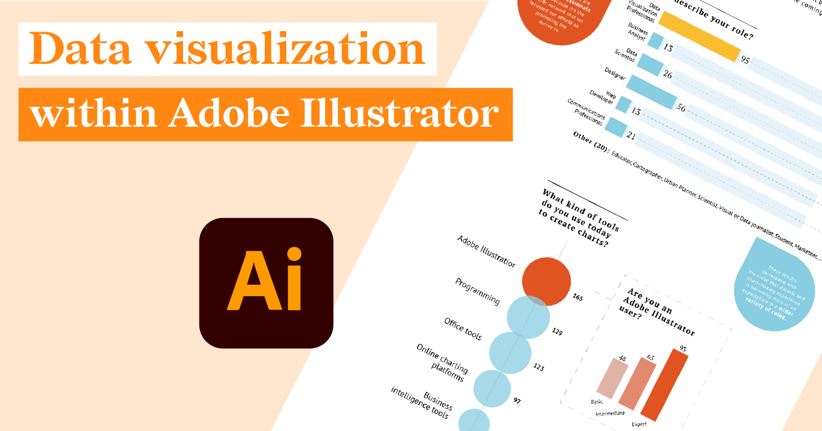
Data visualization within Adobe Illustrator
With a goal to dive deeper into the growing need for smarter dataviz solutions within Illustrator,...
Product News
What's new in Release 49
So a designer walks into a bar...
Okay, we're not that good at telling "bar" jokes. We'd much...
Illustrator Chalk Talk
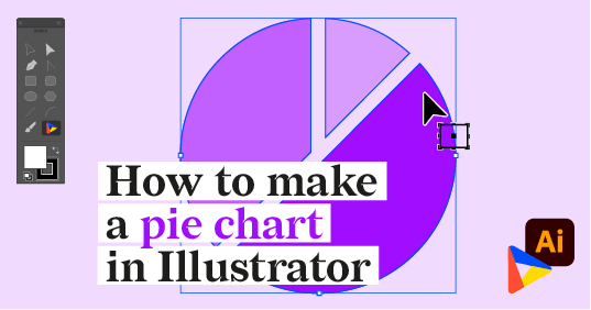
How to make a pie chart in Illustrator with Datylon
In this tutorial, we will make a multi-level (or multi-layered) pie chart that shows the chemical...
DataViz Best Practices
Mind your data visualization
If I am to believe my mom, I was already pasting stickers next to each other in a neat pattern...
Food For Thought
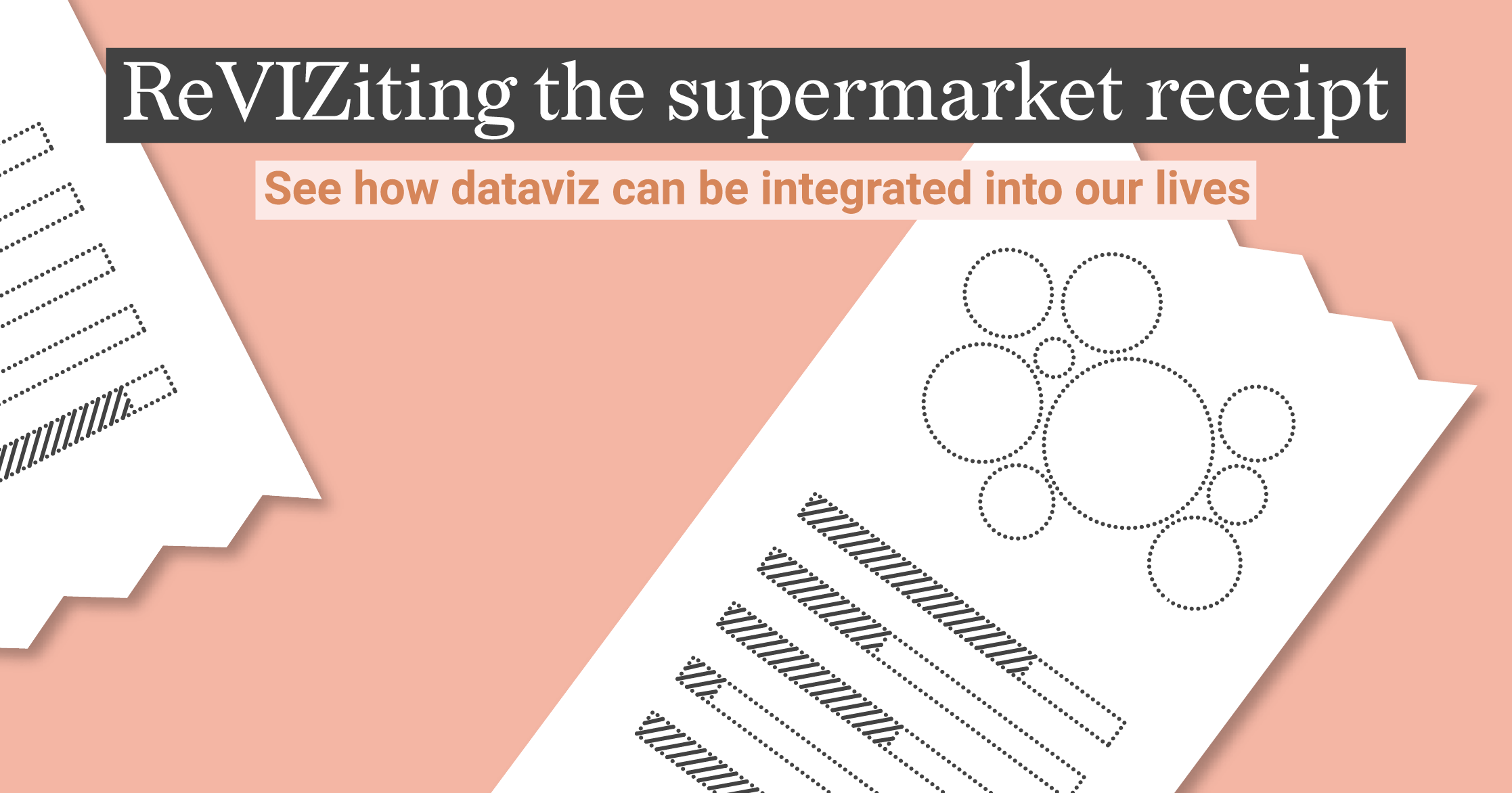
ReVIZiting the humble supermarket receipt
A while ago, Sussie Li (@DataToViz) shared on Twitter a prototype for a reconditioned supermarket...
DataViz Best Practices
A deep dive into... treemaps
“Your disk is almost full. Save space by optimizing storage”. Does this sound familiar? Well, for...
Illustrator Chalk Talk
How to make a treemap chart in Illustrator with Datylon
Climate change is one of the most heated (no pun intended) topic conversations today. This is not...
Food For Thought
Our take on data storytelling
Increasingly organizations are turning to their data to measure, track, report, and ultimately...
DataViz Best Practices, Food For Thought
The birth of a new chart
Creating effective and beautiful visualizations is a process. Very rarely (along with many things...
Product News
Happy New Year 2022!
The end of 2021 is almost here. And what a year it was. Surely, we all hoped for some things to go...
