Dataviz Resources
Do you speak dataviz?
Are you a newcomer to the data visualization world? Or are you struggling with some terms in data...
Product News
What's new in Release 52
Happy New Year! 🎉 We hope this year is full of great health and happiness. Until then, cheers to...
Product News, Food For Thought
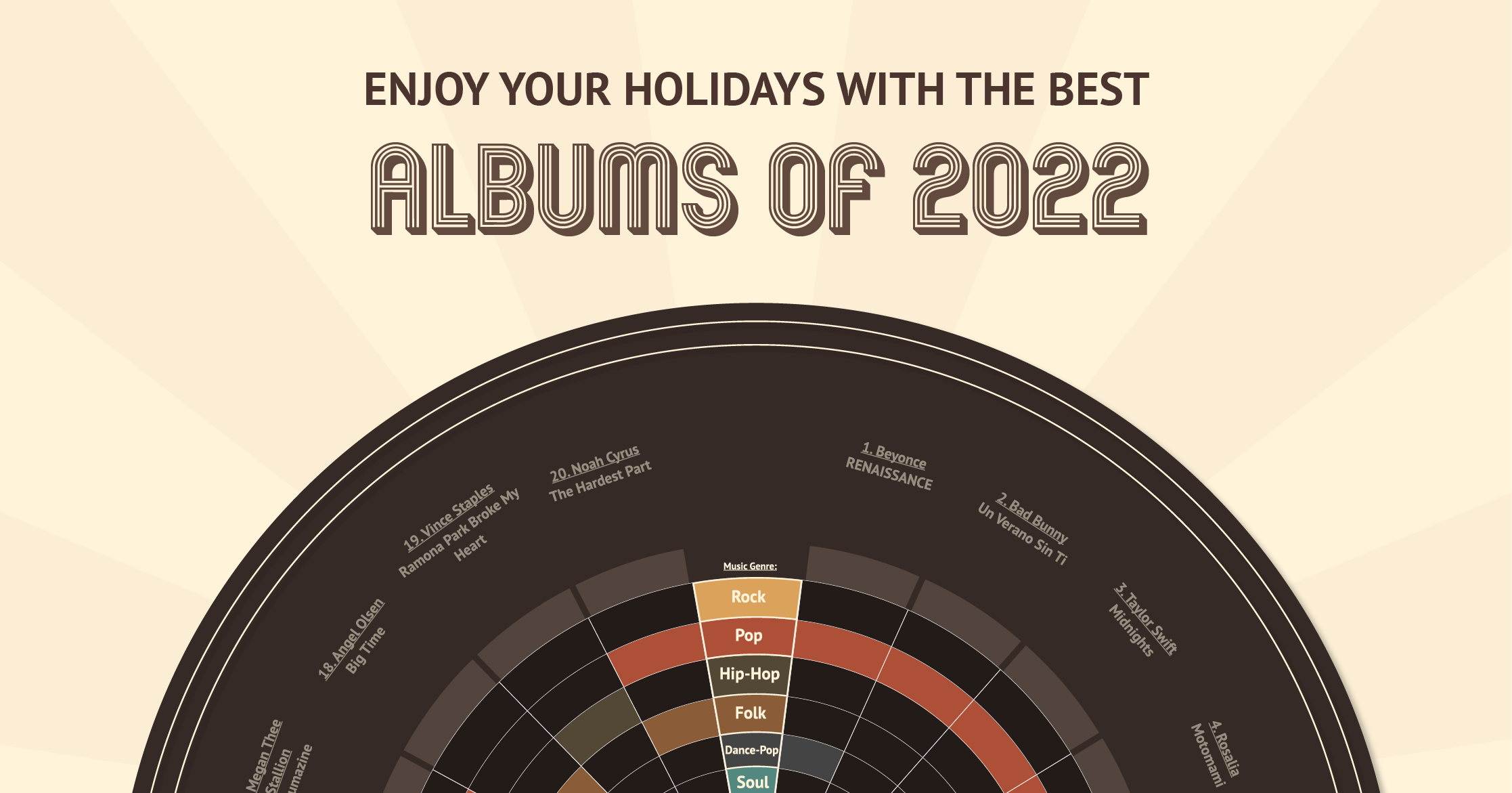
Datylon unwrapped: the best albums of 2022!
And that's a wrap! 2022 is coming to an end, and what a year it was, huh? From large global events...
DataViz Best Practices
11 tips for designing accessible charts for visually impaired readers
Recently we’ve published an article about how to choose and refine a chart for colorblind viewers....
DataViz Best Practices
5 actionable ways to create engaging and impactful data visualization
The world today is a data-driven economy. Businesses of all sizes rely on data to make informed...
Dataviz Resources
Do you speak data?
Are you interested in telling data stories with data visualizations? But your data language can...
Product News
What's new in Release 51
Today we released yet another Datylon version packed with improvements and new features on...
Illustrator Chalk Talk
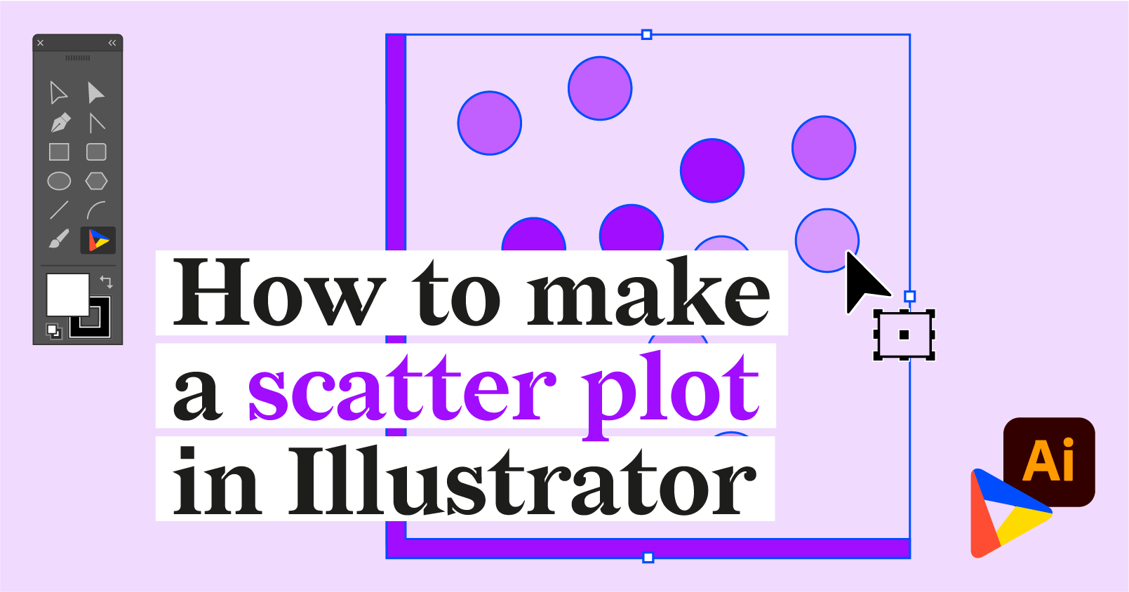
How to make a scatter plot in Illustrator with Datylon
Recently, electric cars are becoming an alternative to cars with internal combustion engines...
DataViz Best Practices
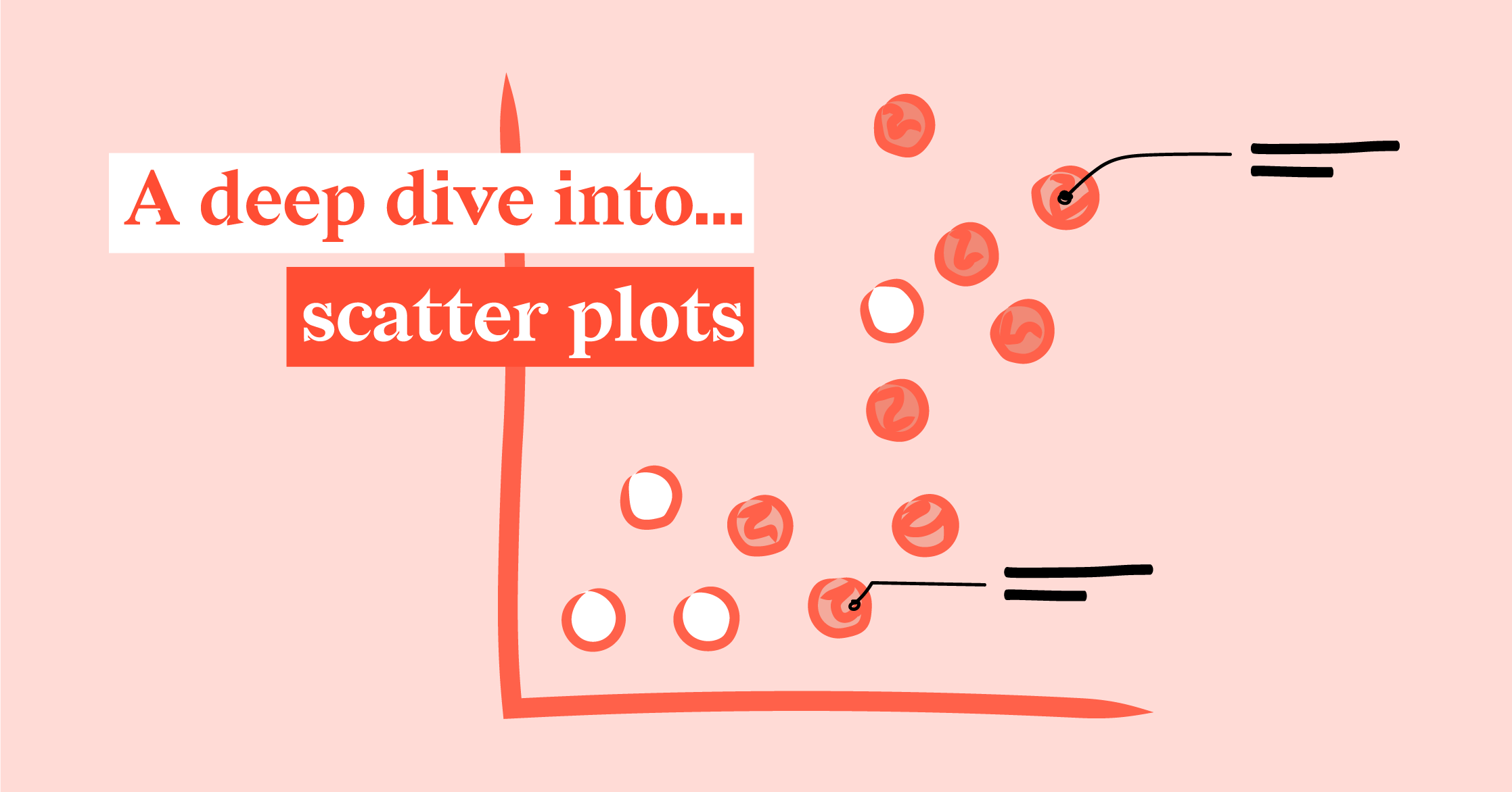
A deep dive into... scatter plots
When I think about scatter plots, my mind takes me back to the years when I studied and worked as...
Reporting
The journey towards repertoire diversity in U.S. orchestras
Margaret Bonds was a fascinating and truly talented woman. Born in Chicago in 1913, she was only...
