DataViz Best Practices
Our Favorite Data Visualization Books
In today’s data-driven world, the ability to create visualizations that effectively deliver...
DataViz Best Practices, Financial Services, Dataviz Resources
How to pick the right graph for financial data visualization
When it comes to selecting the right graph for financial data visualization, it's important to...
Technical, Dataviz Resources
A Guide To Data Visualization using Excel & Datylon Plugin
Data visualization is a useful tool to help users better understand trends, patterns, and insights...
DataViz Best Practices
Bad data visualization: how to notice and fix it (27 examples)
Data visualization is a great tool for presenting complex data in a simple way. It is better to...
Report Design, Report Server, Reporting
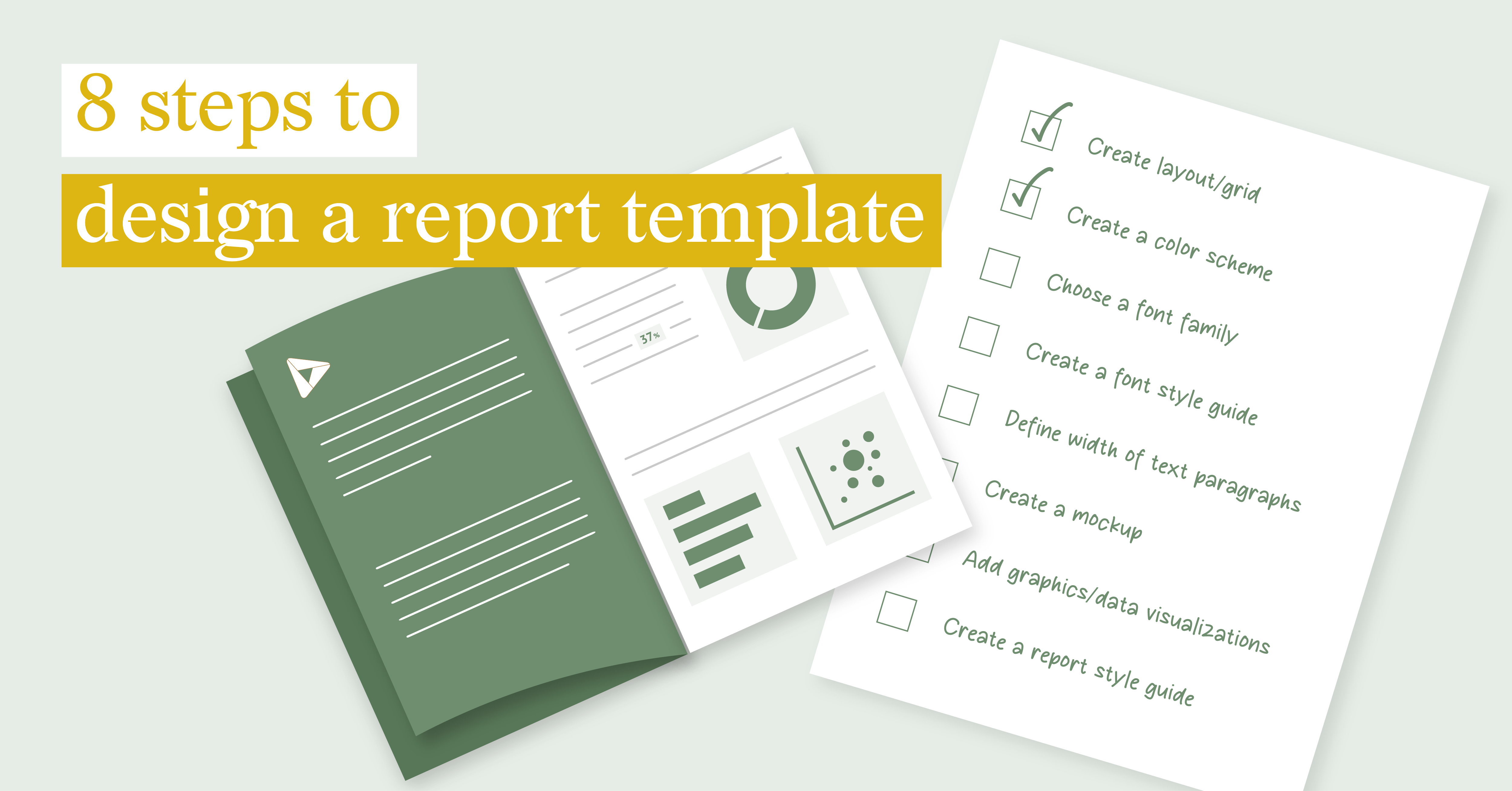
8 steps to design a report template
DataViz Best Practices, Report Design, Food For Thought, Reporting
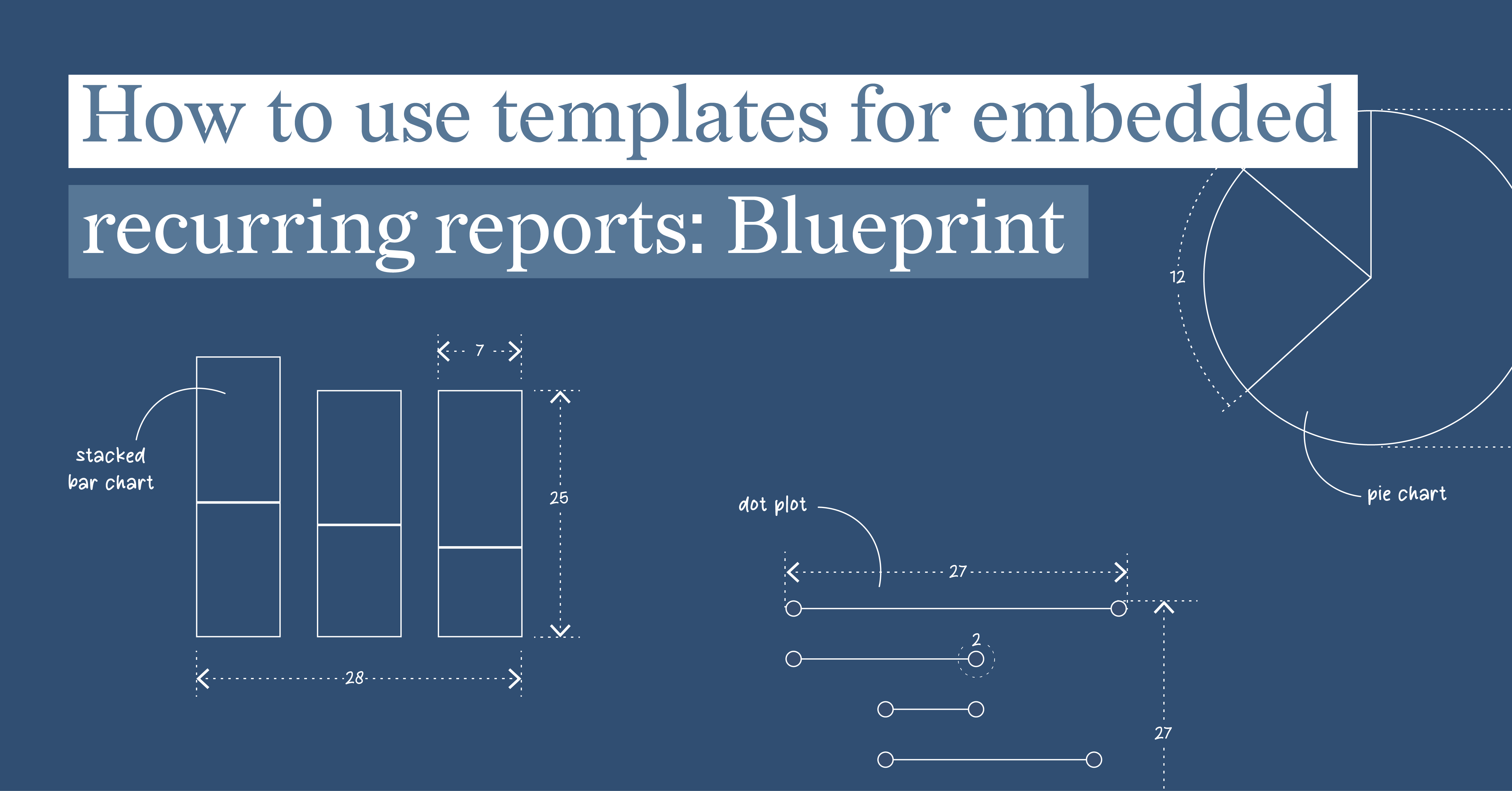
How to use templates for embedded recurring reports: Blueprint
Embedded reports play a crucial role in today's data-driven business landscape. By embedding...
Technical, Food For Thought
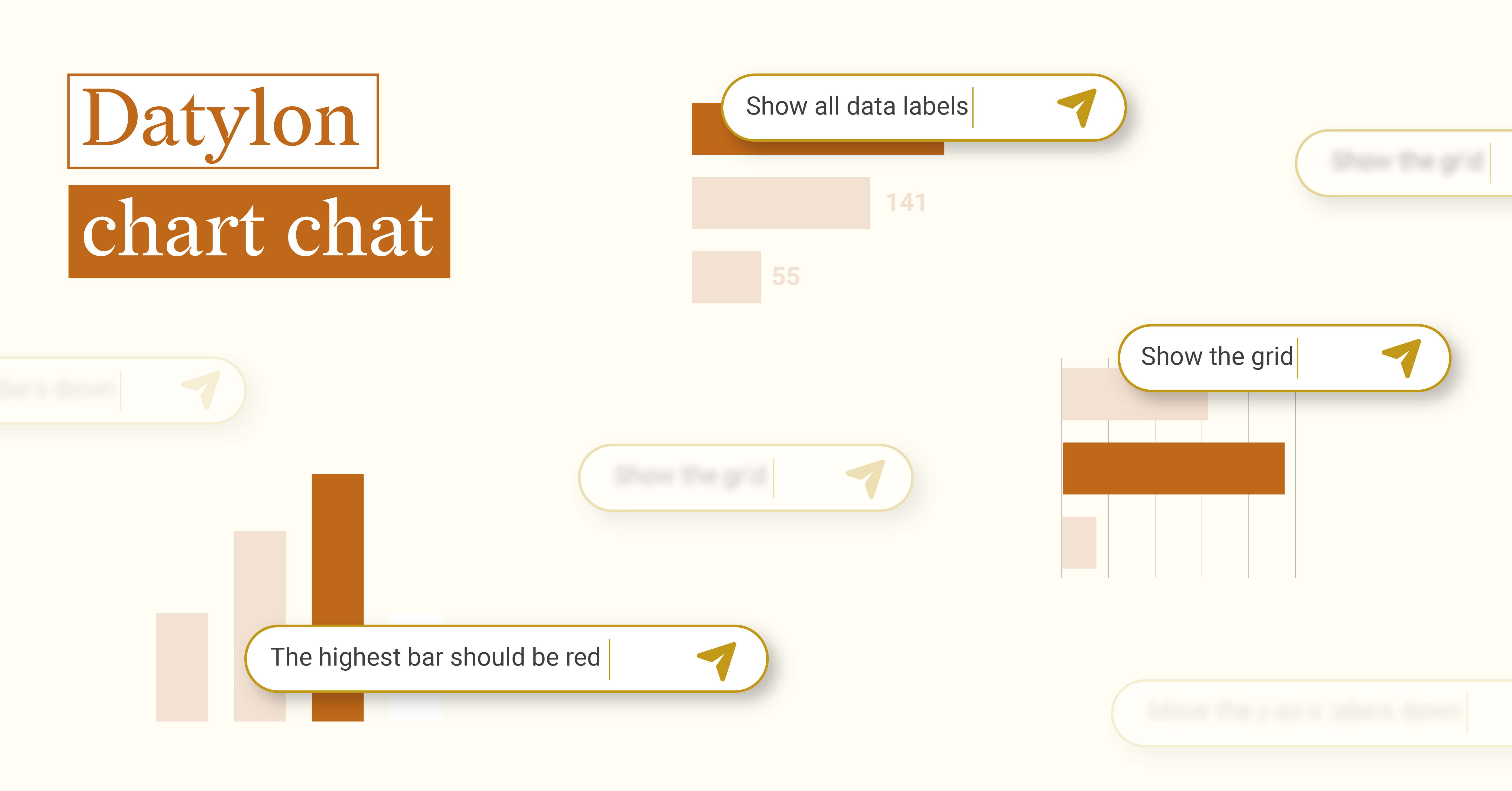
Datylon chart chat
When OpenAI released ChatGPT to the public in November 2022, both the potential and challenges of...
Technical, Report Server, Reporting
Mastering Versioned Stand-Alone Reports
In the world of data reporting, versioned stand-alone reports occupy a special niche. They are a...
Food For Thought
Halloween: run for your life?
It’s that time of the year again when you shouldn’t be surprised if you bump into...
