Product News
What's new in Release 46
This month’s release is focused on keeping Datylon for Illustrator future-proof. With R46, we...
Reporting
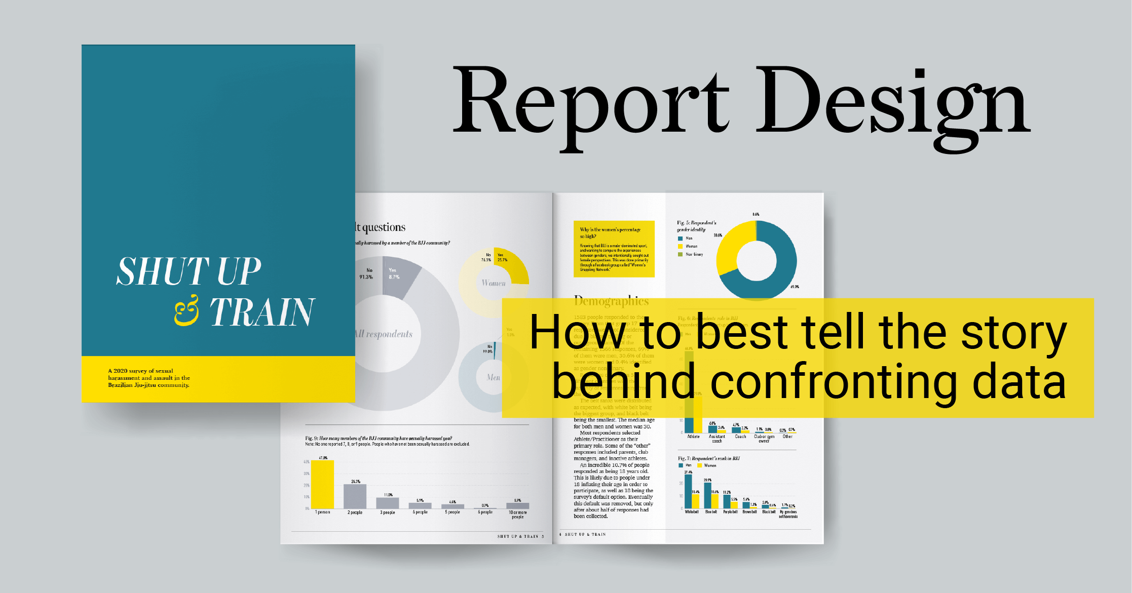
How to best tell the story behind confronting data
When you find the time and have the skills, setting up your own data visualization project is one...
Product News
What's new in Release 45
You asked, we listened! If you design charts and reports, sometimes you surely need to change the...
DataViz Best Practices
A deep dive into... heatmaps
Chart types can sometimes be summarized into one iconic example. Think about the global warming...
Product News
What's new in Release 44
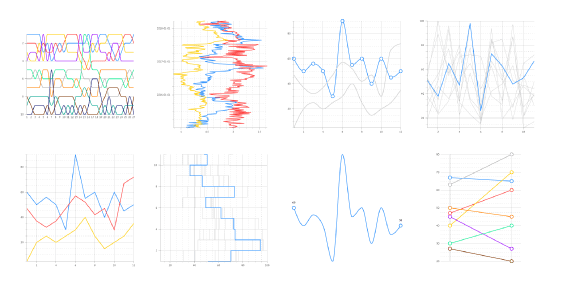
Another couple of weeks have passed and here we are with yet a new version (R44) of our Datylon...
DataViz Best Practices
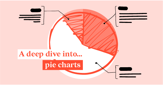
A deep dive into... pie charts
I have often said that pie charts are the Comic Sans of data communication, but over the last few...
Product News
What's new in Release 43
First of all, we wish you a healthy and inspiring 2021! Let's hope that we can soon go back to our...
Product News
What's new in Release 42
Here at Datylon, we are working flat-out to make our chart maker the perfect home for your chart...
DataViz Best Practices
Bar Charts 101 - Tips and suggestions for your next bar chart.
Simple on the surface, the faithful bar chart is often one of the first introductions we get to...
Product News
What's new in Release 41
Although we are in the middle of a hot summer at this side of the globe, we keep on working hard to...

