Press & Reviews
What have we learned with Datylon reviews on Capterra
Not long ago, Datylon decided to join the software reviews platform Capterra. There are many...
Product News
What's new in Release 47
At Datylon, we strive to make it easier for our users to create and share data visualizations. And...
Illustrator Chalk Talk
How to make a bubble chart in Illustrator with Datylon
Would a $10,000 yearly income increase make you happy? And what about $100,000? I guess you’re...
DataViz Best Practices
A deep dive into... bubble charts
It is believed that the bar chart is the king of all charts. It’s easy to read and most people are...
Illustrator Chalk Talk
How to make a dot plot in Illustrator with Datylon
A dot plot is a chart type that packs a lot of information in a small space. Recently, we had a...
Illustrator Chalk Talk
How to make a heatmap in Illustrator with Datylon
Lately, we’ve been writing a lot on heatmaps: how they work, how you should use them, and what to...
DataViz Best Practices
A deep dive into... dot plots
First things first: let’s start by clearing up some terminology. Chart naming always triggers a...
Product News
What's new in Release 46
This month’s release is focused on keeping Datylon for Illustrator future-proof. With R46, we...
Reporting
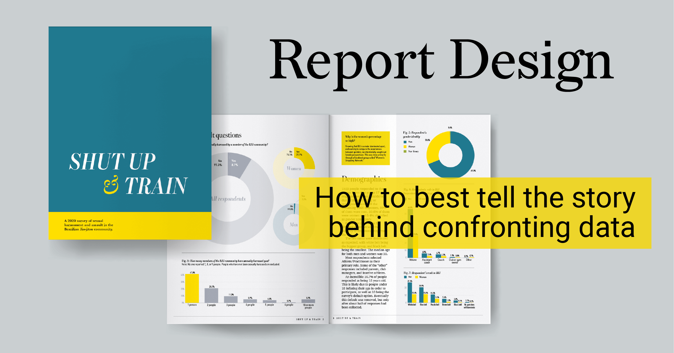
How to best tell the story behind confronting data
When you find the time and have the skills, setting up your own data visualization project is one...
Product News
What's new in Release 45
You asked, we listened! If you design charts and reports, sometimes you surely need to change the...


