How to pick the right graph for financial data visualization
When it comes to selecting the right graph for financial data visualization, it's important to stick to the same principles as choosing a graph in any other field. In this article, we will delve into the fundamental guidelines for choosing the most suitable graph for financial data and showcase some popular finance-specific visualizations used in the industry.
Table of content
|
Categories of graphs.
There are 5 main graph categories based on the function that they fulfil:
- Comparison / Difference
- Part-to-whole comparison / Hierarchical
- Date over time
- Distribution
- Correlation
Each category includes various graphs suitable for visualizing specific types of data. However, there is typically a primary graph type within each category that best serves the majority of visualization tasks. You can learn more about different graph types in our extensive article containing the description of 80 graph types.

Comparison / Difference – Bar graph
Most of the relations between data values can be described via comparison. Visualizing these values helps us see quicker which of them are bigger and which are smaller. Keywords for this type of graph are “smaller than”, “bigger than”, “equal”. If we use sorting, a dimension of order is added. The most popular graph type for comparison is bar graph. One should not be afraid of using bar graphs. They are easy to understand for any audience. The only case when the bar graph might not work well is when the difference between values is an order of magnitude. In this situation icon graph might be a good alternative.
Part-to-whole / Hierarchical – Stacked single bar graph
When one needs not only comparison, but also finding a relation to the whole, a stacked single bar graph is the optimal solution. An alternative option that is really popular is a pie graph, but due to complexities of human perception of sectors of a circle this is not an optimal graph type. There are cases when it’s safe to use pie charts, like when there is a significant difference between values visualized, but otherwise it’s safer to use stacked single bar graphs as a more universal option. Keywords for the analysis of this type of data are “share”, “proportion”, “part”, “percentage of the whole”.
Date over time – Line graph
The function of graphs that visualize data over time is to show not the separate values, but the overall trends. Line graphs are considered the best option for visualizing data over time. They are rather versatile, simple for perception and work well for different audiences. Line graphs are also very good companions for other graphs due to low density of lines. They are often combined with bar graphs and scatter plots.
Distribution – Histogram
Distribution graphs aimed at showing the number of items fall into a certain range. In general they show the frequency distribution of a variable. Histogram is the first option here. It looks similar to a bar graph, but visually they are distinguished by the space between bars. In histogram there’s no space between bars while in the bar graph there’s a separation between bars.
Correlation - Scatter graph
The aim of correlation graphs is to show the relationship between two variables, for example transfer volume and processing time across services like PayPal, Wise, TransferGo, or others. Scatter graph is the go-to option for visualizing correlation. One of the variables is shown along the X-axis, the other with the Y-axis. The form of the dot clusters allows one to identify the type and direction of the correlation. In the dataviz community it is considered that scatter graphs might not be the best choice for a wide audience. However it’s an ultimate graph for research and visualizing multiple variables. It also has a wide potential for customisation.
Specific types of graphs that are popular in finance
Some of the charts are more popular in finance due their ability to visualize financial data in a very specific way. In this part of the article we'll take a look at bullet chart, waterfall graph, candlestick graph, quadrant graph, funnel chart, Gantt chart, boxplot. Visually, all this charts are variations of bar graph and scatter graph, but each of then has some specific properties that allow to show multiple variables at the same time.
Bullet chart
Bullet charts are often used in finance. It usually shows three types of values. First is the actual value of the given company. It is visualized using the bar. The second value is the target value that is visualized using a datamark or line. The third set of values represents the ranges that can be useful to show the general context of the values, like “good”, “bad”, and “average”. It’s usually visualized with a stacked bar, every element of which represents a certain range.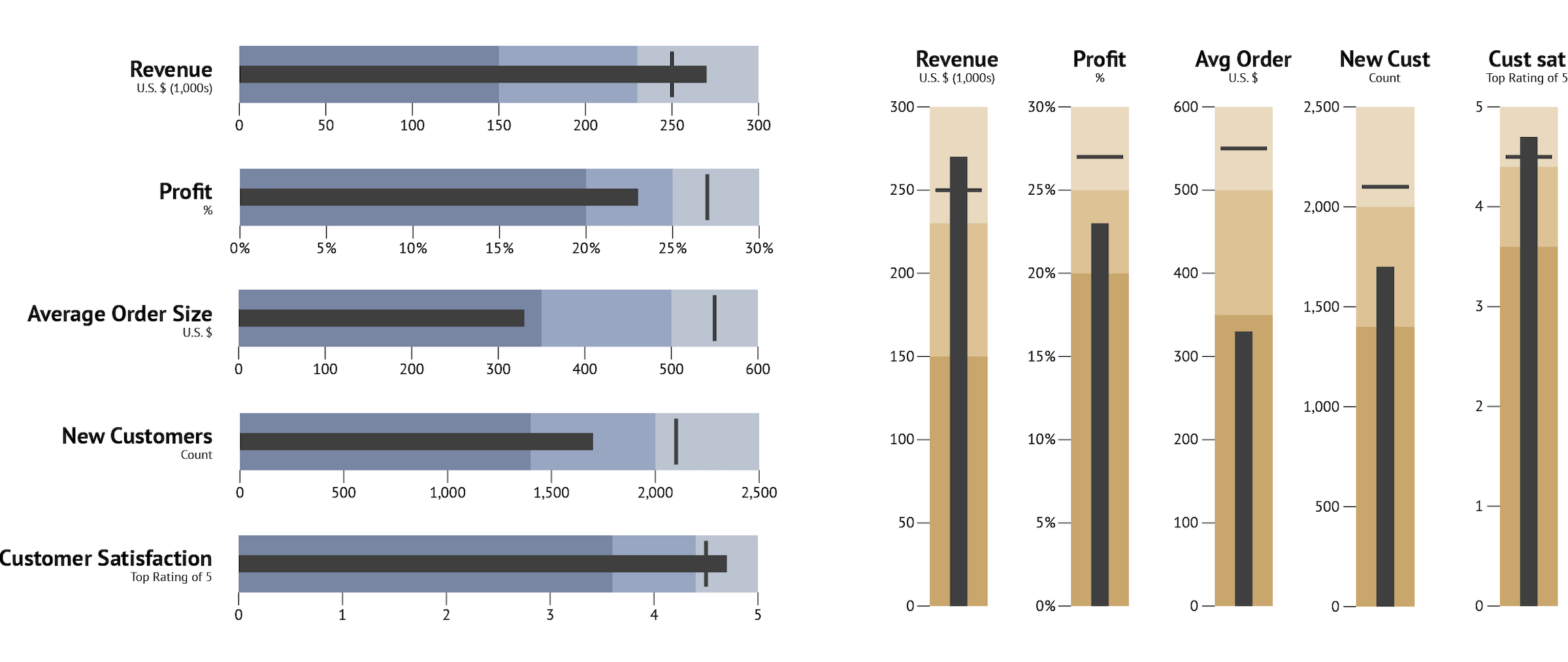
Waterfall chart
A waterfall chart is used to show the dynamic over a period of time, making an accent on the magnitude of changes. As visual elements it uses bars. The first and the last bar is plotted exactly how it’s done in bar chart – starting from zero and visualizing the value of the first category or time period. But the next bars follow a different logic. They start from the end point of a previous bar and the length of the bar is used to show the difference between the first and the second category or time period. The direction of the changes is shown with color (f.e. positive is blue, negative – red).
Waterfall charts can be used to show how an indicator is changed over a year, also highlighting the value of changes for every single period. It can also be used to show the structure of financial statements – highlighting every element and its contribution.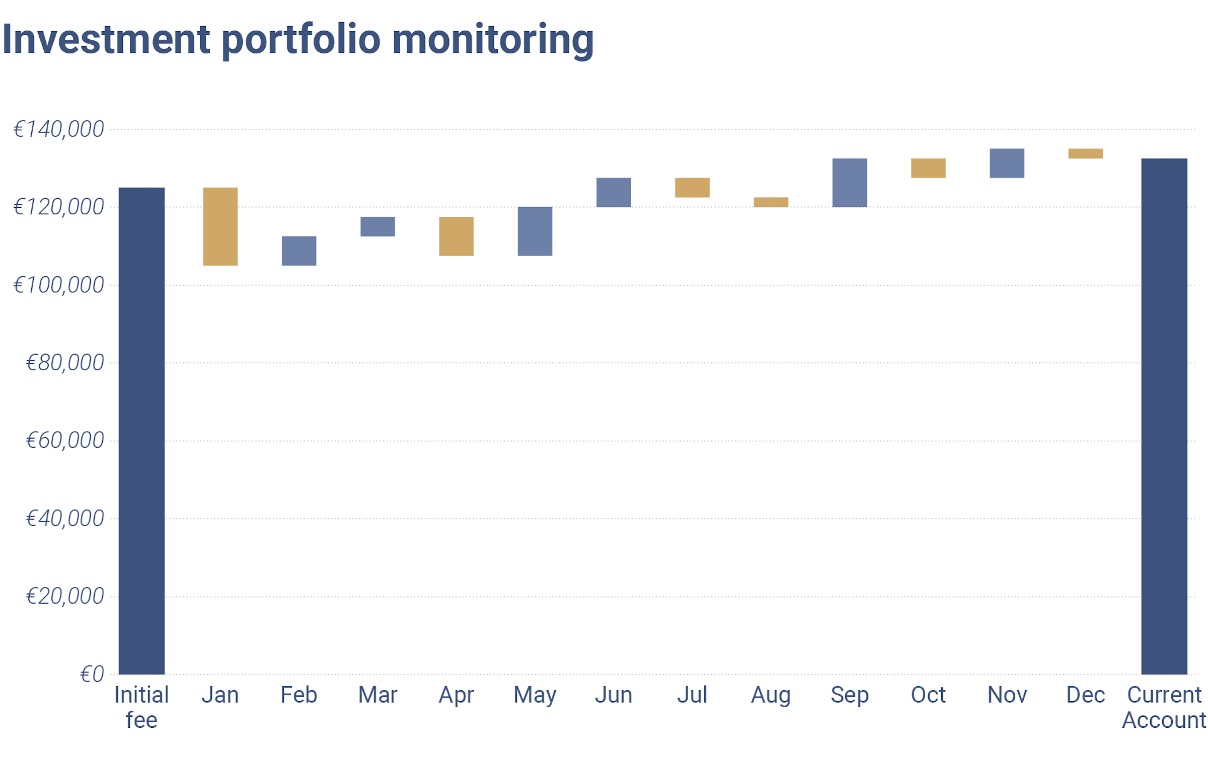
Candlestick chart
A Candlestick chart is a typical chart for the financial industry. It can be found as a visual aid in stock, option, commodity, and foreign exchange trading. It consists of three parts: upper shadow, lower shadow, and the body. The top of the upper shadow represents the highest value of the period, and the bottom of the lower shadow represents the lowest value of the period. The body represents the open and close values.
The positioning works in accord with the color. If the color of the body is red, it means the bottom of the body is the close value, the top – open value. If the color of the body is green, it means the bottom of the body is open value, the top – close value.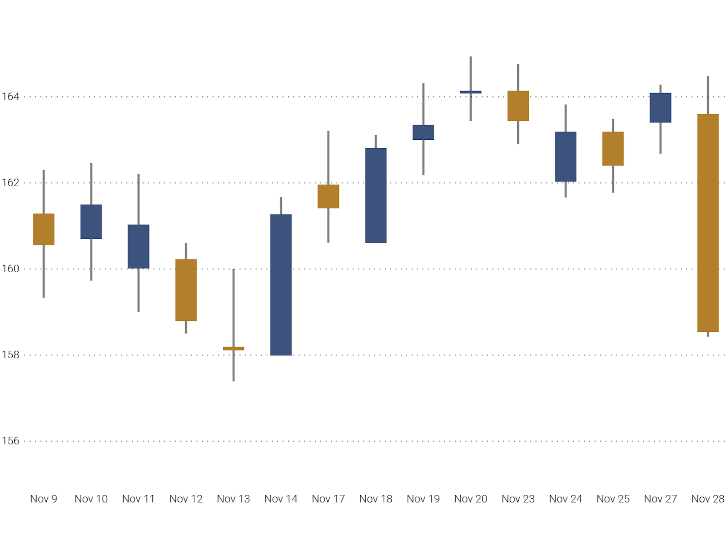
Quadrant graph
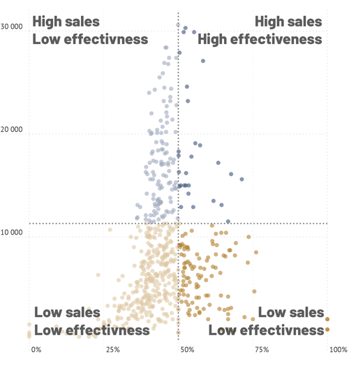
The quadrant chart can be seen as an extension of the scatter plot. The difference is that the quadrant chart has two additional lines that divide the field into four parts. Each part has its own name which makes it easier for the reader to analyze it.
Quadrant graphs can be used for different purposes: competitive analysis, SWOT analysis etc. Gantner quadrant is one of the most famous quadrant graphs.
Funnel chart
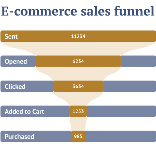
The name of the funnel chart speaks for itself. It is used to visualize all kinds of funnels: the funnel of sales, content funnel, cancellation funnel etc. It is not ideal for visualizing the actual values of the data in an accurate way, because in most cases it’s centered, which is not the best for perception. On the other hand it can give a good understanding of the structure of the process.
Gantt chart
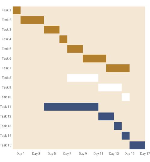
Gantt chart is used to show some processes over time. In practice, it is most useful for planning. The main visual elements are bars. They are placed horizontally. Each bar visualizes the period of time needed to complete a task. Each line corresponds to a person, branch or division that is responsible for executing the task. The bars allow you to see the load in a certain period and help to see the general structure of the planned process and make the corresponding changes.
Boxplot
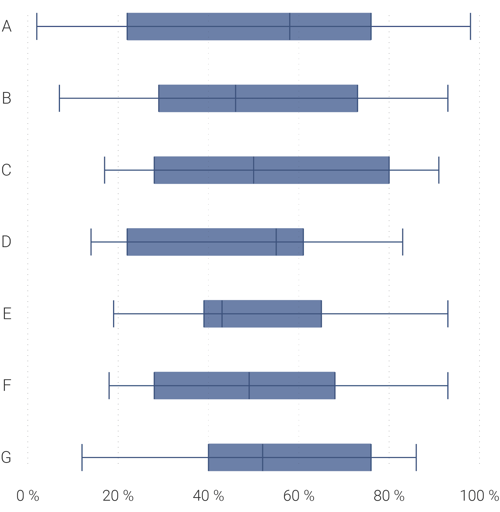
The box plot is very similar to the candlestick chart, but it has a different meaning and purpose. It is used to show the distribution of a variable in a very minimalistic way.
The box plot consists of a box, a median line, and two whiskers. Sometimes some outliers are presented outside the whiskers. The box represents an interquartile range (IQR). Meaning the start of the box is the first quartile (Q1) and the end of the box is the third quartile (Q3). The box also contains the medial line.
The first whisker represents the “minimum” value. It’s in quotes because there can be outliers plotted before the “minimum” value. This “minimum” value is calculated as Q1 – 1.5IQR. The similar case is with an upper whisker, represented by the “maximum” value. It is calculated as Q3 + 1.5IQR. The outliers that fall out of the min-max range are plotted as separate dots.
Box plot chart is widely used in a professional community and can be easily identified. You can easily find it in scientific or finance papers and reports. However for the unprepared reader it can be a challenge, as it’s based on specific statistics concepts.
Conclusion
In conclusion, choosing the right graph for financial data visualization is crucial for effectively communicating insights and trends. By understanding the principles behind different graph types and their functions, finance professionals can select the most appropriate visualizations to convey their data accurately and efficiently. Whether it's comparing values, showing trends over time, or highlighting distributions and correlations. By utilizing the appropriate graph types, finance professionals can enhance their analysis and decision-making processes, ultimately leading to more informed and successful outcomes.
In the financial world, it's common for charts to be reused or repurposed across various reports, and reports sometimes need to be created periodically (monthly or quarterly) or for different departments or regions. This can be time-consuming, especially when dealing with frequent data updates or complex datasets.
To streamline this process, automated reporting tools offer a valuable solution. These tools enable the creation of chart and report templates and can connect to different data sources, automating the generation of charts and reports. The Datylon Report Server is one such tool that can significantly enhance efficiency and accuracy in financial reporting.
If you're looking to streamline your charting or reporting process with an automated solution, schedule a demo with one of our experts today or read our complete guide.
👉If you're keen on crafting custom data visualizations, visit our Bespoke Data Visualization Solutions page.


