How to make a scatter plot in Illustrator with Datylon
Recently, electric cars are becoming an alternative to cars with internal combustion engines (ICE). Over the last decade the cost of production of batteries – the most expensive part of an electric car – has dropped significantly. If in 2010 the cost of kWh was €609 per kWh, then by 2019 it was already €100 per kWh.
In the US and EU, the cost of electric car ownership is lower than that of an ICE car. Based on surveys of potential car buyers, around a third of respondents are considering a purchase of an electric car, another third consider hybrid cars and the rest consider ICE cars. Some countries plan to allow new car sales of only electric cars by 2025.
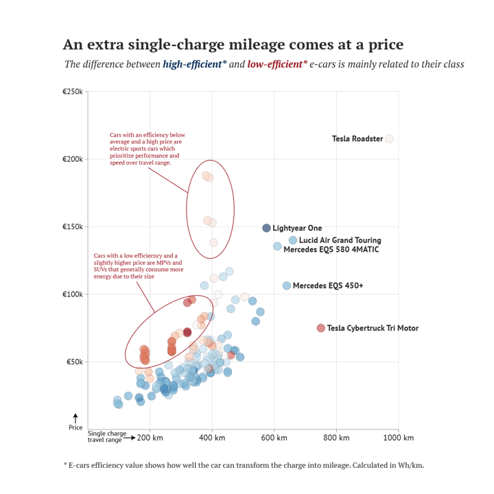
In this tutorial, we will create a scatter plot presenting a mileage range that e-cars can cover on a single charge as well as prices and their efficiency. The final result will look like this:
Download & install Datylon for Illustrator
For this tutorial, we assume you have already downloaded and installed the Datylon for Illustrator plug-in. If not, you can sign in and download the plug-in here. If you need help with installing the plug-in, make sure to look at this article. If you don't have an account on Datylon, join now! It only takes a few seconds and it doesn't cost anything! |
Table of contents
Step 1: Preparing the artboard Step 5: Styling the scatter plot Step 6: Adding a title, subtitle, and other elements |
Step 1: Preparing the artboard
It’s a good idea to prepare your artboard before creating a visualization. In most cases you need a chart of a certain size and proportions, so taking care of this in advance will make your life easier. You can set the height and width before creating a document or later in the process. For our design, we will set the size of our artboard to 1200 by 1200 pixels.
Step 2: Drawing a chart area
First off, we need to draw the chart area. Select the Datylon icon in the AI toolbar and draw a rectangle that more or less fits the desired dimensions of the scatter plot. You can later easily resize the chart if needed: chart elements will be redistributed using the new proportions. By releasing the rectangle, the Datylon pane will appear.
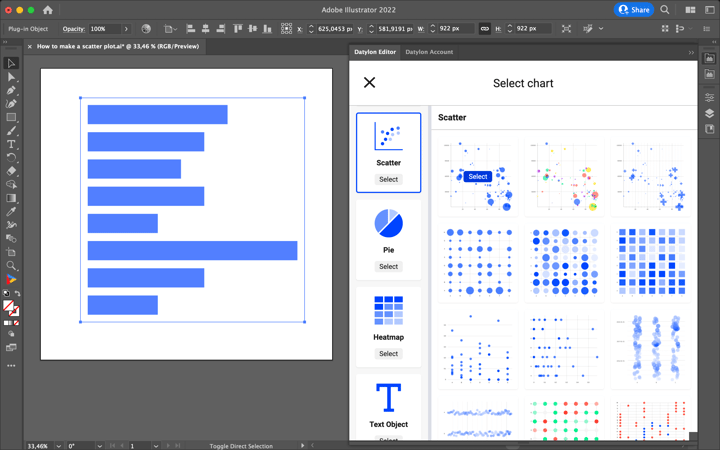
Default charts serve as a starting point to help you design your chart. So if you already know where you want to go with the design, these defaults could help you get there faster. In the case of the scatter, one can choose from 15 default charts.
For our visualization, we will go with the first default chart.
Step 3: Adding data
Once you have selected your default chart, the Datylon editor appears. On the left side, you can see a data pane, and on the right side is the property pane. The property pane in itself contains a binding tab, a data formatting tab, and a styling tab.
But let’s take a look at the data pane first. There are three ways of adding data:
- Type or copy-paste your data into an empty or dummy data sheet.
- Add a workbook from the Datylon Report Studio.
- Import a locally saved data file.
To create this scatter plot we are going to use a CSV file we have saved locally on our computer. Simply click Manage Data > Add > Import File and browse to find and add your workbook or datasheet. Pick the required datasheet and click on the ‘Select Sheet’ button.
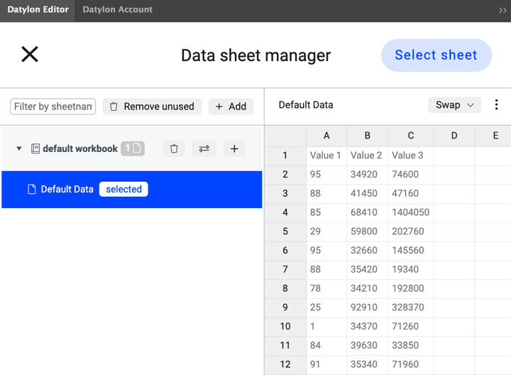
Step 4: Binding the data
In data visualization, binding the data defines which data drives which visual cue. Some data could drive size, some data could drive position, some data could drive color, etc.
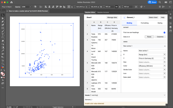
Once our data update is complete, the chart is crossed out and an error message “X” values should be of type ‘number’ ” appears. It means we have to bind numerical values to the X-axis. Let’s start binding data step by step. First, bind “Range (km)” to X-axis, “Price in Germany (€)” to Y-axis, and “Name” to Labels. Now the warning is gone and we can see the correlation between e-cars prices and the range that this car cover on a single charge. To see the differences in efficiency, bind the “Efficiency (Wh/km)” column to Color. Another warning appears “Invalid color value detected”.
In most cases, this means that a single color is chosen for data marks where a palette is expected. We’ll fix it in the Formatting and Styling tabs.
If your data contains dates, time, currencies, or other special data formats, the Formatting tab allows you to interpret them correctly. For this chart, only the “Efficiency (Wh/km)” column needs to be formatted. The reason is that this column will be used to show numerical values through color. By default, if we bind some column/row to color it’s perceived as categorical values. You can read more about formatting options here.
To apply formatting go to:
Formatting > Select column… > Efficiency (Wh/km) > Number
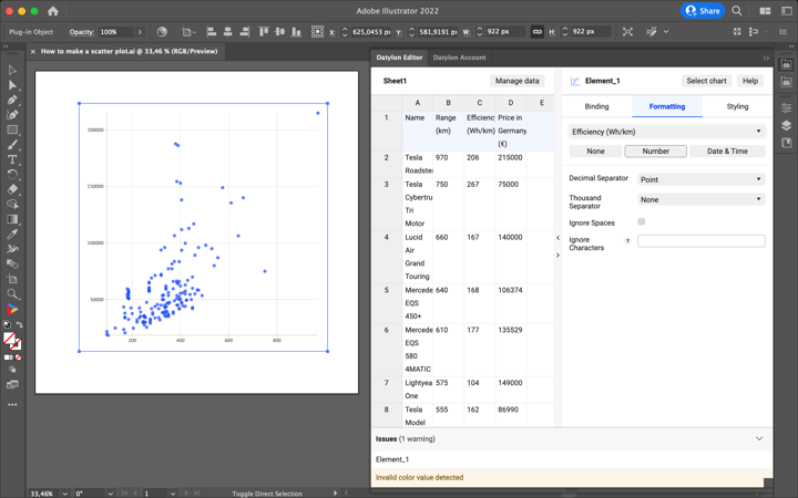
Now the values from the “Efficiency (Wh/km)” column are perceived as numerical values – the way we wanted – and we can proceed to the Styling tab.
Step 5: Styling the scatter plot
Let’s start with the styling of Data Marks. First, increase the width and height to 20px:
Styling > Data Marks > Symbol > Size > Width > 20px
Styling > Data Marks > Symbol > Size > Height > 20px
Now change the color from solid to diverging continuous palette so we can see the differences in efficiency.
Styling > Data Marks > Symbol > Color > Palette > Diverging
In the top right corner of the palette, select the “Continuous” option. This option allows one to have a corresponding tone for every value from the palette range. To set a range of values that will be linked with the palettes set Min Value, Max Value and Center for Range property.
Styling > Data Marks > Symbol > Color > Palette > Range > Min Value > 100
Styling > Data Marks > Symbol > Color > Palette > Range > Max Value > 300
Styling > Data Marks > Symbol > Color > Palette > Range > Center > 100
As the big “Efficiency (Wh/km)” values mean less efficiency, they should be colored in red. To do that we can reverse the palette:
Styling > Data Marks > Symbol > Color > Palette > Reversed > On
The last adjustment to Data Marks is to add a minor stroke around them so that white marks are visible:
Styling > Data Marks > Symbol > Stroke > 0.1px
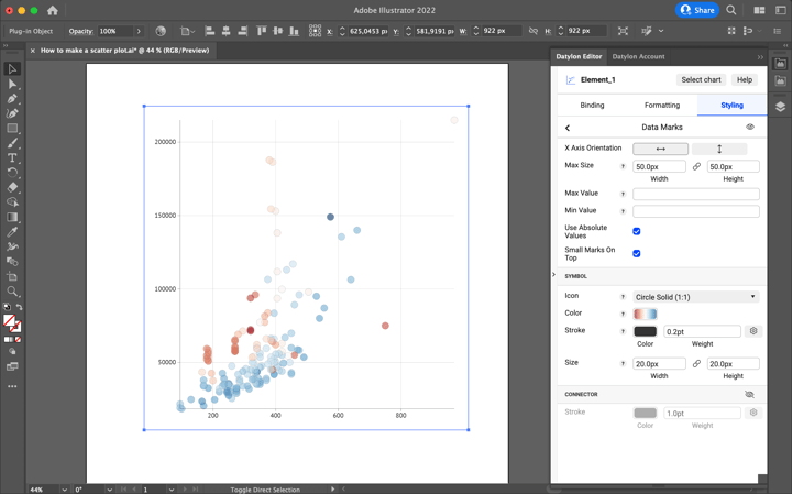
Now let’s style axes. First set the X-axis’ labels type size, then add a suffix, so the reader can understand what units of measurement are used:
Styling > X Axis > Labels > Character > Size > 20px
Styling > X Axis > Labels > Suffix > “km”
Then add an extra tick so that the gridline looks complete:
Styling > X Axis > Major Ticks and Grid > Add Extra Tick
A zero label appears, but we won’t need it as this space will be used later for the axis name, so it’s ok to remove it:
Styling > X Axis > Hide Zero
The same adjustments are needed for Y-Axis:
Styling > Y Axis > Labels > Character > Size > 20px
Styling > Y Axis > Labels > Prefix > “€”
Styling > Y Axis > Major Ticks and Grid > Add Extra Tick
Styling > Y Axis > Hide Zero
To show Y-axis labels in thousands of Euro use the short notation:
Styling > Y Axis > Number Format > Short Notation > Kilo
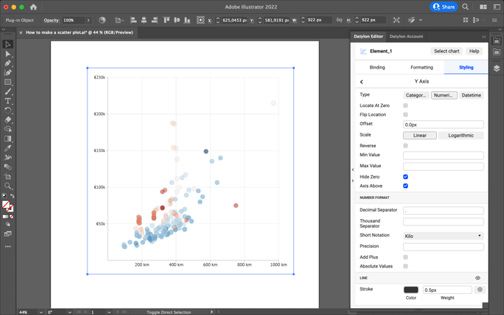
The next step is to style Data Labels. As the number of labels will make the chart overcrowded, we will delete all the car names except the first six cars – cars with the longest mileage range.
Now, turn on data labels, adjust the positioning of the labels and change the font size.
Styling > Data Labels > On
Styling > Data Labels > Data Mark Anchor > Center Right
Styling > Data Labels > Horizontal Alignment > Right
Styling > Data Labels > Vertical Alignment > Center
Styling > Data Labels > Horizontal Offset > 5px
Styling > Data Labels > Character > Size > 20px
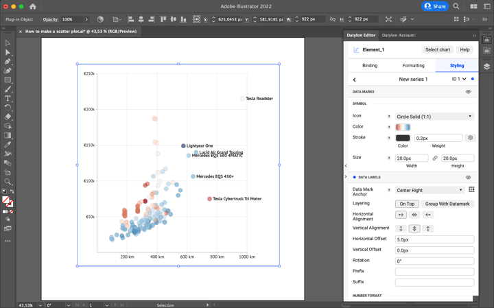
Few adjustments can be made for some of the data marks to save space and avoid overlapping, by using data point styling.
Styling > New Series 1 > Data points > ID 1 > Data Labels > Data Mark Anchor > Center Left
Styling > New Series 1 > Data points > ID 1 > Data Labels > Horizontal Alignment > Left
Styling > New Series 1 > Data points > ID 5 > Data Labels > Vertical Alignment > Bottom
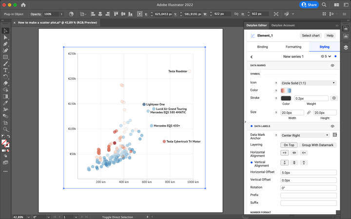
Step 6: Adding a title, subtitle, and other elements
Now the styling of the actual scatter plot is done, we have a few details left to add, but these details are key for understanding the chart. First – add the names of the X and Y axes using the Illustrator Type Tool. For the X-axis it’s: “Single charge travel range”, for Y-axis: “Price”. Add a line with an arrow on one side to show the direction of the axis.
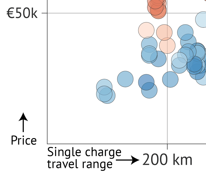
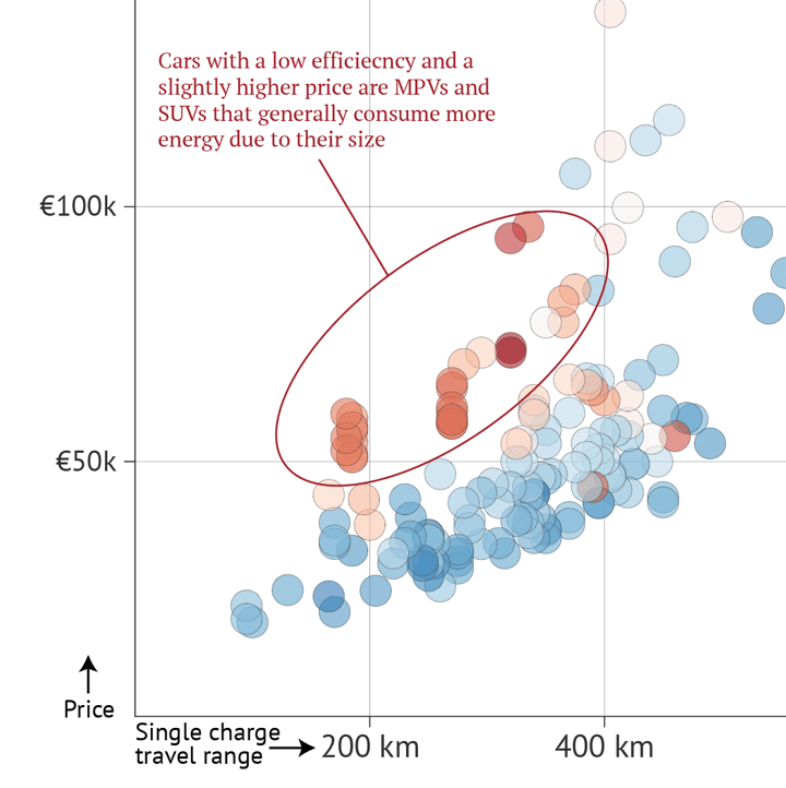
There are a few data marks on this chart that need additional explanation. The first group is data marks representing cars with slightly higher prices but significantly less efficient. These are MPV cars that generally have a higher weight and that’s why they consume more energy and are less efficient. We’ll add an oval and a connector pointing out this group of cars and text annotation.
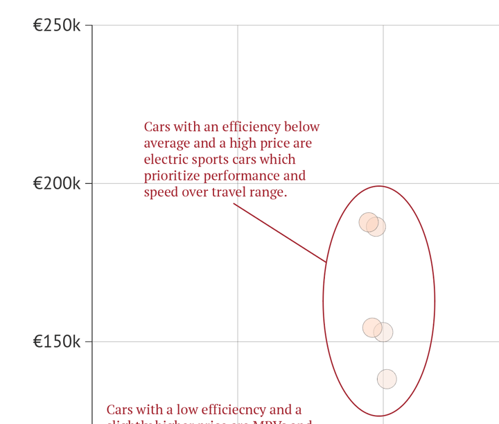
The second group of data marks represents cars that have a significantly higher price, low efficiency, and an average single-charge travel range. These are sports cars that prioritize performance and speed over travel range. Add another oval with a connector and annotation explaining this.
Now only the title, subtitle, and some footnotes are left to add. For the title use a large font with a bold font style. In this case, we used 36px PT Serif Bold. For the subtitle use a slightly smaller italic style font. We used 24px PT Serif Italic. You can also use the subtitle as a legend coloring “high-efficient” in blue and “low-efficient” in red. Color can be taken directly from the chart using a color picker. Also, it makes sense to style a colored legend font in italic-bold. To clarify what "efficiency" means, add a footnote in a slightly smaller regular-style font under the chart. We used an 18px PT Serif Regular.
Step 7: Using and sharing
And you're done! Congratulations.
Once you are happy with your design, you can export this scatter plot as an image (PNG, SVG, etc.) like you would do with any other Illustrator project and use it in all kinds of tools like PowerPoint, Word, Excel, Google Slides, etc. You can also add the AI file to your Indesign documents and when updating the chart in AI, the link will ensure it is also updated in the Indesign document.
You can also export this scatter plot to the Datylon Report Studio and start collaborating on the template.
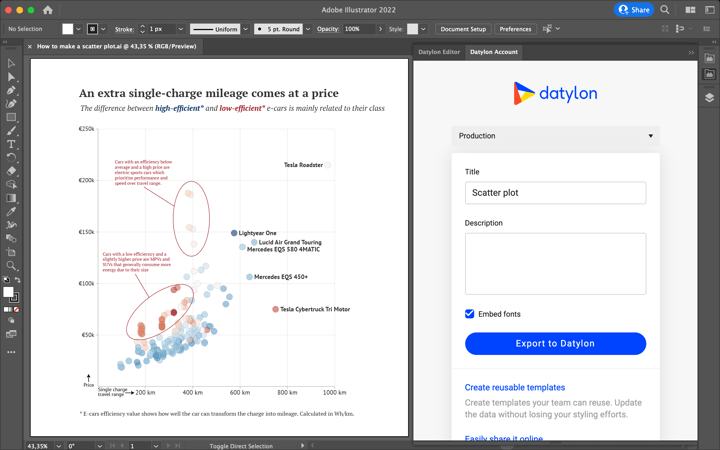
To do this, open the Datylon Account pane in Illustrator via Windows > Extensions > Datylon Account. Log in to your account, give the scatter plot a title and description, and export it to the Datylon platform. From here, you can easily receive and manage data, reuse your template by updating it with new data, or share the scatter plot design by publishing it for the world to see! You can also learn more about how to work with Datylon templates here.
By exporting to Datylon Report Studio, your template becomes accessible to Datylon Report Server. Datylon Report Server is a powerful tool that can help you automate data visualizations and reports. By connecting to your data source and providing a template, you can easily generate customized visualizations on a regular schedule or on-demand. This automated reporting eliminates the need for manual intervention and ensures that your reports are always up-to-date and consistent.
Scatter Plot Resources
- Deep dive into… scatter plots - Delve into the fascinating world of scatter plots & learn about their origin, different forms, and how they’re used in data visualization.
- Scatter plot resource page - Your starting point to create scatter plots, full of useful design tips for stunning data visualization.
- Scatter plot properties - Discover all styling properties in Datylon and use them to design your own scatter plot.


