How to make a dot plot in Illustrator with Datylon
A dot plot is a chart type that packs a lot of information in a small space. Recently, we had a closer look at what makes a good dot plot. And today, we will show you how to make one with the Datylon plug-in for Adobe Illustrator.
In this tutorial, we chose to make a dot plot that shows how 2020 changed the mood in the countries with the highest happiness score. The data comes from World Happiness Report 2021, which in turn was collected with the Gallup World Poll and Lloyd’s Register Foundation. It is mainly based on the survey respondents' rating of their (quality of) life.
The 2021 edition of the report sheds some light on the effects of Covid-19 and how it influenced the overall happiness of people. It is publicly available to download.
The happiness score is one of the indicators from the World Happiness Report. Respondents are asked to rate their life on a ladder scale from 0 to 10. Interestingly enough, Finland has been ranked the happiest country in the world fourth time in a row.
If you want to follow the steps, you can download the data that we will be using here. Together, we will make a dot plot chart, step by step. In the end, our chart will look like this:
Download and install Datylon for Illustrator
For this tutorial, we assume you have already downloaded and installed the Datylon for Illustrator plug-in. If not, you can sign in and download the plug-in here. |
So buckle up and follow these steps to create this dot plot with Datylon for Illustrator. You can continue reading below or you can also watch the tutorial video here:
Table of contents
|
Step 1: Preparing the artboard
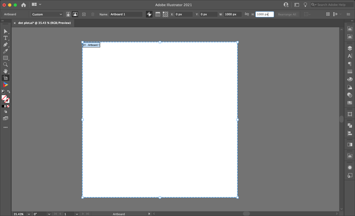
It’s a good idea to prepare your artboard before creating a visualization. In most cases you need a chart of a certain size and proportions, so taking care of this in advance will make your life easier. For our design, we will work with the artboard set to 1000 by 1000 pixels.
Step 2: Drawing a chart area
First off, we’ll need to draw the chart area by selecting the Datylon icon in the AI toolbar and drawing a rectangle that more or less fits the desired dimensions of the dot plot. Don't worry about the size of your chart design. In Datylon for Illustrator, you can easily resize the chart at any moment, whenever needed: chart elements will be redistributed in the same proportions. This very important feature will ensure that scaling will not mess up your design.
By releasing the rectangle, the Datylon pane will appear.
Select the right chart type in the chart library by scrolling down a bit and clicking on the dot plot card. Make sure you click the card and not the select button. Clicking ‘select’ will immediately select the first default chart of that chart type and that might not always be what you want. Instead, clicking on the entire tile will display all the different variations of a dot plot chart.
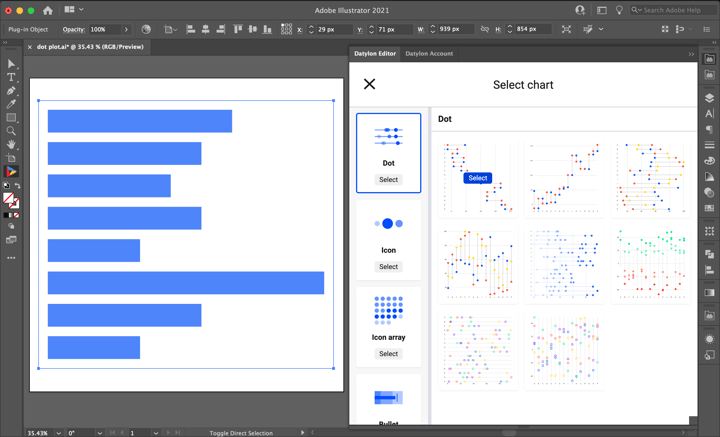
Default charts serve as a starting point to help you design your chart. So if you already know where you want to go with the design, these defaults could help you get there faster. In the case of the dot plot, we can choose from eight default charts.
The first two charts are horizontal and vertical versions of a simple dumbbell chart. The third and the fourth ones are the connected dot plots with dots colored according to the category. The fifth and sixth charts show the possibilities of color binding of values with sequential and diverging palettes. The seventh and the eighth ones give a hint about the variability of icons that can be used for data marks.
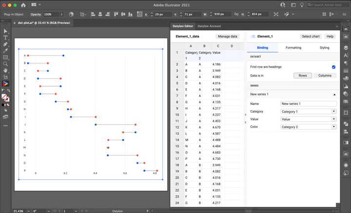
For this tutorial, we’ll go with the first default chart.
Step 3: Adding data
Once you have selected your default chart, the Datylon editor appears. On the left you can see a data pane, on the right you can see the editor. The editor in itself contains a binding tab, a data formatting tab, and a styling tab.
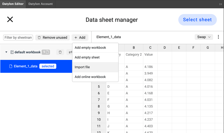
But let’s take a look at the data pane first. There are three ways of adding data:
- You can start from a dummy sheet/an empty sheet and copy-paste your own data into it.
- You can upload a file from the Datylon Report Studio if you have some data stored there.
- You can upload a locally saved file.
We are going to use a file we have saved locally on our computer. Simply click Manage Data > Add > Import File and browse to find your datasheet. Add your sheet and click ‘Select Sheet’.
In our design, we are adding data from the World Happiness Report 2021. If your data would contain dates or times, currencies, or other special data formats, the formatting tab helps you handle these data types. Our data is already in the correct format, so we can completely skip this tab.
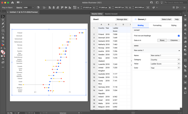
Once the update is complete, we see that the dot plot is updated with the new data. Now we have three columns. Each column represents one variable: country, year or happiness score. In our design, we want to communicate the difference that occurred in the happiness ranking per country between 2018, 2019, and 2020. Our data is sorted based on the happiness score from 2018 – the higher the rating the higher the country’s name will be on the categorical (Y-axis).
Step 4: Binding the data
In data visualization, binding the data lets you define which data drives which visual cue. Some data could drive size, some data could drive position, some data could drive color, etc.
For every chart, there is a preferable data presentation type. For the dot plot, it is a flat table. It means that every column represents one variable. For dot plot, two obligatory bindings are Category and Value. The value should be bound to a column or row containing numerical data. In our case, we want to bind Value to Ladder Score. The Category should be bound to the column that contains the list of categories across which we want to compare our numerical data. For this chart, Category is bound to Country. Color binding is an additional option in case we want to differentiate dots on some additional principle. In this case, it’s Year variable. For this chart, we don’t really need to bind anything because after we imported all the data everything is in its right place. Lucky we are!
Step 5: Styling the dot plot
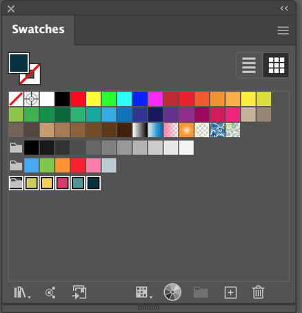
Before we start the styling process, we need to define our color palette. We can do this by using predefined colors and palettes from the editor, but if we need to follow specific style guidelines it’s better to create a new color group in Illustrator swatches and add all the custom colors there. Later we can use these colors both for chart elements and labels. We will create a color group with the following colors: green (#cbcc51), yellow (#f5ce47), magenta (#d93569), cyan (#499798), dark green (#03323f).
The first step is to change the icon type from circle to vertical dash. To do that we can go to Styling > Data Marks > Symbol > Icon and change it to “Square solid”. For now, it’s a square but we can turn it into a dash by using the Size property on the same page. First, we need to make sure the link icon shows that it's turned off. This will allow us to adjust the Width and the Height separately. Then we can change the Width to 3px and the Height to 24px.
And if we want to change the color of the icons we can go to the Color property on the same page and choose another palette. As we have categorical variables bound to color, the best palette options in the editor are Categorical and Categorical (D3). But as we have custom colors we will choose the palette that we’ve created before.
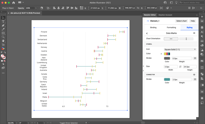
We will also change the color and the stroke of the Connector. In this case, we should choose the solid color type – cyan. We will also thicken the connector and increase the strokes to 2px.
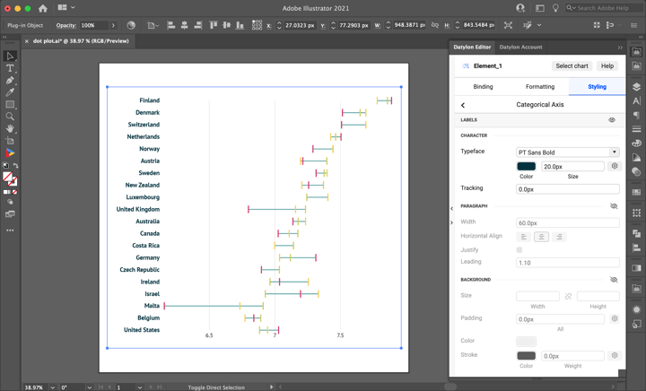
Now let’s move on to the styling of Categorical Axis > Labels.
First, we need to change the Typeface Size. If we are preparing a universal visualization for both mobile and desktop, the rule of thumb is to have the typeface size st to not less than 20px. And to add extra clarity to our design, we will choose the PT Sans Bold. We will also change the color of the font to dark green to match our style guide.
As we can see, the names of the countries are centered and some of them are in two lines. To fix that and make one-lined names aligned to the right we need to go Styling > Categorical Axis > Labels > Paragraph and switch Horizontal Align to “Right” and increase the Width property. But the fastest way, in this case, is to click on the eye icon in the top right corner of the Paragraph properties group.
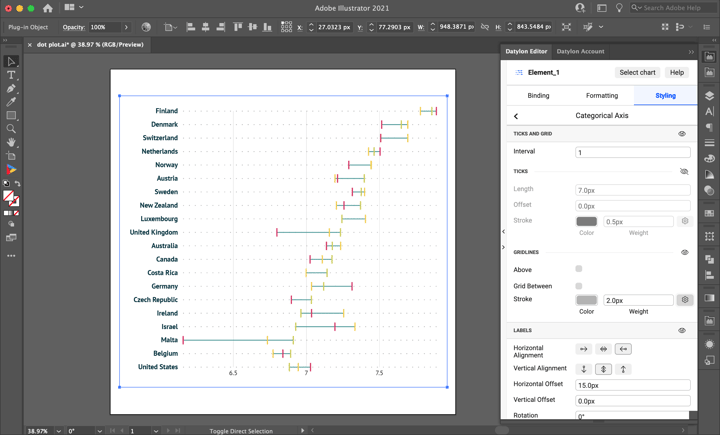
Now, the next thing is adding a grid to the categorical axis. Generally, it’s better to follow the data-to-ink concept and avoid excessive elements like grids, but in our case, we need to introduce a grid because for the top countries it’s hard to define the correspondence between the country and the connected dashes.
To add the gridline we will go to Styling > Categorical Axis > Ticks and Grid > Gridlines. Make sure you turn Ticks and Grid and Gridlines on by clicking the eye icon. Set the Color of the gridline to grey (#b3b3b3), set the Weight to 2px. To make the gridline dashed we need to click on the cogwheel icon. A dashed line menu will appear. Set the dashed line to 2px and the gap to 15px.
In this chart, we won’t need Ticks so we can remove them by clicking on the eye icon. Usually, we need ticks if we are very precise with the grid or if we want to place labels on the side. In this case, labels are centered and we don’t need to be very precise, we just need to have an idea about the size of the range between two data marks. And now we are done with categorical axis styling.
Now let’s move to the styling of the Numerical Axis.
First, we need to make the interval between the labels a bit smaller, to have a more accurate reference. To change the interval between labels we will go to Styling > Numerical Axis > Major Ticks and Grid and turn on Custom Ticks Amount by clicking on the eye icon. Set the Tick Interval to 0.2.

Now we can see that the numbers are not very elegant. To fix that we should also change the Starting Tick to 6.2.
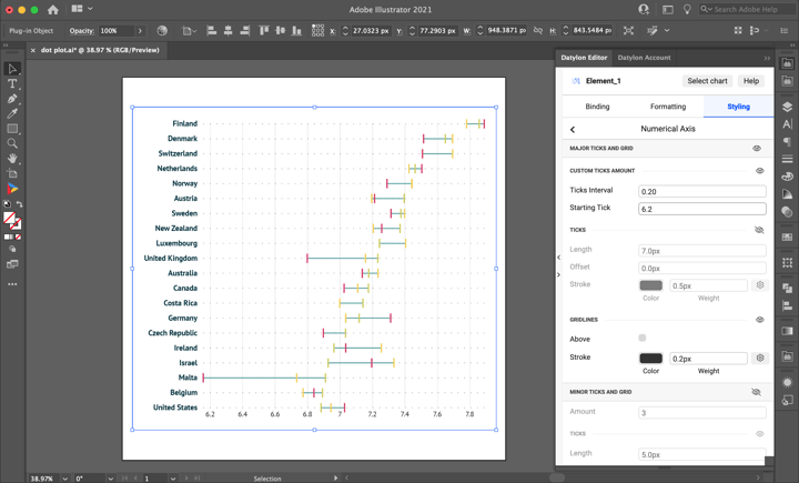
It already looks better, but we see that one of the labels overlaps with the chart element. To avoid that we still need to adjust Vertical Offset for axis labels. We can find it under Styling > Numerical Axis > Labels > Vertical Offset. We will set it to 25 px. We will also change the font size to 20 px. As it’s one of the main elements of the chart we want it to be clearly visible in all of the digital media. Then we will adjust the font color to dark green picking it from our color palette.
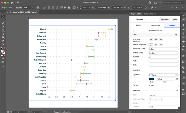
Now that we are done with the chart, we still need to add two very important elements to our design: a title and a source.
Giving a title to a chart is very important; it gives the context and hints on how we should read the chart and what we should focus on. The title can also function as a legend to the chart. Now we’ll show you how it works.
To make a title we will use an Illustrator Type Tool. Just type “T” and select an area where you want to place the title (preferably it’s the top of the chart). Type in the title of our chart “How did happiness score change in 2020 compared to 2018 and 2019 in the top 20 world’s happiest countries”. Select the Character panel and change the Font to PT Sans, the Font Size to 36px, and the color to cyan.
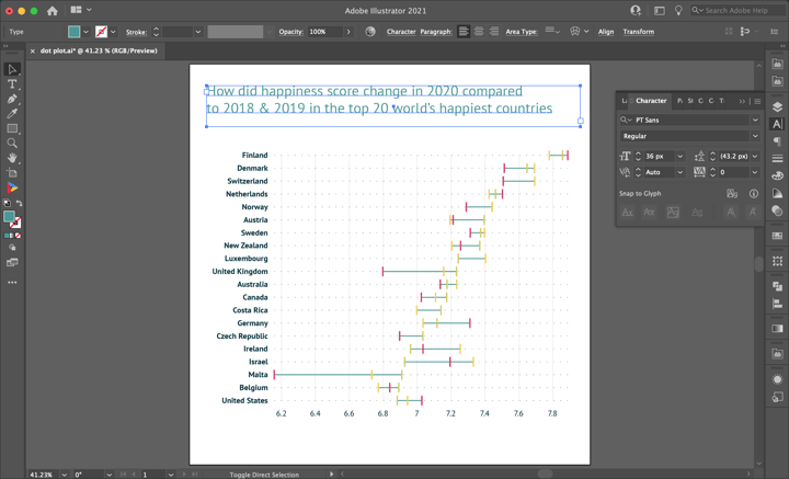
Looking pretty good already. But as we already mentioned above, this title can also be used as a legend in our dot plot. To do that we will simply change the color of each part of the text corresponding to a year. We will apply the same color as the one shown in the chart. Let’s select only “2020” from the text, select the Eye Dropper icon and click on the red line or dash of the chart. Voila! Now “2020” is colored in the same red color corresponding to the dot plot. To make it stand out even more we’ll make it bold, selecting “2020” again and changing the font to “PT Sans Bold”. And we’ll do the same for “2018” and “2019”. This way, we added a pretty nice title / legend to the design.
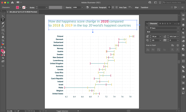
Currently, on the chart, we have the visible axis scale from 6.2 to 7.8 but the full scale is from 0 to 10. To clarify that and to explain what the actual name of the variable from the report is represented here we will add a subtitle. For the subtitle, we will also use Illustrator’s type tool. We’ll place a text box under the title. As for the text, we’ll use PT Sans Italic 24px font and cyan color.
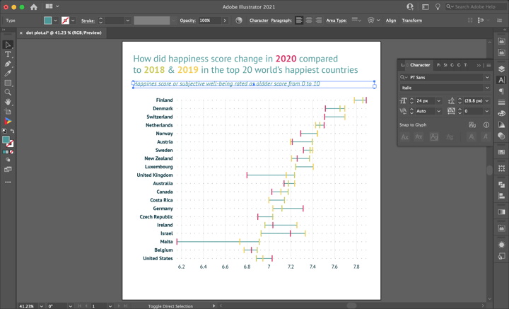
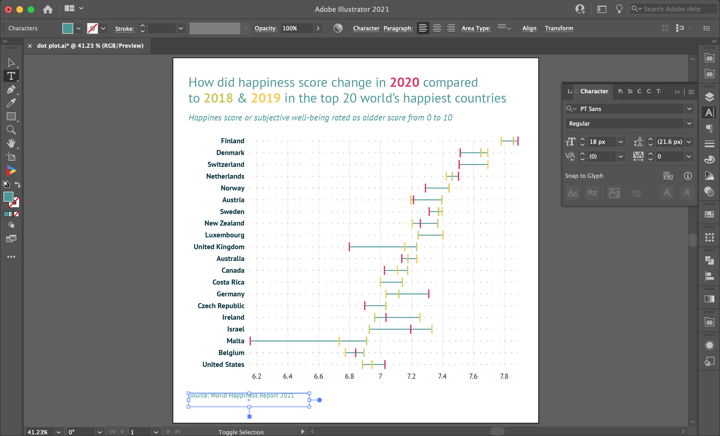
Last but not least we still need to add the source of the data. It’s not only legally correct but also a polite/ethical thing to do – to give credit to people who generated and prepared this data. We got the data for this visualization from the World Happiness Report 2021.
Step 6: Using and sharing
Once you are happy with your design, you can export this chart as an image like you would do with any other Illustrator design and use it in all kinds of tools like Powerpoint, Word,... You can also add the AI file to your Indesign documents and when updating the chart in AI, the link will make sure it is also updated in the Indesign document.
You can also export this chart to our Datylon Report Studio and start collaborating on the template.
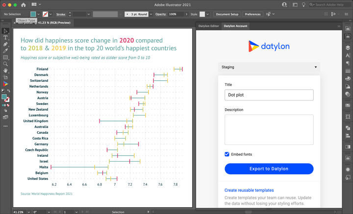
To do this, open the Datylon Account pane in Illustrator via Windows > Extensions > Datylon Account. Use your credentials to log in, give the chart a title and description, and export it to the Datylon platform. From here, you can easily receive and manage data, reuse your template by updating it with new data or share the design by publishing it for the world to see!
Datylon Dot Plot Resources
- Blog: Deep dive into... dot plots
- Chart library: Dot plot resource page
- Chart properties: Dot plot properties


