How to make a bubble chart in Illustrator with Datylon
Would a $10,000 yearly income increase make you happy? And what about $100,000? I guess you’re already thinking about the way you can spend this extra money 😉
Recently, a lot of research has been done on the topic of happiness and money. Most of the time it affirms that with the increase in income the happiness increases as well. But after reaching a certain point, an increase in income does not lead to an increase in happiness anymore. And according to this or this research, that point ranges from $75,000 to $110,000 a year.
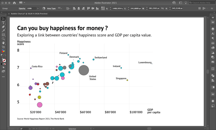
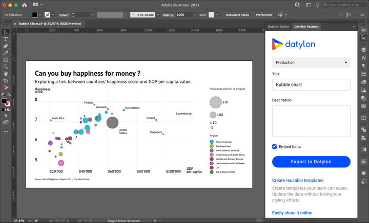
In this article, we will create a nice bubble chart that visualizes this insight. It will look like this:
To build a bubble chart we use two indicators. GDP per capita adjusted for purchasing power indicates wealth and money. The happiness score represents the level of subjective happiness. The size of a bubble depicts the population of a given country. Note that not all countries are included in the chart. To be able to see the trends clearly, we’ve filtered out countries with GDP per capita lower than $15,000. The dataset we’ll be using is a combination of data taken from the World Happiness Report 2021 and The World Bank websites. You can download the dataset that we will be using here.
Download and install Datylon for Illustrator
For this tutorial, we assume you have already downloaded and installed the Datylon for Illustrator plug-in. If not, you can sign in and download the plug-in here. |
So buckle up and follow these steps to create this bubble chart with Datylon for Illustrator. You can continue reading below or you can also watch the tutorial video here:
Table of contents
Step 1: Preparing the artboard Step 2: Drawing the chart area Step 5: Styling the bubble chart |
Step 1: Preparing the artboard
It’s a good idea to prepare your artboard before creating a visualization. In most cases you need a chart of a certain size and proportions, so taking care of this in advance will make your life easier. You can set the height and width before creating a document or later in the process. For our design, we will set the size of our artboard to 1920 by 1080 pixels.
Step 2: Drawing a chart area
First off, we need to draw the chart area. Select the Datylon icon in the AI toolbar and draw a rectangle that more or less fits the desired dimensions of the bubble chart. You can later easily resize the chart if needed: chart elements will be redistributed in the same proportions. By releasing the rectangle, the Datylon pane will appear.
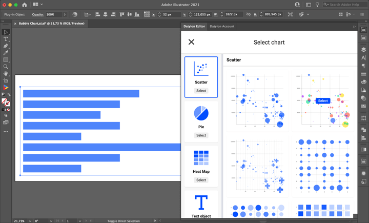
Select the right chart type in the chart library by scrolling down a bit and clicking on the scatter plot card, as this is the basis for a bubble chart. Make sure you click the card and not the Select button. Clicking ‘Select’ will immediately select the first default chart of that chart type and that might not always be what you want. Instead, clicking on the entire tile will display all the different variations of a scatter plot chart.
Default charts serve as a starting point to help you design your chart. So if you already know where you want to go with the design, these defaults could help you get there faster. In the case of the scatter plot, one can choose from 14 default charts. The first three charts are variations of bubble charts. The next three are categorical scatter plots. The seventh and eighth are counts plots. The ninth and tenth are jitter plots. The eleventh and twelves are categorical scatter plots with diverging coloring. And the thirteenth and fourteenth are barcode charts.
For this chart, we will go with the second default chart.
Step 3: Adding data
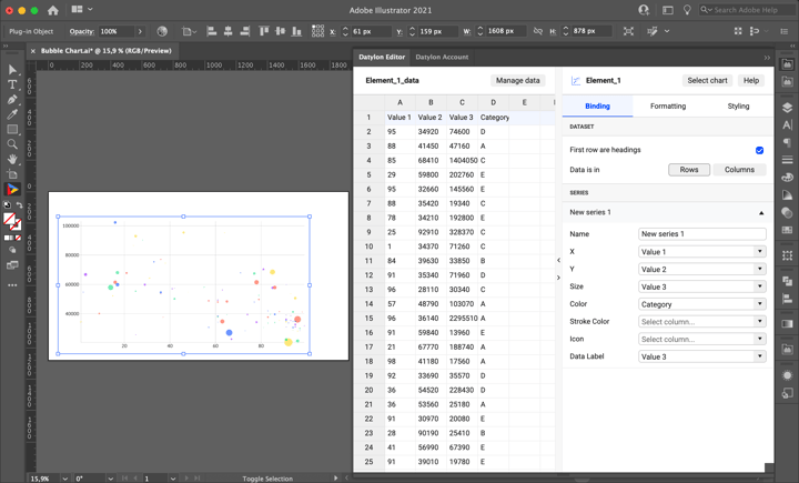
Once you have selected your default chart, the Datylon editor appears. On the left side, you can see a data pane, and on the right side is the editor. The editor in itself contains a binding tab, a data formatting tab, and a styling tab.
But let’s take a look at the data pane first. There are 3 ways of adding data:
- Type or copy-paste your data into an empty or dummy data sheet.
- Add a workbook from the Datylon Report Studio.
- Import a locally saved data file.
We are going to use a file we have saved locally on our computer. Simply click Manage Data > Add > Import File and browse to find your data sheet. As the data sheet is added you can see its preview. In our design, we are using a compound dataset that contains 6 columns: Country Name, Population, Ladder Score, GDP per capita, Region, and a Dummy Column (we’ll need it later for the legend). After we explored our data we can click ‘Select Sheet’.
Step 4: Binding the data
Once the data update is complete, the chart is crossed out and an error message “ “X” values should be of type ‘number’ ” appears. It means we have to bind numerical values to the X-axis. The first step is to bind the X and Y axes. Bind GDP per capita to X-axis and Ladder Score to Y-axis. Now the warning is gone and we can see the correlation between GDP per capita and happiness score. Let’s bind Size to Population and Color to Region. To highlight some of the bubbles with labels later, bind Data Label to Country Name.
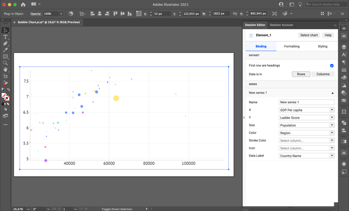
If your data contains dates, time, currencies, or other special data formats, the formatting tab allows you to convert them correctly. Our data is already in the correct format, so we can completely skip this tab.
Step 5: Styling the bubble chart
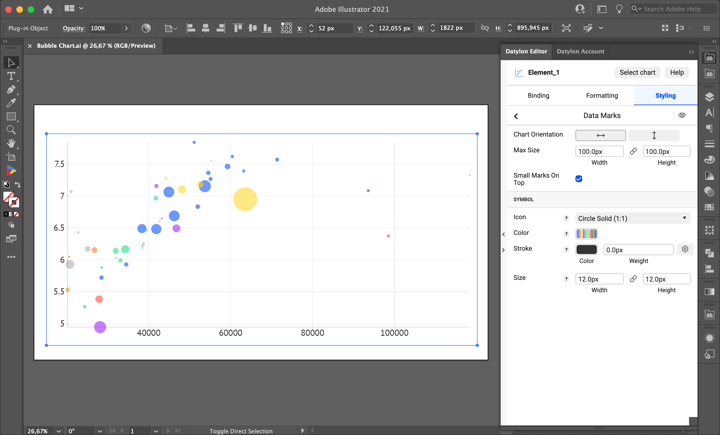
Let’s start with styling the bubbles. First, increase the size of the bubbles by changing the Max Size property. Go to Styling > Data Marks > Max Size and change the value to 100 px both for height and width.
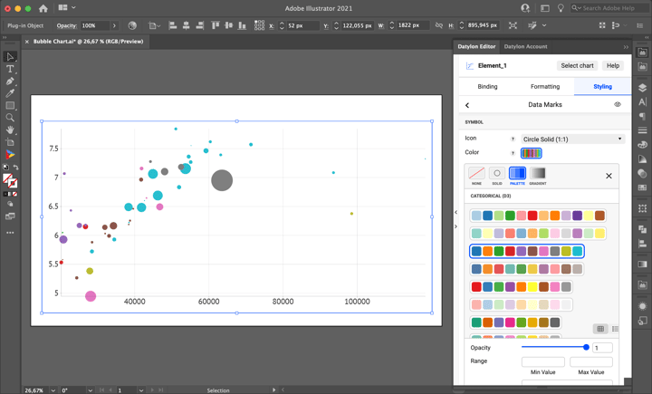
Then change the color palette by going to Styling > Data Marks > Symbol > Color > Palette and selecting one of the categorical d3 palettes. To change the order of colors in the palette turn on the Reversed checkbox. This default chart has transparent fills. You can change that in Opacity. To make the bubbles look sharper add a 1 px stroke in Styling > Data Marks > Symbol > Stroke in a solid color.
Now let’s move to Axes styling. We’ll start with the X-axis. To add some space to the sides of the chart go to Styling > Axes and Grid > X Axis and set Min and Max values to 15.000 and 119.000 accordingly. To make the chart cleaner we remove the axis line by clicking on the eye icon. To make the numbers more readable a Thousand Separator is added by X Axis > Number Format > Thousand Separator and enter “ ‘ “ sign to the text field.
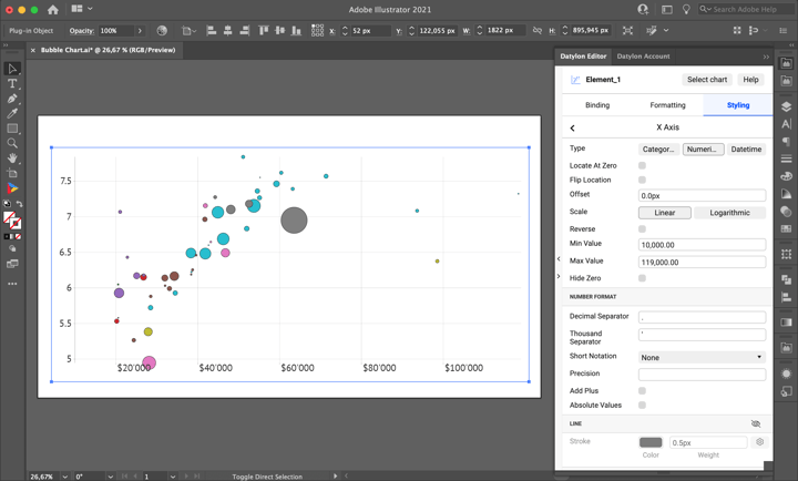
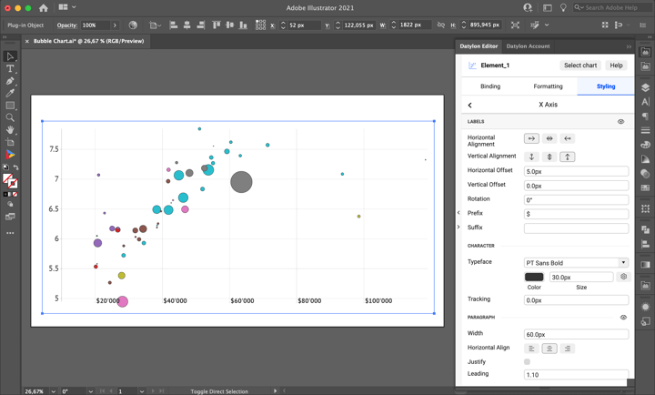
The next step is styling axis labels. As the X-axis is bound to GDP per capita it will be useful to specify units. To add a prefix go to Styling > X Axis > Labels > Prefix and enter “$” into the text field. As we will have some additional space to the left and to the bottom of the chart, we can use it to place labels. To place the labels to the right of the gridline you should go to Styling > X Axis > Labels and adjust Horizontal Alignment, Vertical Alignment, and set Vertical Offset to 0px and Horizontal Offset to 5px. To make labels more readable change the Typeface to “PT Sans Bold '' and set the font size to 30 px.
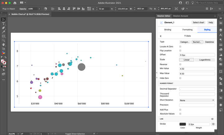
For the Y-axis we’ll need to make similar adjustments. Starting from adding Min Value and Max Value – 4.5 and 8.5 accordingly – and removing Y-Axis Line. As we will need only gridlines, ticks can be turned off. To do that go to Styling > Y Axis > Major Ticks and Grid and click on the eye icon next to the Ticks properties group.
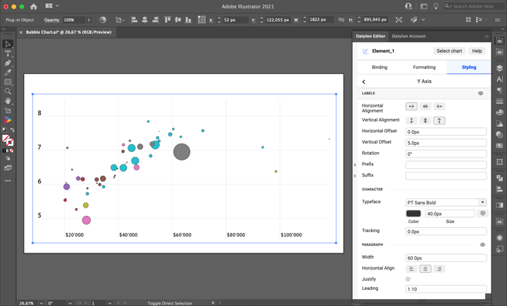
Now let’s move to Y-axis labels. To place labels on top of the gridline go to Styling > Y Axis > Labels. Here, Horizontal Alignment and Vertical Alignment should be adjusted, and Horizontal Offset set to 0px and Vertical Offset to 5px. Also, change Typeface to “PT Sans Bold” and set the font size to 40 px.
The next step is to add labels to highlight outliers and bubbles with the highest GDP per capita, Happiness score, and population. It can be done using data point styling. To edit one of the bubbles go to Styling > Series > New Series 1 and then select the line representing the bubble you want to edit. Let’s select the first bubble representing Luxembourg. First, turn on the Data Labels properties group by clicking on the eye icon. We want to place the label on the top left corner of the bubble. To do that, set Data Mark Anchor to “Top Left” and then select an icon with the arrow pointing to the left for the Horizontal Alignment property and an icon with the arrow pointing to the top for the Vertical Alignment property. Also, add 3 px Horizontal Offset and Vertical Offset so that the label and bubble don’t intersect.
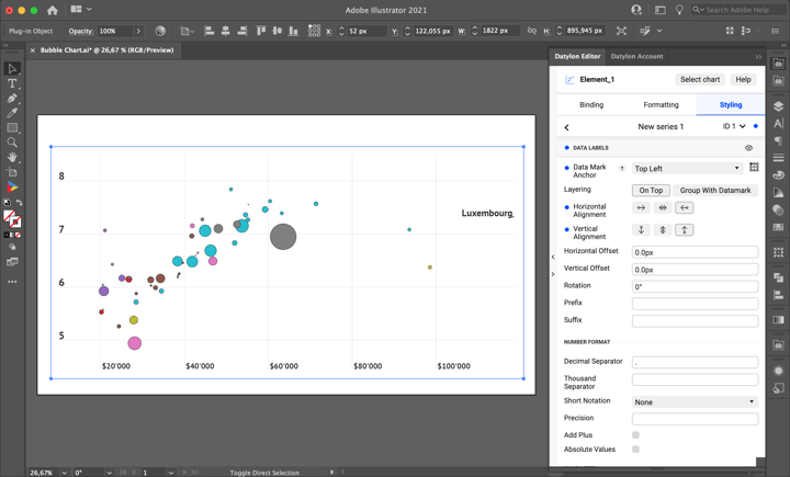
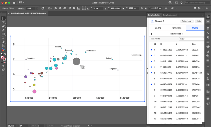
Data labels can take up a lot of space and overlap with each other so it’s better to find an optimal font size for them. By trial and error, we found out that the reasonable font Size for data labels would be 24 px. Depending on the available space use different Data Mark Anchor positioning for all the bubbles you want to highlight.
Step 6: Adding title, source, and axis names
After we’re done with the styling of the chart we need to resize it to leave some space for the title, source, and legend.
Giving a title to a chart is very important; it puts a chart into context and hints at how we should read the chart and what we should focus on. To make a title we will use the Illustrator Type Tool. Just type “T” and select an area where you want to place the title (preferably it’s the top of the chart). Type in the title of our chart “Can you buy happiness for money?”. For the title, it’s better to use a large font. Select the Character panel and change the Font to PT Sans Bold and the Font Size to 60 px. The next step is creating a subtitle. The steps are the same as for the title: type “T” and select an area where you want to place the subtitle. Type the subtitle of the chart: “Exploring a link between countries’ happiness score and GDP per capita value”. For subtitles, a slightly smaller font is used: 40px PT Sans Regular.
If you want to add a variable title you can make it data-driven. For this, you can use a Datylon text object instead of the Illustrator type tool. Stay tuned as we’ll cover Datylon Text Objects in another video.
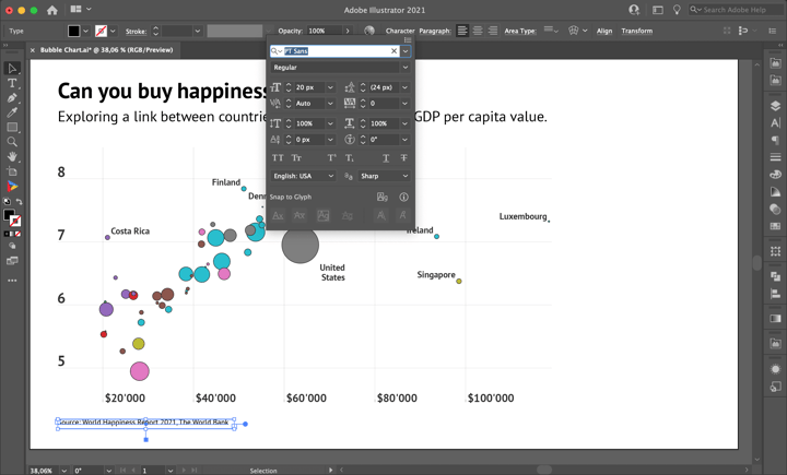
We also need to add the source of the data. It’s not only legally correct but also a polite/ethical thing to do – to give credit to the people who generated and prepared this data. We got the data for this visualization from the World Happiness Report 2021 and The World Bank website. We use the same font & size as the bubble labels: PT Sans, 20 px.
The next step is to add axis names in the same font type and size as was used for X-axis labels: 30px PT Sans Bold. Type “GDP per capita” and place it near the X-axis labels, then type “Happiness score” and place it near the Y-axis labels.
Step 7: Adding legend
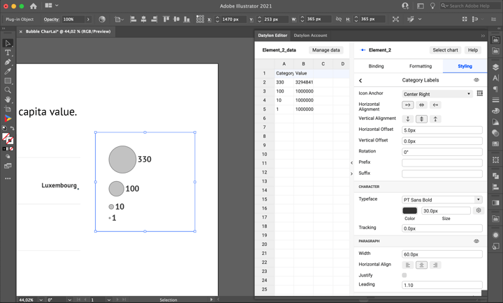
Now the visualization is almost ready but it is still unclear what different sizes and colors represent. To make a legend that will show the relative sizes of bubbles we’ll use an icon chart. First, add the simple vertical icon chart to the right side of the main bubble chart. Edit a dataset in the editor window so it looks exactly like in the picture below: enter 330, 100, 10 and 1 into the Category column and 330 000 000, 100 000 000, 10 000 000, 1 000 000 into the Value column. Bind Category column to Category and Value column to Size. Then go to Styling > Icons > Alignment and change it to the first option. Then go to Styling > Icons > Symbol and change the Color of the bubbles to neutral grey and add a 1px Stroke.
To make the legend accurate we need Max Size values to be the same in both charts. First, we need to be sure that we use fixed margins. To do that go to Styling > Position and Size > Plot Area > Fixed Positioning. Then go to Styling > Icons > Distribution > Absolute and set Max Size Width and Height to 100px.
Now Category Labels are too small. To adjust their size and positioning go to Styling > Category Labels > Icon Anchor and set it to Center-Right. Also, change Horizontal Alignment to the first option. Set the Typeface to PT Sans Bold and change the Size to 30 px.
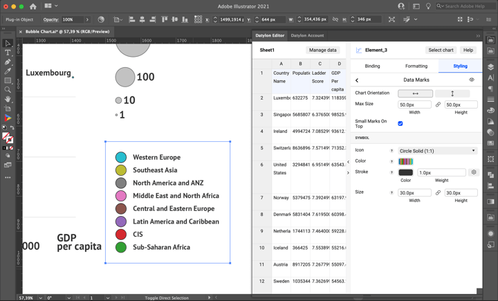
Now let’s create a color-coding legend. Use the scatter plot default chart number five. Using Manage data select the same dataset that was used for the main bubble chart. Then bind Dummy Column to X-Axis, and Region to Y-Axis and Color. You can remove other bindings that were left.
Now let’s move on to styling. Go to Styling > X Axis > Ticks and Grid and turn them off by clicking on the eye icon. Then go to Styling > X Axis > Labels and turn them off too.
Next, we need to edit some Y-Axis properties. Go to Styling > Y Axis > Sorting and set it to “None”. To place labels on the right side turn on the Flip Location checkbox. Turn off Ticks and Grids and go to Styling > Y Axis > Labels, set the Horizontal Alignment to the first option, and change the Typeface to PT Sans Bold and Size to 30 px, and turn off the Paragraph by using the eye icon.
Now just Styling > Data Marks need to be finalized. Go to Styling > Data Marks > Symbol > Color and choose the exact same Color options as we chose for the main bubble chart Data Marks (don't forget to reverse the color palette). And the final touches: add a 1 px Stroke and change the Size to 30px Height and 30px Width.
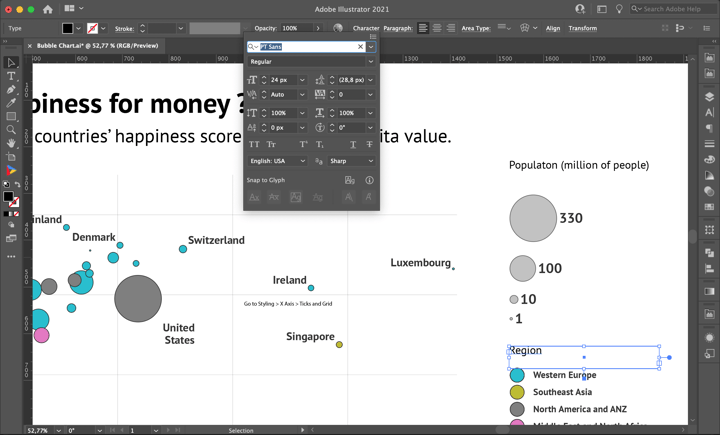
Now let’s add a title for each legend. For the bubble size, it’s “Population (millions of people)”, and for bubble color, it’s “Region”. Both titles in PT Sans, 24 px.
Step 8: Using and sharing
Once you are happy with your design, you can export this chart as an image like you would do with any other Illustrator design and use it in all kinds of editors, or embed it on a website by exporting it to the Datylon Report Studio and copying the embedding code. Alternatively, you can place the AI file in an Indesign document and when updating the chart in Illustrator, the link will make sure it is also updated in the InDesign document.
Datylon Bubble Chart Resources
- Blog: Deep dive into... bubble charts
- Chart library: Bubble chart resource page
- Chart properties: Scatter plot resources


