Data visualization revolution: ChatGPT as a collaborative tool

Want to transform your data into impactful visuals quickly and effortlessly? You spend hours analyzing and preparing your data, only to find that creating clear and engaging visualizations takes even longer.
However clear and compelling data visualizations are essential for effectively communicating insights. Think of the impact of a complex dataset explained with just text versus one illuminated by insightful visuals. Data visualization acts as your artistic partner, transforming raw numbers into a compelling narrative that resonates with your audience. However, data visualization can be a time-consuming bottleneck, often perceived as requiring advanced coding skills.
This is where ChatGPT, a large language model developed by OpenAI, can offer you a fresh perspective. It simplifies the process by using natural language processing. You can chat with ChatGPT in plain English, guiding it to create data visualizations through well-defined prompts. This innovative tool optimizes the workflow, and allows you to focus on your core strengths – extracting insightful narratives from your data.
A recent tweet by @heykahn sparked our curiosity. He prompted ChatGPT to analyze an attached spreadsheet and generate charts and visualizations from it. Inspired by this, we decided to put GPT-4o, to the test ourselves!
In this article, we'll be exploring and reviewing ChatGPT’s capabilities in several key areas:
Data Exploration: Can ChatGPT effectively generate basic charts to help us understand our data?
Chart Recommendations: Does ChatGPT choose the most suitable chart types for our data?
Customization options: How much control do we have over the look and feel of the visualizations generated by ChatGPT?
Complex visualizations & data: Can ChatGPT handle more intricate visualizations beyond basic charts?
User-friendliness: How user-friendly is ChatGPT? We'll explore its learning curve, integration with existing tools, and feedback mechanisms for iterative design.
By answering these questions, we'll get a clearer picture of how ChatGPT can be used to streamline the data visualization workflow, and where human expertise and other designs tools like Datylon remain essential.
After our review, we will give you some prompting techniques to get the most out of your experience with ChatGPT charts and graphs. Finally, we will explore what the future holds for creating data visualizations with ChatGPT.
Disclaimer: This research was conducted on May 30, 2024, and as both ChatGPT and the field of data visualization are constantly evolving, some findings may change in the future.
Table of content
1. Putting ChatGPT to the test
|
Putting ChatGPT to the test
We dove headfirst into testing ChatGPT's capabilities in data visualization. We fed it a variety of Kaggle spreadsheets and challenged it to generate charts and graphs.

Prompting ChatGPT with a dataset from Kaggle. We prompted it with “Analyze this spreadsheet. Generate charts and visualizations. Please be creative”
To give you a clear picture of ChatGPT's strengths and weaknesses, we'll use a 1-to-5 star rating system for key categories. This will highlight where it shines and where human expertise remains crucial and where other design tools are still needed to finish the job.
Data exploration
Explore your data like never before: ChatGPT's instant visualization toolkit
Data exploration with ChatGPT feels like a superpower. Following a simple prompt and data upload, ChatGPT dives into your data, rapidly getting the data’s essence and generating visualizations in only a few seconds. This speed allows you to iterate through various visualizations quickly, a significant advantage in the initial stages of data exploration.
ChatGPT excels at generating a range of well-understood exploratory charts, including bar charts, line charts, heatmaps, and boxplots. These initial visualizations are ideal for quickly identifying patterns, outliers, and overall data distribution. However, it's important to remember that human expertise becomes crucial as you delve deeper into your exploration.

Example of an explorative line chart with interactivity
When human expertise shines
While ChatGPT provides a great starting point, human analysts can delve deeper, using their understanding of the data and the specific research question to identify subtle patterns and ask more nuanced questions.
Moreover, humans can bring domain expertise to the table, interpreting the explorative visualizations within the broader context of the field. This contextualization adds layers of meaning to the data, leading to richer and more actionable insights.
Use dashboarding tools for a deeper data exploration
Unlike ChatGPT, data analysis or dashboarding tools are ideal for diving deeper into your data. Dashboards let you see trends and connections visually, making exploration easier. You can play around with the data by filtering and drilling down, uncovering hidden patterns and how different data points interact. They're built to handle large datasets and can be shared with others for collaborative exploration. Essentially, dashboards offer a powerful, interactive environment to truly understand your data.
The verdict
In conclusion, ChatGPT acts as a powerful exploration assistant, generating explorative visualizations very quickly. However, human expertise remains essential for uncovering deeper insights and contextualizing the data, which ensures a focused and successful exploration process. Also, for truly insightful exploration, consider switching to dedicated data analysis or dashboarding tools.
⭐⭐⭐
Chart recommendations
Great start, needs polish for final reports
While ChatGPT's initial exploration charts were generated swiftly, some recommendations weren't always optimal for final presentations. For instance, continuous data might be visualized with bar charts when line charts would provide a clearer trend. Similarly, column charts for categorical data with lengthy labels can necessitate rotation, reducing readability. Additionally, pie charts were suggested for datasets with numerous categories, which can become cluttered and difficult to interpret.
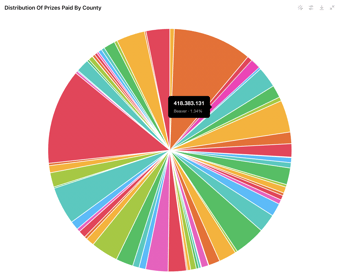
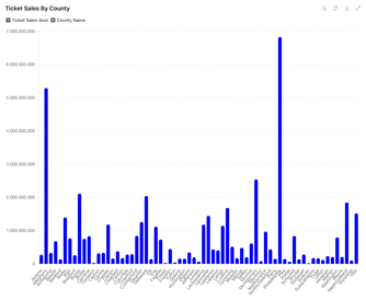
Initial picks by ChatGPT
However, it's important to remember that these visualizations can still serve a valuable purpose during initial data exploration. While not ideal for final reports, they offer a quick starting point for understanding data distribution.
Furthermore, these initial visualizations can serve as a springboard for creative exploration. By rapidly iterating through different chart types suggested by ChatGPT, you can gain valuable inspiration and identify which visualizations effectively show your specific dataset. This experimentation can be particularly helpful for complex datasets where the most suitable chart type might not be immediately apparent.
Human expertise: Selecting charts for maximum impact
Choosing the right chart type is the moment for you to shine. Human analysts excel at choosing the most effective chart types to present data clearly. They consider factors like data type, number of variables, audience, readability, and emphasis. This ensures the final visualizations not only showcase the data accurately but also resonate with the intended audience.
The verdict
While ChatGPT offers a quick starting point for data exploration, human expertise remains essential for selecting the most impactful chart type for final presentations. Human analysts consider factors like data type, audience, and clarity to ensure visualizations resonate and effectively communicate your message.
⭐⭐⭐
Customization options
Don't get fancy yet: ChatGPT edits charts like a beginner
From a designer's perspective, customization held significant promise, but the current capabilities require further refinement. While ChatGPT offers basic adjustments like swapping between vertical and horizontal bar charts or modifying colors, more specific prompts often resulted in misinterpretations. This necessitated multiple attempts with revised instructions to reach the desired outcome. Ultimately, achieving highly tailored charts remained a time-consuming process.


Removing tick marks resulted in the disappearance of both axes
In our example, attempting to remove just the tick marks resulted in the entire x and y-axes disappearing. This highlights a current limitation: intricate customizations might require significant back-and-forth prompting, potentially hindering efficiency for final report-ready visualizations.
ChatGPT for reports: A work in progress
While you can combine multiple charts generated by ChatGPT into a single document and export it, this functionality is limited for creating professional reports. The current level of customization makes it difficult to add essential elements like titles, annotations, and accompanying text. This is where dedicated reporting tools like Datylon Report Studio come into play.
Highly customized visualizations require other design tools and human expertise
ChatGPT offers basic customization options but achieving truly tailored visualizations that are both creative and accessible requires other design tools and human expertise. Complex customization requires significant back-and-forth prompting, hindering efficiency and the ability to achieve the desired level of detail for final report-ready visualizations.
Designers, armed with tools like Datylon for Illustrator, redefine customization through their deep understanding of data, design principles, and audience needs. Here's how:
- Strategic Design Choices: They make informed decisions about data labels, color palettes, and formatting, ensuring the final chart effectively communicates its story and guides the audience's interpretation.
- Creative Expression: Customization extends beyond basic aesthetics. Human designers can push the boundaries of traditional formats, crafting metaphorical and engaging visualizations that spark new ideas and resonate with the audience.
- Accessibility for All: Customization also encompasses ensuring visualizations are accessible to everyone. Designers incorporate features like proper color contrast, alternative text descriptions, and other elements that cater to a diverse audience with varying abilities.
Want to ensure your charts are inclusive for everyone? Our specialized blog dives into making visualizations accessible.
The Verdict
While ChatGPT offers a starting point for customization, human expertise, and other design tools remain unrivaled for achieving highly tailored, creative, and accessible visualizations. Human designers bring a holistic approach to customization, ensuring your charts not only look good but also communicate effectively and reach the widest possible audience.
⭐⭐
Complex visualizations & data
ChatGPT goes beyond the basics: Maps & interactive charts!
ChatGPT impressed me with its versatility, generating not only classic charts like bar and line graphs, but also more visually engaging options like bubble charts and heatmaps. But the real surprise was the inclusion of maps! This functionality opens doors for location-based data exploration. On top of that, I discovered a hidden gem – interactive charts! While not all visualizations offered this feature yet (date: May 30, 2024), seeing some charts become dynamic with user interaction truly enhanced the experience.
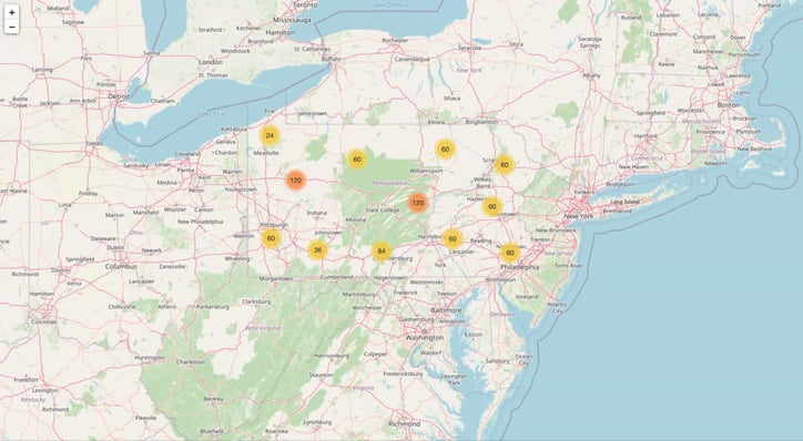
ChatGPT produced an interactive map
Is ChatGPT lying to us?
ChatGPT initially offered the promise of creating advanced and specialized visualizations, but further exploration revealed limitations in its complexity.

ChatGPT says it can deal with advanced and specialized visualizations
Despite mentioning capabilities for radar charts, network diagrams, and treemaps, ChatGPT ultimately failed to deliver on these promises for the datasets that I used. Even a seemingly straightforward request for a stacked bar chart with some random data resulted in a grouped bar chart instead, highlighting a disconnect between its advertised features and its actual performance.
Masters of complexity
Although ChatGPT can generate advanced visualizations like maps and interactive charts, other data visualization tools and human expertise is still necessary for handling other complex data visualizations and data structures.
Complex datasets might overwhelm ChatGPT's capabilities. Human analysts have the experience and knowledge to effectively handle large and intricate data through techniques like data cleaning, transformation, and aggregation. This ensures the data is properly formatted for optimal visualization.
Moreover, human analysts excel at transforming data into complex and impactful stories. Their expertise goes beyond simply generating charts. They delve into the data, uncovering hidden patterns and trends to extract key insights. This deep understanding helps them to create engaging narratives. They don't just choose the most impactful visualizations but also add annotations to guide the audience's interpretation. So, while ChatGPT can generate charts, translating data into compelling narratives and actionable recommendations remains a human strength. Humans bring a level of nuance and persuasion that AI currently struggles to do, ensuring clear and impactful communication.
With design tools like Datylon for Illustrator it is possible to add those annotations to create engaging data stories.
The verdict
While ChatGPT is promising for advanced visualizations, its limitations become apparent with complex data structures. Other more advanced data visualization tools remain essential for creating advanced visualizations and handling large datasets. Moreover, human expertise is still needed to extract deeper meaning from the data through expert interpretation and storytelling.
⭐⭐⭐
User-friendliness
Effortless entry into data visualization: no coding required
ChatGPT offers a revolutionary approach to data visualization: it removes the coding barrier. Anyone, from designers and data analysts to marketers and even business leaders, can now explore their data visually through natural language prompts. This user-friendly interface makes data visualization more accessible than ever before.
Mastering prompts requires effort
However, it's important to acknowledge that mastering these prompts requires some effort. While basic visualizations are achievable with simple instructions, crafting truly impactful and tailored charts involves a learning curve. Understanding how to phrase prompts effectively to extract the most value from ChatGPT's capabilities takes practice.
Chart and report automation
With ChatGPT, you can update your charts with new data while preserving the existing style. This eliminates the need for manual adjustments every time you have fresh information. This automation process is incredibly convenient and expedites the process significantly.
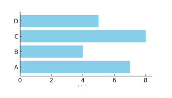
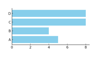
Update of bar chart with new data while keeping the same style
However, for the automation of charts requiring highly customized styling or for report generation, a dedicated report automation tool is more suitable. Datylon Report Server supports you to automatically generate professional, on-brand reports and charts on a recurring basis.
The verdict
ChatGPT democratizes data visualization with its user-friendly interface, but human expertise is still needed for its full potential through effective prompting for impactful and tailored visualizations.
⭐⭐⭐

Human expertise on creating data visualizations (image generated by DALL-E)
Overall, ChatGPT offers a valuable addition to the data visualization toolbox, particularly for initial exploration and sparking creative ideas. However, to create impactful and clear final visualizations that resonate with the audience, other more advanced data visualization tools and human expertise remain crucial throughout the process.
Prompting techniques
Indicate the type of data, the goal, chart type and focus on clarity to maximize the outcome
While human expertise remains crucial for advanced data visualization tasks, ChatGPT excels at initial exploration and generating basic charts. To maximize its effectiveness, however, we need to communicate clearly with this AI tool. Here are some tips for creating effective prompts that will get the most out of ChatGPT:
- Start with the data: Begin by informing ChatGPT about the type of data you have (numerical, categorical, etc.) and the number of variables.
- Specify the goal: Clearly state what insights you're hoping to uncover. Are you looking for trends, comparisons, or relationships between variables?
- Choose chart type (when possible): If you have a good idea of the most suitable chart type (bar chart, line chart, etc.), mention it in your prompt.
- Focus on clarity and conciseness: Keep your prompts short and to the point. Avoid overly complex sentences or jargon.
Examples to get you started
- “I have a dataset of monthly sales data for different regions from January to December 2023. The columns are 'Month', 'Region', and 'Sales'. Can you create a line chart showing the sales trends over the months for each region?”
- “I have a dataset of employee performance reviews with columns 'Employee ID', 'Department', 'Performance Score', and 'Review Date'. Could you generate a bar chart comparing the average performance scores across different departments?”
- “I have a dataset of student test scores with columns 'Student ID', 'Subject', 'Score', and 'Grade Level'. Could you create a box plot to show the distribution of scores for each subject?”
Experiment and be careful with misinterpretation
- While prompting can guide ChatGPT, there's always a chance of misinterpretations.
- Experiment with different prompts to see what works best for your specific data and goals.
The future of using ChatGPT for data visualization
Armed with knowledge of ChatGPT's strengths, weaknesses, and how to effectively prompt it, let's turn our gaze to the future. What exciting possibilities lie ahead for ChatGPT and data visualization?
The potential of ChatGPT for data visualization extends far beyond its current capabilities. As AI technology continues to evolve, exciting possibilities are emerging on the horizon. Let's explore some of the groundbreaking advancements we can expect:
Beyond bars & lines: The future of AI-powered data viz
As GPT-4o and similar AI models continue to learn and grow, their ability to handle complex data structures is expected to improve significantly. This could unlock the creation of complex data visualizations like radial charts, bullet charts or dot plots, offering deeper insights into complex relationships within the data.
Dream team: ChatGPT + design tools = effortless data storytelling
The future might see a seamless integration of ChatGPT with design tools like Datylon. Imagine not only generating charts but also fine-tuning aesthetics and customizing them for specific audiences and presentations – all within a single platform. This could not only streamline the data visualization process but also potentially address the current limitations ChatGPT has with customization, allowing for a more iterative and user-friendly design experience.
AI writes the story
The role of AI in data storytelling is going to expand. ChatGPT could potentially generate narrative elements alongside visualizations, automatically crafting a cohesive and impactful data story. This would free up data analysts to focus on interpreting the data and drawing key conclusions.
AI charts tailored for finance, healthcare & beyond
Future iterations of ChatGPT could be trained on specific data domains like finance, healthcare, or marketing. This specialized training would allow them to create visualizations tailored to the specific needs and conventions of those fields. Imagine stock market visualizations that automatically incorporate relevant financial indicators, or healthcare charts that adhere to industry best practices.
Keeping data viz transparent in an AI-powered future
As AI plays a larger role in data visualization, ethical considerations like data bias and misrepresentation of information will need to be carefully addressed. Transparency in the creation process and human oversight will be crucial to ensure that AI-generated visualizations accurately reflect the data and avoid misleading audiences.

Future of using ChatGPT for data visualization (image generated by DALL-E)
The final verdict
We put ChatGPT to the test to see how it performs in data visualization tasks. Here's a breakdown of its strengths and weaknesses based on a 1-to-5 star rating system:
Data exploration ⭐⭐⭐
ChatGPT shines at generating initial charts to help you understand your data quickly. It can produce basic visualizations like bar charts, line charts, heatmaps, and boxplots, allowing you to identify patterns and trends efficiently.
Chart recommendations ⭐⭐⭐
While ChatGPT suggests charts for your data, the initial recommendations might not always be the most suitable for final presentations. For example, it might suggest bar charts for continuous data when line charts would be a clearer choice. Human judgment remains crucial for selecting the most impactful chart type.
Customization options ⭐⭐
ChatGPT offers basic customization options like changing colors or swapping between bar chart orientations. However, achieving highly tailored designs can be time-consuming, and complex edits often require multiple attempts with revised prompts.
Complex visualizations & data ⭐⭐⭐
While ChatGPT can handle basic maps and interactive charts, it struggles with more intricate visualizations like radar charts or network diagrams. Additionally, handling large or complex datasets might exceed its current capabilities.
User-friendliness ⭐⭐⭐
The user-friendly interface allows anyone to create visualizations through natural language prompts, making data visualization more accessible. However, mastering prompts to achieve desired results requires some practice and understanding of effective phrasing.
Human expertise and design tools: The perfect partners
While ChatGPT offers a valuable starting point, human expertise and design tools like Datylon are still essential for creating impactful final visualizations. Here's why:
- Chart Selection: Humans excel at choosing the most effective chart type for data type, audience, and clarity. They consider factors like data complexity and ensure the chosen visualization communicates the message effectively.
- Customization: While ChatGPT offers basic options, advanced design tools like Datylon for Illustrator help you to create highly tailored and on-brand data visualizations. Datylon allows for strategic design choices like color palettes, data labels, and formatting, ensuring the final chart effectively tells a compelling story and reaches a broader audience.
- Automation & Scale: For automated reporting at scale, tools like Datylon Report Server come into play. ChatGPT is great for quick exploration and one-off visualizations, but businesses often need to produce recurring or versioned reports that remain consistent, visually polished, and up-to-date. With Datylon Report Server, entire reports can be automated—updated with fresh data while maintaining your unique design and branding. Interested in learning more about automated reporting with the Datylon Report Server? We invite you to book a demo with one of our experts or read our complete guide on automated reporting.
- Deep insights & storytelling: Human analysts can extract deeper meaning from data, going beyond chart generation. They can interpret data, identify hidden patterns, and craft engaging narratives. They can also add annotations to visualizations, guiding the audience's interpretation for clear and impactful communication. Datylon made it very easy to add such annotations to your data story.
By combining ChatGPT's exploration and creative spark with human expertise and design tools, you can optimize your data visualization workflow while ensuring the creation of clear, impactful, and audience-specific visualizations.
👉If you're keen on crafting custom data visualizations, visit our Bespoke Data Visualization Solutions page.

Dieuwertje van Dijk - Data Visualization Designer
Data, graphic design, illustration, food and mountains let her dopamine neurons spark on a daily basis. Most of the year she lives in Georgia where she spends her free time enjoying nature in a rooftop tent, eating khinkali and drinking wine.

