Bar Charts 101 - Tips and suggestions for your next bar chart.
Simple on the surface, the faithful bar chart is often one of the first introductions we get to data visualization. But with its simplicity there comes a lot of potential to make incorrect design decisions that impact your chart’s effectiveness.
That's why we want to help you by offering several points to consider, when you’re next creating a bar chart, to ensure the story within the numbers is clearly communicated.
Here are three checks to make sure your bar charts don’t fall short:
1. Understand the communication objective
By having a basic understanding of the data, you can confidently make the correct display choice. First things first: a bar chart’s purpose is to compare categories.
So, if this is your intention, your next step is to plot the correct variable onto the correct axis.
With bar and column charts this means that your category – or your independent variable - should be your categorical axis, and the amount – or your dependent variable –should be the numerical axis. In other words, the amounts drive the height of the bars. For example, for a chart communicating ‘fruits eaten in the office today’ – fruits such as apple, banana, and peach are your categories or independent variables along the base of your chart, and the amounts such as 1,2 3, and 4 are dependent variables along with the height.
Watch out! If you are communicating distribution, rather than comparison, you will be creating a histogram. Despite similar appearances, a histogram is NOT a bar chart. The data and the crafting of your chart need to be approached differently. Using The Data Visualisation Catalogue is also a helpful resource, as it lists out visualization goals, and suggests presentation options and charts you should consider to show the data.
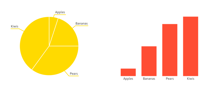
If there is one thing we can stress, many feel that bar charts are ‘too basic’, often thinking that there must be a ‘better way’ to layout the data. But the fact is that lots of data sets that show comparison are best represented in a humble bar chart. See what we mean below, the bar chart is the clearest option to present the story.
2. Simplify what you include
Ok, so you’ve ascertained that you’re communicating comparison and we’ve convinced you not to avoid using a bar or a column chart. Your next step is making the data speak.
A chart’s power to clearly and effectively convey information is often found in its simplicity. Restraint is what sets the best dataviz designers apart from the rest, with the beauty lying in insights shining through for the reader to discover.
Applying context
Knowing how much narrative to include is undoubtedly an art. It takes practice to know when to restrain from explaining and marking out everything. Our biggest tip here would be not to underestimate the power of a useful and informative title to frame and guide the reader through the results and to really work on only including items (both graphic and text) that benefit the message you are conveying.
Also start consuming data visuals yourself. When you begin to build up your own dataviz literacy, you will see which content is valuable and which is redundant.
One chart per message
Be aware that one data set can provide many different stories, so if you are needing to present multiple insights, don’t try and squeeze them all into one chart. Tell a logical data story by guiding your readers through a series of charts and key messages in order to make them understand. Think of it like throwing a tennis ball – if you throw one ball the chances of the receiver catching it is far greater than throwing, 2, 3, or 4 balls (which would be impossible!). Remember who the target audience is and what they need to take away.
Direct labeling
Labeling items cleanly on the chart is far more beneficial to the reader, rather than including an elaborate legend that they need to go back and forth translating against the visual. Another benefit to direct labeling is that you can often remove your numerical axis.
Balance
I know, telling a designer this seems like we are preaching to the choir, but it's surprising how easy it is to lose a sense of your expertise when the word “graph” enters your brief. This is a tricky one, again there are no hard and fast rules to follow, it comes with practice, getting feedback, and rounds of reviews.
Don’t be scared of white space! Allow the insights to have room to breathe and tell that story hidden in the spreadsheet's columns and rows. We mentioned it already, but it's crucial so it permits a repeat: make sure every element you have included on your chart has a purpose.
NEVER do this
No matter how tempted you might be, or how much pressure you are getting to ‘jazz-up’ a chart for next week’s board presentation, there’s one thing that will destroy your dataviz credibility, which is 3D.
Plain and simple, do not add 3D effects to your chart design! It distorts the presentation and makes understanding the chart incredibly difficult.
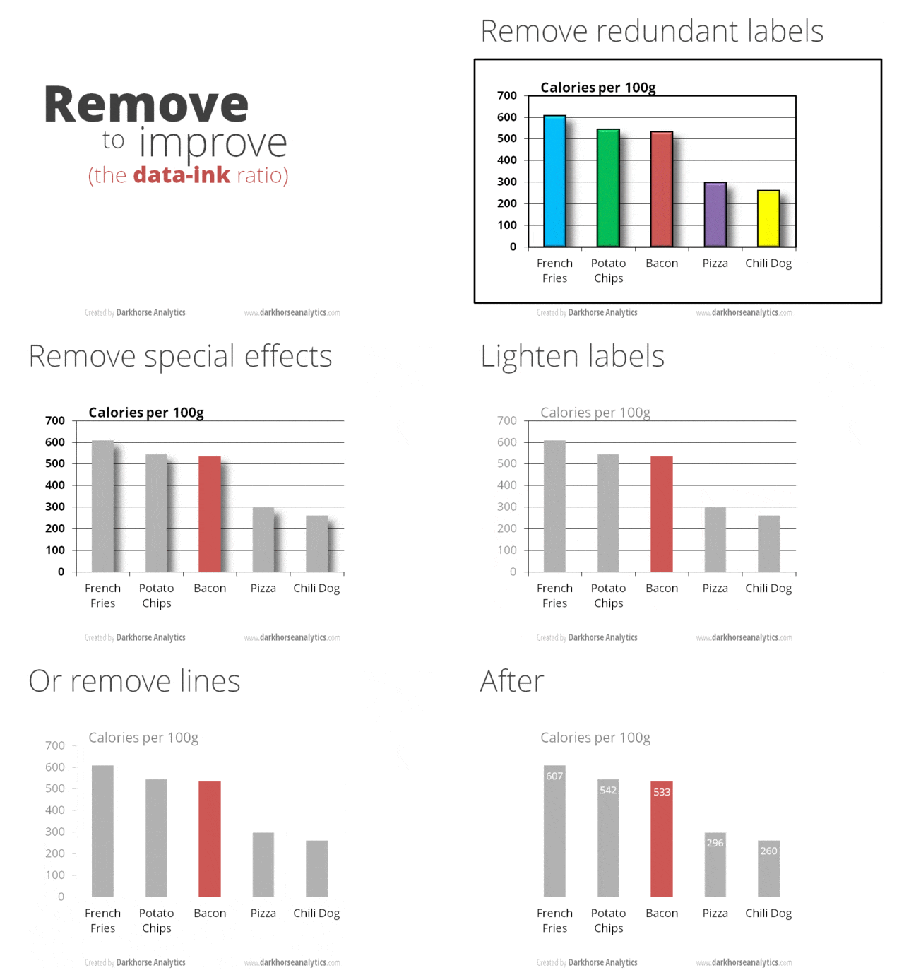
And if you are still in doubt about if you have simplified your chart enough, check out this handy little gif by Darkhorse Analytics.
3. Color application
Not sure if you picked up on it, but there was a major theme missing from the point on simplicity above - some may say it's the most important - and that’s why it has its very own section. The topic of color could license its own blog post, actually even a series of posts, to cover the topic respectfully - it’s a biggy. With lots available to read on the full topic, this tip barely scratches the surface.
But as a starting point, consider this piece of advice: gray is your best friend.
We know there are so many clever ways to incorporate colorways from every which spectrum, they are just a click or two away and it's oh-so-tempting to start applying your application skills to your chart. But please, please, as a word of advice, demonstrate caution with color use.
We challenge you to work toward including only one accent color in your chart. And by all means, avoid coloring each bar a different color! That’s a crime right up there with 3D effects…
If gray is just too much of a leap given the brand palette you need to comply with, then your ‘gray’ could be the less saturated version of your accent - just ensure there is enough contrast for it to be noticeable for the reader.

Hopefully, this post has offered some tips for when you’re next looking to create a bar chart – or perhaps even when you are next reading one! You can always learn more about how to tweak your charts to perfection and stay on-brand on our advanced styling and data-driven styling pages.
This post was focused solely on bar and column charts and is not covering stacked or diverging bar charts. We hope to work towards unpacking more about these formats in separate posts soon!
Look out for this and more posts with a similar angle in the future, all geared towards helping, inspiring, and empowering designers to create clear and powerful charts and data stories.

Leenke De Donder - Data Visualization Designer
Data Visualization Designer. She loves negronis and sees them as the perfect visualization of a well-balanced part to whole relationship.

