8 steps to design a report template
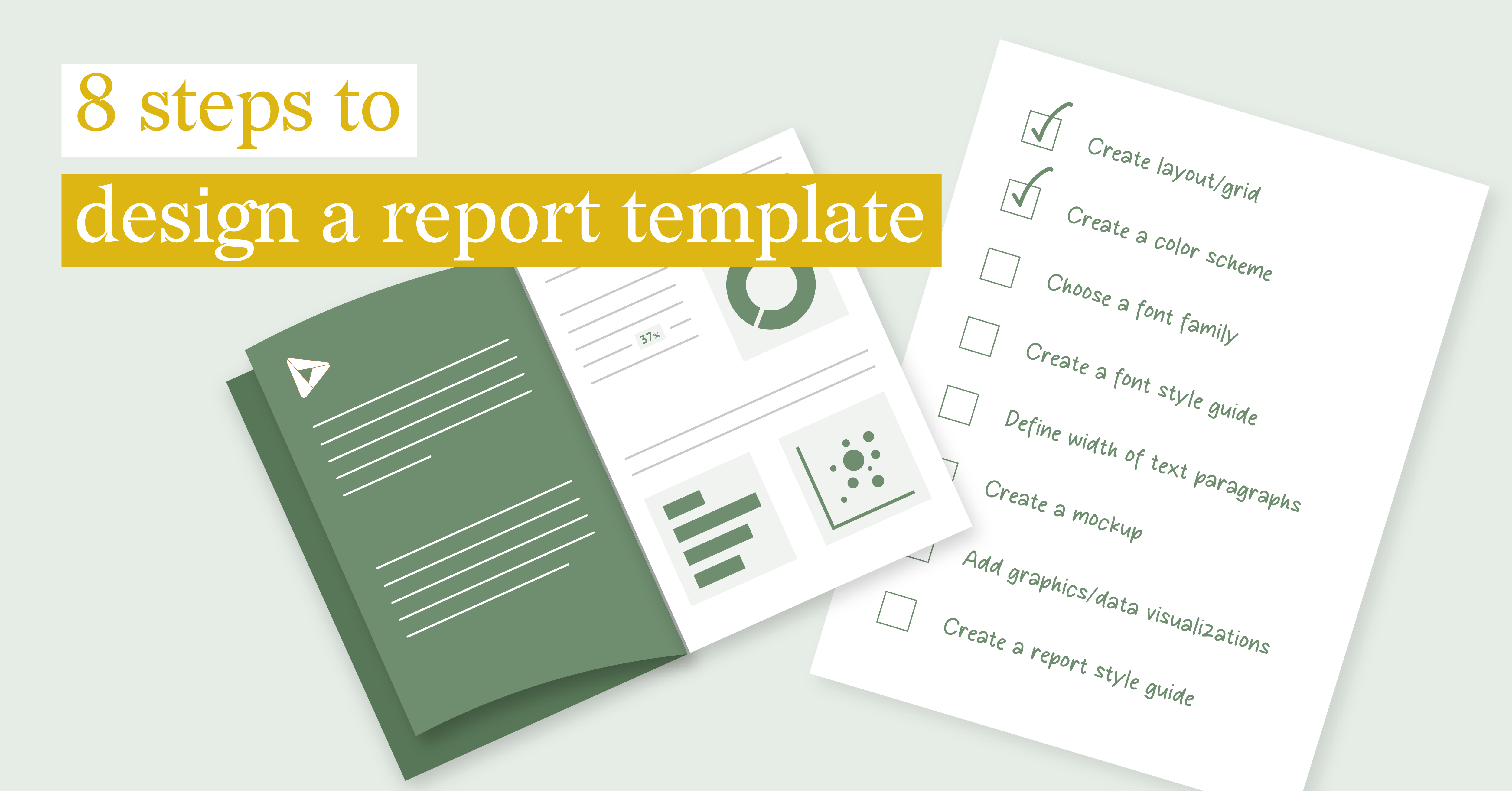
Designing and updating a recurring report can be a daunting task, consuming a significant amount of time and effort. However, there is a solution that can save you from this hassle – creating a report template. The beauty of using a template lies in its structured format, which can be easily automated. This is especially beneficial when dealing with reports that require numerous variations, as the time, effort, and cost savings from automation are immense.
We have all experienced that familiar feeling of impending deadlines and the overwhelming task of manually creating numerous reports. That's why it's crucial to streamline your reporting process by creating a report template that can be easily automated. Whether you're working on a general annual report, a financial report, a marketing report, or an operational report, this comprehensive guide will take you through 8 essential steps to design an effective report template.
Table of contents
|
1. Create layout/grid
Begin the process by making important design choices that will shape the overall appearance of your report. This involves carefully selecting a layout and grid system that will provide a well-structured and organized presentation of information. By default, a grid size of 8px is recommended, but it can be adjusted to 4px or 16px depending on the device and level of detail required.
In addition to using a grid structure, another option for designing the layout of your report is to divide it into columns. A good rule of thumb is to use a 12 column grid, as this allows for flexibility in arranging information blocks in various combinations while still maintaining the overall structure of the report. By dividing 12 into 6, 4, 3, and 2, you have the freedom to fill the content into a various number of columns and create dynamic, visually appealing layouts for your report. You can read more about grids and layout systems here.
2. Create a color scheme
The selection of colors for your report is crucial as they have the power to evoke emotions and set the desired atmosphere. It is essential to choose colors that align with the purpose and message of your report. If you have a company branding or style guide, it is recommended to use colors that are consistent with it. This will create a cohesive and professional look throughout your report.
If you have the freedom to choose your own color palette, take advantage of the various palette generation tools available today. These tools can assist you in creating a captivating and visually appealing color scheme for your report. Few of the many are Coolors.co, Adobe Color, Canva color palette generator. The rule of thumb for color usage is 60% of primary color, 30% of secondary color and 10% of tertiary color. While using color combinations it is important to remember about accessibility. Here you can find details about perception of color and how to choose a palette for color-blind readers.
3. Choose a font family
When it comes to text-heavy reports, it's common practice to use a combination of two fonts, sans-serif and serif. Sans-serif fonts are typically used for headlines due to their boldness and clear lines, while serif fonts are preferred for text as their serifs help align the text and enhance readability. However, there are cases where the roles of serif and sans-serif fonts are reversed, with sans-serif used for text and serifs used for headlines. This reversal is often employed to create a visual contrast between the main headline (h1) and the lower-level headlines (h2-h6). When selecting a font family, it's advisable to opt for one that offers a wide range of typeface variations. This facilitates the seamless creation of a font hierarchy.
Another crucial consideration when selecting a font family is to prioritize accessibility guidelines. It is essential to choose a font that can be easily read and understood by all readers. For more information on how to choose an accessible font, you can refer to this resource.
4. Create a font style guide
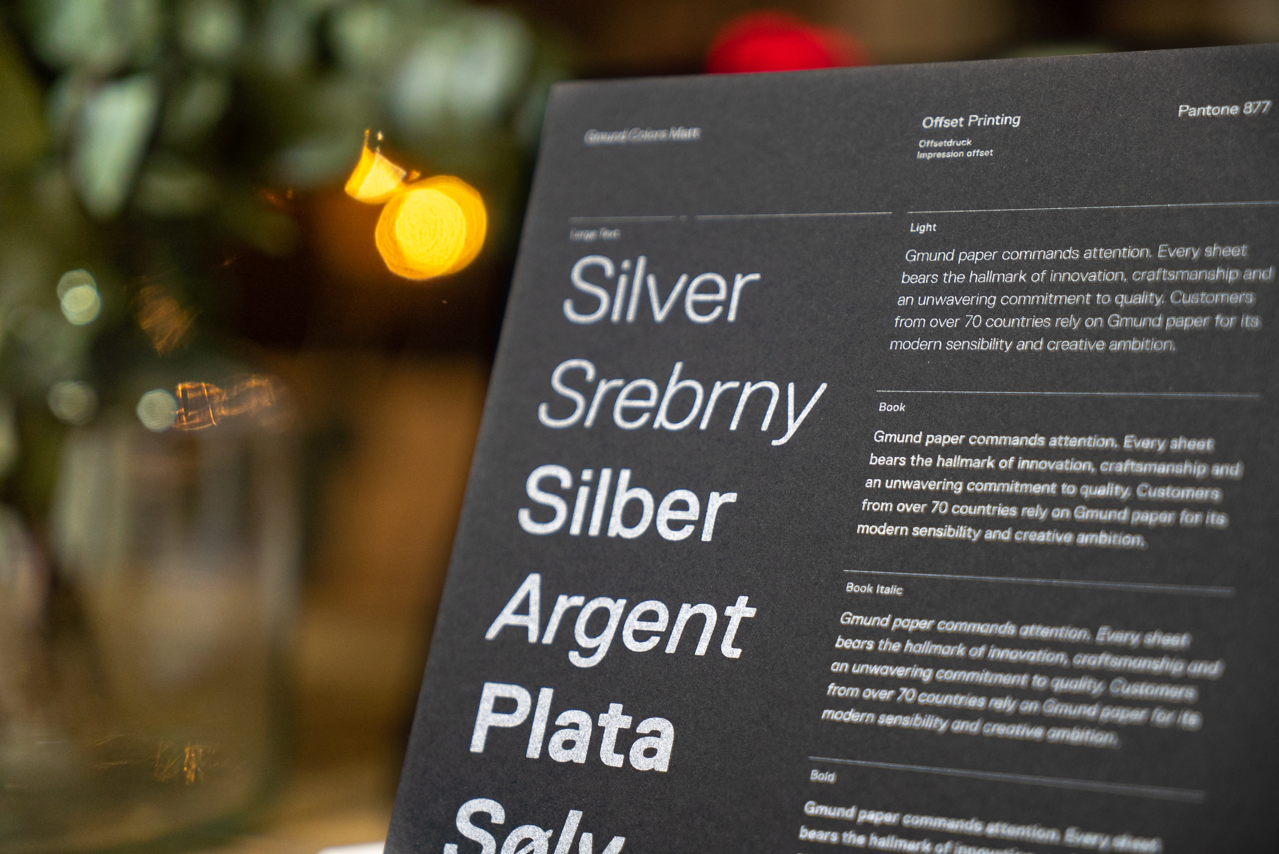
Creating a font style guide is an essential step in designing a report. It enables you to establish a clear hierarchy of titles and subtitles, ensuring that users can easily understand the structure of the report and follow the narrative flow.
When creating a font style guide, the first step is to carefully select the appropriate font size for each type of headline. The starting point for this decision is the font size used for the paragraph text. Typically, the base size is either 16px or 12pt. The minimum font size should be set at 12px or 9pt to ensure optimal readability and legibility.
In addition to the main text, there are usually six variations of headline text that are larger than the base font, as well as two smaller variations that are used for captions and notes. These variations can be determined in a flexible manner by increasing or decreasing the font size in even-number increments.The other way to define the size of the font variations is to use a tool like Typescale that allows to create the whole range of variations based on a certain rule. The font sizes in the tool may not align perfectly with the "even-number-increments," so you may need to adjust them manually or round them to the nearest whole number afterwards.
Once the sizes have been determined, it is advisable to experiment with different font weights for adjacent headlines. This will create a contrast that effectively distinguishes them within the text, especially when they appear next to each other.
Based on the color scheme choose the font colors that are accessible, meaning it can be read easily on the given background. It can be checked via different online tools, for example Color contrast checker.
5. Define the width of the text paragraph
Based on the established grid and font style guide, determine the ideal paragraph length in terms of layout measurements, ranging from 1 to 12 columns. It is important to keep the line length between 45 to 75 characters, as this provides a comfortable reading experience for the audience. If the text extends beyond the desired line length range, make sure to adjust the font size accordingly to maintain a visually pleasing and readable layout.
6. Create a mockup
Mockup is a full-sized version of a report with the prepared layout where all the essential elements like text and visuals are indicated schematically. Mockup allows us to see the full structure of the report without going too much into details. If the report is planned to be recurring, a mockup becomes even more important as it gives an understanding of how the report will look with different lengths of the main content and changeable elements. When creating a mockup of a report it’s useful to follow a checklist that includes general principles of graphic design:
- Hierarchy. Utilizing the font style guide, color palette, and grid system, establish a visually appealing hierarchy of elements that will effectively guide readers through the report.
- Proximity. Arrange information groups based on their proximity to create an intuitive flow of information.
- Alignment. Create a sense of visual harmony and balance by aligning elements to a shared reference point. Use a combination of font sizes, colors, and spacing to establish a clear visual hierarchy that guides the reader's attention.
- Repetition. To maintain consistency and emphasise key information, it is important to repeat elements that serve the same function or hold the same level of hierarchy. This repetition creates a sense of cohesion of the information being presented.
- Contrast. Create contrast among different elements to generate visual interest, captivate the reader's attention and emphasise important aspects.
- Balance. Achieve visual harmony by balancing elements according to the chosen symmetry type, resulting in a captivating and aesthetically pleasing layout.
- White space. Strategically integrate whitespace to optimize design balance and improve readability.
7. Add information graphics and data visualizations
Once the main content and data of the report are complete, it's time to bring it to life with compelling visuals. Information graphics and data visualizations are the preferred types for this purpose, as they have the power to greatly enhance the effectiveness of your report. Unlike decorative illustrations, these visuals serve a purpose by supporting and reinforcing the narrative of your report. They not only grab attention but also effectively communicate complex information within a limited space.
To ensure the best impact, choose appropriate charts, graphs, and information graphics that accurately represent the data and make it easier for your readers to understand the message. Consider using colors, labels, and annotations strategically to enhance the clarity and impact of your visuals. By incorporating these visually engaging elements, you can take your report to the next level and make it even more compelling and insightful for your audience. You can read more about effective use of data visualization here.

8. Create a report style guide with reusable styles and components
During the report design process, it is crucial to meticulously document all the important design choices that are made. This not only ensures a consistent and cohesive outcome but also establishes a streamlined workflow. By creating an extensive documentation, you can support a stable structure for the reporting process and ensure that all collaborators are on the same page, working towards a unified goal.
Conclusion
The creation of a report template is not just about aesthetics; it is a strategic endeavor aimed at streamlining the reporting flow and maximizing efficiency. As you navigate through the eight essential steps outlined in this guide, remember that the template you develop is not static. It should evolve with your reporting needs, allowing for adaptability and ease of future updates.
Furthermore, the incorporation of a comprehensive report style guide serves as the backbone of consistency, ensuring that every aspect of your report aligns with the established design principles. This guide becomes a valuable resource for collaboration, facilitating communication among team members and maintaining a unified approach to reporting.
In a world where information is abundant, the ability to present data in a clear, visually appealing manner is a skill that can set your reports apart. By investing time in the design process and leveraging the power of automation through templates, you not only save valuable resources but also elevate the impact of your reports, making them more accessible and actionable for your audience. Embrace the art of report design, and witness how it transforms your data into a compelling narrative, driving informed decision-making and enhancing your communication strategy.
Ready to learn more? Schedule a demo today and discover how the Datylon Report Server can help you transform your reporting process or contact us for a free trial.


