7 Data Visualization Techniques You Should Know About
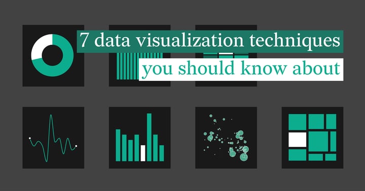
Have you ever wondered how a simple graph can unravel the intricacies of massive datasets? What if you could turn raw numbers into a visual masterpiece that tells a compelling story?
Data visualization techniques are a powerful tool to express the data collected on a specific topic. It provides valuable insights without being inundated with information. It also allows us to decipher and communicate this complex information to identify trends and make informed decisions.
What if you could transform mundane spreadsheets into visual spectacles that not only inform but also inspire action? From the elegance of line charts to the sophistication of heatmaps, each technique has its own magic to cast upon your data.
In this blog, we will delve into the depths of visualization, exploring the tools and tricks that can turn raw numbers into a visual symphony, leaving a lasting impression on your audience.
We’re about to unravel the secrets of the top data visualization techniques. We’ll also explore how to identify when to use different types of graphs for the intention of your data.
Table of contents
1. What is Data Visualization? 9. Choosing the Right Visualization Technique |
What is Data Visualization?
The term “data visualization” refers to the graphic depiction of specified data. Data visualizations are also a fantastic way to present information to an audience without confusion. By using a chart design tool like Datylon, you create an accessible way to examine trends and other patterns.
When making data-driven decisions, visualization techniques are an ideal method to present all the facts for an informed approach.
Advantages
- Since our eyes are drawn to colors and patterns, visualization techniques attract our attention to the data depicted. This allows us to identify patterns and trends at a glance.
- Visualize patterns and correlations
- Easily share information
- Explore opportunities
Disadvantages
- Misinterpreting data is easier when there are many data points. However, selecting specific data points deliberately for your visualization can help prevent this issue.
- Core messages or data could get lost in the representation. Always consider your audience when designing to avoid miscommunicating the intended message.
- Correlation doesn’t always represent causation. Therefore, strive for visual clarity, communicate data limitations, incorporate context, and foster critical thinking in your audience.
1. Line Charts
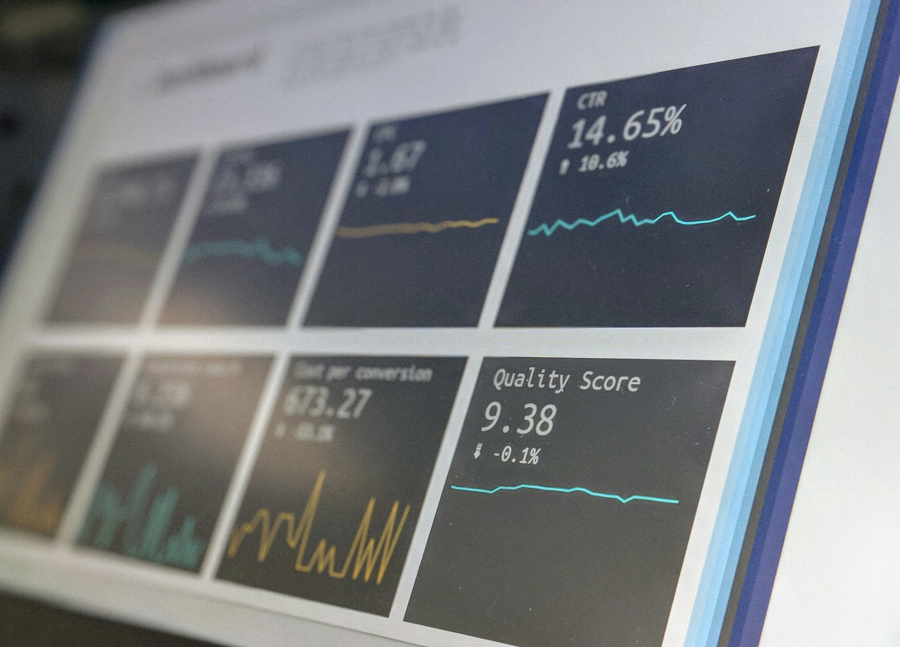
A line chart is one of the most popular visualization techniques. It is an excellent tool for plotting the evolution of a particular variable over time.
Typically, the data is presented by placing the time or value variable on the X-axis and the analyzed variable on the Y-axis. It’s a preferred choice to reflect trends or progress
Line charts provide a simple, versatile way to display data in a way that’s easy to understand. However, it’s crucial to avoid overloading the chart with too much information as it’ll cause your audience confusion.
Best practices
- Create direct labels for the categories and corresponding lines. This step makes it easier for the audience to read if printed in grayscale.
-
Keep the data chart simplified with no more than five lines. When more lines are used, it’s harder to compare the data presented. If this is not possible, consider emphasizing one line while rendering the others in a neutral color.
-
Ensure that you use the correct scale to express the range of data. For most charts, it is recommended to start the x-axis at zero to prevent misinterpretation. However, in line charts, it is better to prioritize showcasing data changes. Therefore, consider not starting the axis at zero for better visibility and interpretation of trends.
- Only use data marks to express specific points more clearly, for example when some data is missing.
2. Bar Charts
Bar charts rank the data according to value over different categories. The chart is often depicted as rectangular or cylindrical bars on an X- or Y-axis, where the length of the bar reflects the value of each category.
Many businesses choose bar charts to reflect comparisons as they’re easy to read. There are many types of bar charts, each to suit the specific purpose of the data. Some variations include vertical, horizontal, or clustered bar charts.
Best practices
- Consider color-blind audiences when creating charts. It’s best to stick to a singular color and place labels next to each category for simplified reading. This step is also helpful in analyzing the data when viewed in grayscale.
- Avoid using additional colors unless it provides extra information to your audience.
- If you aim to draw attention to a specific bar, highlight it in one color while the rest are in another.
- Simplify data comparison by sorting the bars in ascending or descending order by values, not categories, unless there is a natural order, such as age groups in the data
- Another data comparison tool is to use overlapping bars. This graph could for example be used to compare a total value with a subcomponent.
3. Pie Charts
Pie charts are one of the most popular visualization techniques used as it’s easy to understand and visually appealing. However, be careful using it since often a bar chart might be a better choice for comparing the values in the chart.
Pie charts are used to depict a part-to-whole relationship in the data. Each “slice” of the pie reflects a category and specific value or percentage. The total value of the “slices” always maintains a link to the total value of the “pie” (eg. 100%).
Best practices
- When sorting the data in your pie chart, work in ascending or descending order and starting at 12 o’clock. This approach makes it easier to compare the data provided.
- When coloring the chart, single or multi-colors are acceptable. If using a single color, ensure that the hues differ and categories are clearly labeled.
- To avoid confusion when smaller categories are identified, use a “other” label. Combine the smaller categories under this label and make a note of what is included.
4. Scatter Plots
Scatter plots show a visual representation of the relationship between two continuous variables and are a perfect choice for identifying patterns. The X- and Y-axes represent the two variables, with each dot representing a data point.
The scatter plot is a common choice when exploring data to understand the correlation of the data provided. Each dot used in scatter plot visually represents the relationship between two variables and shows how they are correlated.
Best practices
- While scatter plots can show up to seven variables, it’s best to avoid including too many as it may cause confusion. We recommend keeping the limit at three to four variables.
- Using ascending or descending order to sort the categories in a categorical scatter plot can be a huge time saver.
- Highlight specific data points to draw attention to them.
- For easier interpretation, sometimes using labels instead of data marks could work.
5. Heatmaps
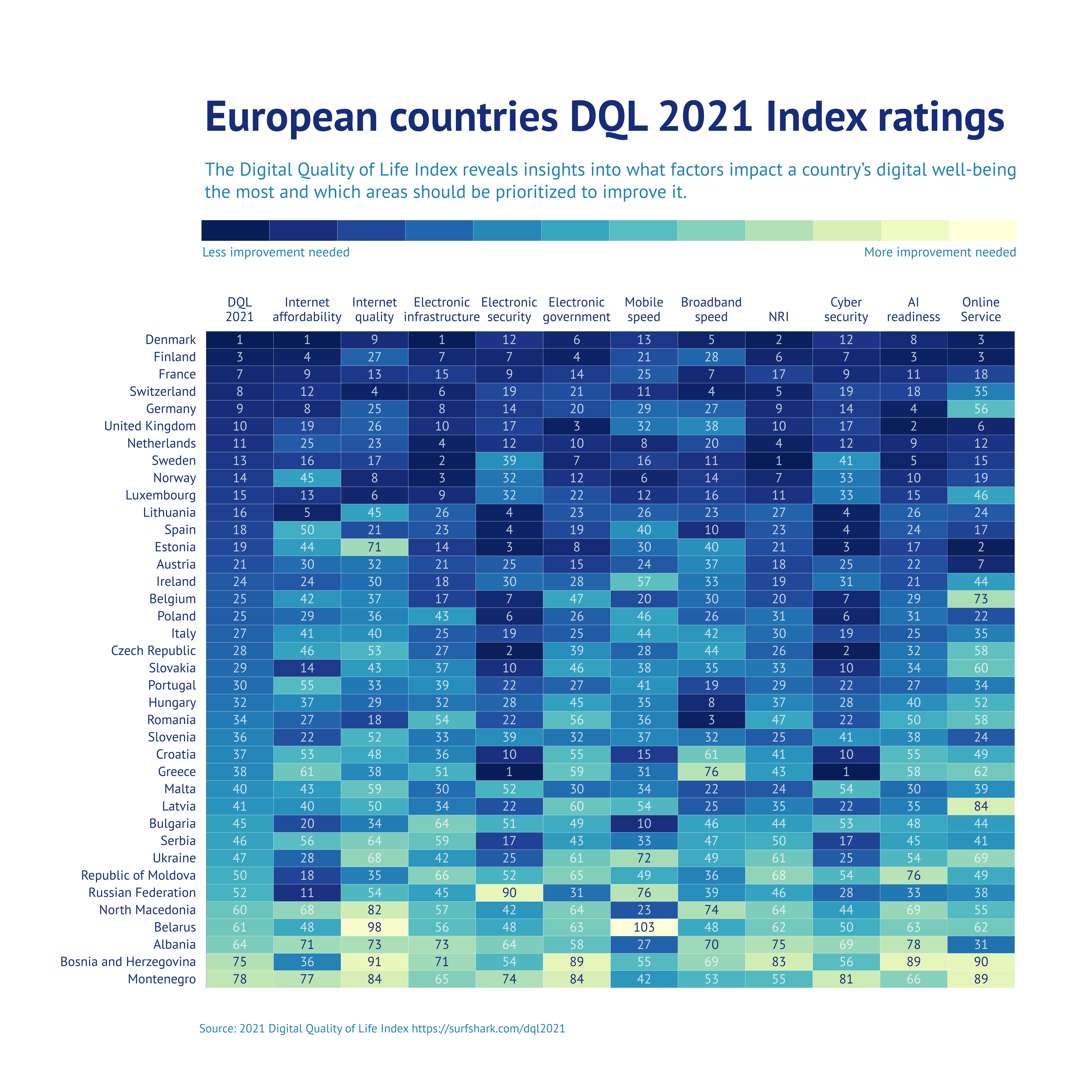
Heatmaps are used to graphically summarize the relation between two variables. This visualization tool uses a color code to express the relationship degree between the variables in question. It is a powerful tool when analyzing trends, patterns, and correlations.
This visualization technique goes beyond data exploration, but can reveal a more detailed story. When combined with other visualization techniques, it explores the data from different angles.
Best practices
- Select between three types of color scales—numerical sequential, numerical diverging, or categorical. Select the type that is most relevant to the data you’re sharing.
- Add labels to each cell for deeper detail
6. Treemaps
The treemap is used to reflect both part-to-whole relationships and hierarchical structures in data. A treemap is composed of various categories, with each category represented by a rectangle. When subcategories are present within the data, these categories may be further divided into smaller rectangles.
Treemaps are an intuitive representation of the correlation in categories of large datasets. It’s an efficient use of space to express a collection of data at once. Avoid adding too many rectangles as they’ll make the chart harder to read.
Best practices
- The best way to depict hierarchical data is in ascending or descending order. This helps the audience read the data clearly.
- For easier identification, add category labels to the most crucial rectangles.
- Use color coding to differentiate between categories. If drawing attention to a specific set of data, opt for a monotone chart and allocate a separate color to highlight that rectangle.
- As with pie charts, if there are smaller rectangles, it’s recommended to group them and apply an “other” label. Be sure to note which categories are listed in this group.
7. Histograms
The histogram chart is used to reflect the distribution of numerical variables in rectangles or bars. It’s similar to the standard bar chart but leaves no gaps between the rectangles to reflect the continuous nature of the variables.
The varying heights of the bars express the frequency of each group and how they fit in each group.
Best practices
Since the histogram reflects an overall pattern, it’s not necessary to apply a label to each bar. Instead, apply the regular axis label.
To keep the data clear and easy to read, avoid using too many colors. Rather use a single color and draw attention to a specific bar with a different color.
Choosing the Right Visualization Technique
Data visualization techniques are an excellent tool for presenting data and analyzing the information displayed. Choosing the right tool for your data, however, impacts how the information is received.
How do you know which technique to use for your specific presentation? The aspects to consider in your decision are:
- Content: The type of data determines the visualization technique used. Data gathered over a specified period, for example, is best depicted on a line graph. When comparing data with different categories, a bar graph is a better approach.
- Audience: Consider your target audience, their browsing platform, and their understanding of the data. For example, for users of a mobile fitness app, the data should be easy to read and understand with mobile-compatible visualizations.
Decision-makers, analysts, and researchers, however, are more likely to work with more complicated charts.
- Dynamics: Various types of data have different rates of change. The rate of change in the data reflects which visualization technique is needed. For example, financial data might change quickly while demographic data might be more steady.
- Purpose: What is the goal of the data presented? The intent of the data visualization determines which technique to use.
Tips for Creating Effective Data Visualization
When done correctly, data visualization could reduce complexity and provide clarity to the information shared. Selecting the correct technique is vital to creating effective visualization.
Some tips to consider when creating effective data visualization to communicate the information accurately include:
- Keep your audience in mind: Always consider the audience and their ability to understand the information provided. The data may be your area of expertise, but they wouldn’t necessarily understand it. Ensure that all data is clear and easy to understand.
- Keep it simple: Clear clutter from the data visualization to make it easier to read. Remove any elements that aren’t relevant to your audience.
It may be tempting to add special fonts and other design aspects to make the visualization attractive. However, it’s best to keep things simple by using one font with no more than three sizes.
- Use colors creatively: Since colors play a significant role in creating eye-catching visualizations, it’s best to select an attractive color scheme. Be consistent with the colors used and be systematic when distinguishing between groups, hierarchy, and levels of importance.
- Automate your charts: Automated data visualizations refer to the process of automatically generating visualizations from templates and data sources. It is useful when you need to reuse them frequently or update them with new data. By automating the generation of the charts, you can save time and ensure that your visualizations are always up-to-date and consistent. Consider using a tool like Datylon Report Server to streamline your chart creation process and book a demo to find out yourself.
Conclusion
Understanding and using these techniques can change how you communicate information. Whether you're a pro or just curious, these tools are here to make data less overwhelming and more like a language everyone can get.
So, next time you see a spreadsheet, think of it as a story waiting to be told. These visualization tricks are your guides—turning ordinary data into compelling narratives.
Is the thought of creating insightful and clear data charts overwhelming you? Contact our team to book a demo and see how Datylon can help you. You could also explore our free trial for captivating data visualizations.
Julia Vorontsova - Chief Marketing Officer
Julia Vorontsova, a seasoned marketer and the CMO of the company, finds joy in guiding businesses through growth. Based in Belgium, having recently relocated from Canada, she immerses herself in diverse cultures while nurturing her passions for travel and jazz.
